


css绘制三角的方法已经很简单了,不过都需要用到transparent属性,不了解的可以先到w3cschool查手册或者到mdn查一下,就是表示透明度的一个属性
先看一张图
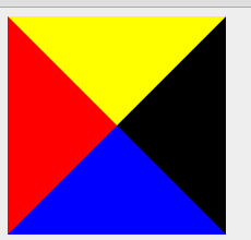
再看这张图的css样式
    .all {
        display:block;
        width:0;
        height:0;
        border-bottom: 100px solid blue;
        border-left: 100px solid red;
        border-right: 100px solid black;
        border-top: 100px solid yellow;
      }
理解起来很简单,就是边框的重叠覆盖,由此我们可以看出应该如何绘制一个三角形。
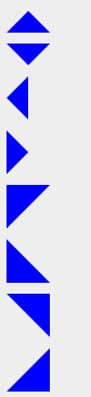
这个图分别是向上,向下,向左,向右,向左上,向左下,向右上,向右下的箭头实现效果,代码如下
  /*三角样式*/
      .arrow-up {
        display:block;
        width:0;
        height:0;
        border-bottom: 20px solid blue;
        border-left: 20px solid transparent;
        border-right: 20px solid transparent;
      }

       /*箭头向下*/
      .arrow-down {
        display:block;
        width:0;
        height:0;
        border-top: 20px solid blue;
        border-left: 20px solid transparent;
        border-right: 20px solid transparent;
      }

       /*箭头向左*/
      .arrow-left {
        display:block;
        width:0;
        height:0;
        border-right: 20px solid blue;
        border-top: 20px solid transparent;
        border-bottom: 20px solid transparent;
      }

      /*箭头向右*/
      .arrow-right {
        display:block;
        width:0;
        height:0;
        border-left: 20px solid blue;
        border-top: 20px solid transparent;
        border-bottom: 20px solid transparent;
      }

      /*箭头左上*/
      .arrow-left-top {
        display:block;
        width:0;
        height:0;
        border-left: 20px solid blue;
        border-top: 20px solid blue;
        border-bottom: 20px solid transparent;
        border-right: 20px solid transparent;
      }

      /*箭头左下*/
      .arrow-left-bottom {
        display:block;
        width:0;
        height:0;
        border-left: 20px solid blue;
        border-bottom: 20px solid blue;
        border-top: 20px solid transparent;
        border-right: 20px solid transparent;
      }

      /*箭头右上*/
      .arrow-right-top {
        display:block;
        width:0;
        height:0;
        border-right: 20px solid blue;
        border-top: 20px solid blue;
        border-bottom: 20px solid transparent;
        border-left: 20px solid transparent;
      }

      /*箭头右下*/
      .arrow-right-bottom {
        display:block;
        width:0;
        height:0;
        border-right: 20px solid blue;
        border-bottom: 20px solid blue;
        border-top: 20px solid transparent;
        border-left: 20px solid transparent;
      }
其实没什么可说的,只要记住一点,实现上下左右的箭头,只需要将反方向的border设置颜色和宽度,其两边设置为透明,覆盖掉开始时设置的颜色,就可实现三角,右上这一类更加简单,只需要设置对应方向的颜色和宽度,将反方向的颜色设置为透明即可。
下面来看几个实用的三角箭头应用
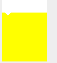
代码:
  /*包含小三角的div*/
      .in-triangle {
        height : 200px;
        width : 150px;
        background-color: yellow;
      }

      .in-triangle > header {
        height: 40px;
        width: 100%;
        background-color: #fff;
      }
      .in-triangle > header > span{
        position: relative;
        display: block;
        top: 40px;
        left: 10px;
        width:0;
        height:0;
        border-left:10px solid transparent;
        border-right:10px solid transparent;
        border-top:10px solid #fff;
      }
      <div class="in-triangle">
      <header>
        <span></span>
      </header>

    </div>
再看一个
代码:
.tag
      {
          width: 300px;
          height: 100px;
          border: 5px solid #09F;
          position: relative;
      }
      .tag em
      {
          display: block;
          border-width: 20px;
          position: absolute;
          bottom: -40px;
          left: 100px;
          border-style: solid dashed dashed;
          border-color: #09F transparent transparent;
      }
      .tag span
      {
          display: block;
          border-width: 20px;
          position: absolute;
          bottom: -33px;
          left: 100px;
          border-style: solid dashed dashed;
          /*border颜色要与背景色一致*/
          border-color: #eee transparent transparent;
      }
      <div class="tag">
        <em></em>
    </div>
    <div class="tag" style="margin-top: 100px">
        <em></em><span></span>
    </div>
有一点需要注意的就是第二个div的span的颜色要与底色一致,其实就是覆盖掉了em的颜色,看上去好像是缺口而已。
最后看一下bootstrap的tooltip实现

.bootstrap-tooltip {
        display: inline-block;
      }

      .bootstrap-tooltip > .tooltip-arrow{
        display: block;
        position: relative;
        width: 0;
        height: 0;
        top: 0;
        left: 50%;
        margin-left: -5px;
        border-width: 0 5px 5px;
        border-color: transparent transparent black;
        border-style: solid;
      }
      .bootstrap-tooltip > .tooltip-word {
        padding: 5px;
        color: white;
        background-color: black;
        border-radius: 5px;
      }
     <div class="bootstrap-tooltip">
      <span class="tooltip-arrow"></span>
      <div class="tooltip-word">tooltip</div>
    </div>
基本可以绝对定位到任何位置,看自己的需求了。
一些学习笔记和对应的文件都传到github上了triangle.html是这个博客讲的内容代码,有需求可以看一看,https://github.com/NickXun/js_note 另外vertical跟horizon是居中布局方法,有别的方法希望可以一起添加一起进步。


 扫一扫
扫一扫
 1758
1758

 被折叠的 条评论
为什么被折叠?
被折叠的 条评论
为什么被折叠?
 到【灌水乐园】发言


