


最近在学习使用WPF开发应用程序。关于WPF程序布局,有很多博客和参考书可供学习。今天试着做了10个简单的WPF界面,将xaml代码和实际展示的界面列出,仅供参考。
1、使用按钮填充父容器,类似于Winform中将按钮的Dock设置为Fill
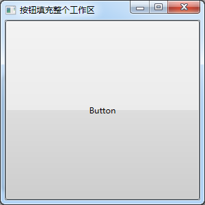
XAML代码如下:
<Window x:Class="WpfLayoutDemo.Window01"
        xmlns="http://schemas.microsoft.com/winfx/2006/xaml/presentation"
        xmlns:x="http://schemas.microsoft.com/winfx/2006/xaml"
        Title="按钮填充整个工作区" Height="300" Width="300">
    <Grid Name="BaseGrid">
        <Button Content="Button" HorizontalAlignment="Left" Margin="0,0,0,0" VerticalAlignment="Top"
                Width="{Binding Path=ActualWidth,ElementName=BaseGrid}"
                Height="{Binding Path=ActualHeight,ElementName=BaseGrid}"/>
    </Grid>
</Window>
2、使用DockPanel进行布局,容器分上、下、左、右、中央五个部分
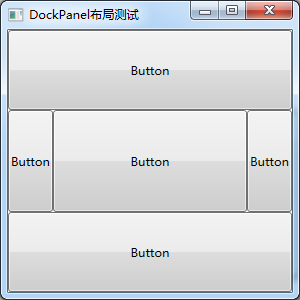
XAML代码如下:
<Window x:Class="WpfLayoutDemo.Window02"
        xmlns="http://schemas.microsoft.com/winfx/2006/xaml/presentation"
        xmlns:x="http://schemas.microsoft.com/winfx/2006/xaml"
        Title="DockPanel布局测试" Height="300" Width="300">
    <DockPanel>
        <Button Content="Button" DockPanel.Dock="Top" Height="80"/>
        <Button Content="Button" DockPanel.Dock="Bottom" Height="80"/>
        <Button Content="Button" DockPanel.Dock="Left"/>
        <Button Content="Button" DockPanel.Dock="Right"/>
        <Button Content="Button" />
    </DockPanel>
</Window>
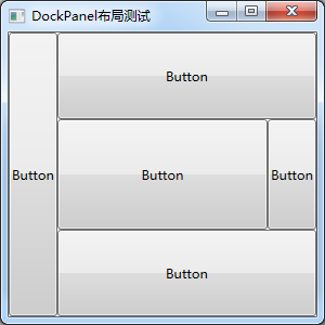
3、使用DockPanel进行布局,调整Dock声明的先后顺序可调整DockPanel内元素的结构

XAML代码如下:
<Window x:Class="WpfLayoutDemo.Window03"
        xmlns="http://schemas.microsoft.com/winfx/2006/xaml/presentation"
        xmlns:x="http://schemas.microsoft.com/winfx/2006/xaml"
        Title="DockPanel布局测试" Height="300" Width="300">
    <DockPanel>
        <Button Content="Button" DockPanel.Dock="Left"/>
        <Button Content="Button" DockPanel.Dock="Right"/>
        <Button Content="Button" DockPanel.Dock="Top" Height="100"/>
        <Button Content="Button" DockPanel.Dock="Bottom" Height="100"/>
        <Button Content="Button" />
    </DockPanel>
</Window>
4、使用DockPanel进行布局,调整Dock声明的先后顺序可调整DockPanel内元素的结构
XAML代码如下:
<Window x:Class="WpfLayoutDemo.Window04"
        xmlns="http://schemas.microsoft.com/winfx/2006/xaml/presentation"
        xmlns:x="http://schemas.microsoft.com/winfx/2006/xaml"
        Title="DockPanel布局测试" Height="300" Width="300">
    <DockPanel>
        <Button Content="Button" DockPanel.Dock="Left"/>
        <Button Content="Button" DockPanel.Dock="Top" Height="80"/>
        <Button Content="Button" DockPanel.Dock="Bottom" Height="80"/>
        <Button Content="Button" DockPanel.Dock="Right"/>
        <Button Content="Button" />
    </DockPanel>
</Window>
5、使用DockPanel进行布局,每一部分可继续嵌套其他布局
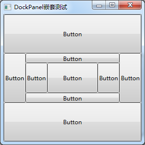
XAML代码如下:
<Window x:Class="WpfLayoutDemo.Window05"
        xmlns="http://schemas.microsoft.com/winfx/2006/xaml/presentation"
        xmlns:x="http://schemas.microsoft.com/winfx/2006/xaml"
        Title="DockPanel嵌套测试" Height="300" Width="300">
    <DockPanel>
        <Button Content="Button" DockPanel.Dock="Top" Height="80"/>
        <Button Content="Button" DockPanel.Dock="Bottom" Height="80"/>
        <Button Content="Button" DockPanel.Dock="Left"/>
        <Button Content="Button" DockPanel.Dock="Right"/>
        <DockPanel>
            <Button Content="Button" DockPanel.Dock="Top" Height="20"/>
            <Button Content="Button" DockPanel.Dock="Bottom" Height="20"/>
            <Button Content="Button" DockPanel.Dock="Left"/>
            <Button Content="Button" DockPanel.Dock="Right"/>
            <Button Content="Button"/>
        </DockPanel>
    </DockPanel>
</Window>
6、在Canvas上绘制控件,以左上角为坐标原点设置各控件位置
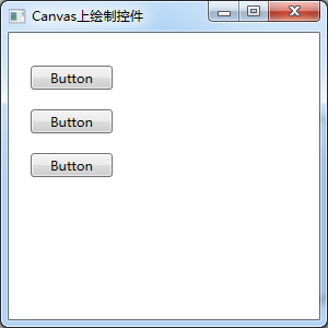
XAML代码如下:
<Window x:Class="WpfLayoutDemo.Window06"
        xmlns="http://schemas.microsoft.com/winfx/2006/xaml/presentation"
        xmlns:x="http://schemas.microsoft.com/winfx/2006/xaml"
        Title="Canvas上绘制控件" Height="300" Width="300">
    <Canvas HorizontalAlignment="Left" Height="270" VerticalAlignment="Top" Width="292">
        <Button Content="Button" Canvas.Left="20" Canvas.Top="30" Width="75"/>
        <Button Content="Button" Canvas.Left="20" Canvas.Top="70" Width="75"/>
        <Button Content="Button" Canvas.Left="20" Canvas.Top="110" Width="75"/>
    </Canvas>
</Window>
7、Grid容器,以网格形式放置元素
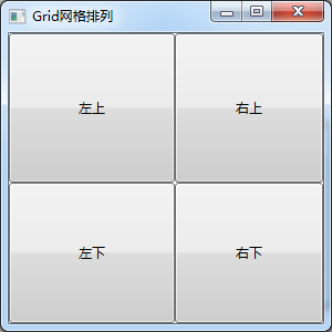
XAML代码如下:
<Window x:Class="WpfLayoutDemo.Window07"
        xmlns="http://schemas.microsoft.com/winfx/2006/xaml/presentation"
        xmlns:x="http://schemas.microsoft.com/winfx/2006/xaml"
        Title="Grid网格排列" Height="300" Width="300">
    <Grid>
        <Grid.ColumnDefinitions>
            <ColumnDefinition Width="150"/>
            <ColumnDefinition Width="*" />
        </Grid.ColumnDefinitions>
        <Grid.RowDefinitions>
            <RowDefinition Height="135" />
            <RowDefinition Height="*" />
        </Grid.RowDefinitions>
        <Button Margin="0,0,0,0" Grid.Row="0" Grid.Column="0">左上</Button>
        <Button Margin="0,0,0,0" Grid.Row="0" Grid.Column="1">右上</Button>
        <Button Margin="0,0,0,0" Grid.Row="1" Grid.Column="0">左下</Button>
        <Button Margin="0,0,0,0" Grid.Row="1" Grid.Column="1">右下</Button>
    </Grid>
</Window>
8、StackPanel容器,自上到下或自左到右显示元素
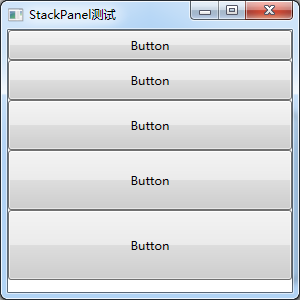
XAML代码如下:
<Window x:Class="WpfLayoutDemo.Window08"
        xmlns="http://schemas.microsoft.com/winfx/2006/xaml/presentation"
        xmlns:x="http://schemas.microsoft.com/winfx/2006/xaml"
        Title="StackPanel测试" Height="300" Width="300">
    <StackPanel>
        <Button Content="Button" Height="30"/>
        <Button Content="Button" Height="40"/>
        <Button Content="Button" Height="50"/>
        <Button Content="Button" Height="60"/>
        <Button Content="Button" Height="70"/>
    </StackPanel>
</Window>
9、StackPanel容器,添加滚动条以显示更多的元素
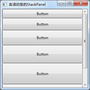
XAML代码如下:
<Window x:Class="WpfLayoutDemo.Window09"
        xmlns="http://schemas.microsoft.com/winfx/2006/xaml/presentation"
        xmlns:x="http://schemas.microsoft.com/winfx/2006/xaml"
        Title="含滚动条的StackPanel" Height="300" Width="300">
    <ScrollViewer x:Name="scrolls" VerticalScrollBarVisibility="Auto">
        <ScrollViewer.Content>
            <StackPanel>
                <Button Content="Button" Height="30"/>
                <Button Content="Button" Height="40"/>
                <Button Content="Button" Height="50"/>
                <Button Content="Button" Height="60"/>
                <Button Content="Button" Height="70"/>
                <Button Content="Button" Height="80"/>
            </StackPanel>
        </ScrollViewer.Content>
    </ScrollViewer>
</Window>
10、WrapPanel容器,自左到右自上到下显示元素
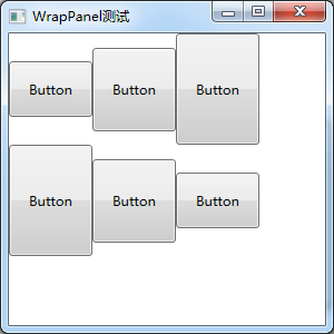
XAML代码如下:
<Window x:Class="WpfLayoutDemo.Window10"
        xmlns="http://schemas.microsoft.com/winfx/2006/xaml/presentation"
        xmlns:x="http://schemas.microsoft.com/winfx/2006/xaml"
        Title="WrapPanel测试" Height="300" Width="300">
    <WrapPanel HorizontalAlignment="Left" Height="270" VerticalAlignment="Top" Width="292">
        <Button Content="Button" Width="75" Height="50"/>
        <Button Content="Button" Width="75" Height="75"/>
        <Button Content="Button" Width="75" Height="100"/>
        <Button Content="Button" Width="75" Height="100"/>
        <Button Content="Button" Width="75" Height="75"/>
        <Button Content="Button" Width="75" Height="50"/>
    </WrapPanel>
</Window>
END


 被折叠的 条评论
为什么被折叠?
被折叠的 条评论
为什么被折叠?
 到【灌水乐园】发言


