


vue vuetify
Vue骨架屏幕 (vue-skeleton-screen)
A skeleton screen written in Vue.js and powered by Vuetify.
用Vue.js编写并由Vuetify提供支持的框架屏幕。
用法 (Usage)
//javascript
import SkeletonCard from 'vue-skeleton-screen'
...
export default{
...
	components: {
    	SkeletonCard,
	}
...
};
<!-- html -->
<skeleton-card actions round hover></skeleton-card>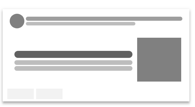
安装 (Installatoin)
Using npm:
使用npm:
$ npm i --save vue-skeleton-screen依存关系 (Dependencies)
Vue, This is a component written in vue and can only use for Vue projects. For information, go to https://vuejs.org/.
Vue ,这是一个用vue编写的组件,只能用于Vue项目。 有关信息,请访问https://vuejs.org/ 。
阿皮 (Api)
-标头 (- header)
Type: Boolean
类型:布尔
Default: true
默认值: true
Description: header with or without a avatar along with a title and subtitle, set to false to hide it.
说明:带有或不带有头像的标题以及标题和副标题,设置为false即可将其隐藏。
-头像 (- avatar)
Type: Boolean
类型:布尔
Default: true
默认值: true
Description: a round avatar in header, set to false to hide it.
说明:标头中的圆形头像,设置为false以隐藏它。
-媒体 (- media)
Type: Boolean
类型:布尔
Default: true
默认值: true
Description: media is a grey div stands for image to be loaded, set to false to hide it.
说明:media是灰色的div,代表要加载的图像,设置为false即可将其隐藏。
-动作 (- actions)
Type: Boolean
类型:布尔
Default: false
默认值: false
Description: actions contains two action button place holders, set to true to enable it.
说明:操作包含两个操作按钮占位符,将其设置为true即可启用它。
-线 (- lines)
Type: Number
类型:数字
Default: 2
默认值: 2
Description: the lines number in text section.
说明:文本部分中的行号。
-圆 (- round)
Type: Boolean
类型:布尔
Default: false
默认值: false
Description: set to true if you want rounded corner of the placeholder.
说明:如果要占位符的圆角,则设置为true 。
-深色(0.0.4中的新增功能) (- dark (new in 0.0.4))
Type: Boolean
类型:布尔
Default: false
默认值: false
Description: set to true to use dark theme.
说明:设置为true以使用深色主题。
翻译自: https://vuejsexamples.com/a-skeleton-screen-written-in-vue-js-and-powered-by-vuetify/
vue vuetify


 2050
2050


 被折叠的 条评论
为什么被折叠?
被折叠的 条评论
为什么被折叠?
 到【灌水乐园】发言


