


 本文介绍了qml自定义数字键盘,它是一个可在移动浏览器中使用的虚拟输入框,支持JavaScript、React和Vue。键盘可以替代系统键盘,提供数字、电话和自定义布局,具有丰富的选项和事件回调。
qml 自定义数字键盘
数字键盘 (Numeric Keyboard)
A custom virtual numeric keyboard works in mobile browsers. It contains a virtual input box which would invoke the numeric keyboard instead of system keyboard, the virtual input box supports many html5 standard properties and also has a nice cursor to make it behaves like native input element as much as possible. Besides, the numeric keyboard is a pluggable component can be used together with other input interfaces.
自定义虚拟数字键盘可在移动浏览器中使用。 它包含一个虚拟输入框,该框将调用数字键盘而不是系统键盘,该虚拟输入框支持许多html5标准属性,并且还具有一个漂亮的光标,以使其表现得尽可能像本机输入元素。 此外,数字键盘是可插入的组件,可以与其他输入接口一起使用。
The numeric keyboard has several versions: Vanilla JavaScript class, React component and Vue component.
数字键盘有多个版本:Vanilla JavaScript类,React组件和Vue组件。
安装 (Install)
You can install it via Yarn
您可以通过Yarn安装它
yarn add numeric-keyboardConfig Webpack to use the right version
配置Webpack以使用正确的版本
resolve: {
  alias: {
    // use Vue component for example
    'numeric-keyboard$': 'numeric-keyboard/dist/numeric_keyboard.vue.js'
  }
},
用法 (Usage)
香草JavaScript (Vanilla JavaScript)
import { NumericInput } from 'numeric-keyboard'
new NumericInput('.input', {
  type: 'number',
  placeholder: 'touch to input',
  onInput(value) {
    ...
  }
})
React (React)
import { NumericInput } from 'numeric-keyboard'
class App extends React.Component {
  input(val) {
    ...
  },
  render() {
    return <div className="input">
      <label>Amount: </label>
      <NumericInput type="number" placeholder="touch to input" onInput={this.input.bind(this)} />
    </div>
  }
}
Vue (Vue)
<template>
  <div class="input">
    <label>Amount: </label>
    <NumericInput placeholder="touch to input" v-model="amount" />
  </div>
</template>

<script>
  import { NumericInput } from 'numeric-keyboard'
  export default {
    components: {
      NumericInput
    },
    data() {
      return {
       amount: null
      }
    }
  }
</script>
选项/道具 (Options/Props)
As a substitute for native input element, the input box supports most of the standard attributes, you can refer the HTML spec for details.
作为本机输入元素的替代,输入框支持大多数标准属性,有关详细信息,请参考HTML规范。
// There are only two types: number and tel
// The layout property for keyboard is inherited from it
type: {
  type:String,
  default: 'number'
},
autofocus: {
  type: Boolean,
  default: false
},
disabled: {
  type: Boolean,
  default: false
},
maxlength: {
  type: Number
},
name: {
  type: String
},
placeholder: {
  type: String
},
readonly: {
  type: Boolean,
  default: false
},
value: {
  type: [String, Number]
},
// Passs a regexp string or function to limit the input.
format: {
  type: [String, Function]
},
// Config the numeric keyboard which will be called when focus. The config detail is described below.
keyboard: {
  type: Object
}
回调/事件 (Callback/Events)
input (input)
The input event is emitted when the value of input changes. The first argument for the callback is the value of the input box rather than an event object from a native input element. A onInput() callback is used in vanilla javascript version.
input值更改时,将发出input事件。 回调的第一个参数是输入框的值,而不是本机输入元素中的事件对象。 在onInput() javascript版本中使用onInput()回调。
键盘 (Keyboard)
The keyboard is a pluggable component which supports custom layout and theme. In order to be able to work properly in a real scene, it usually needs to match an output interface.
键盘是可插拔组件,支持自定义布局和主题。 为了能够在真实场景中正常工作,通常需要匹配输出接口。
用法 (Usage)
香草JavaScript (Vanilla JavaScript)
import { NumericKeyboard } from 'numeric-keyboard'
new NumericKeyboard('.keyboard', {
  layout: 'tel',
  onPress(key) {
    ...
  }
})
React (React)
import { NumericKeyboard } from 'numeric-keyboard'
class App extends React.Component {
  press(key) {
    ...
  }
  render() {
    return <div className="keyboard">
      <NumericKeyboard layout="tel" onPress={this.press.bind(this)} />
    </div>
  }
}
Vue (Vue)
<template>
   <div class="keyboard">
     <NumericKeyboard layout="tel" @press="press" />
   </div>
</template>

<script>
  import { NumericKeyboard } from 'numeric-keyboard'
  export default {
    components: {
      NumericKeyboard
    },
    methods: {
      press(key) {
        ...
      }
    }
  }
</script>
选项/道具 (Options/Props)
// change the layout of keyboard
 layout: {
   type: [String, Array],
   default: 'number'
 },
 // change the style of keyboard
 theme: {
   type: [String, Object],
   default: 'default'
 },
 // change the label of submit button, this is used for specific context and language
 entertext: {
   type: String,
   default: 'enter'
 }
layout (layout)
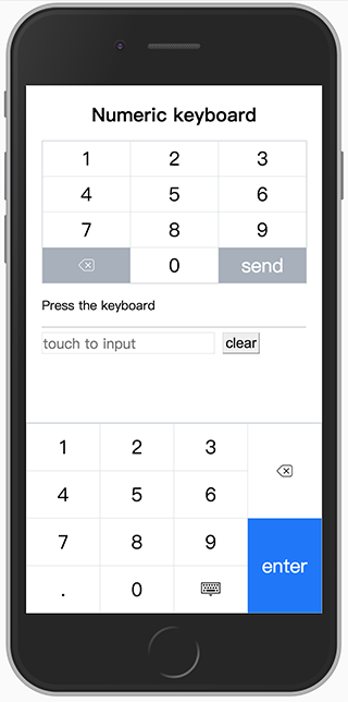
There are two built-in layouts called number and tel which can be used as a replacement of system keyboard. You can still rearrange all the keys to create your own layout. The layout object is a two-dimension array which constructs a table layout, you can make table-specific operations like merging cells.
有两个内置的布局,分别称为number和tel ,可以用作系统键盘的替代品。 您仍然可以重新排列所有键以创建自己的布局。 布局对象是一个二维数组,用于构造表布局,您可以进行表特定的操作,例如合并单元格。
数字布局 (number layout)

电话布局 (tel layout)

自定义布局 (custom layout)
// code sample for the build-in number layout
import { keys } from 'numeric-keyboard'
[
  [
    {
      key: keys.ONE
    },
    {
      key: keys.TWO
    },
    {
      key: keys.THREE
    },
    {
      key: keys.DEL,
      rowspan: 2,
    },
  ],
  [
    {
      key: keys.FOUR
    },
    {
      key: keys.FIVE
    },
    {
      key: keys.SIX
    },
  ],
  [
    {
      key: keys.SEVEN
    },
    {
      key: keys.EIGHT
    },
    {
      key: keys.NINE
    },
    {
      key: keys.ENTER,
      rowspan: 2,
    },
  ],
  [
    {
      key: keys.DOT
    },
    {
      key: keys.ZERO
    },
    {
      key: keys.ESC
    },
  ],
]
theme (theme)
The style of the keyboard can be modified global or per key, currently, it only supports several limit style like font color and background color, however, you can override CSS directly for the complicated style.
键盘的样式可以全局或按每个键进行修改,目前,它仅支持几种限制样式,例如字体颜色和背景颜色,但是,对于复杂的样式,您可以直接覆盖CSS。
// the default style declaration
import { keys } from 'numeric-keyboard'
{
  global: {
    color: '#000000',
    backgroundColor: ['#ffffff', '#929ca8'], // specify a pair of colors for active pseudo class
  },
  key: {
    [keys.ENTER]: {
      color: '#ffffff',
      backgroundColor: ['#007aff', '#0051a8'],
    },
  }
}
回调/事件 (Callbacks/Events)
press (press)
the press event is emitted with a key code when the key is pressed. The argument for the callback is the key just pressed. A onPress() callback is used in vanilla javascript version.
当press键时, press事件会随键码一起发出。 回调的参数是刚刚按下的键。 在原始javascript版本中使用了onPress()回调。
翻译自: https://vuejsexamples.com/a-custom-virtual-numeric-keyboard-works-in-mobile-browsers/
qml 自定义数字键盘


 扫一扫
扫一扫
 2807
2807

 被折叠的 条评论
为什么被折叠?
被折叠的 条评论
为什么被折叠?
 到【灌水乐园】发言


