


tailwind css
When thinking about what CSS framework to use for a new project, options like Bootstrap and Foundation readily jump to mind. They’re tempting to use because of their ready-to-use, pre-designed components, which developers can use with ease right away. This approach works well with relatively simple websites with a common look and feel. But as soon as we start building more complex, unique sites with specific needs, a couple of problems arise.
在考虑将一个CSS框架用于新项目时,诸如Bootstrap和Foundation之类的选项很容易让人想到。 由于它们具有现成的,预先设计的组件,因此开发人员可以立即轻松使用它们,因此它们很容易使用。 这种方法适用于具有共同外观的相对简单的网站。 但是,一旦我们开始构建具有特定需求的更复杂,独特的站点,就会出现一些问题。
At some point, we need to customize certain components, create new components, and make sure the final codebase is unified and easy to maintain after the changes.
在某些时候,我们需要自定义某些组件,创建新的组件,并确保最终的代码库是统一的,并且在更改后易于维护。
It’s hard to satisfy the above needs with frameworks like Bootstrap and Foundation, which give us a bunch of opinionated and, in many cases, unwanted styles. As a result, we have to continuously solve specificity issues while trying to override the default styles. It doesn’t sound like a fun job, does it?
使用Bootstrap和Foundation这样的框架很难满足上述需求,这些框架给了我们很多观点,在很多情况下是不需要的样式。 因此,我们必须不断解决特定性问题,同时尝试覆盖默认样式。 听起来不是一件有趣的工作,对吗?
Ready-to-use solutions are easy to implement, but inflexible and confined to certain boundaries. On other hand, styling web sites without a CSS framework is powerful and flexible, but isn’t easy to manage and maintain. So, what’s the solution?
即用型解决方案易于实施,但缺乏灵活性,并局限于特定范围。 另一方面,不使用CSS框架来样式化网站的样式既强大又灵活,但不易于管理和维护。 那么,解决方案是什么?
The solution, as always, is to follow the golden middle. We need to find and apply the right balance between the concrete and abstract. A low-level CSS framework offers such a balance. There are several frameworks of this kind, and in this tutorial, we’ll explore the most popular one, Tailwind CSS.
一如既往,解决方案是遵循黄金中间路线。 我们需要在具体和抽象之间找到并应用适当的平衡。 低级CSS框架提供了这种平衡。 有几种这样的框架,在本教程中,我们将探讨最受欢迎的Tailwind CSS框架。
什么是逆风? (What Is Tailwind?)
Tailwind is more than a CSS framework, it’s an engine for creating design systems. — Tailwind website
Tailwind不仅是CSS框架,还是创建设计系统的引擎。 — Tailwind网站
Tailwind is a collection of low-level utility classes. They can be used like lego bricks to build any kind of component. The collection covers the most important CSS properties, but it can be easily extended in a variety of ways. With Tailwind, customization isn’t pain in the neck anymore. The framework has great documentation, covering every class utility in detail and showing the ways it can be customized. All modern browsers, and IE11+, are supported.
Tailwind是低级实用程序类的集合。 它们可以像乐高积木一样用来构建任何类型的组件。 该集合涵盖了最重要CSS属性,但是可以通过多种方式轻松地对其进行扩展。 借助Tailwind,自定义不再是困扰。 该框架有出色的文档,详细介绍了每个类实用程序,并显示了可以自定义的方法。 支持所有现代浏览器和IE11 +。
为什么使用效用优先框架? (Why Use a Utility-first Framework?)
A low-level, utility-first CSS framework like Tailwind has a plenty of benefits. Let’s explore the most significant of them:
像Tailwind这样的低级,效用优先CSS框架有很多好处。 让我们探索其中最重要的:
- You have greater control over elements’ appearance. We can change and fine-tune an element’s appearance much more easily with utility classes. 您可以更好地控制元素的外观。 使用实用程序类,我们可以更轻松地更改和微调元素的外观。
- It’s easy to manage and maintain in large projects, because you only maintain HTML files, instead of a large CSS codebase. 在大型项目中,这很容易管理和维护,因为您只维护HTML文件,而不维护大型CSS代码库。
- It’s easier to build unique, custom website designs without fighting with unwanted styles. 构建独特的自定义网站设计更容易,而又不会与不需要的样式作斗争。
- It’s highly customizable and extensible, which gives us unlimited flexibility. 它具有高度可定制性和可扩展性,为我们提供了无限的灵活性。
- It has a mobile-first approach and easy implementation of responsive design patterns. 它具有移动优先的方法,并且易于实现响应式设计模式。
- There’s the ability to extract common, repetitive patterns into custom, reusable components — in most cases without writing a single line of custom CSS. 可以将常见的重复模式提取到自定义的可重用组件中-在大多数情况下,无需编写任何一行自定义CSS。
- It has self-explanatory classes. We can imagine how the styled element looks only by reading the classes. 它具有不言自明的类。 我们可以通过仅阅读类来想象样式化元素的外观。
Finally, as Tailwind’s creators say:
最后,正如Tailwind的创作者所说 :
it’s just about impossible to think this is a good idea the first time you see it — you have to actually try it.
初次看到它是一个好主意几乎是不可能的,您必须实际尝试一下。
So, let’s try it!
所以,让我们尝试一下!
Tailwind入门 (Getting Started with Tailwind)
To demonstrate Tailwind’s customization features, we need to install it via npm:
为了演示Tailwind的自定义功能,我们需要通过npm安装它:
npm install tailwindcssThe next step is to create a styles.css file, where we include the framework styles using the @tailwind directive:
下一步是创建一个styles.css文件,其中使用@tailwind指令包含框架样式:
@tailwind base;

@tailwind components;

@tailwind utilities;
After that, we run the npx tailwind init command, which creates a minimal tailwind.config.js file, where we’ll put our customization options during the development. The generated file contains the following:
之后,我们运行npx tailwind init命令,该命令创建一个最小的tailwind.config.js文件,在开发过程中将放置自定义选项。 生成的文件包含以下内容:
module.exports = {
  theme: {},
  variants: {},
  plugins: [],
}
The next step is to build the styles in order to use them:
下一步是构建样式以便使用它们:
npx tailwind build styles.css -o output.cssFinally, we link the generated output.css file and Font Awesome in our HTML:
最后,我们在HTML中链接生成的output.css文件和Font Awesome :
<link rel="stylesheet" type="text/css" href="output.css">
  <link rel="stylesheet" href="https://cdnjs.cloudflare.com/ajax/libs/font-awesome/5.9.0/css/all.min.css">
And now, we’re ready to start creating.
现在,我们准备开始创建。
建立一页网站模板 (Building a One-page Website Template)
In the rest of the tutorial, we’ll build a one-page website template using the power and flexibility of Tailwind’s utility classes.
在本教程的其余部分中,我们将使用Tailwind实用程序类的强大功能和灵活性来构建一个一页的网站模板。
Here you can see the template in action.
I’m not going to explain every single utility (which would be boring and tiresome) so I suggest you to use the Tailwind cheatsheet as a quick reference. It contains all available utilities with their effect, plus direct links to the documentation.
我将不解释每个实用程序(这会很无聊又烦人),因此我建议您使用Tailwind速查表作为快速参考。 它包含所有可用的实用程序及其效果,以及指向文档的直接链接。
We’ll build the template section by section. They are Header, Services, Projects, Team, and Footer.
我们将逐节构建模板。 它们是页眉,服务,项目,团队和页脚。
We firstly wrap all section in a container:
我们首先将所有部分包装在一个容器中:
<div class="container mx-auto">
  <!-- Put the sections here -->
</div>
标头(徽标,导航) (Header (Logo, Navigation))
The first section — Header — will contain a logo on the left side and navigation links on the right side. Here’s how it will look:
第一部分(标题)将在左侧包含徽标,在右侧包含导航链接。 外观如下:
Now, let’s explore the code behind it.
现在,让我们探究其背后的代码。
<div class="flex justify-between items-center py-4 bg-blue-900">
  <div class="flex-shrink-0 ml-10 cursor-pointer">
    <i class="fas fa-drafting-compass fa-2x text-orange-500"></i>
    <span class="ml-1 text-3xl text-blue-200 font-semibold">WebCraft</span>
  </div>
  <i class="fas fa-bars fa-2x visible md:invisible mr-10 md:mr-0 text-blue-200 cursor-pointer"></i>
  <ul class="hidden md:flex overflow-x-hidden mr-10 font-semibold">
    <li class="mr-6 p-1 border-b-2 border-orange-500">
      <a class="text-blue-200 cursor-default" href="#">Home</a>
    </li>
    <li class="mr-6 p-1">
      <a class="text-white hover:text-blue-300" href="#">Services</a>
    </li>
    <li class="mr-6 p-1">
      <a class="text-white hover:text-blue-300" href="#">Projects</a>
    </li>
    <li class="mr-6 p-1">
      <a class="text-white hover:text-blue-300" href="#">Team</a>
    </li>
    <li class="mr-6 p-1">
      <a class="text-white hover:text-blue-300" href="#">About</a>
    </li>
    <li class="mr-6 p-1">
      <a class="text-white hover:text-blue-300" href="#">Contacts</a>
    </li>
  </ul>
</div>
As you can see, the classes are pretty self-explanatory as I mentioned above. We’ll explore only the highlights.
如您所见,如上所述,这些类非常不言自明。 我们将仅探讨重点。
First, we create a flex container and center its items horizontally and vertically. We also add some top and bottom padding, which Tailwind combines in a single py utility. As you may guess, there’s also a px variant for left and right. We’ll see that this type of shorthand is broadly used in many of the other utilities. As a background color, we use the darkest blue (bg-blue-900) from Tailwind’s color palette. The palette contains several colors with shades for each color distributed from 100 to 900. For example, blue-100, blue-200, blue-300, etc.
首先,我们创建一个flex容器并将其项目水平和垂直居中。 我们还添加了一些顶部和底部填充,Tailwind将其合并到一个py实用程序中。 您可能会猜到,左右还有px变体。 我们将看到这种速记方式广泛用于许多其他实用程序中。 作为背景色,我们使用Tailwind调色板中最深的蓝色( bg-blue-900 )。 调色板包含几种颜色,每种颜色的阴影从100到900分布。例如blue-100 , blue-200 , blue-300等。
In Tailwind, we apply a color to a property by specifying the property followed by the color and the shade number. For example, text-white, bg-gray-800, border-red-500. Easy peasy.
在Tailwind中,我们通过指定属性,然后指定颜色和阴影编号,将颜色应用于属性。 例如, text-white , bg-gray-800 , border-red-500 。 十分简单。
For the logo on the left side, we use a div element, which we set not to shrink (flex-shrink-0) and move it a bit away from the edge by applying the margin-left property (ml-10). Next we use a Font Awesome icon whose classes perfectly blend with those of Tailwind. We use one of them to make the icon orange. For the textual part of the logo, we use big, light blue, semi-bolded text, with a small offset to the right.
对于左侧的徽标,我们使用div元素,我们将其设置为不缩小( flex-shrink-0 ),并通过应用margin-left属性( ml-10 )将其从边缘移开一点。 接下来,我们使用Font Awesome图标,其类与Tailwind的类完美融合。 我们使用其中之一使图标变为橙色。 对于徽标的文字部分,我们使用大而浅的蓝色,半粗略文本,并在右侧稍许偏移。
In the middle, we add an icon that will be visible only on mobile. Here we use one of the responsive breakpoint prefixes (md). Tailwind, like Bootstrap and Foundation, follows the mobile-first approach. This means that when we use utilities without prefix (visible), they apply all the way from the smallest to the largest devices. If we want different styling for different devices, we need to use the breakpoint prefixes. So, in our case the icon will be visible on small devices, and invisible (md:invisible) on medium and beyond.
在中间,我们添加了一个仅在移动设备上可见的图标。 在这里,我们使用响应断点前缀( md )之一。 像Bootstrap和Foundation一样,Tailwind遵循移动优先的方法。 这意味着,当我们使用不带前缀( visible )的实用程序时,它们从最小的设备到最大的设备都会应用。 如果我们想为不同的设备使用不同的样式,则需要使用断点前缀。 因此,在我们的案例中,该图标在小型设备上可见,而在中型及其他设备上md:invisible可见( md:invisible )。
At the right side we put the nav links. We style the Home link differently, showing that it’s the active link. We also move the navigation from the edge and set it to be hidden on overflow (overflow-x-hidden). The navigation will be hidden (hidden) on mobile and set to flex (md:flex) on medium and beyond.
在右侧,我们放置了导航链接。 我们对首页链接的样式有所不同,表明它是活动链接。 我们还从边缘移动了导航并将其设置为在溢出时隐藏( overflow-x-hidden )。 导航将在移动设备上被隐藏( hidden ),在中型及更高版本上将其设置为flex( md:flex )。
You can read more about responsiveness in the documentation.
您可以在文档中阅读有关响应性的更多信息 。
服务 (Services)
Let’s now create the next section, Services. Here’s how it will look:
现在让我们创建下一部分,服务。 外观如下:
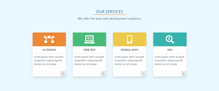
And here’s the code:
这是代码:
<div class="w-full p-6 bg-blue-100">
  <div class="w-48 mx-auto pt-6 border-b-2 border-orange-500 text-center text-2xl text-blue-700">OUR SERVICES</div>
  <div class="p-2 text-center text-lg text-gray-700">We offer the best web development solutions.</div>
  <div class="flex justify-center flex-wrap p-10">
    <div class="relative w-48 h-64 m-5 bg-white shadow-lg">
      <div class="flex items-center w-48 h-20 bg-orange-500">
        <i class="fas fa-bezier-curve fa-3x mx-auto text-white"></i>
      </div>
      <p class="mx-2 py-2 border-b-2 text-center text-gray-700 font-semibold uppercase">UI Design</p>
      <p class="p-2 text-sm text-gray-700">Lorem ipsum dolor sit amet, consectetur adipiscing elit. Aenean ac est massa.</p>
      <div class="absolute right-0 bottom-0 w-8 h-8 bg-gray-300 hover:bg-orange-300 text-center cursor-pointer">
        <i class="fas fa-chevron-right mt-2 text-orange-500"></i>
      </div>
    </div>
    ...
  </div>
</div>
We create a section with light blue background. Then we add an underlined title and a subtitle.
我们创建一个浅蓝色背景的部分。 然后,我们添加带下划线的标题和副标题。
Next, we use a flex container for the services items. We use flex-wrap so the items will wrap on resize. We set the dimensions for each card and add some space and a drop shadow. Each card has a colored section with a topic icon, a title, and a description. And we also put a button with an icon in the bottom-right corner.
接下来,我们将flex容器用于服务项目。 我们使用flex-wrap以便将项目调整大小。 我们为每张卡设置尺寸,并添加一些空间和阴影。 每张卡都有一个带有主题图标,标题和描述的彩色部分。 我们还在右下角放置了一个带有图标的按钮。
Here we use one of the pseudo-class variants (hover, focus, etc.). They’re used in the same way as responsive breakpoints. We use the pseudo-class prefix, followed by a colon and the property name (hover:bg-orange-300).
在这里,我们使用伪类变体之一(悬停,焦点等)。 它们以与响应断点相同的方式使用。 我们使用伪类前缀,后跟冒号和属性名称( hover:bg-orange-300 )。
You can learn more about pseudo-class variants in the documentation.
您可以在文档中了解有关伪类变体的更多信息 。
For brevity, I show the code only for the first card. The other ones are similar. You have to change only the colors, icons, and titles. See the final HTML file on GitHub repo for a reference.
为简便起见,我仅显示第一张卡的代码。 其他的类似。 您只需要更改颜色,图标和标题。 请参阅GitHub存储库上的最终HTML文件以获取参考。
专案 (Projects)
Let’s move to the next section, Projects. Here’s the final look:
让我们进入下一部分,项目。 这是最终外观:
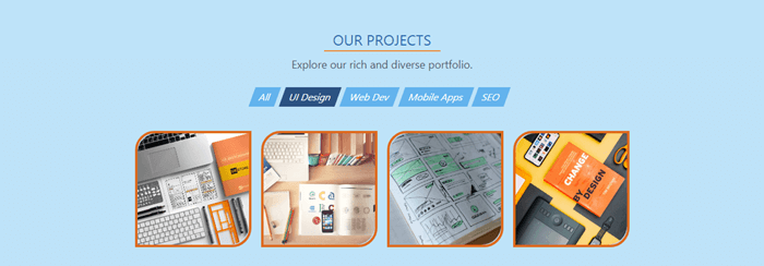
And here’s the code:
这是代码:
<div class="section bg-blue-200">
  <div class="section-title">OUR PROJECTS</div>
  <div class="section-subtitle">Explore our rich and diverse portfolio.</div>

  <nav class="flex justify-center flex-wrap mt-4 mb-8 text-white">
    <div class="h-8 mr-2 px-3 py-1 bg-blue-400 hover:bg-blue-600 text-center cursor-pointer -skewx-20">All</div>
    <div class="h-8 mr-2 px-3 py-1 bg-blue-800 text-center -skewx-20">UI Design</div>
    <div class="h-8 mr-2 px-3 py-1 bg-blue-400 hover:bg-blue-600 text-center cursor-pointer -skewx-20">Web Dev</div>
    <div class="h-8 mr-2 px-3 py-1 bg-blue-400 hover:bg-blue-600 text-center cursor-pointer -skewx-20">Mobile Apps</div>
    <div class="h-8 mr-2 px-3 py-1 bg-blue-400 hover:bg-blue-600 text-center cursor-pointer -skewx-20">SEO</div>
  </nav>

  <div class="flex justify-center flex-wrap">
    <div class="w-48 h-48 m-2 hover:-mt-1 border-4 border-orange-600 rounded-tl-2xl rounded-br-2xl cursor-pointer hover:shadow-lg">
      <img class="w-full h-full object-cover rounded-tl-2xl rounded-br-2xl" src="design1.jpg" />
    </div>
    ...
  </div>
</div>
First, you may notice that here I use section classes. They’re not from the Tailwind. I created them and will show you how right now.
首先,您可能会注意到在这里我使用了section类。 他们不是来自尾风。 我创建了它们,并向您展示了如何进行。
Because all three middle sections will share one and the same base look and feel — which leads to code repetition — now is the time to start thinking in components. One of the great features Tailwind offers is the ability to extract and create easily and painlessly any kind of custom components. So, here we’ll extract a custom section component.
因为所有三个中间部分将共享一个相同的基本外观,从而导致代码重复,所以现在是开始思考组件的时候了。 Tailwind提供的重要功能之一是能够轻松轻松地提取和创建任何类型的自定义组件。 因此,这里我们将提取一个自定义section组件。
Here’s how. Open the styles.css and add the following classes right after the components declaration:
这是如何做。 打开styles.css并在components声明之后添加以下类:
...
@tailwind components;

.section {
  @apply w-full p-6;
}

.section-title {
  @apply w-48 mx-auto pt-6 border-b-2 border-orange-500 text-center text-2xl text-blue-700;
}

.section-subtitle {
  @apply p-2 text-center text-lg text-gray-700;
}
...
As you can see, to create a component class we use the @apply directive followed by the necessary utilities. Here’s more information about extracting components.
如您所见,要创建组件类,我们使用@apply指令,后跟必要的实用程序。 这是有关提取组件的更多信息 。
Now, to use the new classes, we need to re-build the styles again:
现在,要使用新类,我们需要再次重新构建样式:
npx tailwind build styles.css -o output.cssNow, instead of a long array of utilities, we just use one single class for each element. And as you can see, the custom classes can be used safely in conjunction with the regular utilities (section bg-blue-200).
现在,我们不再使用一长串的实用程序,而是对每个元素使用一个单一的类。 如您所见,可以将自定义类与常规实用程序( section bg-blue-200 )一起安全使用。
Let’s move to the navigation buttons. We put them in a flex container and style them as nice-looking rectangles. But we want to make them a bit more dynamic and stylish by applying a little skew effect. The problem is that Tailwind doesn’t offer such utility. So, it’s time to learn how to create our own utilities. It’s super easy.
让我们转到导航按钮。 我们将它们放在flex容器中,并将其样式设置为美观的矩形。 但是我们想通过应用一些偏斜效果使它们更具动感和时尚感。 问题在于,Tailwind不提供此类实用程序。 因此,是时候学习如何创建我们自己的实用程序了。 超级容易。
Open styles.css again and add the needed class right after the utilities declaration:
再次打开styles.css ,并在utilities声明之后添加所需的类:
...
@tailwind utilities;

.-skewx-20 {
  transform: skewX(-20deg);
}
...
What we want is to skew the rectangles horizontally. For this we need the skewX() with a negative value. In Tailwind, utilities with negative values are created by putting a minus sign before the utility name.
我们想要的是水平倾斜矩形。 为此,我们需要带负值的skewX() 。 在Tailwind中,通过在实用程序名称之前放置减号来创建具有负值的实用程序。
We can see the effect of our new utility immediately after we re-build the styles.
重新构建样式后,我们可以立即看到新实用程序的效果。
Here’s more information about adding new utilities.
这是有关添加新实用程序的更多信息。
Now, we create another flex container for the project cards. We want to round their top-left and bottom-right corners, but the amount of roundness which rounded utility offers is less than we need. So, this time we’ll learn how to customize the default Tailwind theme.
现在,我们为项目卡创建另一个flex容器。 我们想对它们的左上角和右下角进行圆角处理,但是rounded实用程序提供的圆度小于我们所需要的。 因此,这次我们将学习如何自定义默认的Tailwind主题。
Open tailwind.config.js and add the borderRadius option after the theme.extend key:
打开tailwind.config.js并添加borderRadius后选择theme.extend关键:
theme: {
    extend: {
      borderRadius: {
        xl: '1rem',
        '2xl': '2rem',
        '3xl': '3rem'
      }
    }
  },
Here we use the extend key, because we don’t want to override other options, we want to include additional options. After we re-build the styles, we can see how our new options take effect.
在这里,我们使用extend键,因为我们不想覆盖其他选项,因此我们希望包括其他选项。 重建样式后,我们可以看到新选项如何生效。
To learn more about theme customization, visit the documentation.
There’s one more thing we want to do which Tailwind doesn’t offer by default. We want the card to rise up a bit on hover. So we need to add a subtle negative margin on hover. But to make it work we need to enable the hover variant to the margin utility.
我们还有另一件事要做,默认情况下Tailwind不提供。 我们希望卡在悬停时上升一点。 因此,我们需要在悬停时添加一个微妙的负边距。 但是要使其工作,我们需要为margin实用程序启用hover变体。
To do so, we put the following in tailwind.config.js:
为此,我们将以下内容放在tailwind.config.js :
variants: {
    margin: ['responsive', 'hover']
  },
The important thing here is that we must always provide the complete list of variants we want to enable, not only the new ones.
这里重要的是,我们必须始终提供要启用的变体的完整列表,而不仅仅是新变体。
Learn more about configuring variants in the documentation.
Now, let’s re-build the styles and see the result.
现在,让我们重新构建样式并查看结果。
球队 (Team)
At this stage you’ve got a pretty good idea of how Tailwind works, and building the Team section will be pretty familiar. Here’s how it will look:
在此阶段,您已经对Tailwind的工作原理有了很好的了解,并且非常熟悉构建团队部分。 外观如下:

Here’s the code:
这是代码:
<div class="section bg-blue-100">
      <div class="section-title">OUR TEAM</div>
      <div class="section-subtitle">Meet our skilled professionals.</div>

      <div class="flex justify-center flex-wrap">
        <div class="w-48 m-4 py-2 bg-white shadow-lg">
          <img class="w-24 h-24 mx-auto rounded-full" src="jessica.jpg" />
          <p class="mx-2 mt-2 text-center text-lg text-gray-700 font-semibold">Jessica Thompson</p>
          <p class="text-center text-gray-600">UI Artisan</p>
          <div class="flex justify-center items-center mt-2">
            <i class="fab fa-facebook-square fa-2x mx-1 text-blue-500 hover:text-orange-500 cursor-pointer"></i>
            <i class="fab fa-twitter-square fa-2x mx-1 text-blue-500 hover:text-orange-500 cursor-pointer"></i>
            <i class="fab fa-google-plus-square fa-2x mx-1 text-blue-500 hover:text-orange-500 cursor-pointer"></i>
          </div>
        </div>
        ...
      </div>
    </div>
Here, we create a set of profile cards. The code for them is highly repetitive, so we’ll extract it in a reusable card component. We already know how to do it.
在这里,我们创建了一组配置文件。 它们的代码是高度重复的,因此我们将其提取到可重复使用的卡组件中。 我们已经知道该怎么做。
We create the card classes and put them in the styles.css file:
我们创建卡类并将其放入styles.css文件中:
...
.card {
  @apply w-48 m-4 py-2 bg-white shadow-lg;
}

.card-image {
  @apply w-24 h-24 mx-auto rounded-full;
}

.card-title {
  @apply mx-2 mt-2 text-center text-lg text-gray-700 font-semibold;
}

.card-subtitle {
  @apply text-center text-gray-600;
}

.card-icons {
  @apply flex justify-center items-center mt-2;
}

.card-icon {
  @apply mx-1 text-blue-500 cursor-pointer;
}

.card-icon:hover {
  @apply text-orange-500;
}
...
Now, let’s re-build the styles and use the card classes in our file. We swap the utilities with the classes, and as a result we get a much shorter version of the code.
现在,让我们重新构建样式并使用文件中的card类。 我们将这些实用程序与这些类交换,结果得到的代码版本要短得多。
<div class="section bg-blue-100">
  <div class="section-title">OUR TEAM</div>
  <div class="section-subtitle">Meet our skilled professionals.</div>

  <div class="flex justify-center flex-wrap">
    <div class="card">
      <img class="card-image" src="jessica.jpg" />
      <p class="card-title">Jessica Thompson</p>
      <p class="card-subtitle">UI Artisan</p>
      <div class="card-icons">
        <i class="fab fa-facebook-square fa-2x card-icon"></i>
        <i class="fab fa-twitter-square fa-2x card-icon"></i>
        <i class="fab fa-google-plus-square fa-2x card-icon"></i>
      </div>
    </div>
    ...
  </div>
</div>
页脚(关于,联系人) (Footer (About, Contacts))
Now we’ll look at the final Footer section. This will contain three columns and will look like this:
现在,我们看最后的页脚部分。 这将包含三列,如下所示:
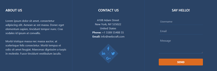
Here’s the code:
这是代码:
<div class="w-full bg-blue-900">
      <div class="flex flex-wrap text-center text-white">

        <!-- ABOUT COLUMN -->

        <div class="w-full md:w-1/3 p-5 border-r border-blue-800 md:text-left">
          <div class="my-6 ml-3 text-xl font-semibold">ABOUT US</div>
          <p class="p-3 text-gray-400">Lorem ipsum dolor sit amet, consectetur adipiscing elit. Aenean ac est massa. Donec eget elementum sapien, tincidunt tempor nunc. Cras sodales id ipsum at convallis.</p>
          <p class="p-3 text-gray-400">Morbi tristique massa nec massa auctor, at scelerisque felis consectetur. Morbi tempus et odio sit amet feugiat. Maecenas dignissim a turpis in molestie. Fusce tincidunt vestibulum iaculis.</p>
        </div>

        <!-- CONTACTS COLUMN -->

        <div class="w-full md:w-1/3 p-5 border-r border-blue-800">
          <div class="my-6 text-xl font-semibold">CONTACT US</div>
          <p class="mt-8 text-gray-400">
            A108 Adam Street <br>
            New York, NY 535022 <br>
            United States <br>
            <strong>Phone:</strong> +1 5589 55488 55 <br>
            <strong>Email:</strong> info@webcraft.com
          </p>
          <div class="relative w-20 h-20 mx-auto my-12 bg-blue-300 rotate-45">
            <div class="flex justify-center items-center absolute left-0 top-0 w-10 h-10 hover:-ml-1 hover:-mt-1 bg-blue-800 cursor-pointer">
              <i class="fab fa-facebook-f fa-lg text-blue-500 -rotate-45"></i>
            </div>
            <div class="flex justify-center items-center absolute top-0 right-0 w-10 h-10 hover:-mt-1 hover:-mr-1 bg-blue-800 cursor-pointer">
              <i class="fab fa-twitter fa-lg text-blue-500 -rotate-45"></i>
            </div>
            <div class="flex justify-center items-center absolute right-0 bottom-0 w-10 h-10 hover:-mr-1 hover:-mb-1 bg-blue-800 cursor-pointer">
              <i class="fab fa-google-plus-g fa-lg text-blue-500 -rotate-45"></i>
            </div>
            <div class="flex justify-center items-center absolute bottom-0 left-0 w-10 h-10 hover:-mb-1 hover:-ml-1 bg-blue-800 cursor-pointer">
              <i class="fab fa-linkedin-in fa-lg text-blue-500 -rotate-45"></i>
            </div>
          </div>
        </div>

        <!-- FORM COLUMN -->

        <div class="w-full md:w-1/3 p-5">
          <div class="mt-6 text-xl font-semibold">SAY HELLO!</div>
          <form class="w-4/5 mx-auto mt-2 px-6 pt-6 pb-4 rounded">
            <div class="flex items-center mb-4">
              <input class="w-full h-10 p-2 border-b border-blue-800 bg-blue-900 text-white" type="text" placeholder="Username">
            </div>
            <div class="flex items-center mb-4">
              <input class="w-full h-10 p-2 border-b border-blue-800 bg-blue-900 text-white" type="text" placeholder="Email">
            </div>
            <div class="mb-6">
              <textarea class="w-full h-24 px-2 pt-2 border-b-2 border-blue-800 bg-blue-900 text-white" placeholder="Message"></textarea>
            </div>
            <div class="flex justify-between items-center">
              <button class="w-full py-2 px-4 rounded bg-orange-600 hover:bg-orange-700 text-white font-bold" type="button">SEND</button>
            </div>
          </form>
        </div>

      </div>
    </div>
Here, we create a three-column, responsive grid. For that we use the Flexbox utility and width utility with its responsive variants. By using w-full md:w-1/3 classes, we force the columns to be stacked on mobile, and in a row on medium and beyond.
在这里,我们创建了一个三列的响应式网格。 为此,我们使用Flexbox实用程序和width实用程序及其响应变体。 通过使用w-full md:w-1/3类,我们强制将列堆叠在移动设备上,并在中型和更高级别上连续放置。
In the first column, the text will be left-aligned on medium and beyond (md:text-left).
在第一列中,文本将在中等及以上( md:text-left )处左对齐。
In the second column, we put some contact information and a social sharing widget. Let’s see how to create it.
在第二列中,我们放置了一些联系信息和一个社交共享小部件。 让我们看看如何创建它。
We use a square flex container where we put four smaller squares positioned evenly on each corner. We rotate all squares 45 degrees. Inside each small square we put a social icon which we rotate -45 degrees to align it to its container. On hover, each small square moves a bit outside the big square.
我们使用一个方形的伸缩容器,在其中将四个较小的正方形均匀放置在每个角上。 我们将所有正方形旋转45度。 在每个小方块内,我们放置一个社交图标,我们将其旋转-45度以使其与容器对齐。 悬停时,每个小方块都会移到大方块之外。
As we can see, we need to create two more utilities for the rotation operations. So, we open styles.css again and add the necessary classes:
如我们所见,我们需要为旋转操作再创建两个实用程序。 因此,我们再次打开styles.css并添加必要的类:
...
.rotate-45 {
  transform: rotate(45deg);
}
.-rotate-45 {
  transform: rotate(-45deg);
}
...
Now, re-build the styles and see the results.
现在,重新构建样式并查看结果。
In the last column, we have a subtle contact form.
在最后一栏中,我们有一个微妙的联系表。
最后考虑 (Last Considerations)
You’ve already noticed for sure that the final file size is pretty big. Don’t worry, this can be fixed. For detailed information, see the controlling file size section of the documentation.
您已经确定最终文件的大小会很大。 不用担心,可以解决此问题。 有关详细信息,请参见文档的控制文件大小部分 。
I intentionally left more places with code repetition in the template. You already know how to deal with this issue, and it will be a good exercise to extract it into components as reinforcement.
我故意在模板中留出更多代码重复的地方。 您已经知道如何处理此问题,将其提取为增强部件将是一个很好的练习。
结论 (Conclusion)
As you can see, Tailwind gives you a straightforward workflow, without restricting options or limiting flexibility. The utility-first approach offered by Tailwind is successfully implemented by large companies like GitHub, Heroku, Kickstarter, Twitch, Segment, and more.
如您所见,Tailwind为您提供了直接的工作流程,而没有限制选项或限制灵活性。 Tailwind提供的实用程序优先方法已成功由GitHub,Heroku,Kickstarter,Twitch,Segment等大型公司成功实施。
For me, personally, after many hours of “fighting” and “battling” with styles from frameworks like Bootstrap, Foundation, Semantic UI, UIkit, and Bulma, using Tailwind utilities feels like flying freely in a cloudless sky.
对我个人而言,在使用Bootstrap,Foundation,Semantic UI,UIkit和Bulma等框架中的样式进行了数小时的“战斗”和“战斗”之后,使用Tailwind实用程序就像在无云的天空中自由飞行。
翻译自: https://www.sitepoint.com/tailwind-unique-beautiful-websites/
tailwind css


 2105
2105

 被折叠的 条评论
为什么被折叠?
被折叠的 条评论
为什么被折叠?
 到【灌水乐园】发言


