


sql表格模型获取记录内容
介绍 (Introduction)
A few weeks back I had been working on an interesting proof of concept for a client within the food/grocery industry. The objectives were to be able to provide the client with information on sales patterns, seasonal trends and location profitability. In our previous “get-together” we discussed how to create a tabular model project and how to create efficient and effective reports utilizing Excel.
几周前,我一直在为食品/杂货行业的客户提供有趣的概念证明。 目标是能够向客户提供有关销售模式,季节性趋势和地区盈利能力的信息。 在之前的“聚会”中,我们讨论了如何创建表格模型项目以及如何使用Excel创建高效的报告。
In today’s “fireside chat” we shall be examining how efficient and effective reports may be created utilizing SQL Server Reporting Service 2016; especially with the complex reporting requirements and large amounts of data which clients tend to have.
在今天的“炉边聊天”中,我们将研究如何使用SQL Server Reporting Service 2016创建高效的报告。 尤其是在复杂的报告要求和客户倾向于拥有大量数据的情况下。
Thus, let’s get started.
因此,让我们开始吧。
入门 (Getting Started)
As our point of departure, we shall “pick up” with the Tabular project that we created in our last “get together”. Should you not have had a chance to work through the discussion, do feel free to glance at the step by step discussion by clicking on the link below:
作为出发点,我们将“拾取”在上一个“聚会”中创建的Tabular项目。 如果您没有机会进行讨论,请单击下面的链接随意浏览逐步讨论:
Beer and the tabular model DO go together
表现不佳的企业 (Under performing enterprises)
As a part of the proof of concept, our client Mary had asked for a vertical bar chart report that would reveal under-performing months. Those ‘below expected value’ months were to be highlighted in red, on target months in yellow and the ‘overachievers’ in green.
作为概念验证的一部分,我们的客户Mary要求提供垂直条形图报告,以显示表现不佳的月份。 那些“低于预期值”的月份将以红色突出显示,目标月份将以黄色突出显示,而“过分成就者”则以绿色突出显示。
Let us now have a look at how we achieve her request.
现在让我们看看我们如何实现她的要求。
We begin by opening SQL Server Management Studio (SSMS) and open the “Beersales554” table (see below).
我们首先打开SQL Server Management Studio(SSMS),然后打开“ Beersales554”表(如下所示)。

Now, our “beersales” table contains the sales from ‘many’ chains, for ‘many’ months, thus we shall be looking at the sales for the year 2013 from “Checkers” in our example. Further, we shall NOT be utilizing our relational table but rather the tabular cube that we created in our last get together. The query that we shall be utilizing may be seen below in the section entitled “Creating the required query”.
现在,我们的“啤酒销售”表包含“许多”连锁店在“许多”月份的销售量,因此,在本示例中,我们将查看“ Checkers” 2013年的销售量。 此外,我们将不会使用关系表,而将利用我们在上一个聚会中创建的表格立方体。 我们将要使用的查询可以在下面的标题为“ 创建所需查询”的部分中看到。
The important point to retain is that when our report is created that bars of the chart must indicate the firm’s performance and the bars must be color coded as follows.
需要保留的重要一点是,在创建我们的报告时,图表的条形图必须表明公司的业绩,并且条形图必须按如下所示进行颜色编码。
For the fiscal year 2013, we are going to examine beer sales for Checkers.
在2013财年,我们将检查Checkers的啤酒销售。
ZAR 0 – ZAR 97,500,000 is under target and the bars must be red.
ZAR 0 – ZAR 97,500,000低于目标,条形必须为红色。
ZAR 97,500,001 to ZAR 100,000,000 is acceptable and must be yellow.
可接受的价格为97,500,001 ZAR至100,000,000 ZAR。
Above ZAR 100,000,000 is great and should be coloured green.
超过1亿南非randint的硬币是非常好的,应该将其涂成绿色。
创建所需的查询 (Creating the required query)
As a reminder, what we would like to ascertain are the sales figures for Checkers for the whole of the fiscal year 2013.
提醒一下,我们要确定的是Checkers 2013整个会计年度的销售数据。
The DAX query to achieve this is shown below,
实现此目的的DAX查询如下所示,
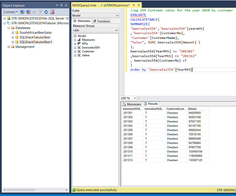
We note that in order to obtain the actual customer name we must utilize the Customer entity and the “amount”, “yearMth” and the “CustomerNo” come from the “beersales554” table. The said and for all intents and purposes, we require a join, which we created with the relationship diagram within the SSAS project. Please see Beer and the tabular model DO go together
我们注意到,为了获得实际的客户名称,我们必须使用客户实体,并且“金额”,“ yearMth”和“ CustomerNo”来自“ beersales554”表。 出于所有上述目的和目的,我们需要一个连接,该连接是我们在SSAS项目中使用关系图创建的。 请参阅Beer和表格模型一起去
The DAX code for the query may also be found in Addenda 1
该查询的DAX代码也可以在附录1中找到
Now that we have our core query, let us create a report to show the results.
现在我们有了核心查询,让我们创建一个报告以显示结果。
创建我们的报告 (Creating our report)
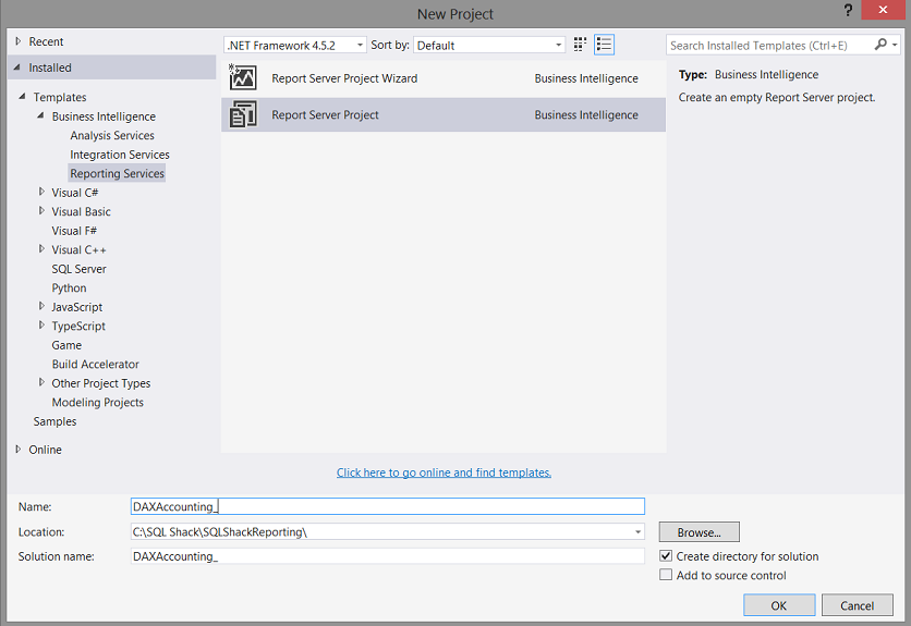
Opening either Visual Studio 2015 or SQL Server Data Tools 2010 we select “New Project” (see below)
打开Visual Studio 2015或SQL Server Data Tools 2010,我们选择“新建项目”(见下文)

We now find ourselves on the “New Project” screen. We give our new project the name “DAX Accounting” and click “OK” to create the project (see below).
现在,我们可以在“新项目”屏幕上找到自己。 我们将新项目命名为“ DAX Accounting”,然后单击“确定”以创建项目(请参见下文)。
We find ourselves on our Report Design Surface (see below).
我们发现自己在报告设计图面上(见下文)。

We note that under the DAX accounting project that there are three folders.
我们注意到在DAX记帐项目下有三个文件夹。
Shared Data Sources
共享数据源
Shared Data Sets
共享数据集
Reports
报告书
For our report, we begin by creating a “Shared Data Source”. A data source may be likened to the water hose connecting to the water tap on the side of a house.
对于我们的报告,我们首先创建一个“共享数据源”。 数据源可以比喻为连接到房屋侧面的水龙头的水管。
The house being a “database”.
房子是一个“数据库”。

We right-click on the “Shared Data Source” tab and select “Add New Data Source” as may be seen above.
我们右键单击“共享数据源”选项卡,然后选择“添加新数据源”,如上所示。

The “Shared Data Source Properties” Dialog box appears (see above).
出现“共享数据源属性”对话框(请参见上文)。

We give our shared data source a name and click the “Edit” button (see above). The “Connection Properties” dialogue box is brought into view (see above and to the left).
我们给共享数据源命名,然后单击“编辑”按钮(见上文)。 将显示“连接属性”对话框(请参见上方和左侧)。
Note that we tell the system that we require an “Analysis Services” connection. We also give the system the name of our Analysis Services database and then test the connection. If successful, we then click the “OK” button to exit the “Connection Properties” dialogue box.
请注意,我们告诉系统我们需要“分析服务”连接。 我们还将系统命名为Analysis Services数据库,然后测试连接。 如果成功,则我们单击“确定”按钮以退出“连接属性”对话框。
Our screen should now look as follows:
现在,我们的屏幕应如下所示:

Clicking on the “Credentials” tab, we ensure (in my case) that “Windows Authentication” has been selected (see below).
单击“凭据”选项卡,我们确保(对于我而言)已选择“ Windows身份验证”(请参见下文)。

We click “OK” to leave the “Share Data Source Properties” dialog box.
我们单击“确定”离开“共享数据源属性”对话框。

We note that our shared data source now appears within the “Shared Data Sources” directory (see above).
我们注意到,共享数据源现在显示在“共享数据源”目录中(请参见上文)。
添加我们的报告 (Adding our report)

We right-click on the “Reports” directory and select “Add” and then “New Item” (see above).
我们右键单击“ Reports”目录,然后选择“ Add”,然后选择“ New Item”(参见上文)。
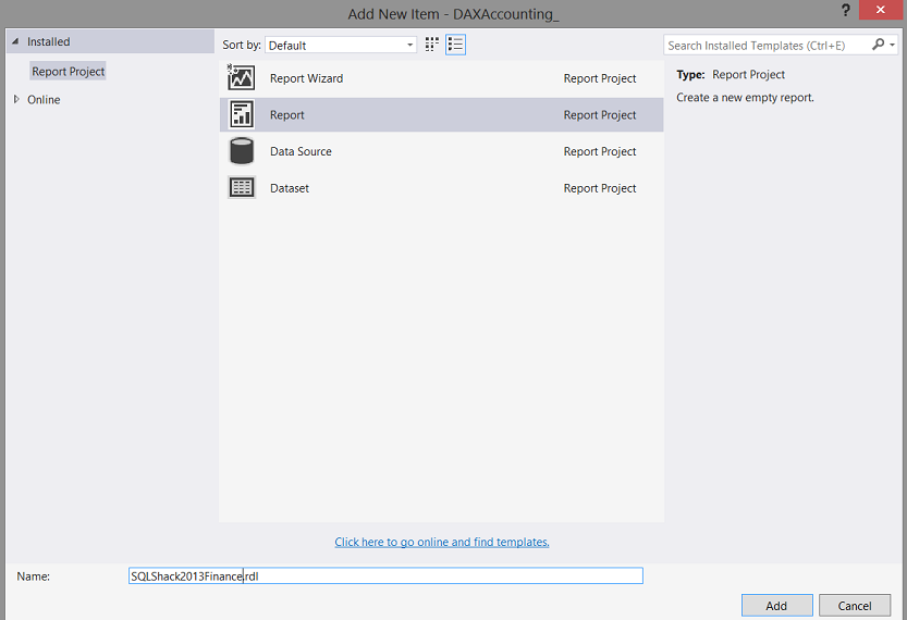
We select “Report” and then give our report a name “SQLShack2013Finance” (see above).
我们选择“报告”,然后为我们的报告命名为“ SQLShack2013Finance”(请参见上文)。
We then click “Add”.
然后,我们单击“添加”。
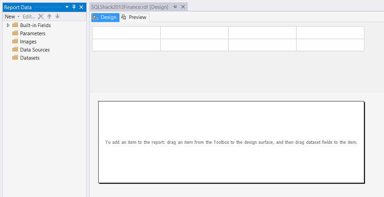
We now find ourselves on our report drawing surface. The reader will note the white rectangle (see above). This is where our chart will reside.
现在,我们可以在报告图纸表面找到自己。 读者会注意到白色矩形(请参见上文)。 这就是我们的图表所在的位置。
We resize our drawing surface (see above).
我们调整绘图表面的大小(请参见上文)。
创建我们的本地数据源和本地数据集 (Creating our local data source and our local dataset)
We right click on the “Data Set” directory / tab and select “Add Dataset” (see below).
我们右键单击“数据集”目录/选项卡,然后选择“添加数据集”(见下文)。

The Dataset Properties dialog box opens (see below).
将打开“数据集属性”对话框(请参见下文)。

We give our dataset a name and click the “New” button to create a new “local data source” (a local hose pipe) which we shall relate to the GLOBAL or Shared Data Source / hose pipe that we chatted about above.
我们为数据集命名,然后单击“新建”按钮以创建一个新的“本地数据源”(本地软管),该数据源将与我们上面讨论的GLOBAL或共享数据源/软管相关。
Once again, the “eagle-eyed” reader will ask the question “Why have so many data sources?” The reason is simple. Our “Shared Data Source” acts as a global connector and if we think about it, it should be as general as possible in order for it to be “re-usable”. The local data source, which we are now going to create may be customised for this particular report only and will not affect any other reports which have been created or may be created in the future.
再次,“老鹰眼”的读者会问一个问题:“为什么有这么多数据源?” 原因很简单。 我们的“共享数据源”充当全局连接器,如果我们考虑一下,它应该尽可能通用,以使其“可重用”。 我们现在将要创建的本地数据源可能仅针对该特定报告进行了自定义,不会影响已经创建或将来可能创建的任何其他报告。

We give our local data source a name and select the GLOBAL data source with which to connect (see above). In short, by connecting to the global data source our local data source will inherit all the properties of the global source and we may add other restrictions to the local source without affecting the global data source. Once again we set the “Credentials” tab to “Windows Authentication”
我们为本地数据源命名,然后选择要连接的GLOBAL数据源(请参见上文)。 简而言之,通过连接到全局数据源,我们的本地数据源将继承 全局源的所有属性,我们可以在不影响全局数据源的情况下向本地源添加其他限制。 我们再次将“凭据”选项卡设置为“ Windows身份验证”
We click OK” to leave this dialogue box.
我们单击“确定”离开该对话框。
Now here is where the “Fun and Games” come in! We have a GOTCHA!!!!
现在,这里是“娱乐与游戏”的发源地! 我们有一个GOTCHA !!!
We are now back at the “Dataset Properties” dialog box and we can neither select to add our query to the “Query” box nor can we add a Stored Procedure as it is “Greyed” out. Not a bug but Microsoft claims that it is a “feature”. Wink! Wink!
现在,我们回到“数据集属性”对话框,既不能选择将查询添加到“查询”框中,也不能添加存储过程,因为它是“灰色”的。 不是错误,但微软声称这是“功能”。 眨眼! 眨眼!

What we need to do is to click the “Query Designer” button (see above).
我们需要做的是单击“查询设计器”按钮(请参见上文)。

The “Query Designer” is brought up (see above).
出现“查询设计器”(请参见上文)。

We select the “Data Mining Button” (go figure)!
我们选择“数据挖掘按钮”(如图)!

We click “Yes” to the warning which pops up (see above).
我们对弹出的警告单击“是”(请参见上文)。

The “Query Designer” opens and we select “Design Mode” (see above).
“查询设计器”打开,我们选择“设计模式”(请参见上文)。
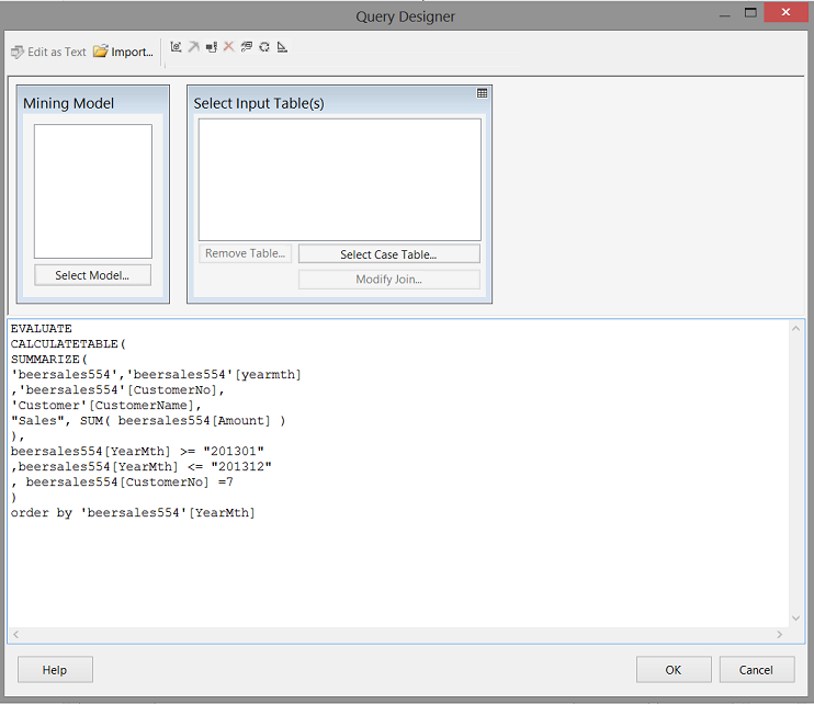
We are now able to enter our query within the large white space above. We click “OK” to leave this screen.
现在,我们可以在上方的大空白内输入查询。 我们单击“确定”离开此屏幕。

We find ourselves back in the “Dataset Properties” dialogue box (see above).
我们回到“数据集属性”对话框中(参见上文)。

We click the “Refresh Fields” button (see above).
我们点击“刷新字段”按钮(见上文)。

Wow!! By clicking our “Fields” tab, we see that the system has in fact located all the fields in our query, within the Analysis Services database (see above).We click “OK” to leave the dialogue box.
哇!! 通过单击“字段”选项卡,我们看到系统实际上已经在Analysis Services数据库中找到了查询中的所有字段(请参见上文)。单击“确定”离开对话框。

We find ourselves back on our design surface, and we note that the data set has in fact been created (see above and to the left).
我们发现自己回到了设计图上,并且注意到实际上已经创建了数据集(请参见上方和左侧)。

We now bring up the “Toolbox” which may be seen above.
现在,我们调出上面可以看到的“工具箱”。
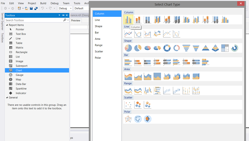
We select a chart and then a “Column” chart (see above).
我们选择一个图表,然后选择一个“柱形”图表(请参见上文)。

A chart now appears in the white portion of our design surface (see above).
现在,图表出现在设计图面的白色部分(请参见上文)。
We resize this area (see below).
我们调整该区域的大小(请参见下文)。

Our next task is to connect the dataset to the chart.
我们的下一个任务是将数据集连接到图表。

We click on the chart. The “Properties” dialogue box will open (see above and to the bottom right). We set the “DataSetName” property to our data set.
我们点击图表。 “属性”对话框将打开(请参见上方和右下方)。 我们将“ DataSetName”属性设置为我们的数据集。
Clicking on the chart also brings up the “Chart Data” box (see above).
单击该图表还会弹出“图表数据”框(请参见上文)。

We set the Σ to sum the sales. The “Category Groups” to the YearMth and the “Series Groups” to the customer name (see above).
我们将Σ设置为销售总和。 YearMth的“类别组”和客户名称的“系列组”(请参见上文)。
让我们给我们的报告一个“旋转” (Let us give our report a “whirl”)

We select the “Preview” tab (see above) and the report comes into view. Unfortunately, it is not very informative. The astute reader will remember that we requested (within the query) results for Checkers only.
我们选择“预览”选项卡(请参见上文),然后显示报告。 不幸的是,它不是非常有用。 精明的读者会记住,我们仅请求(在查询内)Checkers的结果。
Let us add the required coloring to the bars (as described above) and also format the chart.
让我们将所需的颜色添加到条形图(如上所述),并设置图表格式。
We right-click on any of the blue bars and select “Series Properties” (see below).
我们右键单击任何蓝色条,然后选择“系列属性”(见下文)。
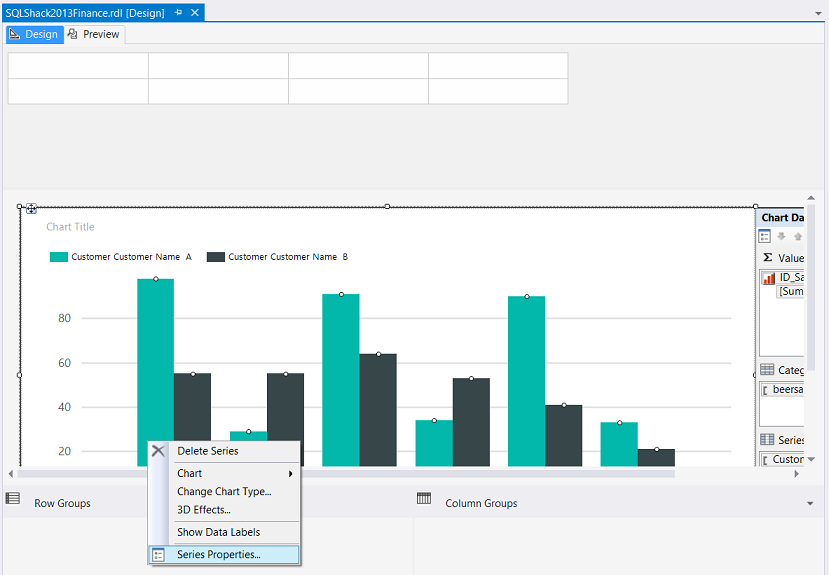
The “Series Properties” dialog box is opened (see below).
“系列属性”对话框打开(请参见下文)。

We select the “Fill” tab and select the fx tab (see circled above).
我们选择“填充”标签,然后选择fx标签(请参见上面的圆圈)。
The function box opens and we add the following code (see below).
功能框打开,我们添加以下代码(请参见下文)。

The code:
代码:
=Switch (isnothing(Fields!ID_Sales_.Value) , "LightGrey",
       Fields!ID_Sales_.Value  <= 99500000 , "Red" ,
       Fields!ID_Sales_.Value >=99500000 and
	Fields!ID_Sales_.Value <=100000000 , "Yellow",
       Fields!ID_Sales_.Value >=100000000, "Green")
We also would like to see the sales amounts correctly formatted above each vertical bar.
我们还希望看到每个垂直条上方的格式正确的销售额。
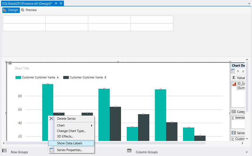
Once again, we right-click on the vertical bar and this time we select “Show Data Labels” (see above).
再次,我们右击垂直栏,这次我们选择“显示数据标签”(见上文)。
Running our report, once again we find the following.
运行我们的报告,我们再次找到以下内容。
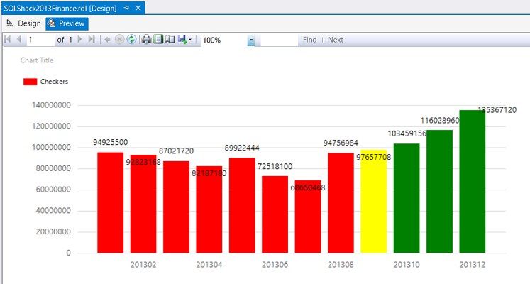
We note that the values are now present however that they are very poorly formatted. Let us fix that now.
我们注意到这些值现在存在,但是它们的格式设置很差。 现在让我们修复它。
Back in “Design Mode”, we right click on the numbers themselves (see below).
回到“设计模式”,我们右键单击数字本身(请参见下文)。

We select “Series Label Properties” (see above).
我们选择“系列标签属性”(请参见上文)。

The “Series Label Properties” box is brought up. We select “Number” and set the currency and format (see below).
出现“系列标签属性”框。 我们选择“数字”并设置货币和格式(见下文)。

We click “OK” to accept these changes.
我们单击“确定”接受这些更改。
Running our report again, we find the following.
再次运行我们的报告,我们发现以下内容。
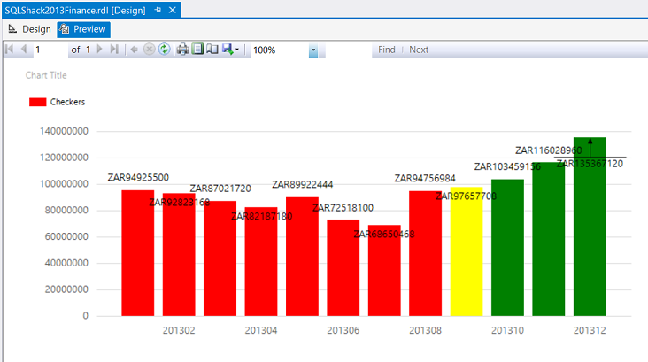
This appears much nicer, however there are still two more tasks to do.
这看起来好多了,但是还有两个任务要做。
Format the vertical axis of the graph
格式化图形的垂直轴
Show every yearmth name
显示每年的名字
To format the vertical axis, we right-click the axis and select “Vertical Axis Properties” (see below).
要格式化垂直轴,请右键单击该轴,然后选择“垂直轴属性”(请参见下文)。

The “Vertical Axis Properties” dialogue box is brought up.
出现“垂直轴属性”对话框。

We select “Number”
我们选择“数字”

The “Vertical Axis Properties” box changes and we now select “Currency”, no “Decimal Places”, use “1000 separator” and change to currency to “ZAR” (see above).
“垂直轴属性”框发生更改,我们现在选择“货币”,不选择“小数位数”,使用“ 1000分隔符”并将货币更改为“ ZAR”(请参见上文)。
We next format the horizontal axis (see below).
接下来,我们格式化水平轴(请参见下文)。

The “Horizontal Axis Properties” dialog box is brought up. We change the “Interval” from “Auto” to 1 (see below).
出现“水平轴属性”对话框。 我们将“间隔”从“自动”更改为1(请参见下文)。

Running our report, yet again we find the following:
运行我们的报告,我们再次发现以下内容:
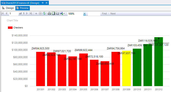
This report is much more pleasing, in addition to being more informative.
除了提供更多信息之外,该报告还令人愉悦。
更具包容性 (Being more inclusive)
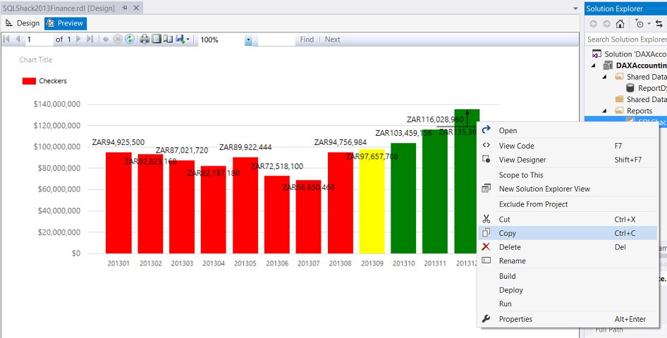
Now that we have our “Checkers” report to the stage that we want it, Mary asked to see the results from Checkers and all the other firms that we have, once again for the same period.
现在我们已经有了我们所需的“ Checkers”报告,Mary再次要求查看Checkers和我们拥有的所有其他公司的结果。
This is easier than it sounds.
这比听起来容易。
We begin by right clicking on our “Checkers” report and click “Copy” (see below).
首先,右键单击“检查器”报告,然后单击“复制”(请参见下文)。
We paste it in the same folder and rename the file “Allinclusive” (see below).
我们将其粘贴到同一文件夹中,并将文件重命名为“ Allinclusive”(如下所示)。

We now open “AllInclusive” and delete the local data set and create a new one in a similar fashion that we did above.
现在,我们打开“ AllInclusive”并删除本地数据集,并以与上述相同的方式创建一个新数据集。

We see our query which is used to extract our data from the database (see above).
我们看到了用于从数据库中提取数据的查询(见上文)。
What we now do is fairly easy. Just comment out the line of code that says “Where the customer number is 7” (see above).
我们现在所做的相当容易。 只需注释掉代码行“客户编号为7”(请参见上文)。
We are now all ready to test our query.
现在我们已经准备好测试我们的查询。
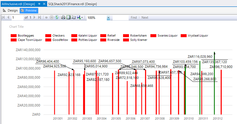
Our report appears as above HOWEVER we do have issues as we cannot determine “who is who”. In short using the fill feature that we used for “Checkers” is not really appropriate here.
我们的报告如上所述,但是我们确实存在问题,因为我们无法确定“谁是谁”。 简而言之,在这里使用我们用于“检查器”的填充功能并不是很合适。
Let us set the fill back to “Automatic”. How to achieve this is described above.
让我们将填充设置回“自动”。 上面描述了如何实现。
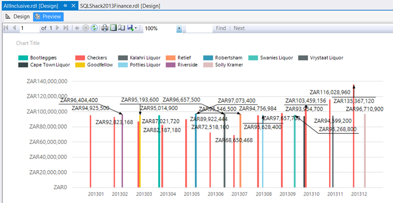
This done, we find that our chart becomes more meaningful.
完成此操作后,我们发现图表变得更加有意义。
So we come to the end of another “fireside chat”. I sincerely hope that this presentation has proved stimulating to you and as always your feedback is always appreciated.
因此,我们来到了另一个“炉边聊天”的结尾。 我衷心希望本演示文稿能刺激您,并且一如既往地感谢您的反馈。
结论 (Conclusions)
Decision makers oft times are faced with difficult decisions with regards to corporate strategy and the direction and correction that must be made in order for the enterprise to achieve its mission and objectives. While many decision-makers prefer to utilize Excel as a reporting front end, we oft time find ourselves in the position where the sheer amount of data makes this option unworkable. We have seen how we may alter the appearance of reports, to add more meaningful information. In our next “get together” we shall be looking at reporting where we are able to change the parameters such as the date and client and how this makes our reporting efforts more efficient and effective.
决策者经常面对有关公司战略以及为使企业实现其使命和目标而必须做出的方向和更正的艰难决策。 尽管许多决策者倾向于将Excel用作报告前端,但我们常常发现自己处于这样一个位置,即大量数据使此选项不可行。 我们已经看到了如何改变报告的外观,以添加更多有意义的信息。 在我们的下一个“聚会”中,我们将研究报告,在这里我们可以更改日期和客户等参数,以及这如何使我们的报告工作更加有效。
In the interim, happy programming.
在此期间,编程愉快。
附录1 (Addenda 1)
DAX query
DAX查询
EVALUATE
CALCULATETABLE(
SUMMARIZE(
'beersales554','beersales554'[yearmth]
,'beersales554'[CustomerNo],
'Customer'[CustomerName],
"Sales", SUM( beersales554[Amount] )
),
beersales554[YearMth] >= "201301"
,beersales554[YearMth] <= "201312"
, beersales554[CustomerNo] =7
)
order by 'beersales554'[YearMth]
参考文献: (References:)
- Charts (Report Builder and SSRS) 图表(报表生成器和SSRS)
- Tutorial: Adding a Bar Chart to a Report (Report Designer) 教程:向报表添加条形图(报表设计器)
- Bar Charts (Report Builder and SSRS) 条形图(报表生成器和SSRS)
翻译自: https://www.sqlshack.com/sql-server-and-bi-document-tabular-model-with-reporting-services-2016/
sql表格模型获取记录内容


 122
122

 被折叠的 条评论
为什么被折叠?
被折叠的 条评论
为什么被折叠?
 到【灌水乐园】发言


