


先知ppt
In Forecasting Time-Series data with Prophet – Part 1, I introduced Facebook’s Prophet library for time-series forecasting. In this article, I wanted to take some time to share how I work with the data after the forecasts. Specifically, I wanted to share some tips on how I visualize the Prophet forecasts using matplotlib rather than relying on the default prophet charts (which I’m not a fan of).
在使用Prophet预测时间序列数据–第1部分中 ,我介绍了用于时间序列预测的Facebook Prophet库。 在本文中,我想花一些时间分享预测后如何处理数据。 具体来说,我想分享一些有关如何使用matplotlib可视化先知预测的技巧,而不是依赖于默认的先知图表(我不喜欢它)。
Just like part 1, I’m going to be using this retail sales example csv file find on github.
就像第1部分一样,我将使用在github上找到的这个零售示例csv文件。
For this work, we’ll need to import matplotlib and set up some basic parameters to be format our plots in a nice way (unlike the hideous default matplotlib format).
对于这项工作,我们需要导入matplotlib并设置一些基本参数,以一种不错的方式格式化图表(这与可怕的默认matplotlib格式不同)。
from fbprophet import Prophet
import numpy as np
import pandas as pd
import matplotlib.pyplot as plt

%matplotlib inline #only needed for jupyter
plt.rcParams['figure.figsize']=(20,10)
plt.style.use('ggplot')
With this chunk of code, we import fbprophet, numpy, pandas and matplotlib. Additionally, since I’m working in jupyter notebook, I want to add the %matplotlib inline instruction to view the charts that are created during the session. Lastly, I set my figuresize and sytle to use the ‘ggplot’ style.
通过这段代码,我们导入了fbprophet,numpy,pandas和matplotlib。 另外,由于我使用的是Jupyter Notebook,因此我想添加 %matplotlib inline 说明,以查看在会话期间创建的图表。 最后,我将图形尺寸和样式设置为使用“ ggplot”样式。
Since I’ve already described the analysis phase with Prophet, I’m not going to provide commentary on it here. You can jump back to Part 1 for a walk-through.
由于我已经描述了先知的分析阶段,因此在此不做评论。 您可以跳回到第1部分进行演练 。
sales_df = pd.read_csv('examples/retail_sales.csv')

sales_df['y_orig']=sales_df.y # We want to save the original data for later use
sales_df['y'] = np.log(sales_df['y']) #take the log of the data to remove trends, etc

model = Prophet()
model.fit(sales_df);

#create 12 months of future data
future_data = model.make_future_dataframe(periods=12, freq = 'm')

#forecast the data for future data
forecast_data = model.predict(future_data)
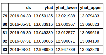
At this point, your data should look like this:
此时,您的数据应如下所示:
Now, let’s plot the output using Prophet’s built-in plotting capabilities.
现在,让我们使用Prophet的内置绘图功能来绘制输出。
model.plot(forecast_data)
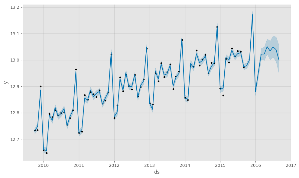
While this is a nice chart, it is kind of ‘busy’ for me. Additionally, I like to view my forecasts with original data first and forecasts appended to the end (this ‘might’ make sense in a minute).
虽然这是一张不错的图表,但对我来说有点“忙”。 此外,我想先查看原始数据的预测,然后再附加末尾的预测(此“可能”在一分钟之内就能理解)。
First, we need to get our data combined and indexed appropriately to start plotting. We are only interested (at least for the purposes of this article) in the ‘yhat’, ‘yhat_lower’ and ‘yhat_upper’ columns from the Prophet forecasted dataset. Note: There are much more pythonic ways to these steps, but I’m breaking them out for each of understanding.
首先,我们需要将我们的数据合并并正确索引以开始绘图。 我们仅对Prophet预测数据集中的'yhat','yhat_lower'和'yhat_upper'列感兴趣(至少出于本文的目的)。 注意:这些步骤还有更多的pythonic方法,但是为了理解每个模块,我将其分解。
sales_df.set_index('ds', inplace=True)
forecast_data.set_index('ds', inplace=True)
viz_df = sales_df.join(forecast_data[['yhat', 'yhat_lower','yhat_upper']], how = 'outer')
del viz_df['y']
del viz_df['index']
You don’t need to delete the ‘y’and ‘index’ columns, but it makes for a cleaner dataframe.
您无需删除'y'和'index'列,但这可以使数据框更整洁。
If you ‘tail’ your dataframe, your data should look something like this:
如果您“尾随”数据框架,则数据应如下所示:
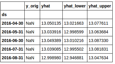
You’ll notice that the ‘y_orig’ column is full of “NaN” here. This is due to the fact that there is no original data for the ‘future date’ rows.
您会注意到,“ y_orig”列中充满了“ NaN”。 这是由于以下事实:“未来日期”行没有原始数据。
Now, let’s take a look at how to visualize this data a bit better than the Prophet library does by default.
现在,让我们看一下如何以可视化的方式比Prophet库默认情况下更好的可视化这些数据。
First, we need to get the last date in the original sales data. This will be used to split the data for plotting.
首先,我们需要获取原始销售数据中的最后日期。 这将用于拆分数据以进行绘图。
sales_df.index = pd.to_datetime(sales_df.index)
last_date = sales_df.index[-1]
To plot our forecasted data, we’ll set up a function (for re-usability of course). This function imports a couple of extra libraries for subtracting dates (timedelta) and then sets up the function.
为了绘制我们的预测数据,我们将设置一个函数(当然是为了可重用性)。 此函数导入几个额外的库,用于减去日期(时间增量),然后设置该函数。
from datetime import date,timedelta
def plot_data(func_df, end_date):
end_date = end_date - timedelta(weeks=4) # find the 2nd to last row in the data. We don't take the last row because we want the charted lines to connect
mask = (func_df.index > end_date) # set up a mask to pull out the predicted rows of data.
predict_df = func_df.loc[mask] # using the mask, we create a new dataframe with just the predicted data.
# Now...plot everything
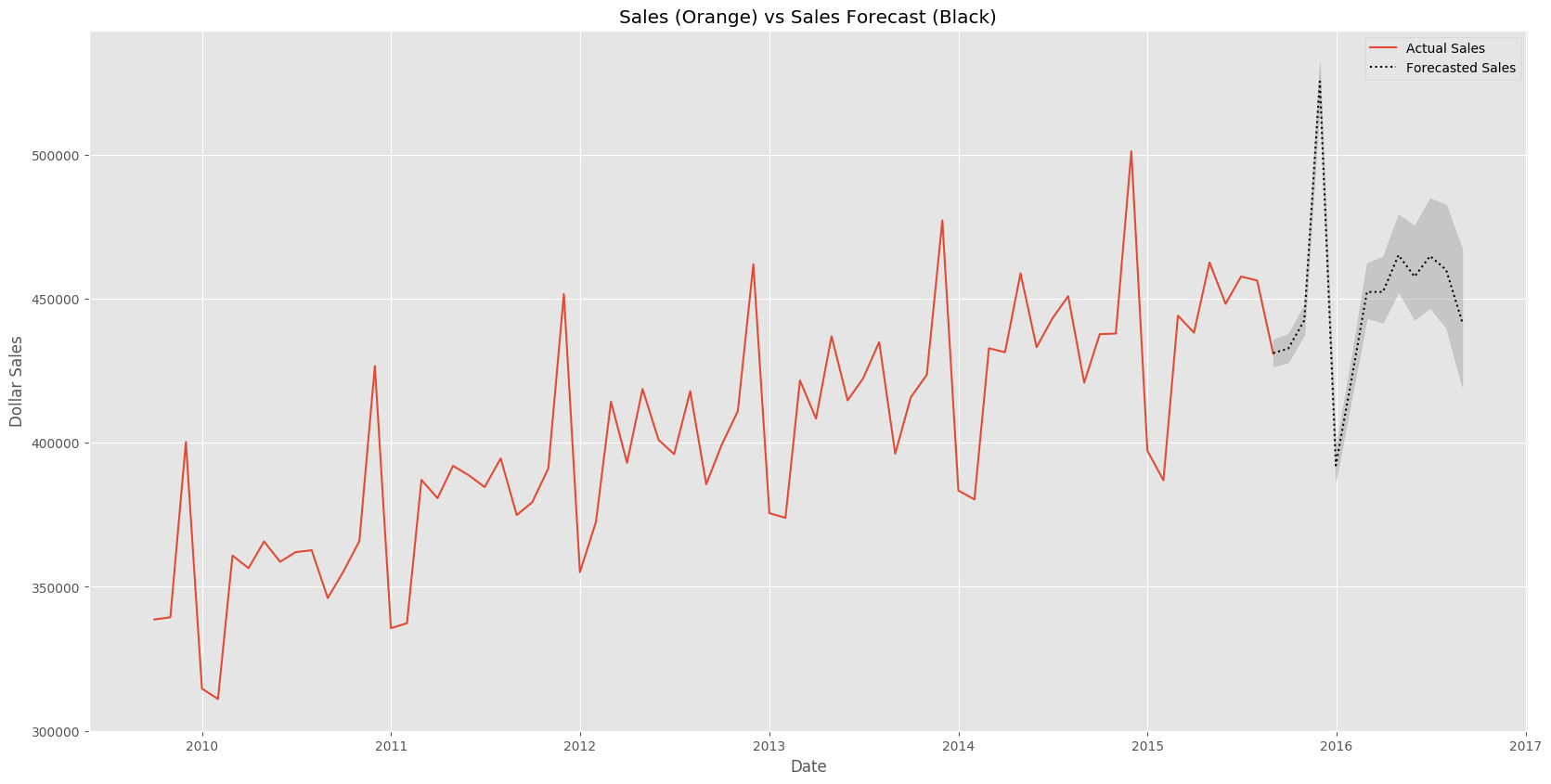
fig, ax1 = plt.subplots()
ax1.plot(sales_df.y_orig)
ax1.plot((np.exp(predict_df.yhat)), color='black', linestyle=':')
ax1.fill_between(predict_df.index, np.exp(predict_df['yhat_upper']), np.exp(predict_df['yhat_lower']), alpha=0.5, color='darkgray')
ax1.set_title('Sales (Orange) vs Sales Forecast (Black)')
ax1.set_ylabel('Dollar Sales')
ax1.set_xlabel('Date')
# change the legend text
L=ax1.legend() #get the legend
L.get_texts()[0].set_text('Actual Sales') #change the legend text for 1st plot
L.get_texts()[1].set_text('Forecasted Sales') #change the legend text for 2nd plot
This function does a few simple things. It finds the 2nd to last row of original data and then creates a new set of data (predict_df) with only the ‘future data’ included. It then creates a plot with confidence bands along the predicted data.
此功能可以做一些简单的事情。 它找到原始数据的第二到最后一行,然后创建仅包含“未来数据”的新数据集(predict_df)。 然后,它会沿着预测数据创建一个带有置信带的图。
The ploit should look something like this:
ploit应该看起来像这样:
翻译自: https://www.pybloggers.com/2017/06/forecasting-time-series-data-with-prophet-part-2/
先知ppt


 被折叠的 条评论
为什么被折叠?
被折叠的 条评论
为什么被折叠?
 到【灌水乐园】发言


