


Web-based notebooks have proven to be an extremely popular medium for mining data and sharing valuable insights. They combine a traditional development console with the robustness of the world-wide-web, but often fail to leverage the full web browser capabilities to provide a rich, interactive user experience. We will look at a case where the Jupyter Declarative Widget Extension was used to enhance an existing notebook, replacing charts based on static rasterized images and server-bound event handling with new reusable, highly interactive components based on vector graphics. You can find more information on Jupyter Declarative Widgets in Gino Bustelo’s blog post. The end result is an improvement the user experience, making it easier for the user to explore information.
事实证明,基于Web的笔记本是一种非常流行的媒介,用于挖掘数据和分享有价值的见解。 它们将传统的开发控制台与万维网的强大功能结合在一起,但是常常无法利用完整的Web浏览器功能来提供丰富的交互式用户体验。 我们将研究使用Jupyter声明性小部件扩展来增强现有笔记本的情况,将基于静态光栅化图像和服务器绑定事件处理的图表替换为基于矢量图形的可重用,高度交互的新组件。 您可以在Gino Bustelo的博客文章中找到有关Jupyter声明性小部件的更多信息 。 最终结果是改善了用户体验,使用户更容易浏览信息。
笔记本中的数据可视化 (Data Visualizations in the Notebook)
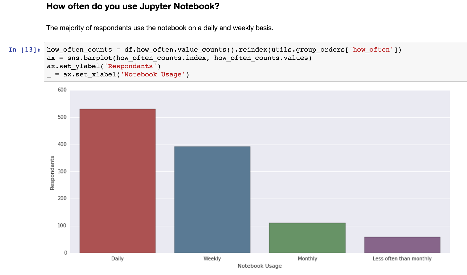
We begin with a report for a survey on user experience conducted by the Jupyter community. As an example of dogfooding, the author did the data analysis and created an interactive notebook-dashboard, all using the Jupyter notebook. In this typical notebook, the data is prepped and loaded into Pandas Dataframes. A bar chart visualization is generated with a straightforward call to Seaborn, a Python plotting library based on matplotlib. From this call, we get back a simple raster image in PNG format displayed in output cell.
我们首先从Jupyter社区进行的用户体验调查报告中开始。 作为狗食的一个例子,作者进行了数据分析,并使用Jupyter笔记本创建了一个交互式笔记本仪表板 。 在这个典型的笔记本中,数据已准备好并加载到Pandas Dataframes中 。 直接调用Seaborn即可生成条形图可视化效果, Seaborn是基于matplotlib的Python绘图库。 通过此调用,我们获得了在输出像元中显示的PNG格式的简单光栅图像。
使用Jupyter声明性小部件的可视化 (Visualizations using Jupyter Declarative Widgets)
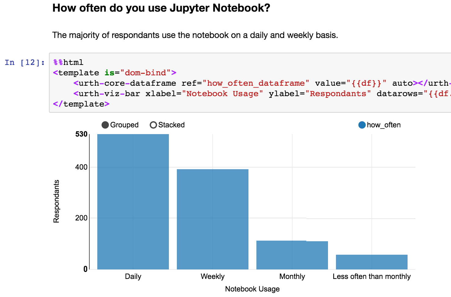
In a newer revision of the notebook, we will generate a similar bar chart using the Jupyter Incubator Declarative Widgets project. The Jupyter Declarative Widgets Extension provides a standard bar chart visualization called <urth-viz-bar> that is implemented with the nvd3 chart library. First, we must load the definition using a <link rel=”import”> tag. Once that is done, the rest of the notebook can make use of the <urth-viz-bar> widget.
在笔记本的较新版本中 ,我们将使用Jupyter Incubator声明性窗口小部件项目生成类似的条形图。 Jupyter声明性窗口小部件扩展提供了一个称为<urth-viz-bar> viz <urth-viz-bar>的标准条形图可视化,可通过nvd3图表库实现 。 首先,我们必须使用<link rel=”import”>标记加载定义。 完成后,笔记本的其余部分可以使用<urth-viz-bar>小部件。
|
%%html % % html <link rel=‘import’ href=‘path/to/urth-viz-bar.html’ is=‘urth-core-import’> <link rel = ‘import’ href = ‘path/to/urth-viz-bar.html’ is = ‘urth-core-import’ > |
Since <urth-viz-bar> requires a data frame as input, we need to create one:
由于<urth-viz-bar>需要一个数据框作为输入,因此我们需要创建一个:
1 1 | how_often_dataframe = pd.DataFrame(how_often_counts).reset_index() how_often_dataframe = pd . DataFrame ( how_often_counts ) . reset_index ( ) |
We can now feed <urth-viz-bar> data from how_often_dataframe by using <urth-core-dataframe> in a <template> element:
现在,我们可以通过在<template>元素中使用<urth-core-dataframe> how_often_dataframe <urth-core-dataframe> how_often_dataframe <urth-viz-bar>从how_often_dataframe中提供<urth-core-dataframe> how_often_dataframe <urth-viz-bar> how_often_dataframe <urth-viz-bar>数据:
|
1 1 2 2 3 3 4 4 5 5 6 6 |
%%html % % html <template is=“dom-bind”> <template is = “dom-bind” > <urth-core-dataframe ref=“how_often_dataframe” value=“{{df}}” auto></urth-core-dataframe> <urth-core-dataframe ref = “how_often_dataframe” value = “{{df}}” auto > </urth-core-dataframe> <urth-viz-bar xlabel=“Notebook Usage” ylabel=“Respondents” datarows=“{{df.data}}” columns=“{{df.columns}}”></urth-viz-bar> <urth-viz-bar xlabel = “Notebook Usage” ylabel = “Respondents” datarows = “{{df.data}}” columns = “{{df.columns}}” > </urth-viz-bar> </template> </template> |
The <urth-core-dataframe> widget reflects the dataframe how_often_dataframe in the kernel to the browser, placing the JSON string representation in its attribute value. In the scope of this template, we bind this data representation to a variable called df. Then <urth-viz-bar> can be bound to df and use its data and columns properties.
<urth-core-dataframe> how_often_dataframe <urth-core-dataframe>小部件将内核中的数据how_often_dataframe反映到浏览器,并将JSON字符串表示形式放置在其属性value 。 在此模板的范围内,我们将此数据表示形式绑定到一个名为df的变量。 然后,可以将<urth-viz-bar>绑定到df并使用其data和column属性。
The result looks something like the Seaborn chart we saw earlier:
结果看起来像我们之前看到的Seaborn图表:
与可重复使用的复合控件的交互 (Interactivity with compound, reusable widgets)
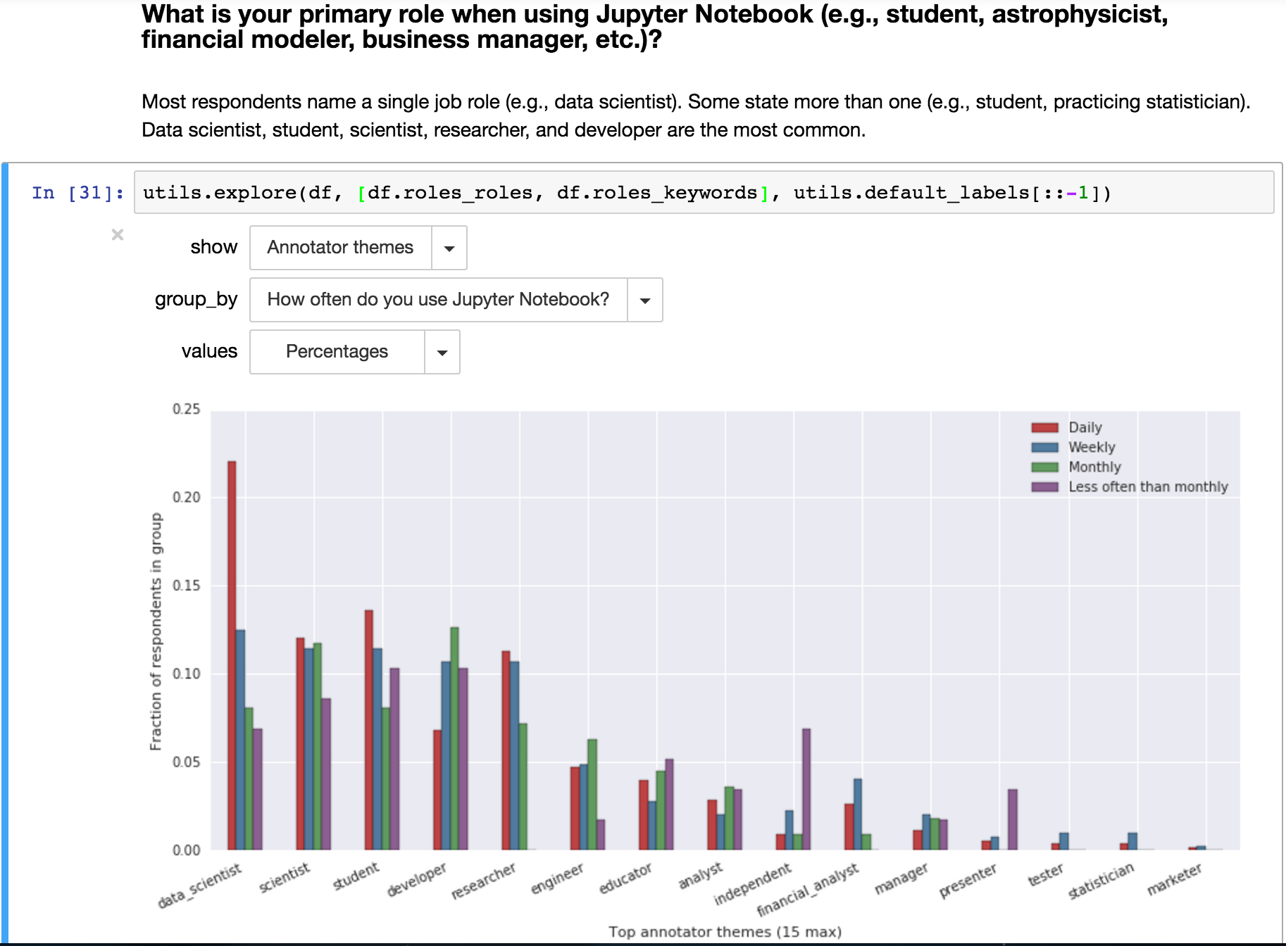
Let’s go back to the first notebook without Declarative Widgets. To allow the user to interact with the data visualizations, we provide a separate Notebook that can be imported as the utils module. We’re specifically interested in the function utils.explore from this module, which will display three dropdowns for user inputs on how they want to filter the data. Once the selection is made, corresponding visualization is generated with a call to matplotlib. This logic runs in the kernel, processing client-side events from the dropdown menus to generate new raster images to send back to the browser client.
让我们回到没有声明性小部件的第一个笔记本。 为了允许用户与数据可视化进行交互,我们提供了一个单独的Notebook ,可以将其导入为utils模块。 我们对该模块中的utils.explore函数特别感兴趣,它将为用户输入显示三个下拉列表,说明他们希望如何过滤数据。 选择之后,将通过调用matplotlib生成相应的可视化。 该逻辑在内核中运行,从下拉菜单中处理客户端事件,以生成新的光栅图像,以发送回浏览器客户端。
使用声明性小部件提供更加互动的体验 (Delivering an even more interactive experience with Declarative Widgets)
We can build the same experience with declarative widgets, and add a bit more interactivity, too. This time, instead of an ad hoc <template>, we’ll declare a custom Polymer element we’ll call <survey-explorer>. This is done in a separate HTML file which can be imported into the page using <link rel=”import”>.
我们可以使用声明性小部件构建相同的体验,并且还添加更多的交互性。 这次,我们将声明一个自定义的Polymer元素,称为<survey-explorer>,而不是临时的<template>。 这是在单独HTML文件中完成的,可以使用<link rel=”import”>导入到页面中。
|
%%html % % html <link rel=‘import’ href=‘prep/widgets/survey-explorer/survey-explorer.html’> <link rel = ‘import’ href = ‘prep/widgets/survey-explorer/survey-explorer.html’ > |
You can look at the full implementation of survey-explorer on Github.
您可以查看Github上Survey survey-explorer的完整实现 。
Where utils.explore used three dropdown widgets for inputs, in we will use UI elements from the Polymer paper project, including <paper-dropdown-menu> and <paper-toggle-button>. For example, the toggle button used to switch between counts and percentages on the y axis is created with the following markup:
在utils.explore使用三个下拉小部件进行输入的地方,我们将使用Polymer纸项目中的UI元素,包括<paper-dropdown-menu>和<paper-toggle-button> 。 例如,使用以下标记创建用于在y轴上的计数和百分比之间切换的切换按钮:
1 1 | <paper-toggle-button checked=“{{percentages}}”>Use percentages</paper-toggle-button> <paper-toggle-button checked = “{{percentages}}” > Use percentages </paper-toggle-button> |
Again, the visualization is provided by an <urth-viz-bar> widget. But instead of a reference to a single <urth-core-dataframe> instance, we need some more prepping beforehand to filter the data as requested by the user.
同样,可视化由<urth-viz-bar>小部件提供。 但是,除了引用单个<urth-core-dataframe>实例之外,我们还需要预先做一些准备工作,以便根据用户的要求过滤数据。
So first, we create a Python function exploreDataFrame in module utils. This function takes user’s input of how the data should be filtered, and returns the corresponding dataframe. Then to use exploreDataFrame, we need an <urth-core-function> to reflect the dataframe from the kernel to our template in the browser.
因此,首先,我们在模块utils创建一个Python函数exploreDataFrame 。 该函数接受用户输入的数据过滤方式,并返回相应的数据帧。 然后,要使用exploreDataFrame ,我们需要一个<urth-core-function> ,以将数据帧从内核反映到浏览器中的模板。
1 1 | <urth-core-function ref=“exploreDataFrame” arg-series=“{{seriesByLabel(selectedLabel)}}” arg-group_by=“{{group_by}}” arg-percentages=“{{percentages}}” result=“{{df}}” auto></urth-core-function> <urth-core-function ref = “exploreDataFrame” arg-series = “{{seriesByLabel(selectedLabel)}}” arg-group_by = “{{group_by}}” arg-percentages = “{{percentages}}” result = “{{df}}” auto > </urth-core-function> |
Then, similar to the previous example, the result df is passed to the visualization, <urth-viz-bar>:
然后,类似于前面的示例,将结果df传递到可视化文件<urth-viz-bar> :
|
<urth-viz-bar datarows=“{{df.data}}” columns=“{{df.columns}}” xlabel=“{{xlabel}}” ylabel=“{{ylabel}}” margin=‘{“bottom”:100, “right”:50}’ rotatelabels=“25” selection-info=“{{sel}}”> <urth-viz-bar datarows = “{{df.data}}” columns = “{{df.columns}}” xlabel = “{{xlabel}}” ylabel = “{{ylabel}}” margin = ‘{“bottom”:100, “right”:50}’ rotatelabels = “25” selection-info = “{{sel}}” > <template is=“dom-if” if=“{{percentages}}” restamp=“true”> <template is = “dom-if” if = “{{percentages}}” restamp = “true” > <urth-viz-col index=“1” type=“numeric” format=“%”></urth-viz-col> <urth-viz-col index = “1” type = “numeric” format = “%” > </urth-viz-col> </template> </template> </urth-viz-bar> </urth-viz-bar> |
<urth-viz-bar> also has a child tag <urth-viz-col> which is responsible for formatting values on the y-axis as percentages. This tag is placed conditionally, only if percentages is truthy, and will be updated automatically should this state change. Putting these pieces together, the compound widget begins to take shape:
<urth-viz-bar>还有一个子标记<urth-viz-col> ,该子标记负责将y轴上的值格式化为百分比。 仅当percentages为真时,才有条件地放置此标签,并且如果此状态更改,它将自动更新。 将这些片段放在一起,复合控件开始成形:
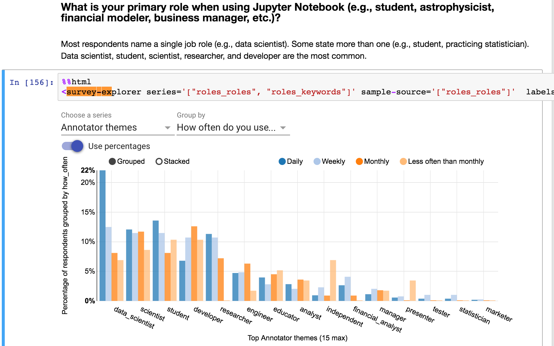
Now we have a similar visualization to the first notebook, but there is one thing this notebook lacks that we can now support with Declarative Widgets. It is the ability for user to interact with the bar chart, explore and validate the data. When the data was prepped, how were the themes on the x-axis determined?
现在,我们具有与第一个笔记本类似的可视化效果,但是该笔记本缺少的一件事是我们现在可以使用声明性小部件来支持。 用户可以与条形图进行交互,浏览和验证数据。 准备数据后,如何确定x轴上的主题?
To answer this question, we add another Python function getSample to module utils. Very similar to how exploreDataFrame works, getSample receives information on which section of the data should be sampled and returns the corresponding data frame. To invoke getSample, we need another <urth-viz-function>:
为了回答这个问题,我们向模块utils添加了另一个Python函数getSample 。 与exploreDataFrame工作原理非常相似, getSample接收有关应对数据的哪一部分进行采样的信息,并返回相应的数据帧。 要调用getSample ,我们需要另一个<urth-viz-function> :
|
1 1 2 2 3 3 4 4 5 5 6 6 7 7 8 8 9 9 |
<urth-core-function ref=“getSample” arg-keyword=“[[sel.x]]” arg-groupby=“[[group_by]]” arg-sample_size=“10” result=“{{sampleData}}” arg-groupby_key=“[[sel.key]]” arg-series=“{{seriesByLabel(selectedLabel)}}” arg-sample_source=“{{sampleSource}}” auto></urth-core-function> <urth-core-function ref = “getSample” arg-keyword = “[[sel.x]]” arg-groupby = “[[group_by]]” arg-sample_size = “10” result = “{{sampleData}}” arg-groupby_key = “[[sel.key]]” arg-series = “{{seriesByLabel(selectedLabel)}}” arg-sample_source = “{{sampleSource}}” auto > </urth-core-function> <template is=“dom-repeat” items=“[[sampleData.data]]”> <template is = “dom-repeat” items = “[[sampleData.data]]” > <template is=“dom-repeat” items=“[[item]]”> <template is = “dom-repeat” items = “[[item]]” > <template is=“dom-if” if=“[[item]]”> <template is = “dom-if” if = “[[item]]” > <div style=“padding: 15px; background-color: white;”>[[item]]</div> <div style = “padding: 15px; background-color: white;” > [[item]] </div> </template> </template> </template> </template> <hr/> <hr/> </template> </template> |
Because <urth-viz-bar> is built with d3, click event listeners can trigger further examination of the selected data. We bind this selected data to a variable called sel which is also bound to the getSample call. The resulting dataframe called sampleData is bound to a dom-repeat template which will generate <div> tags corresponding to each data element in the array.
因为<urth-viz-bar>是使用d3构建的,所以单击事件侦听器可以触发对选定数据的进一步检查。 我们将此选定的数据绑定到一个名为sel的变量,该变量也绑定到getSample调用。 生成的名为sampleData数据帧绑定到dom-repeat模板,该模板将生成与数组中每个数据元素相对应的<div>标签。

Now that all that is complete, you can go a step further by laying out the interactive widgets and deploying the result as a standalone web application.
现在,所有步骤都已完成,您可以通过布置交互式窗口小部件并将结果部署为独立的Web应用程序来进一步进行操作 。
结论 (Conclusion)

Adam is a Software Engineer in the IBM Emerging Technologies group
Adam是IBM Emerging Technologies小组的软件工程师
翻译自: https://www.pybloggers.com/2016/04/adding-declarative-widgets-to-the-jupyter-notebook/


 4381
4381

 被折叠的 条评论
为什么被折叠?
被折叠的 条评论
为什么被折叠?
 到【灌水乐园】发言


