


 本文深入探讨CSS中的repeating-radial-gradient()函数,一种用于创建重复径向渐变背景的强大工具。通过详细解析其定义、语法及示例,帮助读者掌握如何利用此功能提升网页设计的视觉效果。
repeating 路由
Introduction:
介绍:
Dealing and implementing functions daily is the trait of a good and professional developer. You cannot call yourself a good developer if you know nothing about functions in web development. Functions are an indispensable part of web development for creating various websites or web pages. Well, if you do not know about functions, then don’t worry as articles and contents like these are always out there for your help and reference. Similarly, like all other functions, in this article, we will discuss a very interesting function known as repeating-radial-gradient() function in CSS. So, without much delay let us start to learn about this function.
每天处理和执行功能是优秀且专业的开发人员的特征。 如果您对Web开发中的功能一无所知,就不能称自己为优秀的开发人员。 功能是创建各种网站或网页的Web开发必不可少的部分。 好吧,如果您对功能一无所知,那么不要担心,因为此类文章和内容总在您身边,可以为您提供帮助和参考。 同样,与所有其他函数一样,在本文中,我们将讨论一个非常有趣的函数,称为CSS中的repeating-radial-gradient()函数 。 因此,让我们立即开始学习此功能。
Functions are always going to help you for creating really attractive and stylish websites or web pages. All you gotta do is learn as many functions as you can and use them in your codes. Functions not just help in building attractive websites or web pages but they also help in optimizing your code as when you will start using functions, then you will notice that the number of lines in your codes will be reduced to some extent. Therefore, functions help in avoiding long lethargic codes. So, try to learn about functions and their behavior. Now, let us start talking about the function we are interested in, the repeating-radial-gradient() function in CSS.
功能总是会帮助您创建真正有吸引力且时尚的网站或网页。 您要做的就是学习尽可能多的功能,并在代码中使用它们。 函数不仅有助于构建吸引人的网站或网页,而且还可以在开始使用函数时帮助优化代码,然后您会注意到代码中的行数会有所减少。 因此,功能有助于避免长时间的嗜睡代码。 因此,请尝试了解功能及其行为。 现在,让我们开始讨论我们感兴趣的函数,即CSS中的repeating-radial-gradient()函数 。
Definition:
定义:
The repeating-radial-gradient() function is not tough to understand and is very easy to implement. So, let us first look at the definition of repeating-radial function() in CSS.
repeating-radial-gradient()函数不难理解,并且易于实现。 因此,让我们首先来看一下CSS中的radial-radial function()的定义。
The repeating-radial function() is nothing but a function built-in for CSS. The purpose of this function is to set the radial gradient as a type of background image that repeats over and over again.
径向重复function()只是CSS内置的函数。 此功能的目的是将径向渐变设置为一遍又一遍重复的背景图像。
So, you see how this function is so interesting and how it behaves. Now, let us look at the syntax of this function so that we can get a much clearer idea of this function.
因此,您将看到此功能的有趣之处以及其行为方式。 现在,让我们看一下该函数的语法,以便我们可以更清楚地了解此函数。
Syntax:
句法:
    element{
	    background-image: repeating-radial-gradient(<shape> <size> at <position>, <color-stop-list>);
    }
Let's look at the values used in this syntax,
让我们看一下此语法中使用的值,
<Shape>: You can choose shapes like circles and ellipse of the gradient. The default shape used is an ellipse when not specified.
<形状> :您可以选择渐变的圆形和椭圆形等形状。 未指定时,使用的默认形状是椭圆。
<Size>: It is used to define the size of the gradient. It takes four possible values which are farthest-corner, closest-side, closest-corner, and farthest-side where farthest-corner is the default value.
<Size> :用于定义渐变的大小。 它采用四个可能的值,即最远角,最近侧,最近角和最远侧,其中最远角为默认值。
<Position>: It is used to define the position of the gradient use. If you don't specify its position, its default value is center. You can use the positions like top-left top-right etc.
<Position> :用于定义渐变使用的位置。 如果未指定其位置,则其默认值为center。 您可以使用左上角,右上角等位置。
<color-stop-list>: It is used to store the list of color values followed by its optional stop position.
<color-stop-list> :用于存储颜色值列表及其后的可选停止位置。
Example:
例:
<!DOCTYPE html>

<html>

<head>
    <style>
        div {
            height: 200px;
            width: 700px;
            background-image: repeating-radial-gradient(circle, pink, red 10%, yellow 20%);
            font-size: 40px;
            font-weight: bold;
            text-align: center;
        }
    </style>
</head>

<body>
    <div>This is Repeating-radial-gradient function() in CSS.</div>
</body>

</html>
Output
输出量
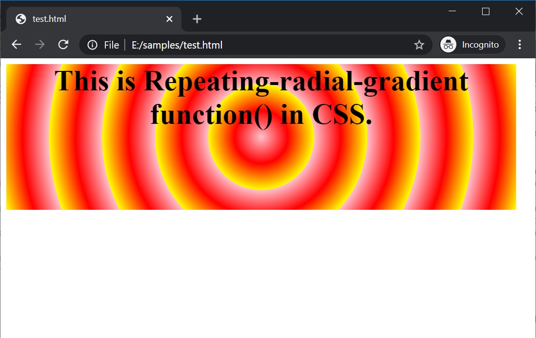
In the above example, three colors are used in the repeating-radial-gradient() function.
在上面的示例中, repeating-radial-gradient()函数使用了三种颜色。
Conclusion:
结论:
That's all folks about the repeating-radial-gradient() function in CSS. Hope this article helped in imparting some knowledge for your web development experience. Go ahead and start playing around with this function and create attractive and stylish websites or web pages.
关于CSS中的repeating-radial-gradient()函数的全部知识 。 希望本文有助于为您的Web开发经验提供一些知识。 继续并开始使用此功能,并创建有吸引力且时尚的网站或网页。
repeating 路由


 扫一扫
扫一扫


 3384
3384

 被折叠的 条评论
为什么被折叠?
被折叠的 条评论
为什么被折叠?
 到【灌水乐园】发言


