


 本文深入探讨了Material Design中的Android按钮设计,包括Android按钮样式、彩色按钮和平面按钮。通过设置不同的style属性,可以实现各种效果。例如,通过修改colorAccent属性可以改变彩色按钮的颜色。同时,文章介绍了平面按钮的无边框和无边框彩色样式,并展示了如何通过自定义主题来控制按钮样式。
Today we’ll dive deep into Android Buttons in Material Design and develop an application that showcases the different styles of a Button.
今天,我们将深入研究Material Design中的Android Buttons,并开发一个应用程序来展示Button的不同样式。
Android Material Design按钮 ()
Buttons in Android are used to communicate our actions with the application. The introduction of Material Design has brought along many different kinds of Button styles which are compatible with pre-Lollipop devices too.
Android中的按钮用于与应用程序交流我们的操作。 Material Design的引入带来了许多不同类型的Button样式,它们也与之前的Lollipop设备兼容。
A basic Button in the layout is defined like this:
布局中的基本Button定义如下:
<LinearLayout xmlns:android="https://schemas.android.com/apk/res/android"
    xmlns:tools="https://schemas.android.com/tools"
    android:layout_width="match_parent"
    android:layout_height="match_parent"
    android:orientation="vertical"
    android:gravity="center"
    tools:context="com.journaldev.androidbuttonstyling.MainActivity">

    <Button
        android:layout_width="wrap_content"
        android:layout_height="wrap_content"
        android:text="NORMAL BUTTON"/>

</LinearLayout>
The above Button has the default style: Widget.AppCompat.Button
上面的Button具有默认样式: Widget.AppCompat.Button
To set a different style on the Button, we use the android:background attribute.
要在Button上设置其他样式,我们使用android:background属性。
<Button
        android:layout_width="wrap_content"
        android:layout_height="wrap_content"
        android:background="@color/colorPrimary"
        android:textColor="@android:color/white"
        android:layout_margin="12dp"
        android:text="BACKGROUND COLOR BUTTON"/>
The output of both of the above Buttons looks like this:
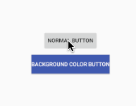
以上两个按钮的输出如下所示:
As it is visible, setting the background removes the click effect. Though there is the raised effect that’s a part of the style itself.
可见,设置背景将消除单击效果。 虽然有凸起的效果是这样的风格本身的一部分。
So either we can create a drawable selector as we’d done in Android Button Selector Tutorial, or the other better approach is by setting styles. We’ll be looking at the later in the below section.
因此,我们可以像在Android Button Selector Tutorial中那样创建可绘制的选择器 ,或者另一种更好的方法是设置样式。 我们将在下一节的后面部分中介绍。
Android按钮样式 ()
In Material Design, Buttons broadly fall under the following two categories.
在材料设计中,按钮大致分为以下两类。
- Raised Buttons – These are the default ones. 加高按钮-这些是默认按钮。
- Flat Buttons – These are borderless. They are typically used in dialogs 平面按钮–这些是无边界的。 它们通常用于对话框中
Following are the primary Button styles that are available.
以下是可用的主要Button样式。
style="@style/Widget.AppCompat.Button"
style="@style/Widget.AppCompat.Button.Colored"

style="@style/Widget.AppCompat.Button.Borderless"
style="@style/Widget.AppCompat.Button.Borderless.Colored"
The last two styles fall under the Flat Buttons category.
最后两种样式属于“平面按钮”类别。
Android彩色按钮 ()
We can set the default colored Button style on a button in the following way:
我们可以通过以下方式在按钮上设置默认的彩色按钮样式:
<Button
        style="@style/Widget.AppCompat.Button.Colored"
        android:layout_width="wrap_content"
        android:layout_height="wrap_content"
        android:layout_margin="12dp"
        android:text="COLORED BUTTON"
        android:padding="8dp" />
This would give the following output:
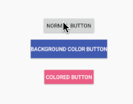
这将给出以下输出:
Why is the color PINK?
The Colored Button takes the color of the colorAccent attribute from the styles.xml file.

为什么是粉红色?
彩色按钮从styles.xml文件中获取colorAccent属性的颜色。
Change the color of colorAccent to one of your choice to get the desired background color.
将colorAccent的颜色更改为您选择的一种,以获得所需的背景色。
Now, there are two important attributes to style a button :
现在,为按钮设置样式有两个重要的属性:
colorButtonNormal: The normal color of the button.
colorButtonNormal :按钮的常规颜色。
colorControlHighlight: The ripple color when the button is pressed.
colorControlHighlight :按下按钮时的波纹颜色。
Setting these inside the AppTheme tag in the styles.xml would give the following output.
在styles.xml的AppTheme标记内进行设置将产生以下输出。
<resources>

    <!-- Base application theme. -->
    <style name="AppTheme" parent="Theme.AppCompat.Light.DarkActionBar">
        <!-- Customize your theme here. -->
        <item name="colorPrimary">@color/colorPrimary</item>
        <item name="colorPrimaryDark">@color/colorPrimaryDark</item>
        <item name="colorButtonNormal">@color/myBlue</item>
        <item name="colorControlHighlight">@color/myWhite</item>

    </style>

</resources>
We’ve added a few colors to our colors.xml pallete as shown below.
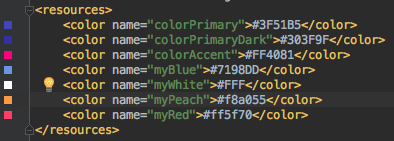
我们在colors.xml添加了一些颜色,如下所示。
We’ve removed colorAccent, still the ColoredButton shows a different color.
我们已经删除了colorAccent ,但是ColoredButton仍然显示不同的颜色。
Why?
为什么?
colorButtonNormal and colorControlHighlight inside the Application’s theme are applicable only on the Buttons with default styles. It applies on ALL buttons with default style in the application.
应用程序主题内的colorButtonNormal和colorControlHighlight仅适用于具有默认样式的Button。 它适用于应用程序中具有默认样式的所有按钮。
So let’s create a custom theme for the ColoredButton. Add the following in the styles.xml file:
因此,让我们为ColoredButton创建一个自定义主题。 在styles.xml文件中添加以下内容:
<style name="PrimaryColoredButton" parent="Base.Widget.AppCompat.Button.Colored">
        <item name="colorButtonNormal">@color/myPeach</item>
        <item name="colorControlHighlight">@color/myRed</item>
</style>
Note: We need to set the style of the button as Colored as the parent.
注意:我们需要将按钮的样式设置为“色”作为父项。
The following code is for the Button in the xml with the theme set.
以下代码用于设置了主题的xml中的Button。
<style name="PrimaryColoredButton" parent="Base.Widget.AppCompat.Button.Colored">
        <item name="colorButtonNormal">@color/myPeach</item>
        <item name="colorControlHighlight">@color/myRed</item>
</style>
The output looks like this:

输出看起来像这样:

This sets default colored button to all. Overrriding Everything.
这会将默认彩色按钮设置为全部。 凌驾一切。
Android平面按钮 ()
Flat Buttons can be Borderless or Borderless.Colored
平面按钮可以是无边框或无边框的。
Borderless.Colorless implies the text color should be colored. Not the background.
无边距。无色表示文本颜色应为彩色。 不是背景。
Add the following style in the styles.xml file
在styles.xml文件中添加以下样式
<style name="FlatButton" parent="Theme.AppCompat.Light">
        <item name="android:textColor">@color/myPeach</item>
        <item name="colorControlHighlight">@color/myRed</item>
</style>
Now add the following Buttons in the xml layout.
现在,在xml布局中添加以下按钮。
<Button
        style="@style/Widget.AppCompat.Button.Borderless"
        android:layout_width="wrap_content"
        android:layout_height="wrap_content"
        android:layout_margin="12dp"
        android:padding="8dp"
        android:text="BORDERLESS BUTTON" />

    <Button
        android:theme="@style/FlatButton"
        style="@style/Widget.AppCompat.Button.Borderless.Colored"
        android:layout_width="wrap_content"
        android:layout_height="wrap_content"
        android:layout_margin="12dp"
        android:padding="8dp"
        android:text="BORDERLESS BUTTON STYLED" />
The output of the above application is given below.

上面的应用程序的输出如下。
The Button with the style Borderless doesn’t have the textcolor set from the theme, though the textColor attribute is present in the theme.
Notice that the Button with the style Borderless.Colored has the text color set from the theme.
尽管主题中存在textColor属性,但具有无边框样式的Button并未从主题中设置文本颜色。
请注意,样式为Borderless.Colored的Button具有从主题设置的文本颜色。
This brings an end to this tutorial. All the styles are available in the Android ButtonStyling Project source code below.
本教程到此结束。 下面的Android ButtonStyling Project源代码中提供了所有样式。
翻译自: https://www.journaldev.com/19911/android-material-design-button-style-design


 扫一扫
扫一扫


 被折叠的 条评论
为什么被折叠?
被折叠的 条评论
为什么被折叠?
 到【灌水乐园】发言


