


 这篇教程详细介绍了如何使用Material Design Components Library在Android中实现Text Fields。内容包括标准和密集文本字段、大纲框文本字段、结束图标模式以及异形文本字段的创建和定制,提供了丰富的代码示例和屏幕截图。
In this tutorial, we’ll implement Text Fields using the new Material Design Components Library.
We have already implemented TextInputLayout here.
在本教程中,我们将使用新的Material Design Components Library来实现Text Fields。
我们已经在这里实现了TextInputLayout。
材质文本字段 (Material TextFields)
TextInputLayout provides an implementation for Material text fields. We just need to use TextInputEditText!
First and foremost, import the new material components dependency. Also, set the MaterialComponent theme in your Activity.
TextInputLayout提供了“材料”文本字段的实现。 我们只需要使用TextInputEditText!
首先,导入新的材料组件依赖项。 另外,在“活动”中设置MaterialComponent主题。
implementation 'com.google.android.material:material:1.1.0-alpha09'By default, an input text field has a filled background to draw users attention.
默认情况下,输入文本字段的背景填充,以引起用户的注意。
Now let’s create a default text field:
现在让我们创建一个默认文本字段:
<com.google.android.material.textfield.TextInputLayout
            android:layout_width="match_parent"
            android:layout_height="wrap_content"
            android:layout_marginBottom="12dp"
            android:hint="Filled box(default)">

            <com.google.android.material.textfield.TextInputEditText
                android:layout_width="match_parent"
                android:layout_height="wrap_content" />

</com.google.android.material.textfield.TextInputLayout>
In the next few sections, we’ll customize text fields in different ways.
在接下来的几节中,我们将以不同的方式自定义文本字段。
标准和密集文本字段 (Standard and Dense Text Fields)
Text Fields have two types of height variants:
文本字段具有两种类型的高度变体:
- Standard – This is used by default if nothing else is there. 标准 –如果没有其他内容,则默认使用此选项。
- Dense –
@style/Widget.MaterialComponents.TextInputLayout.FilledBox.Dense密集 -@style/Widget.MaterialComponents.TextInputLayout.FilledBox.Dense
The dense Text field is slightly shorter in height.
密集文本字段的高度略短。
<com.google.android.material.textfield.TextInputLayout
            android:layout_width="match_parent"
            android:layout_height="wrap_content"
            android:layout_marginBottom="12dp"
            android:hint="Filled box(default)">

            <com.google.android.material.textfield.TextInputEditText
                android:layout_width="match_parent"
                android:layout_height="wrap_content" />

        </com.google.android.material.textfield.TextInputLayout>

        <com.google.android.material.textfield.TextInputLayout
            style="@style/Widget.MaterialComponents.TextInputLayout.FilledBox.Dense"
            android:layout_width="match_parent"
            android:layout_height="wrap_content"
            android:layout_marginBottom="12dp"
            android:hint="Filled box dense"
            app:boxBackgroundColor="#20D81B60">

            <com.google.android.material.textfield.TextInputEditText
                android:layout_width="match_parent"
                android:layout_height="wrap_content" />

        </com.google.android.material.textfield.TextInputLayout>
By default the FilledBox.Standard style is used
app:boxBackgroundColor is used to set the filled box color.
默认情况下使用FilledBox.Standard样式
app:boxBackgroundColor用于设置填充框的颜色。
Here’s how this looks on the screen:
这是在屏幕上的外观:
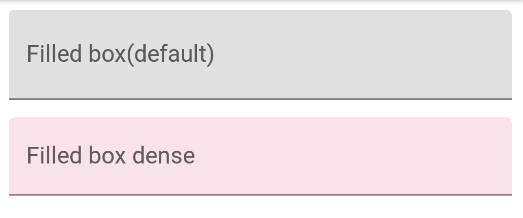
Android Material Text Field Dense Standard Filled Box
Android材质文本字段密集标准填充框
大纲框文本字段 (Outline Box Text Fields)
Apply the following style on the TextInputLayout to get the outlined look text fields:
在TextInputLayout上应用以下样式以获取概述的外观文本字段:
style="@style/Widget.MaterialComponents.TextInputLayout.OutlinedBox"Similar to FilledBox, this has the two height variants as well – Standard and Dense.
To set the corner radius, following attributes are used:
与FilledBox相似,它也有两个高度变体-标准和密集。
要设置拐角半径 ,请使用以下属性:
- boxCornerRadiusTopStart boxCornerRadiusTopStart
- boxCornerRadiusTopEnd boxCornerRadiusTopEnd
- boxCornerRadiusBottomStart boxCornerRadiusBottomStart
- boxCornerRadiusBottomEnd boxCornerRadiusBottomEnd
boxStrokeColor is used to set the stroke color of the outline.
boxStrokeColor用于设置轮廓的笔触颜色。
Here’s how it looks:
外观如下:

Android Material Text Field Outlined Box
Android Material Text Field概述框
结束图标模式 (End Icon Modes)
Moving forward, now let’s set end icon modes.
These are basically icons set at the right of the text field.
Currently, the three types of icons that are available built-in are :
继续前进,现在让我们设置结束图标模式。
这些基本上是设置在文本字段右侧的图标。
当前,内置的三种图标类型是:
password_togglepassword_toggleclear_textclear_textcustomcustom
The above attributes are self-explanatory.
以上属性是不言自明的。
We can set our own icon tint on these icons using endIconTint attribute.
For the custom icon, we use the endIconDrawable attribute
我们可以使用endIconTint属性在这些图标上设置自己的图标色调。
对于自定义图标,我们使用endIconDrawable属性
<com.google.android.material.textfield.TextInputLayout
            style="@style/Widget.MaterialComponents.TextInputLayout.OutlinedBox.Dense"
            android:layout_width="match_parent"
            android:layout_height="wrap_content"
            android:layout_marginBottom="12dp"
            android:hint="Enter password"
            app:endIconMode="password_toggle">

            <com.google.android.material.textfield.TextInputEditText
                android:layout_width="match_parent"
                android:layout_height="wrap_content" />

        </com.google.android.material.textfield.TextInputLayout>

        <com.google.android.material.textfield.TextInputLayout
            style="@style/Widget.MaterialComponents.TextInputLayout.OutlinedBox.Dense"
            android:layout_width="match_parent"
            android:layout_height="wrap_content"
            android:layout_marginBottom="12dp"
            android:hint="Enter password"
            app:endIconMode="password_toggle"
            app:endIconTint="@color/colorAccent">

            <com.google.android.material.textfield.TextInputEditText
                android:layout_width="match_parent"
                android:layout_height="wrap_content" />

        </com.google.android.material.textfield.TextInputLayout>

        <com.google.android.material.textfield.TextInputLayout
            style="@style/Widget.MaterialComponents.TextInputLayout.OutlinedBox.Dense"
            android:layout_width="match_parent"
            android:layout_height="wrap_content"
            android:layout_marginBottom="12dp"
            android:hint="Clear text"
            app:endIconMode="clear_text"
            app:endIconTint="@color/colorPrimaryDark">

            <com.google.android.material.textfield.TextInputEditText
                android:layout_width="match_parent"
                android:layout_height="wrap_content" />

        </com.google.android.material.textfield.TextInputLayout>


        <com.google.android.material.textfield.TextInputLayout
            style="@style/Widget.MaterialComponents.TextInputLayout.OutlinedBox.Dense"
            android:layout_width="match_parent"
            android:layout_height="wrap_content"
            android:layout_marginBottom="12dp"
            android:hint="Custom end icon"
            app:endIconCheckable="true"
            android:id="@+id/custom_end_icon"
            app:endIconDrawable="@android:drawable/ic_input_add"
            app:endIconMode="custom"
            app:endIconTint="@color/colorPrimaryDark">

            <com.google.android.material.textfield.TextInputEditText
                android:layout_width="match_parent"
                android:layout_height="wrap_content" />

        </com.google.android.material.textfield.TextInputLayout>
Here’s how it looks on the screen:
这是它在屏幕上的外观:
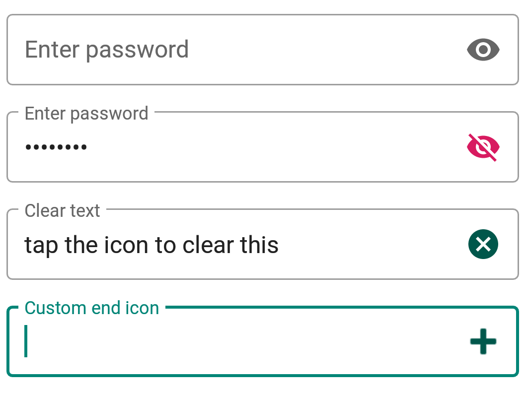
Android Material Text Field End Icons
Android材质文本字段结束图标
For the custom icon, we can use setEndIconOnClickListener callback to listen to clicks and do stuff.
对于自定义图标,我们可以使用setEndIconOnClickListener回调来监听点击和执行操作。
异形文本字段 (Shaped Text Fields)
ShapeAppearance is a powerful style. It lets us customize the shape of the text field.
We have two built-in shapes – cut and round.
ShapeAppearance是一种强大的样式。 它使我们可以自定义文本字段的形状。
我们有两种内置形状–切割和圆形。
<style name="Cut" parent="ShapeAppearance.MaterialComponents.MediumComponent">
        <item name="cornerFamily">cut</item>
        <item name="cornerSize">12dp</item>
    </style>

    <style name="Rounded" parent="ShapeAppearance.MaterialComponents.SmallComponent">
        <item name="cornerFamily">rounded</item>
        <item name="cornerSize">16dp</item>
    </style>
Setting the above styles in the shapeAppearance attributes gives us this –
在shapeAppearance属性中设置上述样式可以使我们–

Android Material Text Field Shapes
Android材质文本字段形状
That sums up Material Components Text Fields for now. In the below source code you’ll find all the above concepts.
现在,总结了“材料组件”文本字段。 在下面的源代码中,您将找到上述所有概念。
翻译自: https://www.journaldev.com/31980/android-material-text-fields


 扫一扫
扫一扫


 被折叠的 条评论
为什么被折叠?
被折叠的 条评论
为什么被折叠?
 到【灌水乐园】发言


