


Tooltip in Silverlight 3
原文链接: Tooltip in Silverlight 3 – part 1Tooltip in Silverlight 3 – part 2
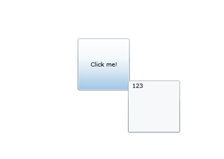
在我们的附录中我们频繁地需要创建tool tips.Silverlight中存在的ToolTip类就是为了这些目的。我们可以更容易地创建这样的tool tips通过使用这个类。
<
Button Content
=
"
Click me!
"
Width
=
"
100
"
Height
=
"
100
"
>
< ToolTipService.ToolTip >
< ToolTip Width = " 100 " Height = " 100 " >
< TextBlock Text = " 123 " />
</ ToolTip >
</ ToolTipService.ToolTip >
</ Button >
如我们看到的这些代码非常简单。然而,这个tool tips我们看着还有些乏味了。
< ToolTipService.ToolTip >
< ToolTip Width = " 100 " Height = " 100 " >
< TextBlock Text = " 123 " />
</ ToolTip >
</ ToolTipService.ToolTip >
</ Button >
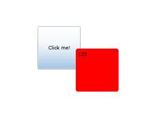
Ok。让我们看看它怎样能用更有趣的形式来定义那些tips的行为。在WPF我们也可以为对象ToolTip重新定义控件模板,本质上改变它的外表。
<
Button Content
=
"
Click me!
"
Width
=
"
100
"
Height
=
"
100
"
>
< ToolTipService.ToolTip >
< ToolTip Width = " 100 " Height = " 100 " >
< ToolTip.Template >
< ControlTemplate TargetType = " ToolTip " >
< Border CornerRadius = " 5 " Background = " Red " >
< ContentPresenter Margin = " 5 " Content = " {TemplateBinding Content} " />
</ Border >
</ ControlTemplate >
</ ToolTip.Template >
< TextBlock Text = " 123 " />
</ ToolTip >
</ ToolTipService.ToolTip >
</ Button >
现在在我们的帮助下显得更漂亮了。
< ToolTipService.ToolTip >
< ToolTip Width = " 100 " Height = " 100 " >
< ToolTip.Template >
< ControlTemplate TargetType = " ToolTip " >
< Border CornerRadius = " 5 " Background = " Red " >
< ContentPresenter Margin = " 5 " Content = " {TemplateBinding Content} " />
</ Border >
</ ControlTemplate >
</ ToolTip.Template >
< TextBlock Text = " 123 " />
</ ToolTip >
</ ToolTipService.ToolTip >
</ Button >
这很明确,每次定义ControlTemplate是不愉快的动作,因此我们将定义tool tips样式。
<
Button Content
=
"
Click me!
"
Width
=
"
100
"
Height
=
"
100
"
>
< ToolTipService.ToolTip >
< ToolTip Width = " 100 " Height = " 100 " >
< ToolTip.Style >
< Style TargetType = " ToolTip " >
< Setter Property = " Template " >
< Setter.Value >
< ControlTemplate TargetType = " ToolTip " >
< Border CornerRadius = " 5 " Background = " Red " >
< ContentPresenter Margin = " 5 " Content = " {TemplateBinding Content} " />
</ Border >
</ ControlTemplate >
</ Setter.Value >
</ Setter >
</ Style >
</ ToolTip.Style >
< TextBlock Text = " 123 " />
</ ToolTip >
</ ToolTipService.ToolTip >
</ Button >
可以把样式放到resources中,以便可以重复使用。
< ToolTipService.ToolTip >
< ToolTip Width = " 100 " Height = " 100 " >
< ToolTip.Style >
< Style TargetType = " ToolTip " >
< Setter Property = " Template " >
< Setter.Value >
< ControlTemplate TargetType = " ToolTip " >
< Border CornerRadius = " 5 " Background = " Red " >
< ContentPresenter Margin = " 5 " Content = " {TemplateBinding Content} " />
</ Border >
</ ControlTemplate >
</ Setter.Value >
</ Setter >
</ Style >
</ ToolTip.Style >
< TextBlock Text = " 123 " />
</ ToolTip >
</ ToolTipService.ToolTip >
</ Button >
<
UserControl.Resources
>
< Style x:Key = " TooltipStyle " TargetType = " ToolTip " >
< Setter Property = " Template " >
< Setter.Value >
< ControlTemplate TargetType = " ToolTip " >
< Border CornerRadius = " 5 " Background = " Red " >
< ContentPresenter Margin = " 5 " Content = " {TemplateBinding Content} " />
</ Border >
</ ControlTemplate >
</ Setter.Value >
</ Setter >
</ Style >
</ UserControl.Resources >
<!-- .
--->
.
--->
< Button Content = " Click me! " Width = " 100 " Height = " 100 " >
< ToolTipService.ToolTip >
< ToolTip Width = " 100 " Height = " 100 " Style = " {StaticResource TooltipStyle} " >
< TextBlock Text = " 123 " />
</ ToolTip >
</ ToolTipService.ToolTip >
</ Button >
现在我们的tool tip外表上变得更亲切了。
< Style x:Key = " TooltipStyle " TargetType = " ToolTip " >
< Setter Property = " Template " >
< Setter.Value >
< ControlTemplate TargetType = " ToolTip " >
< Border CornerRadius = " 5 " Background = " Red " >
< ContentPresenter Margin = " 5 " Content = " {TemplateBinding Content} " />
</ Border >
</ ControlTemplate >
</ Setter.Value >
</ Setter >
</ Style >
</ UserControl.Resources >
<!--
.
--->
< Button Content = " Click me! " Width = " 100 " Height = " 100 " >
< ToolTipService.ToolTip >
< ToolTip Width = " 100 " Height = " 100 " Style = " {StaticResource TooltipStyle} " >
< TextBlock Text = " 123 " />
</ ToolTip >
</ ToolTipService.ToolTip >
</ Button >
然而,需要说的是,在样式上那样的移动不总是可能的,但是关于这些我们下次再讨论( 译者注:下文是part2)。
最近我们讨论了如何能在Silverlight应用程序重新定义tool tip的外表。在那之后tool tip更有趣些。然而,显示的效果仍然糟透了:) 让我们使用添加动画来改变tool tip的展现。
然而,我希望立即警告的是使用动画需要使用trigger,不幸的的是trigger不可以在样式中设置。为了这个原因我们要拒绝使用样式。
因此,最简单的是我们可以在Opacity属性中定义animate。让我们这样做吧。
<
Button Content
=
"
Click me!
"
Width
=
"
100
"
Height
=
"
100
"
>
< ToolTipService.ToolTip >
< ToolTip Name = " RootLayout " Width = " 100 " Height = " 100 " Style = " {StaticResource TooltipStyle} " >
< ToolTip.Triggers >
< EventTrigger >
< BeginStoryboard >
< Storyboard >
< DoubleAnimation Storyboard.TargetName = " RootLayout " Storyboard.TargetProperty = " Opacity " From = " 0 " To = " 1 " Duration = " 0:0:00.2 " />
</ Storyboard >
</ BeginStoryboard >
</ EventTrigger >
</ ToolTip.Triggers >
< TextBlock Text = " 123 " />
</ ToolTip >
</ ToolTipService.ToolTip >
</ Button >
从这个例子我们可以看到在动画过程中主元素的透明度的改变。然而类似动画和标准行为只有很少的不同。让我们添加更多的动态。我们将实现tool tip以钟摆的形式展现。
< ToolTipService.ToolTip >
< ToolTip Name = " RootLayout " Width = " 100 " Height = " 100 " Style = " {StaticResource TooltipStyle} " >
< ToolTip.Triggers >
< EventTrigger >
< BeginStoryboard >
< Storyboard >
< DoubleAnimation Storyboard.TargetName = " RootLayout " Storyboard.TargetProperty = " Opacity " From = " 0 " To = " 1 " Duration = " 0:0:00.2 " />
</ Storyboard >
</ BeginStoryboard >
</ EventTrigger >
</ ToolTip.Triggers >
< TextBlock Text = " 123 " />
</ ToolTip >
</ ToolTipService.ToolTip >
</ Button >
为了这些目的我们将需要添加两个转换-ScaleTransform和Render Transform。那之后能改变那些转换的参数和钟摆的模式行为。
<
DoubleAnimation Storyboard.TargetName
=
"
ScaleMe
"
Storyboard.TargetProperty
=
"
ScaleX
"
From
=
"
0
"
To
=
"
1
"
Duration
=
"
0:0:00.1
"
/>
< DoubleAnimation Storyboard.TargetName = " ScaleMe " Storyboard.TargetProperty = " ScaleY " From = " 0 " To = " 1 " Duration = " 0:0:00.1 " />
< DoubleAnimationUsingKeyFrames Storyboard.TargetName = " RotateMe " Storyboard.TargetProperty = " Angle " >
< DoubleAnimationUsingKeyFrames.KeyFrames >
< DoubleKeyFrameCollection >
< LinearDoubleKeyFrame KeyTime = " 0:00:00.1 " Value = " -15 " />
< LinearDoubleKeyFrame KeyTime = " 0:00:00.2 " Value = " 15 " />
< LinearDoubleKeyFrame KeyTime = " 0:00:00.3 " Value = " -11 " />
< LinearDoubleKeyFrame KeyTime = " 0:00:00.4 " Value = " 11 " />
< LinearDoubleKeyFrame KeyTime = " 0:00:00.5 " Value = " -3 " />
< LinearDoubleKeyFrame KeyTime = " 0:00:00.6 " Value = " 3 " />
< LinearDoubleKeyFrame KeyTime = " 0:00:00.7 " Value = " 0 " />
</ DoubleKeyFrameCollection >
</ DoubleAnimationUsingKeyFrames.KeyFrames >
</ DoubleAnimationUsingKeyFrames >
源代码:
AnimatedTooltip.zip
< DoubleAnimation Storyboard.TargetName = " ScaleMe " Storyboard.TargetProperty = " ScaleY " From = " 0 " To = " 1 " Duration = " 0:0:00.1 " />
< DoubleAnimationUsingKeyFrames Storyboard.TargetName = " RotateMe " Storyboard.TargetProperty = " Angle " >
< DoubleAnimationUsingKeyFrames.KeyFrames >
< DoubleKeyFrameCollection >
< LinearDoubleKeyFrame KeyTime = " 0:00:00.1 " Value = " -15 " />
< LinearDoubleKeyFrame KeyTime = " 0:00:00.2 " Value = " 15 " />
< LinearDoubleKeyFrame KeyTime = " 0:00:00.3 " Value = " -11 " />
< LinearDoubleKeyFrame KeyTime = " 0:00:00.4 " Value = " 11 " />
< LinearDoubleKeyFrame KeyTime = " 0:00:00.5 " Value = " -3 " />
< LinearDoubleKeyFrame KeyTime = " 0:00:00.6 " Value = " 3 " />
< LinearDoubleKeyFrame KeyTime = " 0:00:00.7 " Value = " 0 " />
</ DoubleKeyFrameCollection >
</ DoubleAnimationUsingKeyFrames.KeyFrames >
</ DoubleAnimationUsingKeyFrames >


 290
290

 被折叠的 条评论
为什么被折叠?
被折叠的 条评论
为什么被折叠?
 到【灌水乐园】发言


