


1.radio
      <!-- 提供就业机会 -->
          <div class="content">
            <div class="inp_box  border-bottom">
              <h5 class="label">提供就业机会</h5>
              <input type="radio" id="isJobisJobOpportunity" class="checkbox"  v-model='formData.isJob' value="isJobOpportunity">
              <label for="isJobisJobOpportunity" class="checkbox"></label>
            </div>
          </div>
          <!-- 不显示就业信息 -->
          <div class="content">
            <div class="inp_box  ">
              <h5 class="label">不显示就业信息</h5>
              <input type="radio" id="isJobisShowJobInfomathion" class="checkbox"  v-model='formData.isJob' value="isShowJobInfomathion">
              <label for="isJobisShowJobInfomathion" class="checkbox"></label>
            </div>
          </div>
/* 单选多选框样式 */
input[type="radio"] + label::before {
    content: "\a0"; /*不换行空格*/
    display: inline-block;
    vertical-align: middle;
    width: 0.75rem;
    height: 0.75rem;
    border-radius: 50%;
    border: 1px solid #999999;
    text-align: center;
    line-height: 0.75rem;
    box-sizing: border-box;
}
input[type="radio"]:checked + label::before {
    background-color: #6782f5;
    background-clip: content-box;
    padding: .2rem;
    box-sizing: border-box;
}
input[type="radio"] {
    position: absolute;
    clip: rect(0, 0, 0, 0);
    box-sizing: border-box;
}
效果图

2.checkbox
html
        <!-- 提供住宿 -->
          <div class="content">
            <div class="inp_box  margin-top border-bottom">
              <h5 class="label">提供住宿</h5>
              <input type="radio" class="checkbox" id="isAccommodationyes" v-model='formData.isAccommodation' value="yes">
              <label for="isAccommodationyes" class="checkbox"></label>
            </div>
          </div>
          <!-- 提供免费住宿 -->
          <div class="content">
            <div class="inp_box  border-bottom" >
              <h5 class="label">提供免费住宿</h5>
              <input type="radio" id="free" class="checkbox"  v-model='formData.isAccommodation' value="free">
              <label for="free" class="checkbox"></label>
            </div>
          </div>
css
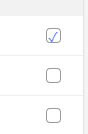
input[type="checkbox"] + label::before {
    content: "\a0";  /*不换行空格*/
    display: inline-block;
    width: 0.75rem;
    height: 0.75rem;
    border-radius: .2rem;
    background-color: #fff;
    text-align: center;
    line-height: 0.75rem;  /*行高不加单位,子元素将继承数字乘以自身字体尺寸而非父元素行高*/
    box-sizing: border-box;
    border: 0.75px solid #999999;
}
input[type="checkbox"]:checked + label::before {
    content: "\2713";
    background-color: #fff;
    border: 1px solid #999999;
    box-sizing: border-box;
    color: #6782f5;
    line-height: 0.75rem;
    font-size: 0.7rem;
}
input {
    /* position: absolute; */
    clip: rect(0, 0, 0, 0);
}
input[type="checkbox"]:focus + label::before {
    box-sizing: border-box;
    border: 1px solid #999999;
}
input[type="checkbox"]:disabled + label::before {
    background-color: #fff;
    box-shadow: none;
    color: #fff;
    box-sizing: border-box;
}
效果图
3.switch
html
       <!-- 支持花呗付款 -->
          <div class="content">
            <div class="inp_box  margin-top border-bottom">
              <h5 class="label">支持花呗付款</h5>
              <label><input class="xxb-switch xxb-switch-animbg" type="checkbox"  v-model='formData.flowerChanting'> </label>
            </div>
          </div>
          <!-- 提供教育贷款 -->
          <div class="content">
            <div class="inp_box  ">
              <h5 class="label">提供教育贷款</h5>
              <label><input class="xxb-switch xxb-switch-animbg" type="checkbox" v-model='formData.loan'> </label>
            </div>
          </div>
css
 .xxb-switch {
  width: 1.25rem;
  height: 0.75rem;
  position: relative;
  border: 0.025rem solid #dfdfdf;
  background-color: #f5ecec;
  box-shadow: #dfdfdf 0 0 0 0 inset;
  border-radius: 0.625rem;
  border-top-left-radius: 0.625rem;
  border-top-right-radius: 0.625rem;
  border-bottom-left-radius: 0.625rem;
  border-bottom-right-radius: 0.625rem;
  background-clip: content-box;
  display: inline-block;
  -webkit-appearance: none;
  user-select: none;
  padding: 0rem;
  outline: none; }
.xxb-switch:before {
    content: '';
    width: 0.65rem;
    height: 0.65rem;
    position: absolute;
    top: 0.025rem;
    left: 0;
    border-radius: 0.325rem;
    border-top-left-radius: 0.325rem;
    border-top-right-radius: 0.325rem;
    border-bottom-left-radius: 0.325rem;
    border-bottom-right-radius: 0.325rem;
    background-color: #fff;
    box-shadow: 0 0 0.075rem rgba(0, 0, 0, 0.4); }
.xxb-switch:checked {
    border-color: #64bd63;
    box-shadow: #64bd63 0 0 0 0.4rem inset;
    background-color: #64bd63; }
.xxb-switch:checked:before {
      left: 0.5rem; }
.xxb-switch.xxb-switch-animbg {
    transition: background-color ease 0.4s; }
.xxb-switch.xxb-switch-animbg:before {
      transition: left 0.3s; }
.xxb-switch.xxb-switch-animbg:checked {
      box-shadow: #dfdfdf 0 0 0 0 inset;
      background-color: #64bd63;
      transition: border-color 0.4s, background-color ease 0.4s; }
.xxb-switch.xxb-switch-animbg:checked:before {
        transition: left 0.3s; }
.xxb-switch.xxb-switch-anim {
    transition: border cubic-bezier(0, 0, 0, 1) 0.4s, box-shadow cubic-bezier(0, 0, 0, 1) 0.4s; }
.xxb-switch.xxb-switch-anim:before {
      transition: left 0.3s; }
.xxb-switch.xxb-switch-anim:checked {
      box-shadow: #64bd63 0 0 0 0.4rem inset;
      background-color: #64bd63;
      transition: border ease 0.4s, box-shadow ease 0.4s, background-color ease 1.2s; }
.xxb-switch.xxb-switch-anim:checked:before {
        transition: left 0.3s; }
效果图


 1万+
1万+


 被折叠的 条评论
为什么被折叠?
被折叠的 条评论
为什么被折叠?
 到【灌水乐园】发言


