


【转载请注明出处:http://blog.csdn.net/feiduclear_up/article/details/46619637 CSDN 废墟的树】
今天来学习总结一下,Android 后添加的一些新的组件和UI效果,Material Dialog,SwipeRefreshLayout,ListPopupWindow,PopupMenu等。
Material Dialog
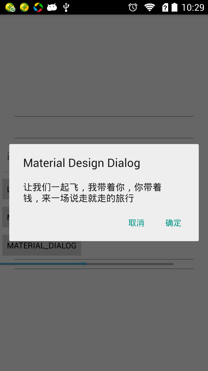
你还在为使用 Material Dialog 去引用第三方的library包么?现在告诉你一个好消息,其实Android 在V7包里面已经实现了 Material 风格的对话框,并且兼容到底版本了。你只需要在你的代码中使用V7中的Dialog即可实现以上图片效果了。代码如下:
private void showDialog1() {
android.support.v7.app.AlertDialog.Builder builder = new AlertDialog.Builder(this); builder.setMessage("让我们一起飞,我带着你,你带着钱,来一场说走就走的旅行") .setNegativeButton("取消", null) .setPositiveButton("确定", null) .setTitle("Material Design Dialog") .show(); }- 1
- 2
- 3
- 4
- 5
- 6
- 7
- 8
是不是很赞,和之前的Dialog使用无任何差别,妈妈再也不用担心我使用Material Dialog对话框了。
SwipeRefreshLayout
原来谷歌已经实现了 Material Design 风格的下拉刷新组件,这个新的组件SwipeRefreshLayout是ViewGroup在V4包下面,你只需按照如下使用:
<android.support.v4.widget.SwipeRefreshLayout xmlns:android="http://schemas.android.com/apk/res/android"
xmlns:app="http://schemas.android.com/apk/res-auto" android:id="@+id/swipe_container" android:layout_width="match_parent" android:layout_height="match_parent"> <!--可滑动的组件,比如ScrollView,ListView,GridView,等--> <ScrollView android:layout_width="match_parent" android:layout_height="wrap_content"> <!--添加自己的内容--> </ScrollView> </android.support.v4.widget.SwipeRefreshLayout>- 1
- 2
- 3
- 4
- 5
- 6
- 7
- 8
- 9
- 10
- 11
- 12
- 13
- 14
- 15
SwipeRefreshLayout组件下包裹一个可滑动的组件即可实现下拉刷新效果。然后在Java代码中使用如下:
 swipeRefreshLayout = findView(R.id.swipe_container);

        //设置下拉刷新监听事件
swipeRefreshLayout.setOnRefreshListener(this); //设置进度条的颜色 swipeRefreshLayout.setColorSchemeColors(Color.RED, Color.BLUE, Color.GREEN); //设置圆形进度条大小 swipeRefreshLayout.setSize(SwipeRefreshLayout.LARGE); //设置进度条背景颜色 swipeRefreshLayout.setProgressBackgroundColorSchemeColor(Color.DKGRAY); //设置下拉多少距离之后开始刷新数据 swipeRefreshLayout.setDistanceToTriggerSync(50);- 1
- 2
- 3
- 4
- 5
- 6
- 7
- 8
- 9
- 10
- 11
- 12
其中包括以下常用方法:
- setColorSchemeColors() 设置进度条颜色,可设置多个值,进度条颜色在这多个颜色值之间变化
- setSize() 设置下拉出现的圆形进度条的大小,有两个值:SwipeRefreshLayout.DEFAULT 和 SwipeRefreshLayout.LARGE
- setProgressBackgroundColorSchemeColor()设置圆形进度条背景颜色。
- setDistanceToTriggerSync() 设置手势操作下拉多少距离之后开始刷新数据
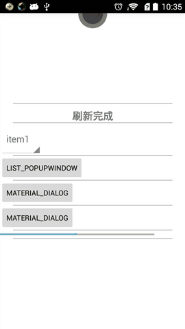
总结:当然 SwipeRefreshLayout 组件有很多不足之处,比如没有上拉刷新这个功能,不过网上已经有人实现了这一效果,想要的可以自己网上搜一把吧。
LinearLayoutCompat
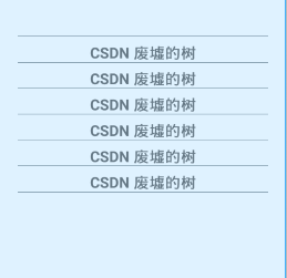
最近在V7包中突然发现 LinearLayoutCompat 组件,处于好奇,百度了一把这个组件的作用:用于给LinerLayout 中的子元素item之间设置间隔线的,效果图如下:
你还在为给每个LinerLayout 的item元素添加分割线烦恼么?告诉你,不用烦恼啦!android 给你现成的组件,你只需简单配置即可。代码参考如下:
<android.support.v7.widget.LinearLayoutCompat
            android:layout_width="match_parent"
android:layout_height="wrap_content" android:layout_gravity="center|center_horizontal" android:orientation="vertical" app:divider="@drawable/line" app:dividerPadding="25dp" app:showDividers="middle|beginning|end"> <TextView android:id="@+id/textView" android:layout_width="match_parent" android:layout_height="wrap_content" android:layout_gravity="center" android:gravity="center" android:paddingTop="10dp" android:text="CSDN 废墟的树" android:textSize="20sp" android:textStyle="bold" /> <TextView android:layout_width="match_parent" android:layout_height="wrap_content" android:layout_gravity="center" android:gravity="center" android:paddingTop="10dp" android:text="CSDN 废墟的树" android:textSize="20sp" android:textStyle="bold" /> <TextView android:layout_width="match_parent" android:layout_height="wrap_content" android:layout_gravity="center" android:gravity="center" android:paddingTop="10dp" android:text="CSDN 废墟的树" android:textSize="20sp" android:textStyle="bold" /> <TextView android:layout_width="match_parent" android:layout_height="wrap_content" android:layout_gravity="center" android:gravity="center" android:paddingTop="10dp" android:text="CSDN 废墟的树" android:textSize="20sp" android:textStyle="bold" /> <TextView android:layout_width="match_parent" android:layout_height="wrap_content" android:layout_gravity="center" android:gravity="center" android:paddingTop="10dp" android:text="CSDN 废墟的树" android:textSize="20sp" android:textStyle="bold" /> <TextView android:layout_width="match_parent" android:layout_height="wrap_content" android:layout_gravity="center" android:gravity="center" android:paddingTop="10dp" android:text="CSDN 废墟的树" android:textSize="20sp" android:textStyle="bold" /> </android.support.v7.widget.LinearLayoutCompat>- 1
- 2
- 3
- 4
- 5
- 6
- 7
- 8
- 9
- 10
- 11
- 12
- 13
- 14
- 15
- 16
- 17
- 18
- 19
- 20
- 21
- 22
- 23
- 24
- 25
- 26
- 27
- 28
- 29
- 30
- 31
- 32
- 33
- 34
- 35
- 36
- 37
- 38
- 39
- 40
- 41
- 42
- 43
- 44
- 45
- 46
- 47
- 48
- 49
- 50
- 51
- 52
- 53
- 54
- 55
- 56
- 57
- 58
- 59
- 60
- 61
- 62
- 63
- 64
- 65
- 66
- 67
- 68
- 69
- 70
- 71
LinearLayoutCompat其实就是LinerLayout组件,只是为了兼容低版本,所以你必须的引用 V7包下面的LinearLayoutCompat。 LinearLayoutCompat除了拥有LinerLayout原本的属性之外,主要有如下几种属性来实现 间隔线效果。
- app:divider=”@drawable/line” 给分隔线设置颜色,这里你需要在drawable在定义shape资源,否则将没有效果。看下面
- app:dividerPadding=”25dp” 给分隔线设置距离左右边距的距离。
- app:showDividers=”middle|beginning|end” 分隔线显示的位置,有四种参数值:middle 每个item之间,beginning最顶端显示分隔线,end 最底端显示分隔线,none不显示间隔线。
注意 这三个属性需要使用 xmlns:app=”http://schemas.android.com/apk/res-auto” 命名空间
app:divider=”@drawable/line” 的资源代码如下:
<?xml version="1.0" encoding="utf-8"?>
<shape xmlns:android="http://schemas.android.com/apk/res/android"> <solid android:color="@color/material_blue_grey_800" /> <!--需要设置高度,否则不显示--> <size android:height="1px" /> </shape>- 1
- 2
- 3
- 4
- 5
- 6
总结:以后你还需要自己画分割线么?看完LinearLayoutCompat组件是不是很高兴啊!!哈哈哈
ListPopupWindow
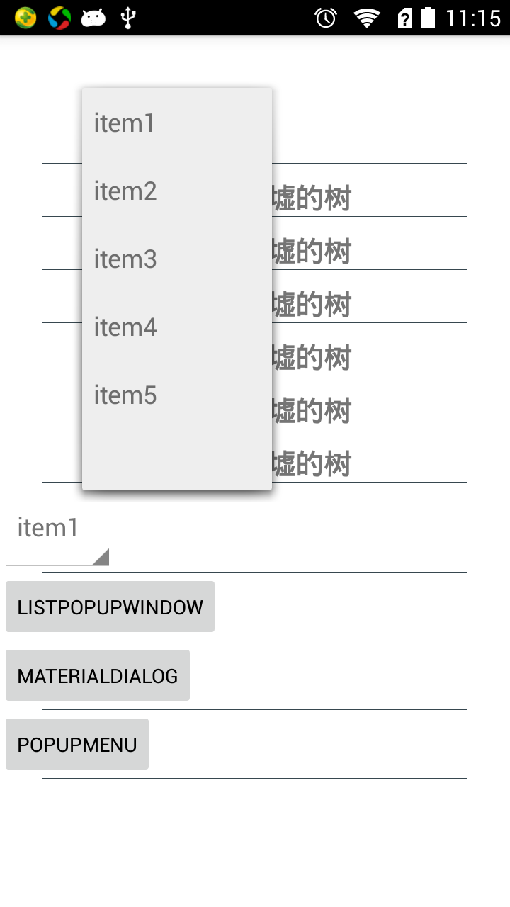
PopupWindow的简单实用,无需更多的去自定义,获取去确定PopupWindow的位置等,你只需要使用ListPopupWindow就能满足你简单的 PopupWindow 弹出框的使用了。直接上代码:
 public void showListPopup(View view) {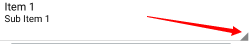
String items[] = {"item1", "item2", "item3", "item4", "item5"}; final ListPopupWindow listPopupWindow = new ListPopupWindow(this); //设置ListView类型的适配器 listPopupWindow.setAdapter(new ArrayAdapter<String>(SwipeRefreshActivity.this, android.R.layout.simple_list_item_1, items)); //给每个item设置监听事件 listPopupWindow.setOnItemClickListener(new AdapterView.OnItemClickListener() { @Override public void onItemClick(AdapterView<?> parent, View view, int position, long id) { Toast.makeText(SwipeRefreshActivity.this, "the position is" + position, Toast.LENGTH_SHORT).show(); // listPopupWindow.dismiss(); } }); //设置ListPopupWindow的锚点,也就是弹出框的位置是相对当前参数View的位置来显示, listPopupWindow.setAnchorView(view); //ListPopupWindow 距锚点的距离,也就是相对锚点View的位置 listPopupWindow.setHorizontalOffset(100); listPopupWindow.setVerticalOffset(100); //设置对话框的宽高 listPopupWindow.setWidth(300); listPopupWindow.setHeight(600); listPopupWindow.setModal(false); listPopupWindow.show(); }- 1
- 2
- 3
- 4
- 5
- 6
- 7
- 8
- 9
- 10
- 11
- 12
- 13
- 14
- 15
- 16
- 17
- 18
- 19
- 20
- 21
- 22
- 23
- 24
- 25
- 26
- 27
- 28
- 29
- 30
- 31
根据以上代码,你可以做如下事情:
- listPopupWindow.setAnchorView(view); 设置弹出框显示的位置
- listPopupWindow.setHorizontalOffset(100);距离锚点View水平距离
- listPopupWindow.setVerticalOffset(100); 距离锚点View的垂直距离
- listPopupWindow.setWidth(300);设置弹出框的大小
不用解释了吧!代码都有注释。望君自己研究然后去手写代码,这样学习更快。
PopupMenu
菜单弹出框,效果如下:
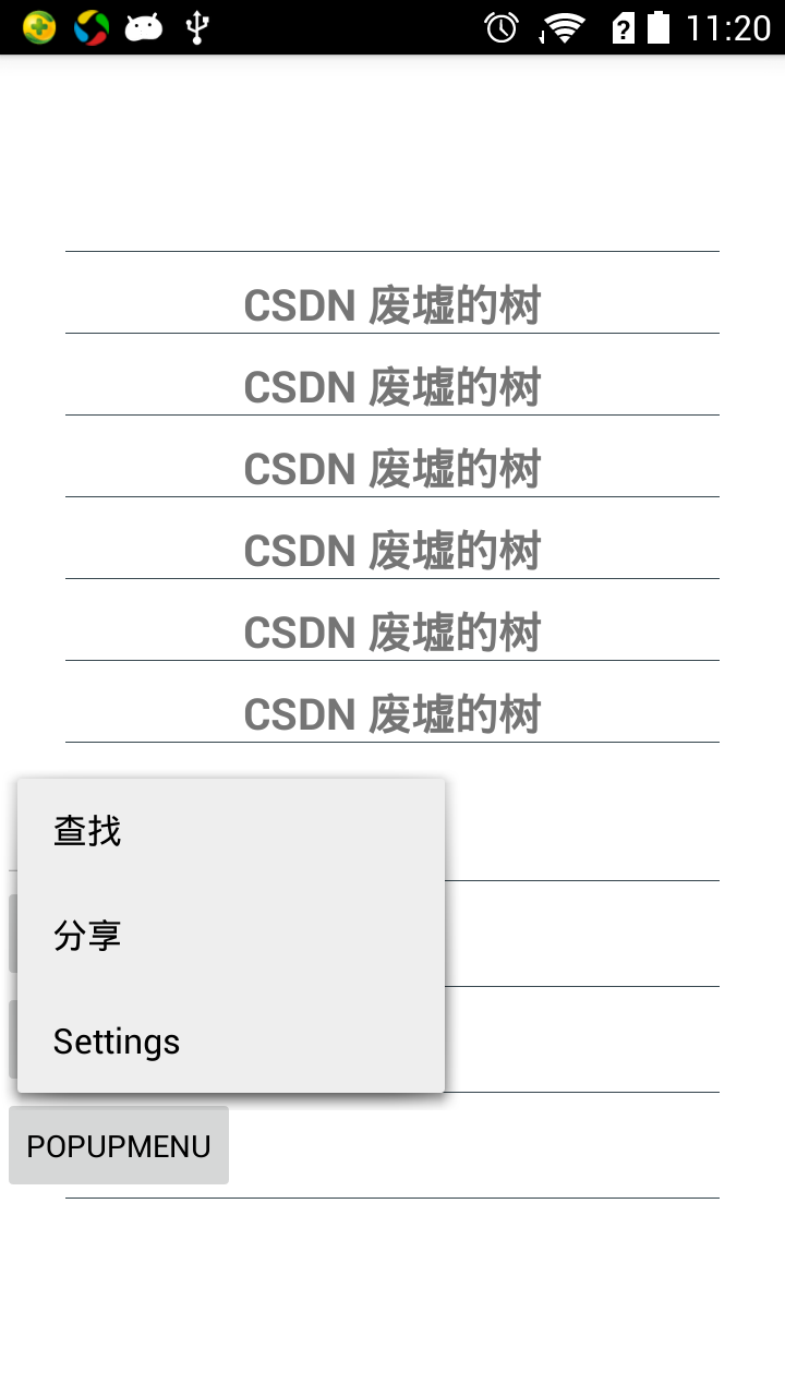
代码如下:
public void showPopupMenu(View view) {
        //参数View 是设置当前菜单显示的相对于View组件位置,具体位置系统会处理
PopupMenu popupMenu = new PopupMenu(this, view); //加载menu布局 popupMenu.getMenuInflater().inflate(R.menu.menu_main, popupMenu.getMenu()); //设置menu中的item点击事件 popupMenu.setOnMenuItemClickListener(new PopupMenu.OnMenuItemClickListener() { @Override public boolean onMenuItemClick(MenuItem item) { return false; } }); //设置popupWindow消失的点击事件 popupMenu.setOnDismissListener(new PopupMenu.OnDismissListener() { @Override public void onDismiss(PopupMenu menu) { } }); popupMenu.show(); }- 1
- 2
- 3
- 4
- 5
- 6
- 7
- 8
- 9
- 10
- 11
- 12
- 13
- 14
- 15
- 16
- 17
- 18
- 19
- 20
- 21
- 22
- 23
总结:PopupMenu 相对ListPopupWindow可定制化比较少。
Spinner
流行风格的下拉类别组件。你只需要在XML布局中使用 新的style主题即可实现如上效果
<Spinner
                android:id="@+id/spinner"
style="@android:style/Widget.Holo.Light.Spinner" android:layout_width="wrap_content" android:layout_height="wrap_content"></Spinner>- 1
- 2
- 3
- 4
- 5
后续如有发现好用的,美观的UI组件会继续添加。今天就暂且到这里吧,退朝!
【转载请注明出处:http://blog.csdn.net/feiduclear_up/article/details/46619637 CSDN 废墟的树】


 2764
2764

 被折叠的 条评论
为什么被折叠?
被折叠的 条评论
为什么被折叠?
 到【灌水乐园】发言


