


本节教程中我们将介绍如何只使用css3创建一个漂亮的导航下拉菜单,兼容所有主流浏览器,包括ie7,ie8当然在ie7/8浏览器中一些css3特性就不支持了,比如圆角,但是整个菜单还是可以很好地显示滴。接下来开始教程~
第一步:HTML标签结构
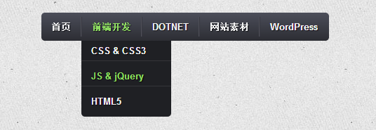
这里我们使用ul无序列表来实现HTML结构,同时每一个菜单项都是一个超链接,子菜单项也是用相同的结构。
 1             <ul class="menu">
 2                 <li><a href="#">首页</a></li>
 3                 <li><a href="#">前端开发</a>
 4                     <ul>
 5                         <li><a href="#">CSS & CSS3</a></li>
 6                         <li><a href="#">JS & jQuery</a></li>
 7                         <li><a href="#">HTML5</a></li>
 8                     </ul>
 9                 </li>
10                 <li><a href="#">DOTNET</a></li>
11                 <li><a href="#">网站素材</a></li>
12                 <li><a href="#">WordPress</a></li>
13             </ul>
第二步:布局
我们为所有的菜单项移除margin, padding, border和outline,然后定义合适的宽高,添加圆角和渐变效果。为了使菜单水平显示,还需要加上左对齐浮动。最后需要加上相对定位的position,这样做是为了固定子菜单的位置。
 1 .menu,
 2 .menu ul,
 3 .menu li,
 4 .menu a {
 5     margin: 0;
 6     padding: 0;
 7     border: none;
 8     outline: none;
 9 }
10
11 .menu {
12     height: 40px;
13     width: 410px;
14
15     background: #4c4e5a;
16     background: -webkit-linear-gradient(top, #4c4e5a 0%,#2c2d33 100%);
17     background: -moz-linear-gradient(top, #4c4e5a 0%,#2c2d33 100%);
18     background: -o-linear-gradient(top, #4c4e5a 0%,#2c2d33 100%);
19     background: -ms-linear-gradient(top, #4c4e5a 0%,#2c2d33 100%);
20     background: linear-gradient(top, #4c4e5a 0%,#2c2d33 100%);
21
22     -webkit-border-radius: 5px;
23     -moz-border-radius: 5px;
24     border-radius: 5px;
25 }
26
27 .menu li {
28     position: relative;
29     list-style: none;
30     float: left;
31     display: block;
32     height: 40px;
33 }
第三步:修饰菜单项链接
我们需要为菜单项加一些基础的样式color,padding,font等等。为了鼠标hover到菜单上的时候,有一个更好的效果,我们为菜单项 添加文字阴影,和颜色过渡transition,最后为每个菜单想加上间隔边框,第一个移除左边框,最后一个移除右边框。当hover的时候只改变菜单链 接的颜色。
 1 .menu li a {
 2     display: block;
 3     padding: 0 14px;
 4     margin: 6px 0;
 5     line-height: 28px;
 6     text-decoration: none;
 7     border-left: 1px solid #393942;
 8     border-right: 1px solid #4f5058;
 9     font-family: Helvetica, Arial, sans-serif;
10     font-weight: bold;
11     font-size: 13px;
12     color: #f3f3f3;
13     text-shadow: 1px 1px 1px rgba(0,0,0,.6);
14     -webkit-transition: color .2s ease-in-out;
15     -moz-transition: color .2s ease-in-out;
16     -o-transition: color .2s ease-in-out;
17     -ms-transition: color .2s ease-in-out;
18     transition: color .2s ease-in-out;
19 }
20 .menu li:first-child a { border-left: none; }
21 .menu li:last-child a{ border-right: none; }
22 .menu li:hover > a { color: #8fde62; }
第四步:子菜单样式
子菜单这里我们使用绝对定位,这就是为什么我们要为第一级菜单li添加绝对定位的原因。当鼠标hover的时候我们设置透明度从0到1来实现渐变显示效果,同样是设置高度从0到36px来实现向下滑出效果。
 1 .menu ul {
 2     position: absolute;
 3     top: 40px;
 4     left: 0;
 5
 6     opacity: 0;
 7     background: #1f2024;
 8
 9     -webkit-border-radius: 0 0 5px 5px;
10     -moz-border-radius: 0 0 5px 5px;
11     border-radius: 0 0 5px 5px;
12
13     -webkit-transition: opacity .25s ease .1s;
14     -moz-transition: opacity .25s ease .1s;
15     -o-transition: opacity .25s ease .1s;
16     -ms-transition: opacity .25s ease .1s;
17     transition: opacity .25s ease .1s;
18 }
19 .menu li:hover > ul { opacity: 1; }
20
21 .menu ul li {
22     height: 0;
23     overflow: hidden;
24     padding: 0;
25
26     -webkit-transition: height .25s ease .1s;
27     -moz-transition: height .25s ease .1s;
28     -o-transition: height .25s ease .1s;
29     -ms-transition: height .25s ease .1s;
30     transition: height .25s ease .1s;
31 }
32
33 .menu li:hover > ul li {
34     height: 36px;
35     overflow: visible;
36     padding: 0;
37 }
设置子菜单的宽度为100px,同时移除左右边框,使用下边框,同时移除最后一个子菜单的下边框。
1 .menu ul li a {
2     width: 100px;
3     margin: 0;
4     border: none;
5     border-bottom: 1px solid #353539;
6     text-align:left;
7 }
8
9 .menu ul li:last-child a { border: none; }
到此教程全部结束:在线演示
<script type="text/javascript"> </script><script type="text/javascript" src="http://pagead2.googlesyndication.com/pagead/show_ads.js"></script>


 扫一扫
扫一扫
 708
708

 被折叠的 条评论
为什么被折叠?
被折叠的 条评论
为什么被折叠?
 到【灌水乐园】发言


