推荐:
- 顶部滑动导航
- swiper
- 推荐商品
- 卡片
卡片组件和组件的传递参数
- 在componets文件加下新建common文件夹下新建卡片组件Card.vue
<template>
<view class="card">
<view class="">-</view>
<slot>
<view class="card-name">{{cardTitle}}</view>
</slot>
<view class="">-</view>
</view>
</template>
<script>
export default{
props:{
cardTitle:String
}
}
</script>
<style lang="scss">
.card{
padding: 20rpx 0;
display: flex;
justify-content: center;
font-weight: bold;
}
.card-name{
padding: 0 20rpx;
font-size: 32rpx;
}
</style>
- index.vue 引入并注册卡片组件 同时 向组件传递参数
<template>
<view class="content">
<view class="index">
<IndexSwiper></IndexSwiper>
<Recommend></Recommend>
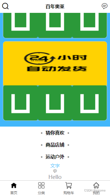
<Card cardTitle='猜你喜欢'></Card>
<Card cardTitle='商品店铺'></Card>
<Card cardTitle='运动户外'></Card>
</view>
<view class="f-active-color">
文字
</view>
<view class="iconfont icon-xiaoxi"></view>
<view class="text-area">
<text class="title">{{title}}</text>
</view>
</view>
</template>
<script>
import IndexSwiper from '@/components/index/indexSwiper.vue';
import Recommend from '@/components/index/Recommend.vue';
import Card from '@/components/common/Card.vue';
export default {
data() {
return {
title: 'Hello'
}
},
components:{
IndexSwiper,
Recommend,
Card
},
onLoad() {
},
methods: {
}
}
</script>
<style>
.content {
display: flex;
flex-direction: column;
align-items: center;
justify-content: center;
}
.logo {
height: 200rpx;
width: 200rpx;
margin-top: 200rpx;
margin-left: auto;
margin-right: auto;
margin-bottom: 50rpx;
}
.text-area {
display: flex;
justify-content: center;
}
.title {
font-size: 36rpx;
color: #8f8f94;
}
</style>
实际案例图片
 卡片组件设计与应用


 本文介绍了一种封装的卡片组件Card及其在index页面的应用实践。通过详细展示Card组件的源代码,包括模板、脚本及样式部分,文章进一步解释了如何在index.vue中引入和使用该组件,并通过传递不同的参数实现多样化的显示效果。


 扫一扫
扫一扫


 被折叠的 条评论
为什么被折叠?
被折叠的 条评论
为什么被折叠?
 到【灌水乐园】发言


