


前言
在Android开发中,UI布局可以说是每个App使用频率很高的,随着UI越来越多,布局的重复性、复杂度也会随之增长,这样使得UI布局的优化,显得至关重要,UI布局不慎,层级嵌套太深,就会引起过度绘制,从而造成UI卡顿的情况,直接影响用户体验,本篇博客,我就来总结一下UI布局优化的相关技巧。
回顾:RelativeLayout和LinearLayout的性能比较
我们都知道一个View的绘制流程是从ViewRoot的performTraversals()方法开始,依次经过measure(),layout()和draw()三个过程才最终将其绘制出来。
通过对比我们发现:
1,RelativeLayout会让子View调用2次onMeasure。如果不使用weight属性,LinearLayout会在当前方向上进行一次measure的过程,如果使用weight属性,LinearLayout会避开设置过weight属性的view做第一次measure,完了再对设置过weight属性的view做第二次measure,但即便这样相比于RelativeLayout的二次measure线性布局LinearLayout还是稍快一点的。
2,RelativeLayout的子View如果高度和RelativeLayout不同,则会引发效率问题,当子View很复杂时,这个问题会更加严重。如果可以,尽量使用padding代替margin。
3,在不影响层级深度的情况下,使用LinearLayout和FrameLayout而不是RelativeLayout。
UI布局优化技巧
技巧一:善用RelativeLayout
疑惑:既然线性布局比相对布局性能更好,那为什么在Studio中创建一个布局文件系统默认的跟布局是相对布局而不是线性布局呢?
通过上面的回顾我们知道在不考虑层级深度的情况下,线性布局的性能要比相对布局好一点,但是在实际的项目开发中,在RelativeLayout和LinearLayout同时能够满足需求时,在不影响层级的前提下,建议优先考虑使用线性布局,但是如果考虑到层级太深会造成UI卡顿,那么建议尽量使用相对布局,因为一般情况下用LinearLayout的时候总会比RelativeLayout多一个View的层级,下面我们来看一个例子:
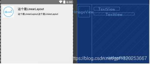
首先用LinearLayout方式来实现:
<?xml version="1.0" encoding="utf-8"?>
<LinearLayout xmlns:android="http://schemas.android.com/apk/res/android"
    android:layout_width="match_parent"
    android:layout_height="match_parent">

    <ImageView
        android:layout_width="wrap_content"
        android:layout_height="wrap_content"
        android:layout_margin="10dp"
        android:src="@mipmap/ic_launcher" />

    <LinearLayout
        android:layout_width="match_parent"
        android:layout_height="match_parent"
        android:orientation="vertical">

        <TextView
            android:layout_width="wrap_content"
            android:layout_height="wrap_content"
            android:layout_marginLeft="10dp"
            android:layout_marginTop="16dp"
            android:text="这个是LinearLayout"
            android:textSize="16sp" />

        <TextView
            android:layout_width="wrap_content"
            android:layout_height="wrap_content"
            android:layout_marginLeft="10dp"
            android:layout_marginTop="10dp"
            android:text="这个是LinearLayout,这个是LinearLayout"
            android:textSize="12sp" />
    </LinearLayout>

</LinearLayout>
接着是RelativeLayout方式:
<?xml version="1.0" encoding="utf-8"?>
<RelativeLayout xmlns:android="http://schemas.android.com/apk/res/android"
    android:layout_width="match_parent"
    android:layout_height="match_parent">

    <ImageView
        android:id="@+id/iv_image"
        android:layout_width="wrap_content"
        android:layout_height="wrap_content"
        android:layout_margin="10dp"
        android:src="@mipmap/ic_launcher" />

    <TextView
        android:id="@+id/tv_title"
        android:layout_width="wrap_content"
        android:layout_height="wrap_content"
        android:layout_marginLeft="10dp"
        android:layout_marginTop="16dp"
        android:layout_toRightOf="@+id/iv_image"
        android:text="这个是LinearLayout"
        android:textSize="16sp" />

    <TextView
        android:id="@+id/tv_content"
        android:layout_width="wrap_content"
        android:layout_height="wrap_content"
        android:layout_below="@+id/tv_title"
        android:layout_marginLeft="10dp"
        android:layout_marginTop="10dp"
        android:layout_toRightOf="@+id/iv_image"
        android:text="这个是LinearLayout,这个是LinearLayout"
        android:textSize="12sp" />

</RelativeLayout>
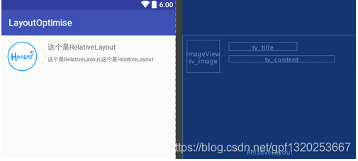
很明显Relativelayout的层级比linearlayout的层级少了一层,当然渲染的时间也是大大减少了,这个界面比较简单,但是如果界面很复杂的情况下,合理的使用相对布局层级就不是少一层呢么简单了。
Google的意思是“性能至上”, RelativeLayout 在性能上更好,因为在诸如 ListView 等控件中,使用 LinearLayout 容易产生多层嵌套的布局结构,这在性能上是不好的。而 RelativeLayout 因其原理上的灵活性,通常层级结构都比较扁平,很多使用LinearLayout 的情况都可以用一个 RelativeLayout 来替代,以降低布局的嵌套层级,优化性能。所以从这一点来看,Google比较推荐开发者使用RelativeLayout,因此就将其作为Blank Activity的默认布局了。
技巧二:使用布局标签include、merge、ViewStub
< include >
include标签常用于将布局中的公共部分提取出来供其他layout共用,以实现布局模块化,也是平常我们设计布局时用的最多的。
<include layout="@layout/item_test_linear_layout" />
include标签使用注意事项:
1,一个xml布局文件有多个include标签需要设置ID,才能找到相应子View的控件,否则只能找到第一个include的layout布局,以及该布局的控件
2,include标签如果使用layout_xx属性,会覆盖被include的xml文件根节点对应的layout_xx属性,建议在include标签调用的布局设置好宽高位置,防止不必要的bug
3,include 添加id,会覆盖被include的xml文件根节点ID,这里建议include和被include覆盖的xml文件根节点设置同名的ID,不然有可能会报空指针异常
4,如果要在include标签下使用RelativeLayout,如layout_margin等其他属性,记得要同时设置layout_width和layout_height,不然其它属性会没反应
< merge >
merge标签主要用于辅助include标签,用于消除视图层次结构中的冗余视图,在使用include后可能导致布局嵌套过多,多余的layout节点或导致解析变慢,例如根布局是Linearlayout,那么我们又include一个LinerLayout布局就没意义了,反而会减慢UI加载速度。
merge标签常用场景:
1,根布局是FrameLayout且不需要设置background或padding等属性,可以用merge代替,因为Activity的ContentView父元素就是FrameLayout,所以可以用merge消除只剩一个。
2,某布局作为子布局被其他布局include时,使用merge当作该布局的顶节点,这样在被引入时顶结点会自动被忽略,而将其子节点全部合并到主布局中。
3,自定义View如果继承LinearLayout(ViewGroup),建议让自定义View的布局文件根布局设置成merge,这样能少一层结点。
使用如下:
<?xml version="1.0" encoding="utf-8"?>
<merge xmlns:android="http://schemas.android.com/apk/res/android">

    <Button
        android:id="@+id/ok"
        android:layout_width="match_parent"
        android:layout_height="wrap_content"
        android:layout_marginLeft="20dp"
        android:layout_marginRight="20dp"
        android:text="OK" />

    <Button
        android:id="@+id/cancel"
        android:layout_width="match_parent"
        android:layout_height="wrap_content"
        android:layout_marginLeft="20dp"
        android:layout_marginRight="20dp"
        android:layout_marginTop="10dp"
        android:text="Cancel" />

</merge>
merge标签使用注意:
1,因为merge标签并不是View,所以在通过LayoutInflate.inflate()方法渲染的时候,第二个参数必须指定一个父容器,且第三个参 数必须为true,也就是必须为merge下的视图指定一个父亲节点.
2,因为merge不是View,所以对merge标签设置的所有属性都是无效的.
3,注意如果include的layout用了merge,调用include的根布局也使用了merge标签,那么就失去布局的属性了
4,merge标签必须使用在根布局 ViewStub标签中的layout布局不能使用merge标签
ViewStub:仅在需要时才加载布局
有的时候我们会遇到这样的场景,就是某个布局当中的元素非常多,但并不是所有元素都一起显示出来的,而是普通情况下只显示部分常用的元素,而那些不常用的元素只有在用户进行特定操作的情况下才会显示出来。
这里举个大家都非常熟悉的例子,我们在添加联系人的时候其实可以编辑的字段真的非常多,姓名、电话、email、传真、住址、昵称等等等等,但其实基本上大家最常用的就是填一个姓名,填一个电话而已。那么将这么多繁杂的字段都一起显示在界面上其实并不是一种很好的做法,因为大多数人都是用不到这些字段的。比较聪明的做法就是把最常用的姓名和电话显示在界面上,然后给用户提供一个添加更多字段的选项,当用户真的有需要去添加其它信息的时候,我们才将另外的元素显示到界面上。
说到实现这样一个功能,我相信大多数人的第一反应就是将不常用的元素使用INVISIBLE或者GONE进行隐藏,然后当用户需要使用这些元素的时候再把它们置成VISIBLE显示出来。使用这种方式肯定可以实现功能的,但是性能方面就表现得一般了,因为即使是将元素进行隐藏,它们其实还是在布局当中的,每个元素还拥有着自己的宽、高、背景等等属性,解析布局的时候也会将这些隐藏的元素一一解析出来。
那么我们如何才能让这些不常用的元素仅在需要时才去加载呢?Android为此提供了一种非常轻量级的控件,ViewStub。ViewStub虽说也是View的一种,但是它没有大小,没有绘制功能,也不参与布局,资源消耗非常低,将它放置在布局当中基本可以认为是完全不会影响性能的。
下面我们就来学习一下如何使用ViewStub来完成仅在需要时才去加载布局的功能,目前profile.xml中只有一个EditText用于编辑信息,那么比如说我们还有另外三个不太常用的EditText,就可以将它们定义在另外一个布局文件当中。新建profile_extra.xml文件,代码如下所示:
<?xml version="1.0" encoding="utf-8"?>
<LinearLayout xmlns:android="http://schemas.android.com/apk/res/android"
    android:layout_width="match_parent"
    android:layout_height="match_parent"
    android:orientation="vertical" >

    <EditText
        android:id="@+id/edit_extra1"
        android:layout_width="match_parent"
        android:layout_height="wrap_content"
        android:layout_marginLeft="20dp"
        android:layout_marginRight="20dp"
        android:hint="Extra field 1" />

    <EditText
        android:id="@+id/edit_extra2"
        android:layout_width="match_parent"
        android:layout_height="wrap_content"
        android:layout_marginLeft="20dp"
        android:layout_marginRight="20dp"
        android:layout_marginTop="10dp"
        android:hint="Extra field 2" />

    <EditText
        android:id="@+id/edit_extra3"
        android:layout_width="match_parent"
        android:layout_height="wrap_content"
        android:layout_marginLeft="20dp"
        android:layout_marginRight="20dp"
        android:layout_marginTop="10dp"
        android:hint="Extra field 3" />

</LinearLayout>
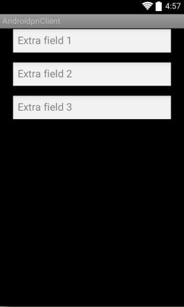
可以看到,在profile_extra.xml这个布局文件当中定义了三个EditText,也就是用于编辑那些不常用信息的控件,现在我们可以来预览一下这个布局,如下图所示:
目前profile_extra.xml是一个独立的布局,和profile.xml这个布局文件是完全没有关系的。接下来我们修改profile.xml文件中的代码,如下所示:
<?xml version="1.0" encoding="utf-8"?>
<LinearLayout xmlns:android="http://schemas.android.com/apk/res/android"
    android:layout_width="match_parent"
    android:layout_height="match_parent"
    android:orientation="vertical" >

    <EditText
        android:id="@+id/edit"
        android:layout_width="match_parent"
        android:layout_height="wrap_content"
        android:layout_marginBottom="10dp"
        android:layout_marginLeft="20dp"
        android:layout_marginRight="20dp"
        android:layout_marginTop="10dp"
        android:hint="@string/edit_something_here" />

    <Button
        android:id="@+id/more"
        android:layout_width="wrap_content"
        android:layout_height="wrap_content"
        android:layout_gravity="right"
        android:layout_marginRight="20dp"
        android:layout_marginBottom="10dp"
        android:text="More" />

    <ViewStub
        android:id="@+id/view_stub"
        android:layout="@layout/profile_extra"
        android:layout_width="match_parent"
        android:layout_height="wrap_content"
        />

    <include layout="@layout/ok_cancel_layout" />

</LinearLayout>
可以看到,这里我们新增了一个More Button,这个按钮就是用于去加载那些不常用的元素的,然后在Button的下面定义了一个ViewStub。在ViewStub控件中,我们先是通过id属性给它指定了一个唯一标识,又通过layout属性将profile_extra布局传入进来,接着给ViewStub指定了一个宽高。注意,虽然ViewStub是不占用任何空间的,但是每个布局都必须要指定layout_width和layout_height属性,否则运行就会报错。
接着修改ProfileActivity中的代码,在Activity中添加More Button的点击事件,并在点击事件中进行如下逻辑处理:
private EditText editExtra1;
private EditText editExtra2;
private EditText editExtra3;

public void onMoreClick() {
	ViewStub viewStub = (ViewStub) findViewById(R.id.view_stub);
	if (viewStub != null) {
		View inflatedView = viewStub.inflate();
		editExtra1 = (EditText) inflatedView.findViewById(R.id.edit_extra1);
		editExtra2 = (EditText) inflatedView.findViewById(R.id.edit_extra2);
		editExtra3 = (EditText) inflatedView.findViewById(R.id.edit_extra3);
	}
}
当点击More Button之后我们首先会调用findViewById()方法将ViewStub的实例获取到,拿到ViewStub的实例之后就很简单了,调用inflate()方法或者setVisibility(View.VISIBLE)都可以将隐藏的布局给加载出来,而加载的这个布局就是刚才在XML当中配置的profile_extra布局。
调用inflate()方法之后会将加载出来的布局进行返回,之后我们就可以对这个布局进行任意的操作了,再次隐藏显示,或者获取子元素的实例等。注意这里我对ViewStub的实例进行了一个非空判断,这是因为ViewStub在XML中定义的id只在一开始有效,一旦ViewStub中指定的布局加载之后,这个id也就失败了,那么此时findViewById()得到的值也会是空。
inflate 方法只能被调用一次,因为调用后viewStub对象就被移除了视图树; 所以,如果此时再次点击显示按钮,就会崩溃,错误信息:ViewStub must have a non-null ViewGroupviewParent;有两种解决方法:
方法1:所以使用try catch ,当此处发现exception 的时候,在catch中使用setVisibility()重新显示;
方法2:设置一个Boolean类型的变量,标记viewstub是否已经inflate,如果viewstub还未inflate则执行初始化操作,反之则不进行操作。其中要使用ViewStub中OnInflateListener()监听事件来判断是否已经填充,从而保证viewstub不重复的inflate。
viewStub_demo.setOnInflateListener(new ViewStub.OnInflateListener() {
@Override
public void onInflate(ViewStub stub, View inflated) {
isInflate_flag = true;
//显示的时候去做一些操作
}
});
示例如下:
public class MainActivity extends AppCompatActivity {

    private ViewStub viewStub;
    private boolean isInflate_flag; // 用来标记ViewStup是否已经被inflate过了

    @Override
    protected void onCreate(Bundle savedInstanceState) {
        super.onCreate(savedInstanceState);
        setContentView(R.layout.activity_main);
        viewStub = (ViewStub) findViewById(R.id.view_stub);
        // 设置viewStub的inflate监听
        viewStub.setOnInflateListener(new ViewStub.OnInflateListener() {
            @Override
            public void onInflate(ViewStub stub, View inflated) {
                // viewStub被inflate的时候调用
                isInflate_flag = true;
            }
        });
    }

    // 按钮的点击事件
    public void show(View view) {
        // 判断viewStub是否已经被inflate过了
        if(isInflate_flag){
            // 已经inflate过了
            Toast.makeText(this, "已经被inflate过了", Toast.LENGTH_SHORT).show();
            int visibility = viewStub.getVisibility();
            if(visibility == View.VISIBLE){
                viewStub.setVisibility(View.GONE);
            }else{
                viewStub.setVisibility(View.VISIBLE);
            }
        }else{
            // 还没有被inflate过
            Toast.makeText(this, "还没有被inflate过", Toast.LENGTH_SHORT).show();
            View inflate = viewStub.inflate();
            TextView tv01 = inflate.findViewById(R.id.tv01);
            tv01.setVisibility(View.GONE);
            tv01.setText("我被显示了!!!");
        }
    }
}
现在我们重新运行一下程序,界面如下图所示:
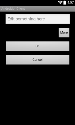
可以看到,界面上只有一个More按钮,ViewStub是完全不占用任何空间的。然后点击一下More按钮,新的界面如下所示:
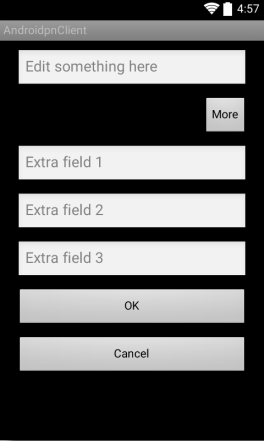
没有问题,profile_extra.xml中定义的布局已经加载出来了,而且显示的位置也是在More按钮和OK按钮之间,正是ViewStub控件定义的位置,说明我们确实已经将ViewStub成功使用起来了。
另外需要提醒大家一点,ViewStub所加载的布局是不可以使用标签的,因此这有可能导致加载出来的布局存在着多余的嵌套结构,具体如何去取舍就要根据各自的实际情况来决定了,对于那些隐藏的布局文件结构相当复杂的情况,使用ViewStub还是一种相当不错的选择的,即使增加了一层无用的布局结构,仍然还是利大于弊。
技巧三:Android最新的布局容器ConstaintLayout(约束布局)
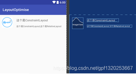
ConstraintLayout允许你在不适用任何嵌套的情况下创建大型而又复杂的布局。它与RelativeLayout非常相似,所有的view都依赖于兄弟控件和父控件的相对关系。但是,ConstraintLayout比RelativeLayout更加灵活,目前在AndroidStudio中使用也十分方便,就和以前的拖拉控件十分相似。
关于约束布局的使用网上教程也很多,此处就不在赘述。
<?xml version="1.0" encoding="utf-8"?>
<android.support.constraint.ConstraintLayout
    xmlns:android="http://schemas.android.com/apk/res/android"
    xmlns:app="http://schemas.android.com/apk/res-auto"
    xmlns:tools="http://schemas.android.com/tools"
    android:id="@+id/lay_root"
    android:layout_width="match_parent"
    android:layout_height="match_parent">

    <ImageView
        android:id="@+id/iv_image"
        android:layout_width="wrap_content"
        android:layout_height="wrap_content"
        android:layout_margin="10dp"
        android:src="@mipmap/ic_launcher"
        android:layout_marginStart="16dp"
        app:layout_constraintLeft_toLeftOf="parent"
        android:layout_marginLeft="16dp"
        android:layout_marginTop="16dp"
        app:layout_constraintTop_toTopOf="parent" />

    <TextView
        android:id="@+id/tv_title"
        android:layout_width="0dp"
        android:layout_height="wrap_content"
        android:layout_toRightOf="@+id/iv_image"
        android:text="这个是ConstraintLayout"
        android:textSize="16sp"
        app:layout_constraintLeft_toRightOf="@+id/iv_image"
        android:layout_marginStart="20dp"
        android:layout_marginLeft="20dp"
        android:layout_marginTop="20dp"
        app:layout_constraintTop_toTopOf="parent" />

    <TextView
        android:id="@+id/tv_content"
        android:layout_width="0dp"
        android:layout_height="wrap_content"
        android:layout_below="@+id/tv_title"
        android:layout_toRightOf="@+id/iv_image"
        android:text="这个是ConstraintLayout,这个是RelativeLayout"
        android:textSize="12sp"
        app:layout_constraintTop_toBottomOf="@+id/tv_title"
        android:layout_marginTop="16dp"
        app:layout_constraintLeft_toLeftOf="@+id/tv_title" />

</android.support.constraint.ConstraintLayout>
最后运行之后看下布局的层级如下:
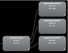
这个是简单的布局,如果是复杂的布局的话,那用Constaintlayout的话最多就两个层级了,不像Relative和Linear一样一层嵌套一层的。


 2549
2549


 被折叠的 条评论
为什么被折叠?
被折叠的 条评论
为什么被折叠?
 到【灌水乐园】发言


