文章参考
- [CSS/JS]圆形不封闭进度条实现
设计思想

代码实现
<!DOCTYPE html>
<html lang="en">
<head>
<title>HTTP Status 404 – Not Found</title>
<style type="text/css">
* {
box-sizing: border-box;
}
.box{
height: 300px;
margin-top: 20px;
}
.circle {
border-radius: 50%;
height: 200px;
width: 200px;
border: 1px solid #722133;
}
.colorful {
border-top: 1px solid green;
border-right: 1px solid yellow;
border-bottom: 1px solid blue;
border-left: 1px solid red;
}
.halfcolorful {
border-top: 1px solid green;
border-right: 1px solid green;
border-bottom: 1px solid red;
border-left: 1px solid red;
}
.halfcolorful-transparent {
border-top: 1px solid red;
border-right: 1px solid red;
border-bottom: 1px solid transparent;
border-left: 1px solid transparent;
}
.halfcolorful-transparent-active {
border-top: 1px solid green;
border-right: 1px solid green;
border-bottom: 1px solid transparent;
border-left: 1px solid transparent;
}
.half {
height: 200px;
width: 100px;
overflow: hidden;
}
.halfrotate {
transform: rotate(45deg);
}
.circle-container {
position: relative;
height: 200px;
width: 200px;
}
.left-circle{
height: 200px;
width: 100px;
position: absolute;
top: 0;
left: 0;
}
.left-circle .circle{
position: absolute;
top: 0;
left: 0;
}
.right-circle{
height: 200px;
width: 100px;
position: absolute;
top: 0;
right: 0;
}
.right-circle .circle{
position: absolute;
top: 0;
right: 0;
}
</style>
</head>
<body>
<div class="box">
<div class="circle"></div>
</div>
<div class="box">
<div class="circle colorful"></div>
</div>
<div class="box">
<div class="circle halfcolorful"></div>
</div>
<div class="box">
<div class="half">
<div class="circle halfcolorful"></div>
</div>
</div>
<div class="box">
<div class="half">
<div class="circle halfcolorful halfrotate"></div>
</div>
</div>
<div class="box">
<div class="half">
<div class="circle halfcolorful-transparent"></div>
</div>
</div>
<div class="box circle-container ">
<div class="half left-circle">
<div class="circle halfcolorful halfrotate"></div>
</div>
<div class="half right-circle">
<div class="circle halfcolorful-transparent"></div>
</div>
</div>
<div class="box circle-container ">
<div class="half left-circle">
<div class="circle halfcolorful halfrotate"></div>
</div>
<div class="half right-circle">
<div class="circle halfcolorful-transparent" style="transform: rotate(45deg);"></div>
</div>
</div>
<hr/>
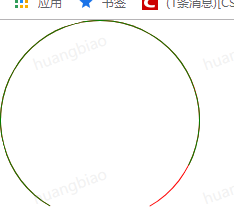
<div>假设预留的空缺是30度</div>
<div class="box circle-container " style="transform: rotate(15deg);">
<div class="half left-circle">
<div class="circle halfcolorful halfrotate"></div>
</div>
<div class="half right-circle">
<div class="circle halfcolorful-transparent" style="transform: rotate(15deg);"></div>
</div>
</div>
<div>进度不到一半的效果</div>
<div class="box circle-container " style="transform: rotate(15deg);">
<div class="half left-circle">
<div class="circle halfcolorful halfrotate"></div>
<div class="circle halfcolorful halfrotate" style="transform: rotate(60deg);"></div>
</div>
<div class="half right-circle">
<div class="circle halfcolorful-transparent" style="transform: rotate(15deg);"></div>
</div>
</div>
<div>圆形恰好一半的效果</div>
<div class="box circle-container " style="transform: rotate(15deg);">
<div class="half left-circle">
<div class="circle halfcolorful halfrotate"></div>
<div class="circle halfcolorful halfrotate" style="transform: rotate(225deg);"></div>
</div>
<div class="half right-circle">
<div class="circle halfcolorful-transparent" style="transform: rotate(15deg);"></div>
</div>
</div>
<div>圆形超过一半的效果</div>
<div class="box circle-container " style="transform: rotate(15deg);">
<div class="half left-circle">
<div class="circle halfcolorful halfrotate"></div>
<div class="circle halfcolorful halfrotate" style="transform: rotate(225deg);"></div>
</div>
<div class="half right-circle">
<div class="circle halfcolorful-transparent" style="transform: rotate(15deg);"></div>
<div class="circle halfcolorful-transparent-active" style="transform: rotate(-110deg);"></div>
</div>
</div>
</body>
</html>
参考别人代码实现
<!DOCTYPE html>
<html>
<head>
<title>圆形未封闭进度条</title>
</head>
<body>
<ul>
<li>画圆通过 border-radius 来控制,即可以控制4条边,分别代表 90 180 270 360 度</li>
<li>设置一个圆形的一半,overflow 为hidden,通过旋转角度内部圆,可以控制显示的角度</li>
<li></li>
<li></li>
<li></li>
</ul>
<div class="container">
<div class="progress">
<div class="wrapper right">
<div class="circle rightcircle-box"></div>
<div class="circle rightcircle" id="right"></div>
</div>
<div class="wrapper left">
<div class="circle leftcircle-box"></div>
<div class="circle leftcircle" id="left"></div>
</div>
</div>
<div class="input">
<input type="text" id="num">
<button id="btn">点击</button>
</div>
<p id="score"></p>
</div>
<script type="text/javascript">
function circleOfScore(index) {
var score = index ? index : 0;
var right = 100 * 180 / 270;
var left = 100 - right;
var rightDeg;
var leftDeg;
var rightCircle = document.getElementById("right");
var leftCircle = document.getElementById("left");
var scorenum = document.getElementById("score");
scorenum.innerHTML = index;
if (score <= right) {
rightDeg = score / right * 180 - 135;
leftDeg = -135;
} else if (score < 100) {
rightDeg = 45;
leftDeg = (score - right) / 100 * 135 - 135;
} else {
rightDeg = 45;
leftDeg = -75;
}
rightCircle.style.transform = 'rotate(' + rightDeg + 'deg)';
leftCircle.style.transform = 'rotate(' + leftDeg + 'deg)';
}
var btn = document.getElementById("btn");
btn.onclick = function() {
var num = document.getElementById("num").value;
circleOfScore(num);
}
</script>
<style type="text/css">
.container {
width: 475px;
height: 600px;
}
.progress {
position: relative;
width: 400px;
height: 400px;
bottom: -40px;
top: 206px;
left: 268px;
transform: rotate(-120deg);
}
.progress .wrapper {
width: 200px;
height: 400px;
position: absolute;
top: 0;
overflow: hidden;
}
.progress .left {
left: 0;
}
.progress .right {
right: 0;
}
.progress .circle {
width: 384px;
height: 384px;
border: 8px solid transparent;
border-radius: 50%;
position: absolute;
top: 0;
transform: rotate(-135deg);
}
.progress .rightcircle-box {
border-top: 8px solid #99edd1;
border-right: 8px solid #99edd1;
border-bottom: 8px solid transparent;
border-left: 8px solid transparent;
right: 0;
transform: rotate(45deg);
}
.progress .leftcircle-box {
border-bottom: 8px solid #99edd1;
border-left: 8px solid #99edd1;
border-top: 8px solid transparent;
border-right: 8px solid transparent;
left: 0;
transform: rotate(-75deg);
}
.progress .rightcircle {
border-top: 8px solid yellow;
border-right: 8px solid yellow;
animation: mymove 5s infinite;
right: 0;
}
.progress .leftcircle {
border-bottom: 8px solid yellow;
border-left: 8px solid yellow;
left: 0;
}
p {
position: absolute;
z-index: 3;
top: 257px;
left: 240px;
width: 475px;
font-size: 81px;
text-align: center;
}
.input {
position: absolute;
top: 560px;
left: 405px;
}
.input input {
width: 100px;
height: 60px;
font-size: 40px;
}
.input button {
height: 50px;
width: 80px;
}
</style>
</body>
</html>
改成Vue的实现
<template>
<div class="circle-progress circle-container" :style="getCompCircleStyle()">
<div class="circle-progress__half left">
<div class="subcircle" :style="getLeftSubCircleUnactiveStyle()"></div>
<div class="subcircle active" :style="getLeftSubCircleActiveStyle(progress)"></div>
</div>
<div class="circle-progress__half right">
<div class="subcircle" :style="getRightSubCircleUnactiveStyle()"></div>
<div class="subcircle active" :style="getRightSubCircleActiveStyle(progress)"></div>
</div>
</div>
</template>
<script>
export default {
name: 'Hello',
data () {
return {
reduceDeg: 60,
progress: 89,
onePercentDeg: 0
}
},
methods: {
getOnePercentDeg: function () {
this.onePercentDeg = (360 - this.reduceDeg) / 100
return this.onePercentDeg
},
getLeftSubCircleActiveStyle: function (percent) {
let zeroDeg = 45 - 180
let oneDeg = this.getOnePercentDeg()
let deg = percent * oneDeg
if (deg >= 180) {
deg = 180
}
return `transform: rotate(${deg + zeroDeg}deg);`
},
getLeftSubCircleUnactiveStyle: function () {
let halfDeg = 45
return `transform: rotate(${halfDeg}deg);`
},
getRightSubCircleActiveStyle: function (percent) {
let defaultDeg = 45
let oneDeg = this.getOnePercentDeg()
let deg = percent * oneDeg
if (deg >= 180) {
deg = deg - 180
} else {
deg = 0
}
return `transform: rotate(${deg + defaultDeg}deg);`
},
getRightSubCircleUnactiveStyle: function () {
let deg = 45 + 180 - this.reduceDeg
return `transform: rotate(${deg}deg);`
},
getCompCircleStyle: function () {
let deg = this.reduceDeg / 2
return `transform: rotate(${deg}deg);`
}
},
computed: {
topContainerStyle: function () {
console.log(this.reduceDeg)
return `transform: rotate(${this.reduceDeg}deg);`
}
}
}
</script>
<style lang="scss" scoped>
$squarelength: 200px;
$activeColor: green;
$unactiveColor: red;
.circle-progress {
position: relative;
height: $squarelength;
width: $squarelength;
.circle {
border-radius: 50%;
height: $squarelength;
width: $squarelength;
border: 1px solid #722133;
}
&__half {
height: $squarelength;
width: calc($squarelength / 2);
overflow: hidden;
position: absolute;
top: 0;
&.left{
height: 200px;
width: 100px;
position: absolute;
top: 0;
left: 0;
.subcircle{
position: absolute;
top: 0;
height: $squarelength;
width: $squarelength;
border-top: 1px solid transparent;
border-right: 1px solid transparent;
border-bottom: 1px solid $unactiveColor;
border-left: 1px solid $unactiveColor;
border-radius: 50%;
transform: rotate(45deg);
&.active{
position: absolute;
top: 0;
height: $squarelength;
width: $squarelength;
border-top: 1px solid transparent;
border-right: 1px solid transparent;
border-bottom: 1px solid $activeColor;
border-left: 1px solid $activeColor;
border-radius: 50%;
transform: rotate(225deg);
}
}
}
&.right{
height: 200px;
width: 100px;
position: absolute;
top: 0;
right: 0;
.subcircle{
position: absolute;
top: 0;
right: 0;
height: $squarelength;
width: $squarelength;
border-top: 1px solid transparent;
border-right: 1px solid transparent;
border-bottom: 1px solid $unactiveColor;
border-left: 1px solid $unactiveColor;
border-radius: 50%;
transform: rotate(135deg);
&.active{
position: absolute;
top: 0;
height: $squarelength;
width: $squarelength;
border-top: 1px solid transparent;
border-right: 1px solid transparent;
border-bottom: 1px solid $activeColor;
border-left: 1px solid $activeColor;
border-radius: 50%;
transform: rotate(225deg);
}
}
}
}
}
</style>


 1715
1715


 被折叠的 条评论
为什么被折叠?
被折叠的 条评论
为什么被折叠?
 到【灌水乐园】发言


