


1.Fluid Grid System
the obvious difference is that ,the fluid grid system uses percentages instead of pixels for column widths.
It has the same responsive capabilities as our fixed grid system, ensuring proper proportions for key screen resolutions and devices. You can make any row “fluid” by changing .row to .row-fluid. The column classes stay exactly the same, making it easy to flip between fixed and fluid grids. To offset, you operate in the same way as the fixed grid system—add .offset* to any column to shift by your desired number of columns:
<div class="row-fluid">
<div class="span4">...</div>
<div class="span8">...</div>
</div>
<div class="row-fluid">
<div class="span4">...</div>
<div class="span4 offset2">...</div>
</div>
Nesting a fluid grid is a little different.Since we are using percentages, each .row resets the column count to 12. For example, if you were inside a .span8, instead of
two .span4 elements to divide the content in half, you would use two .span6 divs .This is the case for responsive content, as we want the content to fill 100% of the container:
<div class="row-fluid">
<div class="span8">
<div class="row">
<div class="span6">...</div>
<div class="span6">...</div>
</div>
</div>
</div>
2.Container Layouts
To add a fixed-width, centered layout to your page, simply wrap the content in <div class="container">...</div>.If you would like to use a fluid layout but want to wrap
everything in a container, use the following: <div class="container-fluid">...</div>. Using a fluid layout is great when you are building applications, administration
screens, and other related projects.
3.Responsive Design
To turn on the responsive features of Bootstrap, you need to add a <meta> tag to the <head> of your web page. If you haven’t downloaded the compiled source, you will also
need to add the responsive CSS file. An example of required files looks like this:
<!DOCTYPE html>
<html>
<head>
<title>My amazing Bootstrap site!</title>
<meta name="viewport" content="width=device-width,
initial-scale=1.0">
<link href="/css/bootstrap.css" rel="stylesheet">
<link href="/css/bootstrap-responsive.css" rel="stylesheet">
</head>
If you get started and find that the Bootstrap responsive features aren’tworking, make sure that you have these tags. The responsive features aren’t added by default at this time because not everything needs to be responsive. Instead of encouraging developers to remove this feature, the authors of Bootstrap decided that it was best to enable it as needed.
4.What Is Responsive Design?
Responsive design is a method for taking all of the existing content that is on the page and optimizing it for the device that is viewing it. For example, the desktop not only
gets the normal version of the website, but it might also get a widescreen layout, optimized for the larger displays that many people have attached to their computers. Tablets get an optimized layout, taking advantage of their portrait or landscape layouts. And then with phones, you can target their much narrower width. To target these different
widths, Bootstrap uses CSS media queries to measure the width of the browser viewport and then, using conditionals, changes which parts of the stylesheets are loaded. Using the width of the browser viewport, Bootstrap can then optimize the content using a combination of ratios or widths, but it mostly relies on min-width and max-width
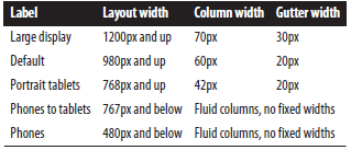
properties. At the core, Bootstrap supports five different layouts, each relying on CSS media queries.The largest layout has columns that are 70 pixels wide, contrasting with the 60 pixels of the normal layout. The tablet layout brings the columns to 42 pixels wide, and when narrower than that, each column goes fluid, meaning the columns are stacked vertically and each column is the full width of the device.


 被折叠的 条评论
为什么被折叠?
被折叠的 条评论
为什么被折叠?
 到【灌水乐园】发言


