


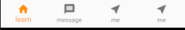
普通tab栏
效果图:
  int _selectIndex = 0;
  static const TextStyle optionStyle =
      TextStyle(fontSize: 30, fontWeight: FontWeight.bold);
  static const List<Widget> _widgetOptions = <Widget>[
    HomeFragmentPage(),
    HomeFragmentPage(),
    HomeFragmentPage(),
    MePage(),
  ];

  @override
  Widget build(BuildContext context) {
    return Scaffold(
      body: Center(
        child: _widgetOptions.elementAt(_selectIndex),
      ),
        bottomNavigationBar: BottomAppBar(
        color: Colors.lightBlue, //底部工具栏的颜色。
        //设置底栏的形状,一般使用这个都是为了和floatingActionButton融合,
        // 所以使用的值都是CircularNotchedRectangle(),有缺口的圆形矩形。
        shape: CircularNotchedRectangle(),

        child: BottomNavigationBar(
          type: BottomNavigationBarType.fixed,
          items: const <BottomNavigationBarItem>[
            BottomNavigationBarItem(
                icon: Icon(Icons.home), title: Text("learn")),
            BottomNavigationBarItem(
                icon: Icon(Icons.message), title: Text("message")),
            BottomNavigationBarItem(
                icon: Icon(Icons.near_me), title: Text("me")),
            BottomNavigationBarItem(
                icon: Icon(Icons.near_me), title: Text("me"))
          ],
          currentIndex: _selectIndex,
          selectedItemColor: Colors.amber[800],
          onTap: onItemTapped,
        ),
      ),
    );
  }

  void onItemTapped(int index) {
    setState(() {
      _selectIndex = index;
    });
  }
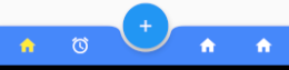
底部凹型tab栏
这种tab也可以用官方的组件.
效果图:
  int _selectIndex = 0;
  static const TextStyle optionStyle =
      TextStyle(fontSize: 30, fontWeight: FontWeight.bold);
  static const List<Widget> _widgetOptions = <Widget>[
    HomeFragmentPage(),
    HomeFragmentPage(),
    HomeFragmentPage(),
    MePage(),
  ];

  @override
  Widget build(BuildContext context) {
    return Scaffold(
      body: Center(
        child: _widgetOptions.elementAt(_selectIndex),
      ),
      ///底部tab中间的突起的按钮
      floatingActionButton: FloatingActionButton(
          onPressed: () {
            Toasts.show("点击了");
          },
          child: Icon(
            Icons.add,
            color: Colors.white,
          )),
      floatingActionButtonLocation: FloatingActionButtonLocation.centerDocked,
       ///BottomAppBar 不规则底部工具栏 ----4个tab
      ///另外一种凹下去的tab
      bottomNavigationBar: BottomAppBar(
        color: Colours.app_main, //底部工具栏的颜色。
        //设置底栏的形状,一般使用这个都是为了和floatingActionButton融合,
        // 所以使用的值都是CircularNotchedRectangle(),有缺口的圆形矩形。
        shape: CircularNotchedRectangle(),
        child: Row(
          //里边可以放置大部分Widget,让我们随心所欲的设计底栏
          mainAxisAlignment: MainAxisAlignment.spaceAround,
          mainAxisSize: MainAxisSize.max,
          children: <Widget>[
            IconButton(
              icon: Icon(
                Icons.home,
                color: _selectIndex == 0 ? Colors.yellow : Colors.white,
              ),
              color: Colors.white,
              onPressed: () {
                setState(() {
                  _selectIndex = 0;
                });
              },
            ),
            IconButton(
              padding: const EdgeInsets.fromLTRB(8.0, 8.0, 100.0, 8.0),
              icon: Icon(
                Icons.access_alarms,
                color: _selectIndex == 1 ? Colors.yellow : Colors.white,
              ),
              color: Colors.white,
              onPressed: () {
                setState(() {
                  _selectIndex = 1;
                });
              },
            ),
            IconButton(
              icon: Icon(
                Icons.home,
                color: _selectIndex == 2 ? Colors.yellow : Colors.white,
              ),
              color: Colors.white,
              onPressed: () {
                setState(() {
                  _selectIndex = 2;
                });
              },
            ),
            IconButton(
              icon: Icon(
                Icons.home,
                color: _selectIndex == 3 ? Colors.yellow : Colors.white,
              ),
              color: Colors.white,
              onPressed: () {
                setState(() {
                  _selectIndex = 3;
                });
              },
            ),
          ],
        ),
      ),
    );
  }
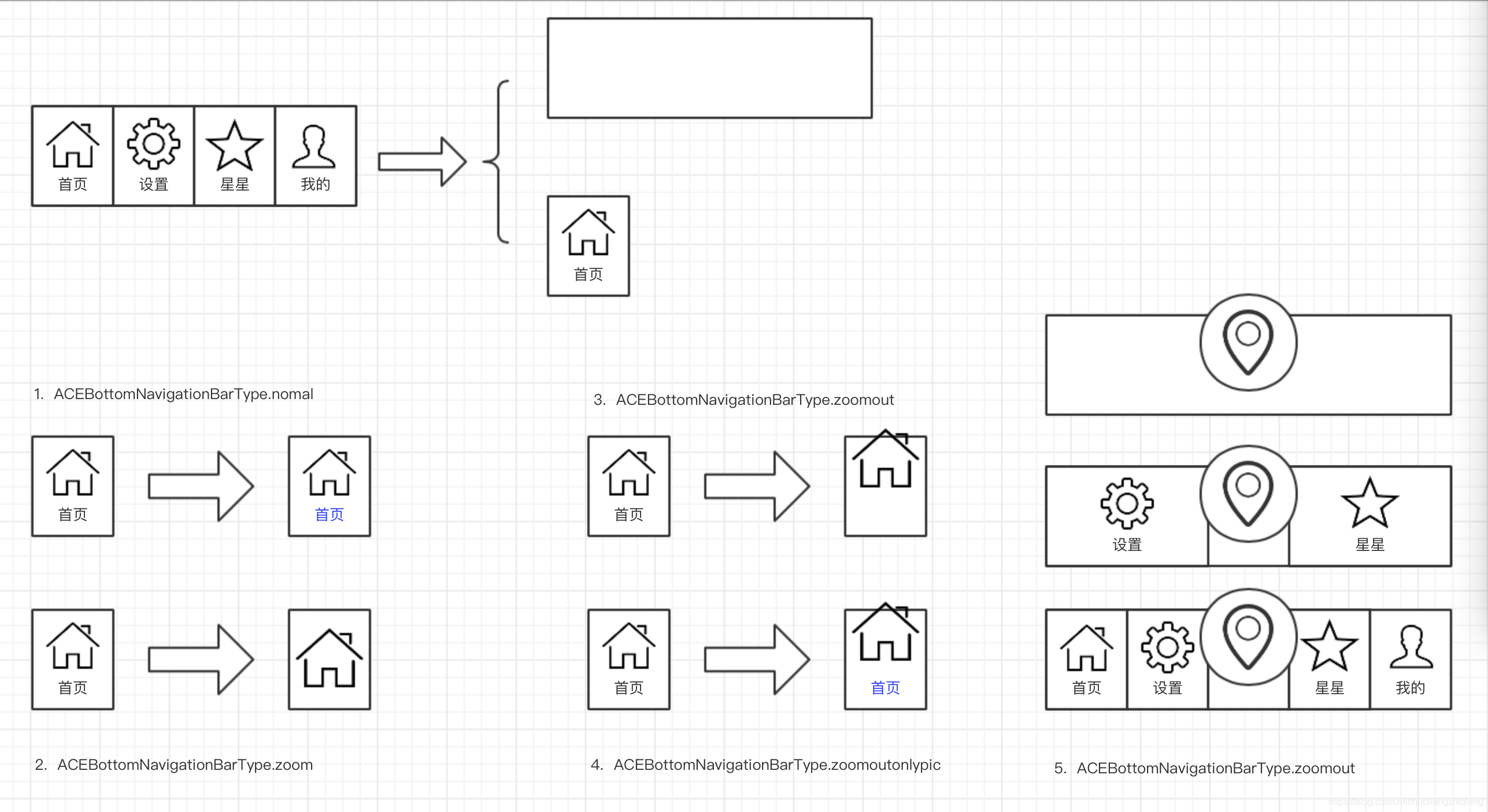
底部凸型tab栏
需要使用第三方库ace_bottom_navigation_bar.
效果图:
通过设置ACEBottomNavigationBarType改变tab的类型.
具体说明和例子可参考:
https://pub.dev/packages/ace_bottom_navigation_bar#-readme-tab-


 2万+
2万+


 被折叠的 条评论
为什么被折叠?
被折叠的 条评论
为什么被折叠?
 到【灌水乐园】发言


