


转自:https://www.cnblogs.com/xiaofeixiang/p/5036154.html
简单的实现了一下横向和纵向时间轴,可以简单的看下一下实现的效果:
Html代码:
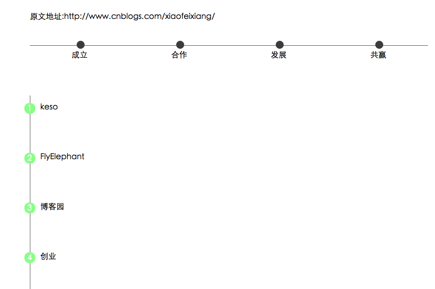
<div class="container">
    <p>原文地址:http://www.cnblogs.com/xiaofeixiang/</p>
    <ul class="time-horizontal">
        <li><b></b>成立</li>
        <li><b></b>合作</li>
        <li><b></b>发展</li>
        <li><b></b>共赢</li>
    </ul>
</div>
<div class="container">
    <ul class="time-vertical">
        <li><b></b><span>1</span><a href="javascript:void(0)">keso</a></li>
        <li><b></b><span>2</span><a href="javascript:void(0)">FlyElephant</a></li>
        <li><b></b><span>3</span><a href="javascript:void(0)">博客园</a></li>
        <li><b></b><span>4</span><a href="javascript:void(0)">创业</a></li>
    </ul>
</div>
/*横向时间轴*/
.time-horizontal {
    list-style-type: none;
    border-top: 1px solid #707070;
    max-width: 800px;
    padding: 0px;
    margin: 0px;
}

.time-horizontal li {
    float: left;
    position: relative;
    text-align: center;
    width: 25%;
    padding-top: 10px;
}

.time-horizontal li b:before {
    content: '';
    position: absolute;
    top: -10px;
    left: 47%;
    width: 12px;
    height: 12px;
    border: 2px solid #4c4c4c;
    border-radius: 8px;
    background: #4c4c4c;
}
/*纵向时间轴*/
.time-vertical {
    list-style-type: none;
    border-left: 1px solid #707070;
    padding: 0px;
    height: 400px;
}

.time-vertical li {
    height: 100px;
    position: relative;
}

.time-vertical li a {
    display: inline-block;
    margin-left: 20px;
    margin-top: 15px;
    text-decoration: none;
    color: #000;
}

.time-vertical li b:before {
    content: '';
    position: absolute;
    top: 15px;
    left: -12px;
    width: 18px;
    height: 18px;
    border: 2px solid #98FB98;
    border-radius: 10px;
    background: #98FB98;
}

.time-vertical li span {
    position: absolute;
    color: #fff;
    top: 18px;
    left: -6px;
}


 603
603


 被折叠的 条评论
为什么被折叠?
被折叠的 条评论
为什么被折叠?
 到【灌水乐园】发言


