


W3C定义的盒模式如下:
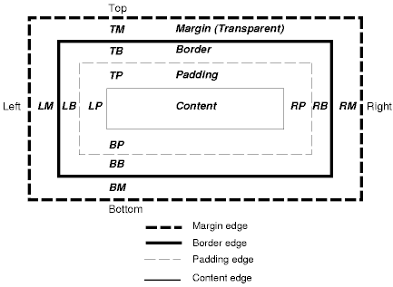
width和height定义的是Content部分的宽度和高度,padding border margin的宽度依次加在外面。背景会填充padding和content部分。
但是由于浏览器设计上的问题,不同浏览器显示效果会有些不同。
左右Margin加倍的问题
当box为float时,IE6中box左右的margin会加倍 比如:
< html xmlns ="http://www.w3.org/1999/xhtml" >
< head >
< meta http-equiv ="Content-Type" c />
< title > Untitled Document </ title >
< style >
.outer {
width : 500px ;
height : 200px ;
background : #000 ;
}
.inner {
float : left ;
width : 200px ;
height : 100px ;
margin : 5px ;
background : #fff ;
}
</ style >
</ head >
< body >
< div class ="outer" >
< div class ="inner" ></ div >
< div class ="inner" ></ div >
</ div >
</ body >
</ html >
左面的inner的左面margin明显大于5px。
这时候,定义inner的display属性为inline。
外层box自动计算高度的问题
根据W3C定义,没有float属性的外层box不会自动计算高度,要计算高度,必须在内层最后一个box加入clear:both。
Opera、netscape、mozilla等不会计算外层box高度,但是微软ie6会自动计算外层高度。比如:
< html xmlns ="http://www.w3.org/1999/xhtml" >
< head >
< meta http-equiv ="Content-Type" c />
< title > Untitled Document </ title >
< style >
.outer {
width : 600px ;
background : #000 ;
}
.inner1 {
float : left ;
width : 200px ;
height : 100px ;
margin : 5px ;
background : red ;
}
.inner2 {
float : left ;
width : 200px ;
height : 100px ;
margin : 5px ;
background : yellow ;
}
</ style >
</ head >
< body >
< div class ="outer" >
< div class ="inner1" ></ div >
< div class ="inner2" ></ div >
</ div >
</ body >
</ html >
上面的代码在ie中有黑色的背景,但是没有正确的计算上下的margin,在inner2下面加上一个包含clear:both属性的div后,可以正确计算margin。但是firefox中仍然没有黑色背景,通常的解决办法是定义一下clear:both这个div的高度,或者插入全角空格,这样就必须增加额外的高度。网上一种比较好的解决办法是在外层div中加入overflow属性,同时使用clear:both,这样就不会增加额外的高度了。如下:
< html xmlns ="http://www.w3.org/1999/xhtml" >
< head >
< meta http-equiv ="Content-Type" c />
< title > Untitled Document </ title >
< style >
.outer {
width : 600px ;
background : #000 ;
overflow : auto ;
}
.inner1 {
display : inline ;
float : left ;
width : 200px ;
height : 100px ;
margin : 5px ;
background : red ;
}
.inner2 {
display : inline ;
float : left ;
width : 200px ;
height : 100px ;
margin : 5px ;
background : yellow ;
}
.clear {
clear : both ;
}
</ style >
</ head > < body >
< div class ="outer" >
< div class ="inner1" ></ div >
< div class ="inner2" ></ div >
< div class ="clear" ></ div >
</ div >
</ body >
</ html >
因此,外层css要定义overflow属性,内层最后要加上clear属性。
居中问题
需要定义元素的宽,并且定义横向的margin,如果你的布局包含在一个层(容器)中,就象这样:
你可以这样定义使它横向居中:
width : 760px ; /* 修改为你的层的宽度 */
margin : 0 auto ;
}
但是IE5/Win不能正确显示这个定义,我们采用一个非常有用的技巧来解决:在外层用text-align属性。就象这样:
#outer {
text-align : center ;
}
#wrap {
width : 760px ; /* 修改为你的层的宽度 */
margin : 0 auto ;
text-align : left ;
}
第一个#outer的text-align:center; 规则定义IE5/Win中#outer的所有元素居中(其他浏览器只是将文字居中) ,第二个text-align:left;是将#warp中的文字居左。
因此,在有居中元素的css中,外层css要定义text-align:center属性,内层居中用margin:x auto x auto定义,并重新定义text-align。


 3万+
3万+


 被折叠的 条评论
为什么被折叠?
被折叠的 条评论
为什么被折叠?
 到【灌水乐园】发言


