


利用CSS3实现精美按钮,效果如下图所示,也可以狠狠点击这里。前端开发whqet,关注前端开发技术 分享网页相关资源。
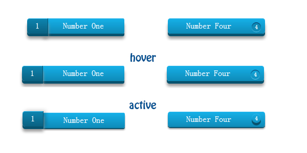
实现两种风格的按钮,主要利用box-shadow阴影实现3d风格的按钮,同时利用css的counter实现计数。
html结构非常简单,详细代码如下。
<div class="buttonContainer">
	<a href="#" class="btn">Number One</a>
	<a href="#" class="btn">Number Two</a>
	<a href="#" class="btn">Number Three</a>
	<a href="#" class="btnn">Number Four</a>
	<a href="#" class="btnn">Number Five</a>
	<a href="#" class="btnn">Number Six</a>
</div>效果一的实现
.btn{
	display: block;
	position: relative;
	width: 160px;
	height: 30px;
	line-height: 30px;
	text-align: center;
	background: linear-gradient(bottom, #0E8AB7, #16B1E9);
	margin: 60px;
	border-radius:3px;
	box-shadow: inset 0px 1px 0px #2ab7ec, 0px 5px 0px 0px #07526e, 0px 10px 5px #999;
	user-select:none;
}
.btn:before{
	content: counter(abc);
	width: 40px;
	height: 30px;
	line-height: 30px;
	position: absolute;
	left: -30px;
	top: 0;
	background: linear-gradient(bottom, #0A6181, #0D85B1);
	border-right:solid 1px #07526e;
	border-radius: 5px 0 0 5px;
	box-shadow: inset 0px 1px 0px #2ab7ec, 0px 5px 0px 0px #07526e, 0px 10px 5px #999;
	transition: left 1s ease;
}
.btn:hover:before{
	left: -40px;
}
.btn:active{
	top: 3px;
	box-shadow: inset 0px 1px 0px #2ab7ec, 0px 2px 0px 0px #07526e, 0px 4px 2px #999;
}
.btn:active:before{
	top:-3px;
	box-shadow:inset 0px 1px 0px #2ab7ec, 0px 5px 0px 0px #07526e, 0px 10px 5px #999,4px 0 8px rgba(0,0,0,.3);
}
效果二的实现
.btnn{
	display: block;
	position: relative;
	width: 190px;
	height: 30px;
	line-height: 30px;
	text-indent: 36px;
	background: linear-gradient(bottom, #0E8AB7, #16B1E9);
	margin: 60px 0 0 30px;
	border-radius:5px;
	box-shadow: inset 0px 1px 0px #2ab7ec, 0px 5px 0px 0px #07526e, 0px 10px 5px #999;
	user-select:none;
}
.btnn:before{
	content: counter(abc);
	color: #fff;
	width: 18px;
	height: 18px;
	text-indent: 0;
	text-align: center;
	line-height: 18px;
	font-size: 12px;
	border-radius:50%;
	position: absolute;
	right: 8px;
	top: 8px;
	box-shadow: inset 0px 1px 0px #052756, 0px 1px 0px #60c9f0;
	background-color: #0E8AB7;
	transition: background-color .5s ease,box-shadow .5s ease;
}
.btnn:hover:before{
	background-color: transparent;
}
.btnn:active{
	top: 3px;
	box-shadow: inset 0px 1px 0px #2ab7ec, 0px 2px 0px 0px #07526e, 0px 4px 2px #999;
}
.btnn:active:before{
	top:4px;
	box-shadow:inset 0px 1px 0px #2ab7ec, 0px 5px 0px 0px #07526e;
}资源推荐


 扫一扫
扫一扫
 147
147

 被折叠的 条评论
为什么被折叠?
被折叠的 条评论
为什么被折叠?
 到【灌水乐园】发言


