


可视化的目的之一是可视化,二是可视化要尽可能的美观大方
- 善用
alpha(透明度)选项,例如取,alpha=0.4*
- 善用
bar:条状
在一条plot语句中绘制多条曲线
此时无法分别指定color,marker以及legend了,如需区别对待、精细绘图,还是分别调用各自的plot为最好,和matlab不同的是,不同的plot之间自带hold(保持属性),除非开辟新的figure。分别指定各自的图例(legend)可以使用plt.legend()(如下所示):
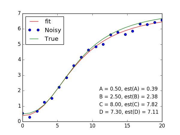
plt.plot(x, peval(x, plesq[0]), x, y_meas, 'o', x, y_true)

plt.legend(['Fit', 'Noisy', 'True'], loc='upper left')- 1
- 2
- 3
figsize
plt.figure(num=None, figsize=(8, 6), dpi=80, facecolor=’w’, edgecolor=’k’)
# figsize=(8, 6),比例一般在4:3
# figsize=(width, height)
plt.figure(figsize=(8, 6))  # default
plt.figure(figsize=(12, 9))
plt.figure(figsize=(4, 3))
plt.figure(figsize=(6, 4.5))

# 当然有时表达一种横向展开的形式
plt.figure(figsize=(10, 5))- 1
- 2
- 3
- 4
- 5
- 6
- 7
- 8
使用Latex
$\sigma$,以字符串形式,置于$$环境中;以字符串形式组织LaTex公式时,内部的
\是有转义的意味\出现的位置换成\\,'$\sigma$'->'$\\sigma$''$\sigma$'换成r'$\sigma$'
多行多列的subplots
fig, ax = plt.subplots(nrows=1, ncols=2, figsize=(8, 4))
ax[0].plot(...)
ax[0].set_xlabel(...)
ax[0].set_title(...)

ax[1].plot(...)
ax[1].set_xlabel(...)
...- 1
- 2
- 3
- 4
- 5
- 6
- 7
- 8
fig, (ax1, ax2, ax3) = plt.subplots(3, 1, sharex=True)- 1
更一般的做法(也是matlab的风格)是这样的:
fig = plt.figure()          # 创建一个figure对象,底下的一切显示均在此figure上完成

plt.subplot(121)
plt.imshow(img1)
plt.subplot(122)
plt.imshow(img2)

plt.show()

# 当然放在一个range里边
for i in range(ndim):
    plt.subplot(ndim//5, 5, i+1)
    plt.hist()
- 1
- 2
- 3
- 4
- 5
- 6
- 7
- 8
- 9
- 10
- 11
- 12
- 13
- 14
可选参数(optional parameter)
| 功能 | api | 说明 |
|---|---|---|
| marker | o, x, ^, v, s(square) | |
| markersize/ms | ||
| linestyle/ls | -(solid), -.(dashdot),:(dotted), --(dashed) | |
| linewidth/lw | 3 | |
| color/c | ||
| label |
使用plot散列点(此时不能使用ls:表示线型的参数了):
plt.plot(x, y, '.k', alpha=.1)
# plt.plot(x, y, ',k', alpha=.1)- 1
- 2
使用plot关于一些点的位置上画圆或特殊形状:
plt.plot(x[outliers], y[outliers], 'o', ms=20, mfc='none', mec='red')
                    # mfc: marker face color
# mec: marker edge color - 1
- 2
- 3
常用api
| 功能 | api | 说明 |
|---|---|---|
| 关闭坐标轴刻度 | plt.xticks([]) plt.yticks([]) | 以tuple或者list为参数 |
| 关闭坐标轴 | plt.axis(‘off’) | |
| 图例的使用 | plt.legend(loc={‘best’, ‘upper left’}, frameon=False) | 也即默认是加框的 |
| 坐标轴的范围 | plt.ylim() plt.xlim() | x1_min, x1_max = x[:, 0].min()-1, x[:, 0].min()+1 x2_min, x2_max = x[:, 1].min()-1, x[:, 1].max()+1 |
| 坐标的刻度 | plt.yscale(‘log’) | |
| 填写文本信息 | plt.text(, , ) | 前两个参数表示坐标 第三个参数对应文本信息 |
| 画水平或者垂线 | plt.axhline() plt.axvline() |
figure的style
>>> import matplotlib.pyplot as plt
>>> plt.style.use('ggplot')- 1
- 2
查看所有可用的styles:
>>> plt.style.available
# 返回一个list- 1
- 2
更多详细信息,参阅 matplotlib官方文档
柱状图
plt.bar(np.array(x)-.4, y)
        # 在一切默认的情况下,减去0.4是平移每一个条形柱的位置
# 可见每一个条形柱的宽度为0.8- 1
- 2
- 3
plt.hist(histtype=”)
histtype={‘bar’, ‘barstacked’, ‘step’, ‘stepfilled’};
optional
default为’bar’
histtype=’step’; 似乎感觉上更道地一点;
errorbar
plt.errorbar(x, y, xerr, yerr, fmt='ok', ecolor='gray', alpha=.5)
                            # fmt='ok',表示的是(x, y)这一坐标位置的显示形式,实心(o)圆点,颜色是黑色
                            # ecolor='gray',表示错误线的颜色
- 1
- 2
- 3
- 4
plt.errorbar(x, y, e, fmt='.k', ecolor='gray', alpha=.4)- 1
有规律的在figure中写东西
规律自然用到循环;
for i, (param, true, est) in enumerate(zip('ABCD', [A, B, C, D], plesq[0])):
    plt.text(10, 3-i*.5, '{} = {:.2f}, est({}) = {:.2f}'.format(param, true, param, est))
# text的前两个参数是需要根据图像的布局反复调整的- 1
- 2
- 3


 653
653

 被折叠的 条评论
为什么被折叠?
被折叠的 条评论
为什么被折叠?
 到【灌水乐园】发言


