


在nilearn库中,提供了两种从fmri数据中提取时间序列的方法,一种基于脑分区(Time-series from a brain parcellation or “MaxProb” atlas),一种基于概率图谱(Time-series from a probabilistic atlas)。参考文章:Varoquaux and Craddock, “Learning and comparing functional connectomes across subjects”, NeuroImage 2013.
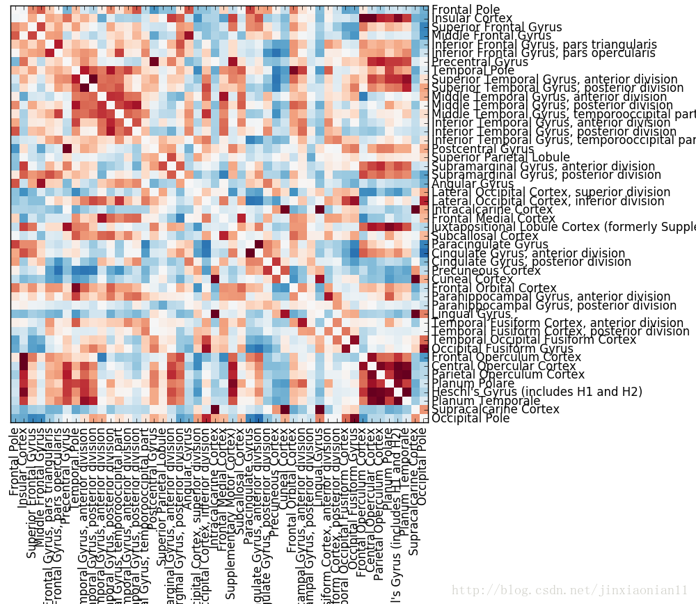
1. 基于大脑分区提取时间序列
(Time-series from a brain parcellation or “MaxProb” atlas)
1.1 一般而言,用“硬分区”定义用于提取信号的分区。人脑分区有很多个版本,可以结合自己的数据和自己的研究目的选取合理的分区图谱,用于自己的研究。
代码:(代码中有详细注释)
# Load fmri image
# Note: functions in learn can accept parameters as: image object or fmri filepath
from nilearn.image import load_img
fMRIData = load_img(r'E:\home\bct_test\NC_01_0001\rs6_f8dGR_w3_rabrat_4D.nii')

# Gain mask
from nilearn import masking
mask = masking.compute_background_mask(fMRIData)

# Download atlas from internet
from nilearn import datasets
dataset = datasets.fetch_atlas_harvard_oxford('cort-maxprob-thr25-2mm')
atlas_filename = dataset.maps
labels = dataset.labels

# Apply atlas to my data
from nilearn.image import resample_to_img
Atlas = resample_to_img(atlas_filename, mask, interpolation='nearest')

# Gain the TimeSeries
from nilearn.input_data import NiftiLabelsMasker
masker = NiftiLabelsMasker(labels_img=Atlas, standardize=True,
                           memory='nilearn_cache', verbose=5)
time_series = masker.fit_transform(fMRIData)

# Extracting times series to build a functional connectome
from nilearn.connectome import ConnectivityMeasure
correlation_measure = ConnectivityMeasure(kind='correlation')
correlation_matrix = correlation_measure.fit_transform([time_series])[0]

# Plot the correlation matrix
import numpy as np
from matplotlib import pyplot as plt
plt.figure(figsize=(10, 10))

# Mask the main diagonal for visualization:
np.fill_diagonal(correlation_matrix, 0)
plt.imshow(correlation_matrix, interpolation="nearest", cmap="RdBu_r",
           vmax=0.8, vmin=-0.8)

# Add labels and adjust margins
x_ticks = plt.xticks(range(len(labels) - 1), labels[1:], rotation=90)
y_ticks = plt.yticks(range(len(labels) - 1), labels[1:])
plt.gca().yaxis.tick_right()
plt.subplots_adjust(left=.01, bottom=.3, top=.99, right=.62)
plt.show()
图形:
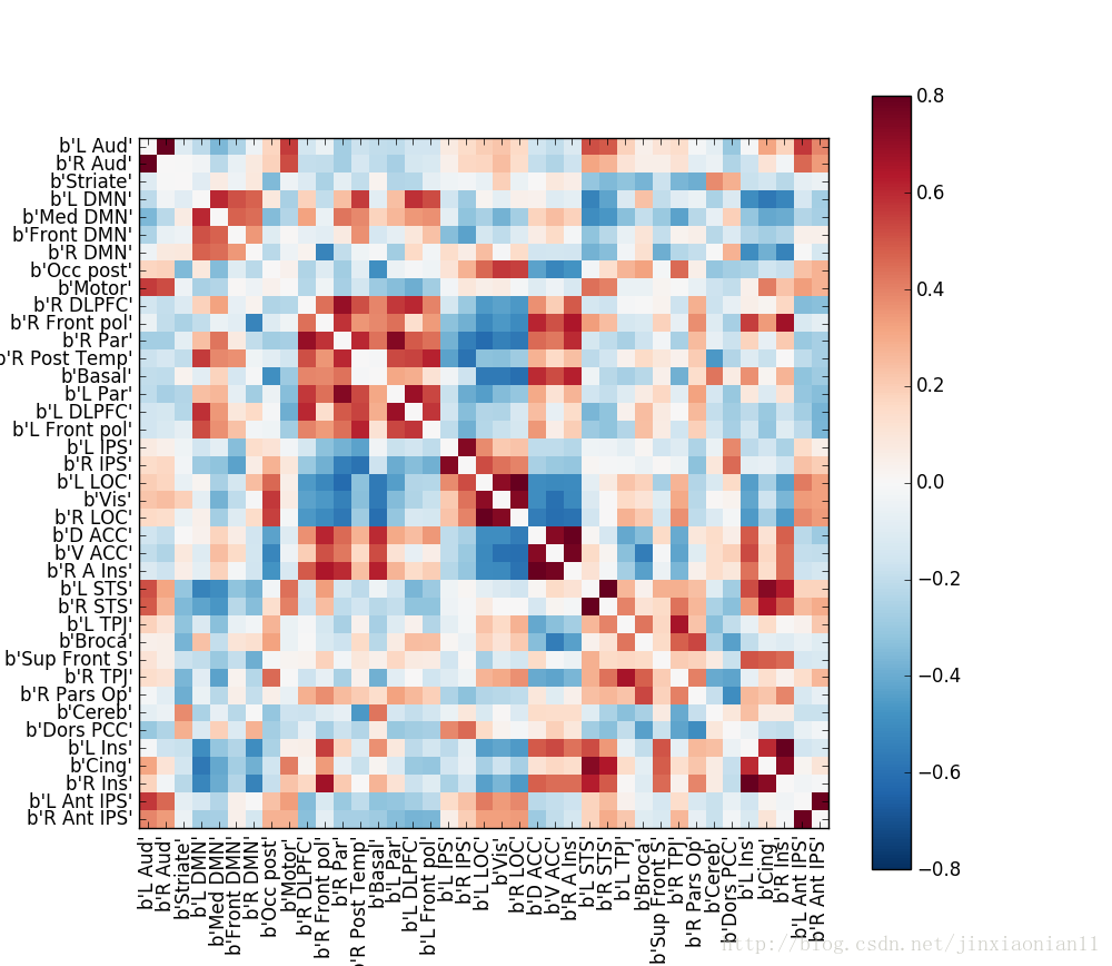
2. 通过概率图谱建立时间序列
通过连续概率图定义的分区能更好的捕获我们对于脑图像中分区边界不完全的知识,这种非常适合静息状态数据分析的图谱的一个实例是MSDL图谱。
在4维的fmri数据中,概率图谱代表的是连续图集。
相比于从脑分区中提取信号的方法,从概率图谱建立时间序列的过程是一样的,只是在nilearn库中选取的类和函数不一样。
代码:
'''
extracting TimeSeries from probabilistic atlas
'''
# Load fmri image
# Note: functions in learn can accept parameters as: image object or fmri filepath
from nilearn.image import load_img
fMRIData = load_img(r'E:\home\bct_test\NC_01_0001\rs6_f8dGR_w3_rabrat_4D.nii')

# Gain mask
from nilearn import masking
mask = masking.compute_background_mask(fMRIData)

# Download atlas from internet
# Retrieve the atlas and the data
from nilearn import datasets
atlas = datasets.fetch_atlas_msdl()
# Loading atlas image stored in 'maps'
atlas_filename = atlas['maps']
# Loading atlas data stored in 'labels'
labels = atlas['labels']

# Apply atlas to my data
from nilearn.image import resample_to_img
Atlas = resample_to_img(atlas_filename, mask, interpolation='continuous')

# Gain the TimeSeries
from nilearn.input_data import NiftiMapsMasker
masker = NiftiMapsMasker(maps_img=Atlas, standardize=True,
                         memory='nilearn_cache', verbose=5)

time_series = masker.fit_transform(fMRIData)

############################################################################
# Build and display a correlation matrix
from nilearn.connectome import ConnectivityMeasure
correlation_measure = ConnectivityMeasure(kind='correlation')
correlation_matrix = correlation_measure.fit_transform([time_series])[0]

# Display the correlation matrix
import numpy as np
from matplotlib import pyplot as plt
plt.figure(figsize=(10, 10))
# Mask out the major diagonal
np.fill_diagonal(correlation_matrix, 0)
plt.imshow(correlation_matrix, interpolation="nearest", cmap="RdBu_r",
           vmax=0.8, vmin=-0.8)
plt.colorbar()
# And display the labels
x_ticks = plt.xticks(range(len(labels)), labels, rotation=90)
y_ticks = plt.yticks(range(len(labels)), labels)

############################################################################
# And now display the corresponding graph
from nilearn import plotting
coords = atlas.region_coords

# We threshold to keep only the 20% of edges with the highest value
# because the graph is very dense
plotting.plot_connectome(correlation_matrix, coords,
                         edge_threshold="80%", colorbar=True)

plotting.show()
输出图形:
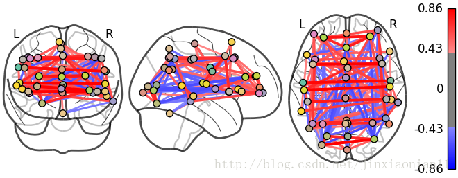
3. 功能连接体:一个相互作用的图
类似于相关矩阵的矩形矩阵,都可以看做“图”:节点和边的集合,节点代表脑区,边代表节点之间相关关系,这种图叫做功能连接体。
在nilearn库中,提供了功能连接体可视化的方法,可以直接调用相应函数将图画出来(第二个例子)。


 6892
6892


 被折叠的 条评论
为什么被折叠?
被折叠的 条评论
为什么被折叠?
 到【灌水乐园】发言


