


【声明】
欢迎转载,但请保留文章原始出处→_→
文章来源:http://www.cnblogs.com/smyhvae/p/4372222.html
Android常见布局有下面几种:
- LinearLayout:线性布局。所有的控件都是串在一条线上的。
- RelativeLayout:相对布局。所有的控件的位置,都是相对于父控件的。
- FrameLayout:帧布局。FrameLayout布局中的控件都是一层一层的。帧布局每次添加的控件都显示在最上面,最后显示在界面上的是最后添加的一个控件。
- TableLayout:表格布局。表格布局可以实现的.一般 可以使用 线性布局实现。
- AbsoluteLayout:绝对布局。已经是废弃的状态,很少用了。
线性布局 LinearLayout 属性详解
orientation:属性是指定线性布局的排列方向。
- horizontal 水平。线性布局默认的朝向是水平的。
- vertical 垂直
例如:
android:orientation="vertical"
gravity:指定当前控件里面的内容容显示位置。(四大layout中均可使用)
- left 左边
- right 右边
- top 上边
- bottom 底边
例如:
android:gravity="center"
gravity中的属性可以组合使用。例如:
android:gravity="bottom|right"
layout_gravity:指定当前控件在父元素的位置。(只在 LinearLayout 和 FrameLayout 中有效)
- left 左边
- right 右边
- top 上边
- bottom 底边
- center
- center_horizontal
- center_vertical
例如:
android:layout_gravity="center"
另外,需要提示的是,对于 LinearLayout :
- 当 android:orientation="vertical" 时, 只有水平方向的设置才起作用,垂直方向的设置不起作用。即:left,right,center_horizontal 是生效的。(top,bottom,center_vertical 无效)
- 当 android:orientation="horizontal" 时, 只有垂直方向的设置才起作用,水平方向的设置不起作用。即:top,bottom,center_vertical 是生效的。(left,right,center_horizontal 无效)
layout_weightSum:把线性布局中剩余空间分成N份。
layout_weight:用于分配剩余空间的比例。【重要】
例如,在线性布局中,当空间处于horizontal水平放置时,如果设置两个控件的width属性和layout_weight属性时,就可以平分宽度:
android:layout_width="0dp"
android:layout_weight="1"
visibility:是控制布局是否显示。
- visible 显示
- invisible 不显示但占空间
- gone 隐藏
例如:
android:visibility="gone"
RelativeLayout 相对布局 属性详解
一、常用属性:
1、第一类:属性值为true或false
android:layout_centerHrizontal 相对于父元素水平居中
android:layout_centerVertical 相对于父元素垂直居中
android:layout_centerInparent 相对于父元素完全居中
android:layout_alignParentBottom 贴紧父元素的下边缘(align:对齐)
android:layout_alignParentLeft 贴紧父元素的左边缘
android:layout_alignParentRight 贴紧父元素的右边缘(默认值为false)
android:layout_alignParentTop 贴紧父元素的上边缘
android:layout_alignWithParentIfMissing 如果对应的兄弟元素找不到的话就以父元素做参照物
2、第二类:属性值必须为id的引用名"@id/id-name"
android:layout_below 在某元素的下方
android:layout_above 在某元素的的上方
android:layout_toLeftOf 在某元素的左边
android:layout_toRightOf 在某元素的右边
android:layout_alignTop 本元素的上边缘和某元素的的上边缘对齐
android:layout_alignLeft 本元素的左边缘和某元素的的左边缘对齐
android:layout_alignBottom 本元素的下边缘和某元素的的下边缘对齐
android:layout_alignRight 本元素的右边缘和某元素的的右边缘对齐
3、第三类:属性值为具体的像素值,如30dp(外边距和内边距)
android:layout_margin 外边距(margin:边缘)
android:layout_marginTop 上外边距
android:layout_marginBottom 下外边距
android:layout_marginLeft 左外边距
android:layout_marginRight 右外边距
android:padding 内边距(padding:填充)
android:paddingTop 上内边距
android:paddingBottom 下内边距
android:paddingLeft 左内边距
android:paddingRight 右内边距
4、第四类:android4.2新增属性
android:layout_alignStart 两个控件开始对齐
android:layout_alignEnd 两个控件结束对齐
android:layout_alignParentStart 子控件和父控件开始对齐
android:layout_alignParentEnd 子控件和父控件结束对齐
注:所有控件,默认处在左上角。
二、外边距和内边距的解释:
来看下面这张图:

例如:当在布局文件中,
将第一个TextView加入如下代码:(注:margin的意思是“边缘”)
android:layout_margin="30dp"
将第二个TextView加入如下代码:(注:padding的意思是“填充”)
android:padding="20dp"
最终效果如下:

三、对齐至控件的基准线:
android:layout_alignBaseline 与某元素的基准线对齐
什么是基准线?
基准线:为了保证印刷字母的整齐而划定的线。

上图中的第三条线就是基准线。
完整版代码举例:

 1 <RelativeLayout xmlns:android="http://schemas.android.com/apk/res/android"
 2     xmlns:tools="http://schemas.android.com/tools"
 3     android:layout_width="match_parent"
 4     android:layout_height="match_parent"  >
 5     <TextView
 6         android:id="@+id/tv1"
 7         android:layout_width="wrap_content"
 8         android:layout_height="wrap_content"
 9         android:background="#FFE4E1"
10         android:textSize="30dp"
11         android:text="shengmingyihao" />
12
13      <TextView
14         android:id="@+id/tv2"
15         android:layout_width="wrap_content"
16         android:layout_height="wrap_content"
17         android:background="#D3D3D3"
18         android:layout_toRightOf="@id/firstView"
19         android:layout_alignBaseline="@id/tv1"
20         android:text="smyhvae" />
21 </RelativeLayout>
上方代码的第19行就是将tv2对齐至tv1的基准线。
显示效果如下:

上图中绿色的虚线即为基准线。
三、其他属性:
1、EditText控件:
android:hint 设置EditText为空时输入框内的提示信息。
2、android:gravity
android:gravity 该属性是对该view里面的内容的限定。比如一个button里面的text,你可以设置该text在view的靠左、靠右等位置。
以button为例:
android:gravity="right" 可以让button里面的文字靠右
android:gravity="top" 可以让编辑框EditText的光标置于左上方
3、android:gravity和android:layout_gravity区别:
- gravity 控制当前控件里面的内容显示区域
- 线性布局中的layout_gravity 当前控件在父元素的位置
比如弄个最外布局,然后里面包了几个布局,如果要使这几个布局都靠底,就可以在最外布局的属性里设置androi:gravity="botton" 因为gravity是对里面的内容起作用。
TableLayout 表格布局属性详解
TableLayout 表格布局:
android:shrinkColumns 收缩列
android:stretchColumns 拉伸列
android:collapseColumns 隐藏列
android:layout_column 指定列(作用在列的身上)
android:layout_span 合并列(作用在列的身上)
注:TableRow为一行,这个单元行里的单元格的宽度小于默认的宽度时就不起作用,其默认是fill_parent,高度可以自定义大小。
其实,表格布局可以实现的,线性布局也可以实现。
代码举例:
1、线性布局的代码举例:(小米计算器界面)
要实现的效果如下:
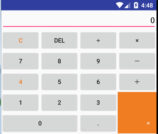
对应的xml文件的代码如下:
<?xml version="1.0" encoding="utf-8"?>
<LinearLayout xmlns:android="http://schemas.android.com/apk/res/android"
              android:layout_width="match_parent"
              android:layout_height="match_parent"
              android:orientation="vertical" >

    <EditText
        android:gravity="right"
        android:hint="0"
        android:textColorHint="#000000"
        android:layout_height="wrap_content"
        android:layout_width="fill_parent"/>

    <LinearLayout
        android:layout_width="fill_parent"
        android:layout_height="wrap_content"
        android:orientation="horizontal">

        <Button
            android:layout_width="0dip"
            android:layout_height="wrap_content"
            android:layout_weight="1"
            android:text="C"
            android:textColor="#F07D22" />

        <Button
            android:layout_width="0dip"
            android:layout_height="wrap_content"
            android:layout_weight="1"
            android:text="DEL" />

        <Button
            android:layout_width="0dip"
            android:layout_height="wrap_content"
            android:layout_weight="1"
            android:text="÷" />

        <Button
            android:layout_width="0dip"
            android:layout_height="wrap_content"
            android:layout_weight="1"
            android:text="×" />
    </LinearLayout>

    <LinearLayout
        android:layout_width="fill_parent"
        android:layout_height="wrap_content" >

        <Button
            android:layout_width="0dip"
            android:layout_height="wrap_content"
            android:layout_weight="1"
            android:text="7" />

        <Button
            android:layout_width="0dip"
            android:layout_height="wrap_content"
            android:layout_weight="1"
            android:text="8" />

        <Button
            android:layout_width="0dip"
            android:layout_height="wrap_content"
            android:layout_weight="1"
            android:text="9" />

        <Button
            android:layout_width="0dip"
            android:layout_height="wrap_content"
            android:layout_weight="1"
            android:text="-" />
    </LinearLayout>

    <LinearLayout
        android:layout_width="fill_parent"
        android:layout_height="wrap_content" >

        <Button
            android:layout_width="0dip"
            android:layout_height="wrap_content"
            android:layout_weight="1"
            android:text="4"
            android:textColor="#F07D22" />

        <Button
            android:layout_width="0dip"
            android:layout_height="wrap_content"
            android:layout_weight="1"
            android:text="5" />

        <Button
            android:layout_width="0dip"
            android:layout_height="wrap_content"
            android:layout_weight="1"
            android:text="6" />

        <Button
            android:layout_width="0dip"
            android:layout_height="wrap_content"
            android:layout_weight="1"
            android:text="+" />
    </LinearLayout>

    <LinearLayout
        android:layout_width="fill_parent"
        android:layout_height="wrap_content" >

        <LinearLayout
            android:orientation="vertical"
            android:layout_width="0dip"
            android:layout_height="match_parent"
            android:layout_weight="3" >

            <LinearLayout
                android:layout_width="fill_parent"
                android:layout_height="wrap_content">
                <Button
                    android:text="1"
                    android:layout_height="wrap_content"
                    android:layout_width="0dip"
                    android:layout_weight="1"/>
                <Button
                    android:text="2"
                    android:layout_height="wrap_content"
                    android:layout_width="0dip"
                    android:layout_weight="1"/>
                <Button
                    android:text="3"
                    android:layout_height="wrap_content"
                    android:layout_width="0dip"
                    android:layout_weight="1"/>

            </LinearLayout>
            <LinearLayout
                android:layout_width="fill_parent"
                android:layout_height="wrap_content">
                <Button
                    android:text="0"
                    android:layout_height="wrap_content"
                    android:layout_width="0dip"
                    android:layout_weight="2"/>
                <Button
                    android:text="."
                    android:layout_height="wrap_content"
                    android:layout_width="0dip"
                    android:layout_weight="1"/>

            </LinearLayout>
        </LinearLayout>

        <Button
            android:gravity="right|bottom"
            android:textColor="#ffffff"
            android:text="="
            android:paddingRight="15dp"
            android:paddingBottom="15dp"
            android:background="#F07D22"
            android:layout_width="0dip"
            android:layout_height="fill_parent"
            android:layout_weight="1" >
        </Button>
    </LinearLayout>

</LinearLayout>
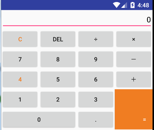
再看一遍效果图:
2、相对布局的代码举例:
要实现的效果如下:
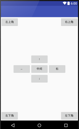
完整版代码实现:
<?xml version="1.0" encoding="utf-8"?>
<RelativeLayout xmlns:android="http://schemas.android.com/apk/res/android"
    android:layout_width="match_parent"
    android:layout_height="match_parent" >
    <Button
        android:id="@+id/center"
        android:layout_centerInParent="true"
        android:text="中间"
        android:layout_width="wrap_content"
        android:layout_height="wrap_content"/>
    <Button
        android:layout_alignLeft="@id/center"
        android:layout_above="@id/center"
        android:text="↑"
        android:layout_width="wrap_content"
        android:layout_height="wrap_content"/>
    <Button
        android:layout_alignLeft="@id/center"
        android:layout_below="@id/center"
        android:text="↓"
        android:layout_width="wrap_content"
        android:layout_height="wrap_content"/>
    <Button
        android:layout_alignBottom="@id/center"
        android:layout_toLeftOf="@id/center"
        android:text="←"
        android:layout_width="wrap_content"
        android:layout_height="wrap_content"/>
    <Button
        android:layout_alignBottom="@id/center"
        android:layout_toRightOf="@id/center"
        android:text="右"
        android:layout_width="wrap_content"
        android:layout_height="wrap_content"/>
    <Button
        android:text="左上角"
        android:layout_width="wrap_content"
        android:layout_height="wrap_content"/>
    <Button
        android:layout_alignParentRight="true"
        android:text="右上角"
        android:layout_width="wrap_content"
        android:layout_height="wrap_content"/>
    <Button
        android:layout_alignParentBottom="true"
        android:text="左下角"
        android:layout_width="wrap_content"
        android:layout_height="wrap_content"/>
    <Button
        android:layout_alignParentRight="true"
        android:layout_alignParentBottom="true"
        android:text="左下角"
        android:layout_width="wrap_content"
        android:layout_height="wrap_content"/>

</RelativeLayout>
3、TableLayout 表格布局的代码举例:(表格布局可以实现的,线性布局也可以实现)
要实现的效果如下:
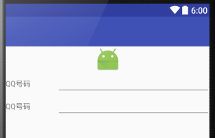
完整的代码实现:
<?xml version="1.0" encoding="utf-8"?>
<TableLayout xmlns:android="http://schemas.android.com/apk/res/android"
             android:layout_width="match_parent"
             android:layout_height="match_parent" >

    <ImageView
        android:src="@mipmap/ic_launcher"
        android:layout_width="fill_parent"
        android:layout_height="wrap_content"/>
    <TableRow
        android:layout_width="fill_parent"
        android:layout_height="wrap_content">

        <TextView
            android:text="QQ号码"
            android:layout_width="0dip"
            android:layout_weight="1"
            android:layout_height="wrap_content"/>
        <EditText
            android:layout_width="0dip"
            android:layout_weight="3"
            android:layout_height="wrap_content"/>
    </TableRow>
</TableLayout>


 1359
1359


 被折叠的 条评论
为什么被折叠?
被折叠的 条评论
为什么被折叠?
 到【灌水乐园】发言


