


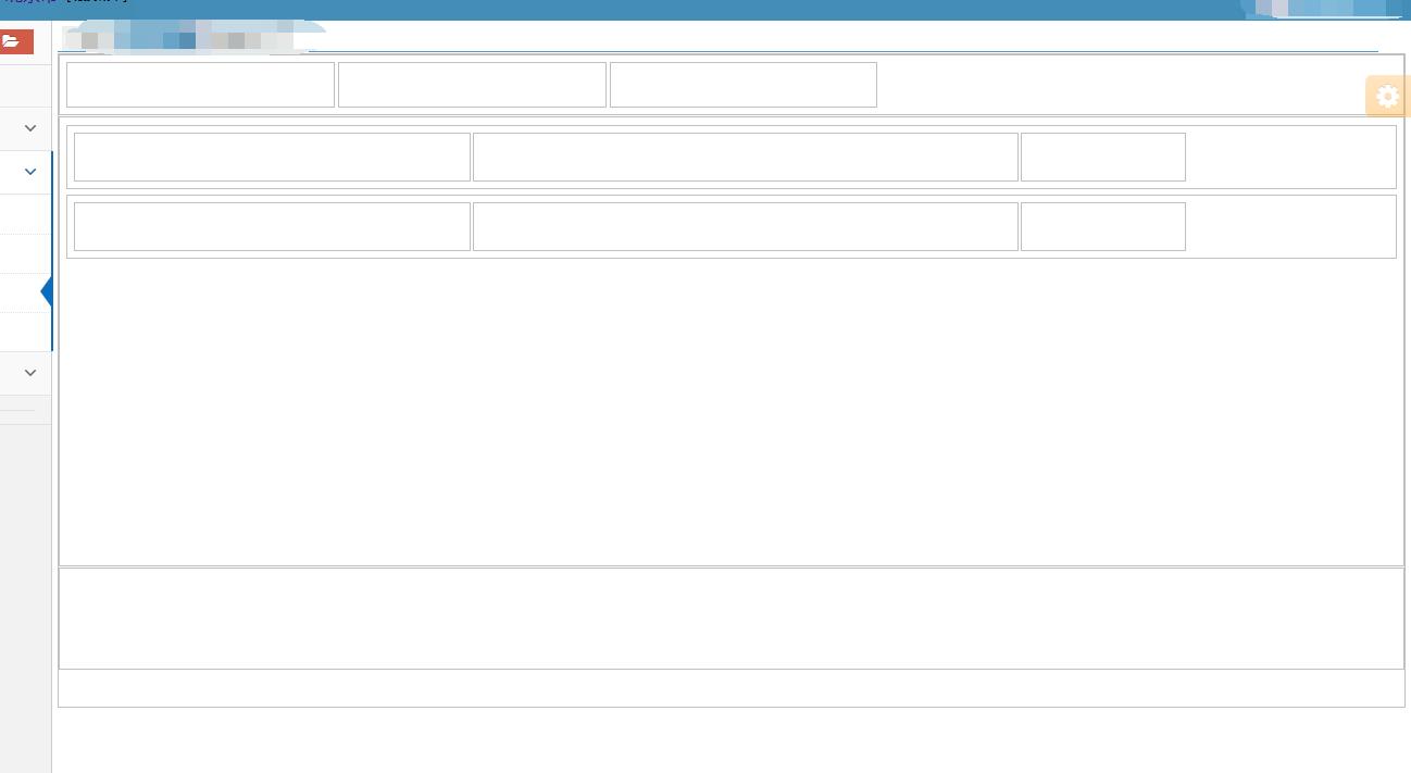
div拆分上中下,且上div连续多个横排小div,中部div连续多个竖排div,且每个竖排div有三个横排div
@charset "utf-8";

.div-body{
	overflow:auto;
	height:100%;
	min-height:600px;
	border: 1px solid #c0c0c0;
}

.div-top{
	overflow:auto;
	height:10%;
   	min-height:40px;
   	border: 0px;
   	border:1px solid #c0c0c0;
   	padding:6px;
}
.div-center{
	/* margin: 0 auto ;*//* 居中 */
	margin-top:1px;
	width: auto;
	height:60%;
	min-height: 400px;
	border: 1px solid #c0c0c0;
	/* text-align:center; */
	padding:6px;
}
.div-bottom{
	margin-top:1px;
	width: auto;
	height:20%;
	min-height: 80px;
	border: 1px solid #c0c0c0;
	/* text-align:center; */
	padding:6px;
}

.div-top-left{
	width: 20%;
	min-width:80px;
	height:100%;
   	min-height:40px;
   	float:left;
	border: 1px solid #c0c0c0;
	margin-right:3px;
	text-align:center;
}

.center-outside{
	overflow:auto;
	margin-top:1px;
	min-height: 45px;
	border: 1px solid #c0c0c0;
	text-align:center;
	padding:6px;
	margin-bottom: 5px;
}


.center-left{
	width:30%;
	min-width:350px;
	height:100%;
	min-height:43px;
	float: left;
	text-align:center;
	border: 1px solid #c0c0c0;
	/* padding:10px; */
}

.center-center{
	width:40%;
	min-width:500px;
	height:100%;
	min-height:43px;
	float: left;
	margin-left:2px;
	text-align:center;
	border: 1px solid #c0c0c0;
	/* padding:10px; */
}

.center-right{
	overflow:auto;
	min-width:150px;
	height:100%;
	min-height:43px;
	float: left;
	margin-left:2px;
	text-align:center;
	border: 1px solid #c0c0c0;
}
<div class="div-body">
	<div class="div-top">
		<div class="div-top-left"></div>
		<div class="div-top-left"></div>
		<div class="div-top-left"></div>
	</div>
	<div class="div-center">
		<div class="center-outside">
			<div class="center-left"></div>
			<div class="center-center"></div>
			<div class="center-right"></div>
		</div>
		<div class="center-outside">
			<div class="center-left"></div>
			<div class="center-center"></div>
			<div class="center-right"></div>
		</div>
	</div>
	<div class="div-bottom"></div>
</div>
效果图:


 扫一扫
扫一扫
 4464
4464

 被折叠的 条评论
为什么被折叠?
被折叠的 条评论
为什么被折叠?
 到【灌水乐园】发言


