


On the other hand when using precision and recall, we are using a single discrimination threshold to compute the confusion matrix. The ROC Curve allows the modeler to look at the performance of his model across all possible thresholds. To understand the ROC curve we need to understand the x and y axes used to plot this. On the x axis we have the false positive rate, FPR or fall-out rate. On the y axis we have the true positive rate, TPR or recall.
To test out the Scikit calls that make this curve for us, we use a simple array repeated many times and a prediction array of the same size with different element. The first thing to notice for the roc curve is that we need to define the positive value of a prediction. In our case since our example is binary the class “1” will be the positive class. Second we need the prediction array to contain probability estimates of the positive class or confidence values. This very important because the roc_curve call will set repeatedly a threshold to decide in which class to place our predicted probability. Let’s see the code that does this.
1) Import needed modules
from sklearn.metrics import roc_curve, auc
import matplotlib.pyplot as plt
import random
2) Generate actual and predicted values. First let use a good prediction probabilities array:
actual = [1,1,1,0,0,0]
predictions = [0.9,0.9,0.9,0.1,0.1,0.1]
3) Then we need to calculated the fpr and tpr for all thresholds of the classification. This is where the roc_curve call comes into play. In addition we calculate the auc or area under the curve which is a single summary value in [0,1] that is easier to report and use for other purposes. You usually want to have a high auc value from your classifier.
false_positive_rate, true_positive_rate, thresholds = roc_curve(actual, predictions)
roc_auc = auc(false_positive_rate, true_positive_rate)
4) Finally we plot the fpr vs tpr as well as our auc for our very good classifier.
plt.title('Receiver Operating Characteristic')
plt.plot(false_positive_rate, true_positive_rate, 'b',
label='AUC = %0.2f'% roc_auc)
plt.legend(loc='lower right')
plt.plot([0,1],[0,1],'r--')
plt.xlim([-0.1,1.2])
plt.ylim([-0.1,1.2])
plt.ylabel('True Positive Rate')
plt.xlabel('False Positive Rate')
plt.show()
The figure show how a perfect classifier roc curve looks like:
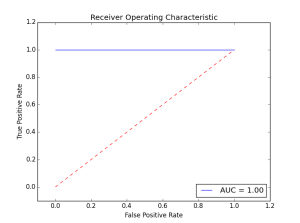
Here the classifier did not make a single error. The AUC is maximal at 1.00. Let’s see what happens when we introduce some errors in the prediction.
actual = [1,1,1,0,0,0]
predictions = [0.9,0.9,0.1,0.1,0.1,0.1]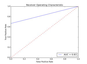
As we introduce more errors the AUC value goes down. There are a couple of things to remember about the roc curve:
1、There is a tradeoff betwen the TPR and FPR as we move the threshold of the classifier.
2、When the test is more accurate the roc curve is closer to the left top borders
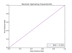
3、A useless classifier is one that has its ROC curve exactly aligned with the diagonal. How does that look like? Let’s say we have a classifier that always gives 0.5 for the classification probabilities.
actual = [1,1,1,0,0,0]
predictions = [0.5,0.5,0.5,0.5,0.5,0.5]
The ROC Curve would like this:
Concerning the AUC, a simple rule of thumb to evaluate a classifier based on this summary value is the following:
.90-1 = very good (A)
.80-.90 = good (B)
.70-.80 = not so good (C)
.60-.70 = poor (D)
.50-.60 = fail (F)


 2077
2077


 被折叠的 条评论
为什么被折叠?
被折叠的 条评论
为什么被折叠?
 到【灌水乐园】发言


