


1.使用图形
attach(mtcars)
plot(wt,mpg)
abline(mpg~wt)
title("Regression of MPG on Weight")
detach(mtcars)
将图形保存到当前工作目录中名为mygraph.pdf中的PDF文件中:
pdf("mygraph.pdf")
attach(mtcars)
plot(wt,mpg)
abline(mpg~wt)
title("Regression of MPG on Weight")
detach(mtcars)
dev.off()
除pdf()外,还可使用win.metafile(()、png()、jpeg()、bmp()、tiff()、xifig()和postscript()将图形保存为其他格式
通过plot()、hist()等命令来创建一幅新图形时,通常会覆盖掉先前的图形,要随时查看方法:
(1)在创建一幅新图形之前打开一个新的图形窗口
eg:
dev.new()
statements to create graph1
dev.new()
statements to create a graph2
etc
(2)通过dev.new()、dev.next()、dev.prev()、dev.set()和dev.off()同时打开多个图形窗口,并造势哪个输出发送到哪个窗口
2 图形参数
(1)修改图形参数的一种方法是通过函数par()来指定选项
格式为:
par(optionname=value,optionname=name,……)
不加参数地执行par()将生成一个含有当前图形设置的列表,添加参数no.readonly=TRUE可生成一个可以修改的当前图形参数列表
(2)符号和线条
用于指定符号和线条类型的参数
| 参数 | 描述 |
| pch | 指定绘制点时使用的符号 |
| cex | 指定符号的大小,缩放比例,0.5、1、1.5 |
| lty | 指定线条类型 |
| lwd | 指定线条宽度,lwd=2将生成一条两倍于默认宽度的线条 |
(3)颜色
用于指定颜色的参数
| 参数 | 描述 |
| col | 默认的绘图颜色,某些参数(如lines和pie)可接受一个含有颜色值的向量,并自动循环使用 |
| col.axis | 坐标轴刻度文字颜色 |
| col.lab | 坐标轴标签(名称)的颜色 |
| col.main | 标题颜色 |
| col.sub | 副标题颜色 |
| fg | 图形的前景色 |
| bg | 图形的背景色 |
eg:
n<-10
mycolors<-rainbow(n)
pie(rep(1,n),labels=mycolors,col=mycolors)
mygrays<-gray(0:n/n)
pie(rep(1,n),labels=mygrays,col=mygrays)
(4) 文本属性
用于指定文本大小的参数
| 参数 | 描述 |
| cex | 表示相对于默认大小缩放倍数的数值 |
| cex.axis | 坐标轴刻度文字的缩放倍数,类似于cex |
| cex.lab | 坐标轴标签(名称)的缩放倍数,类似于cex |
| cex.main | 标题的缩放倍数,类似于cex |
| cex.sub | 副标题的缩放倍数,类似于cex |
| 参数 | 描述 |
| font | 整数,用于指定绘图使用的字体样式1=常规,2=粗体,3=斜体, 4=粗斜体,5=符号字体 |
| font.axis | 坐标轴刻度文字的字体样式 |
| font.lab | 坐标轴标签(名称)的字体样式 |
| font.main | 标题的字体样式 |
| font.sub | 副标题的字体样式 |
| ps | 字体磅值(1磅约为1/72英寸),文本的最终大小为ps*cex |
| family | 绘制文本时使用的字体族,标准的聚会为serif(衬线)、 sans(无衬线)和mono(等宽) |
(5)图形尺寸与边界尺寸
用于控制图形尺寸和边界大小的参数
| 参数 | 描述 |
| pin | 以英寸表示的图形尺寸(宽和高) |
| mai | 以数值向量表示的边界大小,顺序为“下左上右”,单位为英寸 |
| mar | 以数值向量表示的边界大小,顺序同上,单位为英分 |
eg:
#输入数据
dose<-c(20,30,40,45,60)
drugA<-c(16,20,27,40,60)
drugB<-c(15,18,25,31,40)
#修改默认的图形参数
opar<-par(no.readonly=TRUE)
#得到图形将为2英寸宽、3英寸高,线条的宽度为默认的2倍,符号为默认的1.5倍,坐标轴刻度文本被设置为斜体、缩小为默认大小的75%
par(pin=c(2,3))
par(lwd=2,cex=1.5)
par(cex.axis=0.75,font.axis=3)
#画两条线
plot(dose,drugA,type="b",pch=19,lty=2,col="red")
plot(dose,drugB,type="b",pch=23,lty=6,col="blue",bg="green")
#还原图形参数
par(opar)
3.添加文本、自定义坐标轴和图例
eg:
#添加标题(main)、副标题(sub)、坐标轴标签(xlab、ylab)并指定了坐标轴范围(xlim、ylim)
plot(dose,drugA,type="b",
     col="red",lty=2,pch=2,lwd=2,
     main="Clinicial Trials for Drug A",
     sub="This is hypothetical data",
     xlab="Dosage",ylab="Drug Response",
xlim=c(0,60),ylim=c(0,70))(1)标题
可使用title()函数为图形添加标题和坐标轴标签,调用格式 为:
title(main="main title",sub="sub title",xlab="x-axis label",ylab="y-axis label")
(2)坐标轴
格式为:axis(side,at=,labels=,pos=,lty=,col=,las=,tck=,……)
坐标轴选项
| 选项 | 描述 |
| side | 一个整数,表示在图形的哪边绘制坐标轴 (1=下,2=左,3=上,4=右) |
| at | 一个数值型向量,表示需要绘制刻度线的位置 |
| labels | 一个字符型向量,表示置于刻度线旁边的文字标签 |
| pos | 坐标轴线绘制位置的坐标(即与另一条坐标轴相交位置的值) |
| lty | 线条类型 |
| col | 线条和刻度线颜色 |
| las | 标签是否平等于(=0)或垂直于=2)坐标轴 |
| tck | 刻度线的长度,以相对于绘图区域大小的分数表示 |
| (……) | 其他图形参数 |
自定义坐标轴示例
eg:
#生成数据
x<-c(1:10)
y<-x
z<-10/x

opar<-par(no.readonly=TRUE)

par(mar=c(5,4,4,8)+0.1)  #增加边界大小
plot(x,y,type="b",  #绘制x对y的图形
     pch=21,col="red",
     yaxt="n",lty=3,ann=FALSE)
lines(x,z,type="b",pch=22,col="blue",lty=2)  #添加x对1/x的直线
#绘制你自己的坐标轴
axis(2,at=x,labels=x,col.axis="red",las=2)
axis(4,at=z,labels=round(z,digits=2),col.axis="blue",las=2,cex.axis=0.7,tick=-0.01)
#添加标题和文本
mtext("y=1/x",side=4,cex.lab=1,las=2,col="blue")  #mtext()用于在图形的边界添加文本
title("An Example of Creative Axes",xlab="X values",ylab="Y-X")
par(opar)
要创建次要刻度线,需使用Hmisc包中的minor.tick()函数
eg
library(Hmisc)
minor.tick(nx=n,ny=n,tick.ration=n)
<span style="color:#ff6666;">#其中nx和ny分别指定了X轴和Y轴每两条主刻度线之间通过次要刻度线划分得到的敬意个数,tick.ration表示次要刻度线相对于主刻度线的大小比例,当前的主刻度线长度可以使用par("tck")获取</span>
函数abline()可用来为图形添加参考线
格式为:abline(h=yvalues,v=xvalues)
abline()中也可指定其他图形参数(如线条类型、颜色和宽度)
(4)图例
格式:
legend(location,title,legend,……)
#依剂量对比药物A和药物B的响应情况
#输入数据
dose<-c(20,30,40,45,60)
drugA<-c(16,20,27,40,60)
drugB<-c(15,18,25,31,40)

opar<-par(no.readonly=TRUE)

par(lwd=2,cex=1.5,font.lab=2)

#绘制图形
plot(dose,drugA,type="b",
     pch=15,lty=1,col="red",ylim=c(0,60),
     main="Drug A vs.Drgu B",
     xlab="Drug Dosage",ylab="Drug Response")

lines(dose,drugB,type="b",
      pch=17,lty=2,col="blue")

abline(h=c(30),lwd=1.5,lty=2,col="gray")

install.packages("Hmisc")
library(Hmisc)
minor.tick(nx=3,ny=3,tick.ration=0.5)#添加次要刻度线

legend("topleft",inset=0.05,title="Drug Type",c("A","B"),
       lty=c(1,2),pch=c(15,17),col=c("red","blue"))

par(opar)
(5)文本标注
text()可向绘图区域内部添加文本
mtext()则向图四个之一添加文本
格式:
text(location,"text to place",pos,……)
mtext("text to place",side,line=n,……)
eg:
attach(mtcars)
plot(wt,mpg,
     main="Mileage vs.Car Weight",
     xlab="Weight",ylab="Mileage",
     pch=18,col="blue")
text(wt,mpg,
     row.names(mtcars),
     cex=0.6,pos=4,col="red")
detach(mtcars)
eg:
显示不同字体族的代码
opar<-par(no.readonly=TRUE)
par(cex=1.5)
plot(1:7,1:7,type="n")
text(3,3,"Example of default text")
text(4,4,family="mono","Example of mono-spaced text")
text(5,5,family="serif","Example of serif text")
par(opar)
4. 图形的组合
par()和layout()可很容易地组合多幅图形为一幅总括图形
在par()函数中使用图形参数mfrow=c(nrows,ncols)来创建按行填充的、行数为nrows、列数为ncols的图形矩阵,使用nfcol=c(nrows,ncols)按列填充矩阵
(1)
eg:
attach(mtcars)
opar<-par(no.readonly=TRUE)
par(mfrow=c(2,2))
plot(wt,mpg,main="Scatterplot of wt vs.mpg")
plot(wt,disp,main="Scatterplot of wt vs disp")
hist(wt,main="Histogram of wt")
boxplot(wt,main="Boxplot of wt")
par(opar)
detach(mtcars)
(2)layout()
layout(mat) :其中的mat是一个矩阵,指定了所要组合的多个图形所在位置
attach(mtcars)
layout(matrix(c(1,1,2,3),2,2,byrow=TRUE),
       widths=c(3,1),heights=c(1,2))
hist(wt)
hist(mpg)
hist(disp)
detach(mtcars)
(3)图形布局的精细控制
可使用图形参数fig=完成任务
eg:
attach(mtcars)
opar<-par(no.readonly=TRUE)
par(fig=c(0,0.8,0,0.8))
plot(mtcars$wt,mtcars$mpg,
     xlab="Miles Per Gallon",
     ylab="Car Weight")

par(fig=c(0,0.8,0.55,1),new=TRUE)
boxplot(mtcars$wt,horixontal=TRUE,axes=FALSE)
par(fig=c(0.65,1,0,0.8),new=TRUE)
boxplot(mtcars$mpg,axes=TRUE)

mtext("Enhanced Scatterplot",side=3,outer=TRUE,line=3)
par(opar)
detach(mtcars)
5.条形图
barpot(height)(height是一个向量或矩阵)
(1)简单条形图
library(vcd)
counts<-table(Arthritis$Improved)
counts

#简单的条形图
barplot(counts,
        main="Simple Bar Plot",
        xlab="Improvement",ylab="Frequency")

#水平条形图
barplot(counts,
        main="Horizontal Bar Plot",
        xlab="Frequency",ylab="Improvement",
        horiz=TRUE)

#若要绘制的类别型变量是一个因子或有序型因子,可以使用函数plot()快速创建一幅垂直条形图
plot(Arthritis$Improved,main="Simple Bar Plot",
     xlab="Improved",ylab="Frequency")
plot(Arthritis$Improved,horiz=TRUE,main="Simple Bar Plot",
     xlab="Frequency",ylab="Improved")
(2)堆砌条形图和分组条形图
#若要绘制的类别型变量是一个因子或有序型因子,可以使用函数plot()快速创建一幅垂直条形图
plot(Arthritis$Improved,main="Simple Bar Plot",
     xlab="Improved",ylab="Frequency")
plot(Arthritis$Improved,horiz=TRUE,main="Simple Bar Plot",
     xlab="Frequency",ylab="Improved")

#堆砌条形图和分组条形图
#若height是一个矩阵而不是向量时,绘图结果将是一幅堆砌条形图(beside=FALSE)或分组条形图(beside=TRUE)
library(vcd)
counts<-table(Arthritis$Improved,Arthritis$Treatment)
counts

#堆砌条形图
barplot(counts,
        main="Stacked Bar Plot",
        xlab="Treatment",ylab="Frequency",
        col=c("red","yellow","green"),
        legend=rownames(counts))
#分组条形图
barplot(counts,
        main="Stacked Bar Plot",
        xlab="Treatment",ylab="Frequency",
        col=c("red","yellow","green"),
        legend=rownames(counts),beside=TRUE)
(3)均值条形图
使用数据整合函数并将结果传递给barplot()函数,来创建表示均值、中位数、标准差等的条形图
states<-data.frame(state.region,state.x77)
means<-aggregate(states$Illiteracy,by=list(state.region),FUN=mean)
means<-means[order(means$x),]#将均值从小到大排序
barplot(means$x,names.arg=means$Group.1)
title("Mean Illiteracy Rate")
(4)条形图的微调
#names.arg允许指定一个字符向量作为条形的标签名
par(mar=c(5,8,4,2))
par(las=2)
counts<-table(Arthritis$Improved)
barplot(counts,
        main="Treatment Outcome",
        horiz=TRUE,cex.name=0.8,
        names.arg=c("No Improvement","Some Improvement","Marked Improvement"))
(5)棘状图
棘状图对堆砌条形图进行了重缩放,每个条形的高度均为1,每一段的高度即表示比例
spine()函数
library(vcd)
attach(Arthritis)
counts<-table(Treatment,Improved)
counts
spine(counts,main="Spinogram Example")
detach(Arthritis)
6.饼图
饼图函数创建:
pie(x,labels)
par(mfrow=c(2,2))
slices<-c(10,12,4,16,8)
lbls<-c("US","UK","Australia","Germany","France")
#为饼图添加比例数值
pie(slices,labels=lbls,main="Simple Pie Chart")
pct<-round(slices/sum(slices)*100)
lbls2<-paste(lbls," ",pct,"%",sep="")
pie(slices,labels=lbls2,col=rainbow(length(lbls2)),main="Pie Chart with Percentage")
install.packages("plotrix")
library(plotrix)
pie3D(slices,labels=lbls,explode=0.1,main="3D Pie Chart")
#从表格创建饼图
mytable<-table(state.region)
lbls3<-paste(names(mytable),"\n",mytable,sep="")
pie(mytable,labels=lbls3,main="Pie Chart from a Table\n(with sample size)")
扇形图:(扇形中width是重要的,而半径并不重要)
通过plotrix包中的fan.plot()函数来实现:
library(vcd)
slices<-c(10,12,4,16,8)
lbls<-c("US","UK","Australia","Germany","France")
fan.plot(slices,labels=lbls,main="Fan Plot")
7.直方图
创建直方图:
hist()
frequency=FALSE 表示模拟概率密度而不是频数绘制图形
breaks用于控制驵的数量
当数据中有较多的重复值时,可将轴须图的数据打散:
rug(jitter(mtcars$mpg,amount=0.01))
par(mfrow=c(2,2))
hist(mtcars$mpg) #简单直方图

hist(mtcars$mpg,#指定组数和颜色
     breaks=12,
     col="red",
     xlab="Miles Per Gallon",
     main="Colored histogram with 12 bins")

hist(mtcars$mpg,#添加轴须图
     freq=FALSE,
     breaks=12,
     col="red",
     xlab="Miles Per Gallon",
     main="Histogram,rug plot,density curve")
rug(jitter(mtcars$mpg))
lines(density(mtcars$mpg),col="blue",lwd=2)

x<-mtcars$mpg
h<-hist(x,#添加正态密度曲线和外框
        breaks=12,
        col="red",
        xlab="Miles Per Gallon",
        main="Histogram with normal curve and box")
xfit<-seq(min(x),max(x),length=40)
yfit<-dnorm(xfit,mean=mean(x),sd=sd(x))
yfit<-yfit*diff(h$mids[1:2])*length(x)
lines(xfit,yfit,col="blue",lwd=2)
box()

8 核密度图
核密度是用于估计随机变量概率密度函数的一种非参数方法
绘制密度图的方法:plot(density(x))
par(mfrow=c(2,1))
d<-density(mtcars$mpg)
plot(d)
d<-density(mtcars$mpg)
plot(d,main="Kernel Density of Miles Per Gallon")
polygon(d,col="red",border="blue")
rug(mtcars$mpg,col="brown")
可比较的核密度图
sm包中的sm.density.compare()函数可向图形叠加两组或更多的核密度图,使用格式为:sm.density.compare(x,factor)
par(lwd=2)
library(sm)
attach(mtcars)
cyl.f<-factor(cyl,levels=c(4,6,8),
              labels=c("4 cylinder","6 cylinder","8 cylinder"))
sm.density.compare(mpg,cyl,xlab="Miles Per Gallon")#绘制密度图
title(main='MPG Distribution by Car Cylinders')
#通过鼠标单击添加图例
colfill<-c(2:(1+length(levels(cyl.f))))
legend(locator(1),levels(cyl.f),fill=colfill)
detach(mtcars)
9.箱线图
格式:
boxplot()
箱线图可以显示出可能为离群点的观测(范围正负1.5倍的IQR以外的值)
(1)使用并列箱线图进行跨组比较
格式:boxplot(formula,data=dataframe)
formula是一个公式,
eg:
y~A:将类别型变量A的每个值并列地生成数值型变量y的箱线图
y~A*B:为类别型变量A和B所有水平的两两组合生成数值型变量y的箱线图
varwidth=TRUE将使箱线图的宽度与样本大小的平方根成正比
horizon=TRUE可反转坐标轴的方向
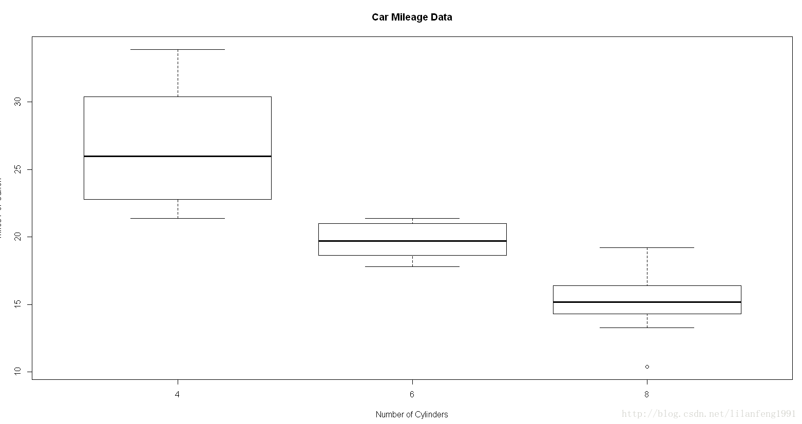
eg:
boxplot(mpg~cyl,data=mtcars,
        main="Car Mileage Data",
        xlab="Number of Cylinders",
        ylab="Miles Per Gallon")
(2)通过添加notch=TRUE 可得到含凹槽的箱线图
boxplot(mpg~cyl,data=mtcars,
        notch=TRUE,
        varwidth=TRUE,
        col="red",
        main="Car Mileage Data",
        xlab="Number of Cylinders",
        ylab="Miles Per Gallon")

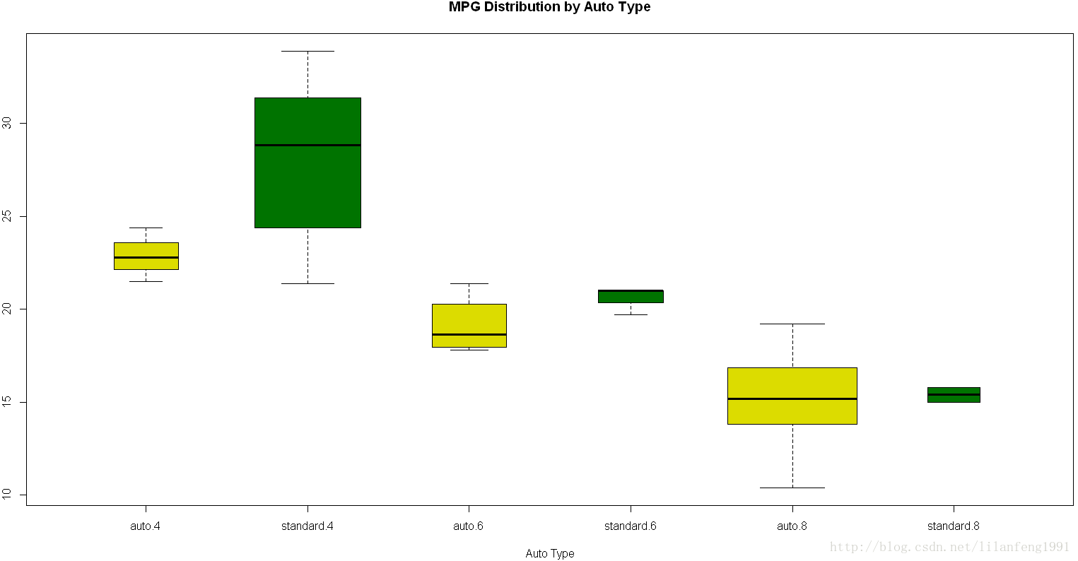
(3)两个交叉因子的箱线图
#创建汽缸数量的因子
mtcars$cyl.f<-factor(mtcars$cyl,
                     levels=c(4,6,8),
                     labels=c("4","6","8"))
#创建变速箱类型的因子
mtcars$am.f<-factor(mtcars$am,
                    levels=c(0,1),
                    labels=c("auto","standard"))
boxplot(mpg~am.f*cyl.f,
        data=mtcars,
        varwidth=TRUE,
        col=c("gold","darkgreen"),
        main="MPG Distribution by Auto Type",
        xlab="Auto Type")
10.小提琴图(violin plot)
是箱线图与核密度图的结合
用vioplot包中vioplot()函数绘制
格式:
vioplot(x1,x2,……,names=,col=)
其中x1,x2……表示要绘制的一个或多个数值向量(将为每个向量绘制一幅小提琴图)
names是小提琴图中标签的字符向量
col是一个为每幅小提琴图指定颜色的向量
install.packages("vioplot")
library(vioplot)
x1<-mtcars$mpg[mtcars$cyl==4]
x2<-mtcars$mpg[mtcars$cyl==6]
x3<-mtcars$mpg[mtcars$cyl==8]
vioplot(x1,x2,x3,
        names=c("4 cyl","6 cyl","8 cyl"),
        col="gold")
title("Violin Plots of Miles Per Gallon")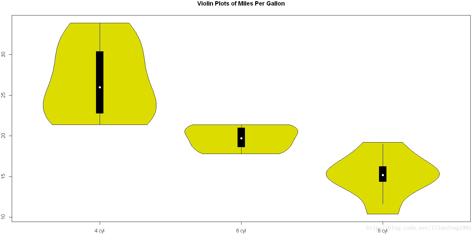
小提琴图基本上是核密度图以镜像方式在箱线图上的叠加
图中,白点是中位数,黑色盒型范围是下四分位点到上四分位点,细黑线表示 须
11.点图
(1)格式:dotchart(x,labels=) (x是一个数值向量,而labels则是由每个点的标签组成的向量)
可设定groups来选定一个因子,用以指定x中元素的分组方式,gcolor可以控制不同组标签的颜色
Hmisc包中也提供了一个带有许多附加功能的点图函数
dotchart(mtcars$mpg,labels=row.names(mtcars),cex=0.7,
         main="Gas Mileage for Car Models",
         xlab="Miles Per Gallon")
(2)分组、排序、着色后的点图
x<-mtcars[order(mtcars$mpg),]
x$cyl<-factor(x$cyl)
x$color[x$cyl==4]<-"red"
x$color[x$cyl==6]<-"blue"
x$color[x$cyl==8]<-"darkgreen"
dotchart(x$mpg,
         labels=row.names(x),
         cex=0.7,
         groups=x$cyl,
         gcolor="black",
         color=x$color,
         pch=19,
         main="Gas Mileage for Car Models\ngrouped by clinder",
         xlab="Miles Per Gallon")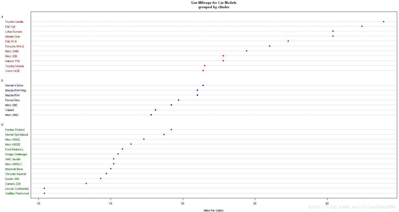


 20
20

 被折叠的 条评论
为什么被折叠?
被折叠的 条评论
为什么被折叠?
 到【灌水乐园】发言


