


##Pyplot教程
matplotlib.pyplot是一些命令样式函数,像MATLAB一样。每一个pyplot函数都会改变图形,例如创建图形、在图行里创建绘图区、在绘图区画线、用标签装饰图形等。在pyplot的函数调用中,隐藏了各种状态,这就意味着要始终跟踪到当前的图形和绘图区域,并且绘图函数要指向当前的坐标轴(注意这里的坐标轴是数字坐标轴,而不是严格意义的数学术语)。
import matplotlib.pyplot as plt
plt.plot([1,2,3,4])
plt.ylabel('some numbers')
plt.show()
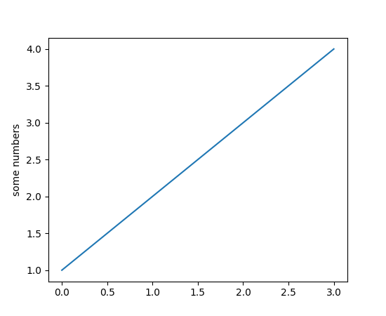
你可能会疑惑为什么x轴范围从0-3,而y轴从1-4。如果只给plot()提供了一个单独的列表或数组,那么matplotlib就假设这些是y轴上的数值序列,然后自动为你生成x轴的数值。python的取值范围默认从0开始,默认x向量长度和y轴一样,但是是从0开始的。因此x的数值列表就是[0,1,2,3]。
plot()是一个通用的命令,可以接收任意数量的参数。例如,想同时绘制x和y轴,你可以发出一下命令:
plt.plot([1, 2, 3, 4], [1, 4, 9, 16])
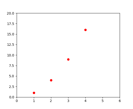
对于每对x,y参数,还有一个可选的第三个参数,它是用来表示线条颜色和类型的格式串。这个格式串的字母和标记来自于MATLAB,你可以把颜色字符串和线条样式字符串链接起来。默认的格式字符串是’b-’,表示绿色实线。例如,为了把上图用红圈绘制,可以执行一下命令:
import matplotlib.pyplot as plt
plt.plot([1,2,3,4], [1,4,9,16], 'ro')
plt.axis([0, 6, 0, 20])
plt.show()
plot()文档里可以看到完整的线样式和格式串。
axis()命令在上面例子中收到一串参数[xmin, xmax, ymin, ymax],用来指定坐标轴的视窗。
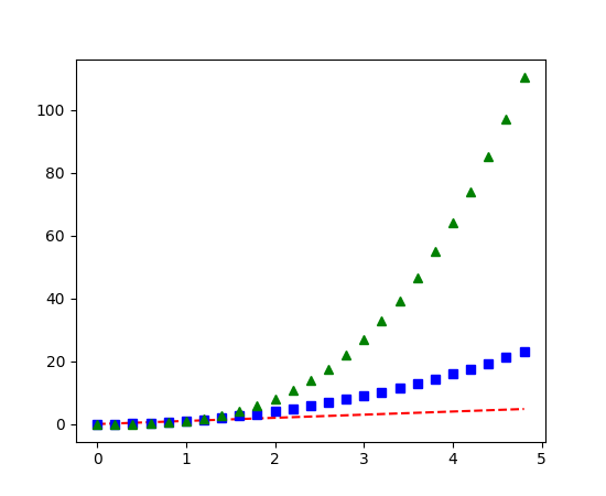
如果matplotlib仅限于处理一维列表,那么对于数字处理来说将是相当受限的。通常使用numpy数组。实际上所有的序列都内部转换成了numpy数组。下面的示例演示了用不同的数组样式绘画几条线。
import numpy as np
import matplotlib.pyplot as plt

# evenly sampled time at 200ms intervals
t = np.arange(0., 5., 0.2)

# red dashes, blue squares and green triangles
plt.plot(t, t, 'r--', t, t**2, 'bs', t, t**3, 'g^')
plt.show()
##控制线条属性
线条有很多属性,你可以设置:线宽、破折样式等。详情见文档。有很多种方法设置线条属性:
- 使用关键词参数。
plt.plot(x, y, linewidth=2.0)
- 使用
Line2D对象的setter方法。plot函数返回Line2D对象列表,例如line1, line2 = plot(x1, y1, x2, y2)。在下面的代码中,我们假设只有一行,因此返回的列表长度为1。我们使用元组来拆开line,并获取到列表的第一个元素。
line, = plt.plot(x, y, '-')
line.set_antialiased(False) # turn off antialising
- 使用
setp()命令。下面的示例使用MATLAB样式的命令在一行上设置多个属性。setp透明的使用一组或一个对象。你既可以使用关键词参数,也可以使用MATLAB形式的键值对。
lines = plt.plot(x1, y1, x2, y2)
# use keyword args
plt.setp(lines, color='r', linewidth=2.0)
# or MATLAB style string value pairs
plt.setp(lines, 'color', 'r', 'linewidth', 2.0)
Line2D属性见文档
获取可设置的Line属性,可以调用setp()函数,并且参数是line或lines。
In [69]: lines = plt.plot([1, 2, 3])

In [70]: plt.setp(lines)
  alpha: float
  animated: [True | False]
  antialiased or aa: [True | False]
  ...snip
##多图和多坐标轴
MATLAB、pyplot都有当前图和当前坐标轴的概念。所有的会话命令都应用与当前坐标轴。gca()返回当前的坐标轴(matplotlib.axes.Axes实例),gcf()返回当前图(matplotlib.figure.Figure实例)。一般,你不必关系这些,因为这些都在幕后运行。下面代码创建两个子图。
import numpy as np
import matplotlib.pyplot as plt

def f(t):
    return np.exp(-t) * np.cos(2*np.pi*t)

t1 = np.arange(0.0, 5.0, 0.1)
t2 = np.arange(0.0, 5.0, 0.02)

plt.figure(1)
plt.subplot(211)
plt.plot(t1, f(t1), 'bo', t2, f(t2), 'k')

plt.subplot(212)
plt.plot(t2, np.cos(2*np.pi*t2), 'r--')
plt.show()
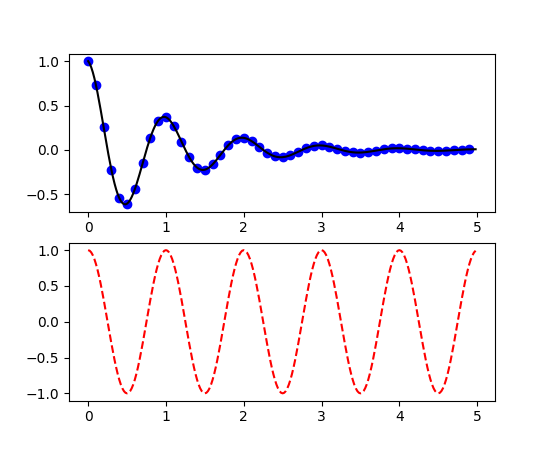
这儿的figure()命令是可选的,因为figure(1)会被默认执行,就像subplot(111)也会被默认执行,只要你不手动定义任何的坐标轴。subplot()命令指定行数(numrows)、列数(numcols)、图形号(fignum),图形号的范围是从1到numrows*numcols。如果numrows*numcols<10,subplot()参数里的逗号是可选的。所以subplot(211)等同于subplot(2, 1, 1)。你可以创建任意数量的子图和坐标轴。如果你想手动放置坐标轴,例如不在一个直角网格里,可以使用axes()命令,axes可以让你给坐标轴定义位置,像axes([left, bottom, width, height]),参数都是小数(0-1)坐标。两个例子:
你通过调用多次参数递增的figure()来创建多个图形。当然,每个图形可以包含尽可能多的坐标轴和子图。
import matplotlib.pyplot as plt
plt.figure(1)                # the first figure
plt.subplot(211)             # the first subplot in the first figure
plt.plot([1, 2, 3])
plt.subplot(212)             # the second subplot in the first figure
plt.plot([4, 5, 6])


plt.figure(2)                # a second figure
plt.plot([4, 5, 6])          # creates a subplot(111) by default

plt.figure(1)                # figure 1 current; subplot(212) still current
plt.subplot(211)             # make subplot(211) in figure1 current
plt.title('Easy as 1, 2, 3') # subplot 211 title
你可以使用clf()清除当前图形,使用cla()清除当前坐标轴。如果你对这些幕后维护的状态(指定当前的图片、图形和坐标轴)感觉别扭,不要灰心:这只是一个面向对象API的少部分状态包装器,你可以使用替代方案,详见Artist tutorial。
如果你要创建多个图形,你需要知道一件事:为一个图形分配的内容没有完全释放,直到图形明确的调用了close()。删除所有图形引用,或者关闭屏幕上的窗口管理器,也不能完全释放内存,因为pyplot在维护内部的引用,只有调用close()才可以。
##文本处理
text()命令可以在任意位置添加文本。xlabel()、ylabel()和title()也可以添加文本到指定的地方。详见Text介绍
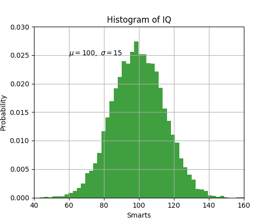
import numpy as np
import matplotlib.pyplot as plt

# Fixing random state for reproducibility
np.random.seed(19680801)

mu, sigma = 100, 15
x = mu + sigma * np.random.randn(10000)

# the histogram of the data
n, bins, patches = plt.hist(x, 50, normed=1, facecolor='g', alpha=0.75)


plt.xlabel('Smarts')
plt.ylabel('Probability')
plt.title('Histogram of IQ')
plt.text(60, .025, r'$\mu=100,\ \sigma=15$')
plt.axis([40, 160, 0, 0.03])
plt.grid(True)
plt.show()
所有的text()命令返回一个matplotlib.text.Text对象。就像上面提到的lines,你可以通过关键词参数或setp()自定义属性。
t = plt.xlabel('my data', fontsize=14, color='red')
详情见文档
###在text里使用数学表达式
matplotlib可以在任何文本表达式中接收TeX方程表达式。例如你可以用美元符包住一个Tex表达式。
plt.title(r'$\sigma_i=15$')
标题字符前的r很重要,他标识字符串是原生字符串,不需要python转义加反斜线。matplotli有一个内置的表达式解析器和结构引擎,提供自己的数学字体,详情见文档。因此你可以跨平台使用数学文本,而不必安装Tex。对于那些已经安装了LaTex和dvipng的人,您还可以使用LaTex来格式化文本,并将输出直接合并到显示数字或保存的postscript中。详情见文档。
###文本注释
使用基本的text()命令可以把文字放到任意位置。文本注释图形的特征,通常annotate()提供帮助功能,可以让注释容易。在一个注释方法里,这里有两点要注意:要注释的位置xy,文本说明的位置xytext。这些参数都是(x,y)元组。
import numpy as np
import matplotlib.pyplot as plt

ax = plt.subplot(111)

t = np.arange(0.0, 5.0, 0.01)
s = np.cos(2*np.pi*t)
line, = plt.plot(t, s, lw=2)

plt.annotate('local max', xy=(2, 1), xytext=(3, 1.5),
            arrowprops=dict(facecolor='black', shrink=0.05),
            )

plt.ylim(-2,2)
plt.show()
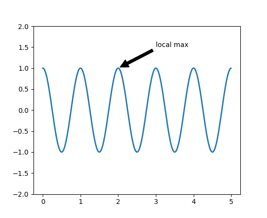
在这个基本例子中,xy(箭头提示)和xytext(文本位置)都在数据坐标里。还有很多可选的其他坐标系统。详见基本注释和高级注释。更多例子见demo。
##对数和其他非线性坐标轴
matplotlib.pyplot不仅支持线性轴刻度,还支持对数和对数刻度。如果数据跨越多个数量级,这通常会被使用。改变轴的尺度很简单:
plt.xscale(‘log’)
下面显示了一个包含相同数据和y轴不同刻度的四个图。
import numpy as np
import matplotlib.pyplot as plt

from matplotlib.ticker import NullFormatter  # useful for `logit` scale

# Fixing random state for reproducibility
np.random.seed(19680801)

# make up some data in the interval ]0, 1[
y = np.random.normal(loc=0.5, scale=0.4, size=1000)
y = y[(y > 0) & (y < 1)]
y.sort()
x = np.arange(len(y))

# plot with various axes scales
plt.figure(1)

# linear
plt.subplot(221)
plt.plot(x, y)
plt.yscale('linear')
plt.title('linear')
plt.grid(True)


# log
plt.subplot(222)
plt.plot(x, y)
plt.yscale('log')
plt.title('log')
plt.grid(True)


# symmetric log
plt.subplot(223)
plt.plot(x, y - y.mean())
plt.yscale('symlog', linthreshy=0.01)
plt.title('symlog')
plt.grid(True)

# logit
plt.subplot(224)
plt.plot(x, y)
plt.yscale('logit')
plt.title('logit')
plt.grid(True)
# Format the minor tick labels of the y-axis into empty strings with
# `NullFormatter`, to avoid cumbering the axis with too many labels.
plt.gca().yaxis.set_minor_formatter(NullFormatter())
# Adjust the subplot layout, because the logit one may take more space
# than usual, due to y-tick labels like "1 - 10^{-3}"
plt.subplots_adjust(top=0.92, bottom=0.08, left=0.10, right=0.95, hspace=0.25,
                    wspace=0.35)

plt.show()
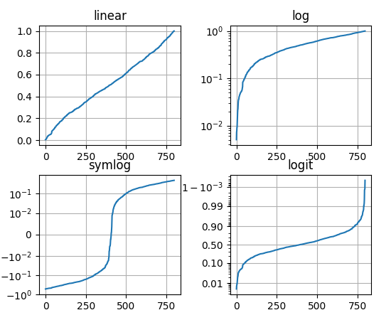
你也可以增加自己的刻度,详见开发者指南。
翻译来自:http://matplotlib.org/users/pyplot_tutorial.html


 1333
1333


 被折叠的 条评论
为什么被折叠?
被折叠的 条评论
为什么被折叠?
 到【灌水乐园】发言


