


希望这个demo能让大家理解CSS3的3d空间动画(其实是个假3D)
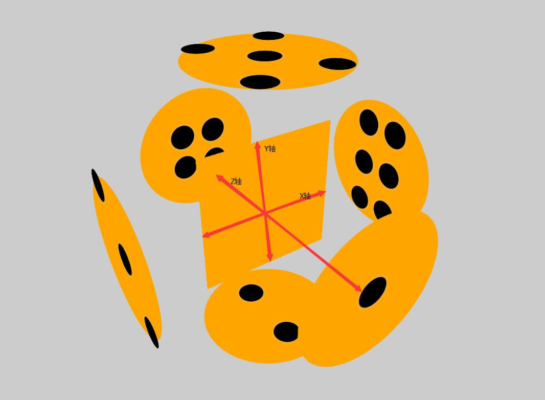
首先给一个3d的解剖图,x/y/z轴线轴线已经标出
下面附上添加特效的动画旋转
可以根据demo并参考上面解剖图进行理解
<!DOCTYPE html>
<html lang="en">
<head>
    <meta charset="UTF-8">
    <title>Document</title>
    <style>
        html{
            height: 100%;
        }
        body{
            height: 100%;
            display: flex;
            justify-content: center;
            align-items: center;
            background-color: black;
            perspective: 1000px;
            transform-style: preserve-3d;

        }
        section{
            width: 300px;
            height: 300px;
            transform-style: preserve-3d;
            animation: zhuan 16s infinite linear;

        }
        div{
            width: 300px;
            height: 300px;
            background-color: orange;
            display: flex;
            flex-wrap: wrap;
            align-items: center;
            justify-content: center;
            position: absolute;
            box-shadow: 0 0 300px green;
            opacity: 0.8;
        }
        div:nth-child(1){
            transform: translateZ(300px);
            border-radius: 50%;
            box-shadow: 0 0 500px orange;
            opacity: 0.4;
        }
        div:nth-child(2){
            transform: rotateX(90deg) translateZ(300px);
            align-items: center;
            justify-content: space-around;
            flex-direction: column;
            border-radius: 50%;
            box-shadow: 0 0 500px orange;
            opacity: 0.4;
        }
        div:nth-child(3){
            transform: rotateY(90deg) translateZ(300px);
            flex-wrap: wrap;
            align-items: flex-start;
            justify-content: center;
            border-radius: 50%;
            box-shadow: 0 0 500px orange;
            opacity: 0.4;
        }
        div:nth-child(3) p:nth-child(2){
            align-self: center;
        }
        div:nth-child(3) p:nth-child(3){
            align-self: flex-end;
        }
        div:nth-child(4){
            transform: translateZ(-300px);
            flex-wrap: wrap;
            border-radius: 50%;
            box-shadow: 0 0 500px orange;
            opacity: 0.4;
        }
        div:nth-child(5){
            transform: rotateX(90deg) translateZ(-300px);
            border-radius: 50%;
            box-shadow: 0 0 500px orange;
            opacity: 0.4;
        }
        div:nth-child(6){
            transform: rotateY(90deg) translateZ(-300px);
            border-radius: 50%;
            box-shadow: 0 0 500px orange;
            opacity: 0.4;
        }
        .low{
            width: 300px;
            height: 150px;
            display: flex;
        }
        .low:nth-child(1){
            align-items: flex-end;
            justify-content: center;
        }
        .low:nth-child(2){
            align-items: flex-start;
            justify-content: center;
        }
        .stree{
            width: 300px;
            height: 33.33%;
            display: flex;
        }
        .stree:nth-child(1){
            justify-content: space-around;
        }
        .stree:nth-child(2){
            justify-content: center;
        }
        .stree:nth-child(3){
            justify-content: space-around;
        }
        .fore{
            width: 300px;
            height: 33.33%;
            display: flex;
        }
        .fore:nth-child(1){
            justify-content: center;
        }
        .fore:nth-child(3){
            justify-content: center;
        }
        p{
            width: 60px;
            height: 60px;
            background-color: white;
            border-radius: 50%;
            box-shadow: 200 60 400px #ccc;
            opacity: 0.7;
            margin: 10px;

        }
        @keyframes zhuan{
            0%{
                transform: rotateX(0deg) rotateY(0deg);
            }
            100%{
                transform: rotateX(360deg) rotateY(360deg) ;
            }
        }

    </style>
</head>
<body>
    <section>
        <div>
            <p></p>
        </div>
        <div>
            <p></p>
            <p></p>
        </div>
        <div>
            <p></p>
            <p></p>
            <p></p>
        </div>
        <div>
        <main class="low">
            <p></p>
            <p></p>
        </main>
        <main class="low">
            <p></p>
            <p></p>
        </main>
        </div>
        <div>
        <main class="stree">
            <p></p>
            <p></p>
        </main>
        <main class="stree">
            <p></p>
        </main>
        <main class="stree">
            <p></p>
            <p></p>
        </main>
        </div>
        <div>
            <main class="fore">
            <p></p>
                <p></p>
            </main>
            <main class="stree">
                <p></p>
                <p></p>
            </main>
            <main class="fore">
                <p></p>
                <p></p>
            </main>
        </div>
    </section>
</body>
</html>


 184
184


 被折叠的 条评论
为什么被折叠?
被折叠的 条评论
为什么被折叠?
 到【灌水乐园】发言


