按钮样式集合

下面是5种常用的样式,CSS文件如下:

ButtonCSS.css

/***按纽样式****/
.btnLightBlue {
    font-family: "tahoma", "宋体";
    font-size:9pt; color: #003399;
    border: 1px #003399 solid;
    color:#006699;
    border-bottom: #93bee2 1px solid;
    border-left: #93bee2 1px solid;
    border-right: #93bee2 1px solid;
    border-top: #93bee2 1px solid;
    background-image:url(../images/bluebuttonbg.gif);
    background-color: #e8f4ff;
    cursor: hand;
    font-style: normal ;
    width:60px;
    height:22px;
}
/*银色背景黑色字体*/
.btnSilver {
	 BORDER-RIGHT: #7b9ebd 1px solid; 
	 PADDING-RIGHT: 2px; 
	 BORDER-TOP: #7b9ebd 1px solid; 
	 PADDING-LEFT: 2px; 
	 FONT-SIZE: 12px; 
	 FILTER: progid:DXImageTransform.Microsoft.Gradient(GradientType=0, StartColorStr=#ffffff, EndColorStr=#cecfde); 
	 BORDER-LEFT: #7b9ebd 1px solid; 
	 CURSOR: hand; COLOR: black; 
	 PADDING-TOP: 2px; 
	 BORDER-BOTTOM: #7b9ebd 1px solid
}
/*绿色背景黑色字体*/
.btnGreen {
	 BORDER-RIGHT: #7EBF4F 1px solid; 
	 PADDING-RIGHT: 2px; 
	 BORDER-TOP: #7EBF4F 1px solid; 
	 PADDING-LEFT: 2px; 
	 FONT-SIZE: 12px; 
	 FILTER: progid:DXImageTransform.Microsoft.Gradient(GradientType=0, StartColorStr=#ffffff, EndColorStr=#B3D997); 
	 BORDER-LEFT: #7EBF4F 1px solid; 
	 CURSOR: hand; 
	 COLOR: black; 
	 PADDING-TOP: 2px; 
	 BORDER-BOTTOM: #7EBF4F 1px solid
}
/*蓝色背景黑色字体*/
.btnBlue {
 BORDER-RIGHT: #002D96 1px solid; 
 PADDING-RIGHT: 2px; 
 BORDER-TOP: #002D96 1px solid; 
 PADDING-LEFT: 2px; 
 FONT-SIZE: 12px; 
 FILTER: progid:DXImageTransform.Microsoft.Gradient(GradientType=0, StartColorStr=#FFFFFF, EndColorStr=#9DBCEA); 
 BORDER-LEFT: #002D96 1px solid; 
 CURSOR: hand; 
 COLOR: black; 
 PADDING-TOP: 2px; 
 BORDER-BOTTOM: #002D96 1px solid
}

.btn{
cursor:pointer!important;
cursor:hand;
background:url(bg_btn.gif); 
background-position:bottom;
background-color:#E1F1D4; 
text-align:center; 
height:20px; font-size:12px;
width:50px;
padding:0px!important;
border:1px solid #54A9DF; 
color:#005500}


前台调用: 

       <input type="button" class="btnLightBlue" value="按钮1" />
       <input type="button" class="btnSilver" value="按钮2" />
       <input type="button" class="btnGreen" value="按钮3" />
       <input type="button" class="btnBlue" value="按钮4" />
       <input type="button" class="btn" value="按钮5" />


效果图:

按钮5的背景图:


另有50个超炫的按钮:

效果图如下:


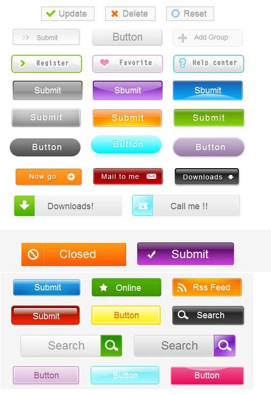
50个超炫按钮样式下载:http://download.csdn.net/detail/lovegonghui/9237485


  • 0
    点赞
  • 2
    收藏
    觉得还不错? 一键收藏
  • 0
    评论
Winform的集合编辑器样式可以通过自定义UITypeEditor来实现。以下是一个示例代码,可以将集合编辑器的样式设置为表格(DataGridView)的形式: ```csharp using System; using System.Collections.Generic; using System.ComponentModel; using System.Drawing.Design; using System.Windows.Forms; using System.Windows.Forms.Design; namespace WinFormsApp { // 自定义集合编辑器 public class CustomCollectionEditor : UITypeEditor { private IWindowsFormsEditorService editorService; private DataGridView dataGridView; private List<object> collection; private Type itemType; public CustomCollectionEditor(Type itemType) { this.itemType = itemType; } public override object EditValue(ITypeDescriptorContext context, IServiceProvider provider, object value) { if (context != null && provider != null) { editorService = (IWindowsFormsEditorService)provider.GetService(typeof(IWindowsFormsEditorService)); if (editorService != null) { // 创建DataGridView控件 dataGridView = new DataGridView(); dataGridView.AutoGenerateColumns = true; dataGridView.AutoSizeColumnsMode = DataGridViewAutoSizeColumnsMode.Fill; dataGridView.DataSource = new BindingList<object>((List<object>)value); dataGridView.CellEndEdit += DataGridView_CellEndEdit; editorService.DropDownControl(dataGridView); // 返回编辑后的值 return collection; } } return value; } private void DataGridView_CellEndEdit(object sender, DataGridViewCellEventArgs e) { // 更新集合 collection = new List<object>(); foreach (DataGridViewRow row in dataGridView.Rows) { if (!row.IsNewRow) { object obj = Activator.CreateInstance(itemType); foreach (DataGridViewCell cell in row.Cells) { var prop = itemType.GetProperty(dataGridView.Columns[cell.ColumnIndex].Name); if (prop != null) prop.SetValue(obj, cell.Value); } collection.Add(obj); } } dataGridView.DataSource = new BindingList<object>(collection); } public override UITypeEditorEditStyle GetEditStyle(ITypeDescriptorContext context) { return UITypeEditorEditStyle.DropDown; } } // 测试代码 public class TestClass { [Editor(typeof(CustomCollectionEditor), typeof(UITypeEditor))] public List<TestItem> Items { get; set; } } public class TestItem { public string Name { get; set; } public int Age { get; set; } } } ``` 在上述代码中,我们首先定义了一个CustomCollectionEditor类,继承自UITypeEditor,并实现了EditValue和GetEditStyle方法。EditValue方法在用户点击编辑按钮时调用,返回编辑后的集合数据。在EditValue方法中,我们创建了一个DataGridView控件,并设置其数据源为当前集合值。当用户编辑数据后,DataGridView的CellEndEdit事件会触发,我们可以在该事件中更新集合数据。最后,我们返回更新后的集合数据。 在测试代码中,我们定义了一个TestClass类,包含一个Items属性,使用了我们自定义的集合编辑器。我们可以在属性面板中编辑该属性,呈现出DataGridView的形式。

“相关推荐”对你有帮助么?

  • 非常没帮助
  • 没帮助
  • 一般
  • 有帮助
  • 非常有帮助
提交
评论
添加红包

请填写红包祝福语或标题

红包个数最小为10个

红包金额最低5元

当前余额3.43前往充值 >
需支付:10.00
成就一亿技术人!
领取后你会自动成为博主和红包主的粉丝 规则
hope_wisdom
发出的红包
实付
使用余额支付
点击重新获取
扫码支付
钱包余额 0

抵扣说明:

1.余额是钱包充值的虚拟货币,按照1:1的比例进行支付金额的抵扣。
2.余额无法直接购买下载,可以购买VIP、付费专栏及课程。

余额充值