


先言:
现在网页布局大多都是flex布局,像浮动这些用得比较少,在面试中flex也是被经常问到的。而有些同学学完flex后,又不懂怎么练习巩固,所以,所以,所以,我汇聚了一些常见的flex的练习题案例,写完再次加强掌握flex~

第一题:
效果如下,先看效果自己写或者思考,最后再看代码:

html:
<div class="container">
   <div class="item"> </div>
</div>
css:
.container{
  width: 300px;
  height: 300px;
  background-color: skyblue;
  display: flex;
  justify-content: center;
  align-items: center;
}
.item{
  width: 100px;
  height: 100px;
  background-color: blue;
}
第二题:
效果如下:
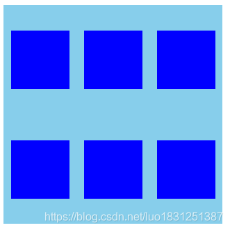
html:
<div class="container">
   <div class="item"> </div>
   <div class="item"> </div>
   <div class="item"> </div>
   <div class="item"> </div>
   <div class="item"> </div>
   <div class="item"> </div>
</div>
css:
.container{
  width: 300px;
  height: 300px;
  background-color: skyblue;
  display: flex;
  justify-content: space-around;
  flex-wrap: wrap;
  align-content: space-around;
}
.item{
  width: 80px;
  height: 80px;
  background-color: blue;
}
第三题:
先看效果:
 html:
html:
<div class="container">
   <div class="item"> </div>
   <div class="item"> </div>
</div>
css:
.container{
  width: 300px;
  height: 300px;
  background-color: skyblue;
  display: flex;
  justify-content: space-between;
}
.item{
  width: 80px;
  height: 80px;
  background-color: blue;
}
.container div:nth-of-type(2){
    align-self: flex-end;
}
第四题:
先看效果:

html:
<div class="container">
   <div class="item"> </div>
   <div class="item"> </div>
   <div class="item"> </div>
</div>
css:
.container{
  width: 300px;
  height: 300px;
  background-color: skyblue;
  display: flex;
  justify-content: space-between;
}
.item{
  width: 80px;
  height: 80px;
  background-color: blue;
}
.container div:nth-of-type(2){
    align-self: center;
}
.container div:nth-of-type(3){
  align-self: flex-end;
}
第五题:
先看效果:

html:
<div class="container">
  <div class="first">
    <div class="item"> </div>
    <div class="item"> </div>
  </div>
   <div class="second">
    <div class="item"> </div>
    <div class="item"> </div>
  </div>
</div>
css:
.container{
  width: 300px;
  height: 300px;
  background-color: skyblue;
  display: flex;
  justify-content: space-between;

}
.item{
  width: 80px;
  height: 80px;
  background-color: blue;
  border: 1px solid green;
}
.first,.second{
  display: flex;
  flex-direction: column;
  justify-content: space-between;
}
第六题:
先看效果:

html:
<div class="container">
  <div class="first">
    <div class="item"> </div>
    <div class="item"> </div>
  </div>
   <div class="second">
    <div class="item"> </div>
  </div>
    <div class="three">
    <div class="item"> </div>
    <div class="item"> </div>
  </div>
</div>
css:
.container{
  width: 300px;
  height: 300px;
  background-color: skyblue;
  display: flex;
  justify-content: space-between;

}
.item{
  width: 80px;
  height: 80px;
  background-color: blue;
  border: 1px solid green;
}
.first,.three{
  display: flex;
  flex-direction: column;
  justify-content: space-between;
}
.second{
  align-self: center;
}
第七题:
先看效果:

html:
<div class="container">
  <div class="first">
    <div class="item"> </div>
    <div class="item"> </div>
    <div class="item"> </div>
  </div>
   <div class="second">
    <div class="item"> </div>
    <div class="item"> </div>
    <div class="item"> </div>
  </div>
</div>
css:
.container{
  width: 300px;
  height: 300px;
  background-color: skyblue;
  display: flex;
  justify-content: space-between;

}
.item{
  width: 80px;
  height: 80px;
  background-color: blue;
  border: 1px solid green;
}
.first,.second,.three{
  display: flex;
  flex-direction: column;
  justify-content: space-between;
}
第八题:
先看效果,两边盒子宽不变,中间盒子动态适应宽度大小:

html:
<div class="container">
  <div class="first">1</div>
   <div class="second">2</div>
   <div class="third">3</div>
</div>
css:
.container{
  width:100%;
  height: 100px;
  background-color: skyblue;
  display: flex;
  justify-content: space-around;
}
.first{
  width:100px;
  background-color: red;
}
.second{
  background-color: orange;
  flex-grow: 1;
}
.third{
  width:100px;
  background-color: pink;
}
第九题:
先看效果,左右上下都能动态调整大小:

html:
<div class="container">
  <div class="head">1</div>
   <div class="body">
      <div class="body-left">2.1</div>
      <div class="body-center">2.2</div>
   </div>
   <div class="footer">3</div>
</div>
css:
.container{
  height: 100vh;
  background-color: skyblue;
  display: flex;
  flex-direction: column;
}
.head{
   background-color: blue;
   flex-grow: 2;
}
.body{
  display: flex;
  flex-grow: 5;
}
.body-left{
   background-color: green;
  flex-grow: 1;
}
.body-center{
   background-color: pink;
  flex-grow: 5;
}
.footer{
  flex-grow: 1;
   background-color: orange;
}
第十题:
先看效果,也是动态改变大小的:

html:
<div class="container">
  <div class="first">
     <div class="item" style="background: red;">A</div>
     <div class="item" style="background: yellow;">B</div>
     <div class="item" style="background: blue;">C</div>
  </div>
   <div class="second">
      <div class="box">
           <div class="item" style="background: green;">D</div>
           <div class="item" style="background: pink;">E</div>
      </div>
      <div class="bigitem" style="background: orange;">F</div>
  </div>
</div>
css:
.container{
  height: 100vw;
  width: 100vw;
  background-color: skyblue;
  display: flex;
  flex-direction: column;

 }
.item{
  flex: 1;
}

.first{
  display: flex;
  flex: 1;
}
.second{
   display: flex;
   flex: 2;
}
.box{
    display: flex;
    flex-direction: column;
    flex: 1;
}
.bigitem{
  flex: 2;
}
总结:
建议收藏,这篇文章持续更新,会一直添加flex布局案例练习题~
~关注我看更多简单创意特效:
文字烟雾效果 html+css+js
环绕倒影加载特效 html+css
气泡浮动背景特效 html+css
简约时钟特效 html+css+js
赛博朋克风格按钮 html+css
仿网易云官网轮播图 html+css+js
水波加载动画 html+css
导航栏滚动渐变效果 html+css+js
书本翻页 html+css
3D立体相册 html+css
霓虹灯绘画板效果 html+css+js
记一些css属性总结(一)
Sass总结笔记
…等等
进我主页看更多~


 766
766


 被折叠的 条评论
为什么被折叠?
被折叠的 条评论
为什么被折叠?
 到【灌水乐园】发言


