


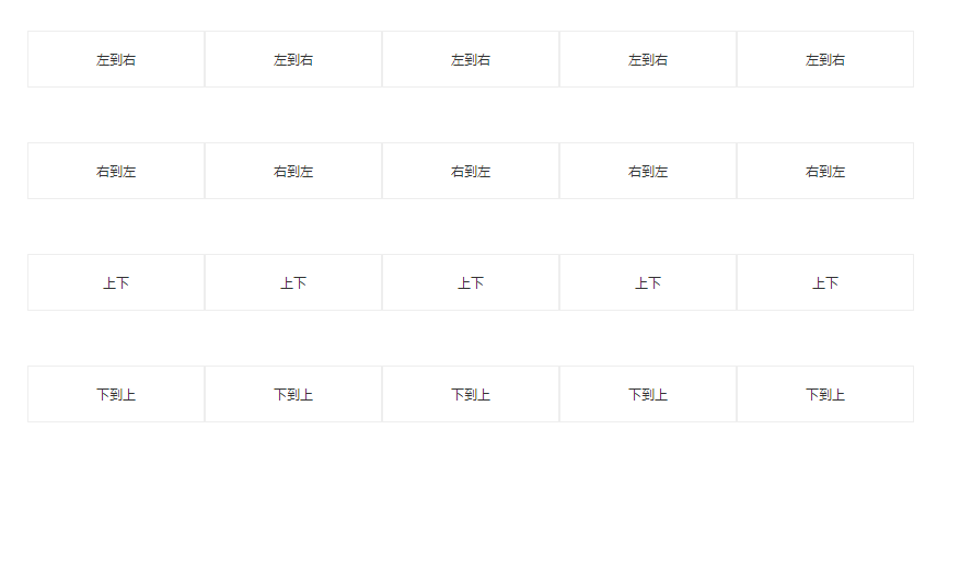
效果图
<!DOCTYPE html>
<html lang="en">
<head>
    <meta charset="UTF-8">
    <meta name="viewport" content="width=device-width, initial-scale=1.0">
    <meta http-equiv="X-UA-Compatible" content="ie=edge">
    <title>鼠标滑过</title>
    <style>
        .ul{
            display: flex;
            margin-top: 50px;
            margin-left: 100px;
        }
        .lis{
            width: 100px;
            height: 50px;
            line-height: 50px;
            text-align: center;
            cursor:pointer;
            color: #333333;
            border: 1px solid #eeeeee;
            position: relative;
            transition: 0.6s linear;
        }
        .lis:hover{
            color: #ffffff;
        }
        .lis:after{
            width: 0;
            cursor:pointer;
            position: absolute;
            content: "";
            top: 0;
            bottom: 0;
            left: 0;
            z-index: -1;
            background: #2a68cc;
            transition: 0.6s linear;
        }
        .lis:hover:after{
            width: 100px;
        }
        .ul2{
            display: flex;
            margin-top: 50px;
            margin-left: 100px;
        }
        .lis2{
            width: 100px;
            height: 50px;
            line-height: 50px;
            text-align: center;
            cursor:pointer;
            color: #333333;
            border: 1px solid #eeeeee;
            position: relative;
            transition: 0.6s linear;
        }
        .lis2:hover{
            color: #ffffff;
        }
        .lis2:after{
            width: 0;
            cursor:pointer;
            position: absolute;
            content: "";
            top: 0;
            bottom: 0;
            right: 0;
            z-index: -1;
            background: orangered;
            transition: 0.6s linear;
        }
        .lis2:hover:after{
            width: 100px;
        }
        .ul3{
            display: flex;
            margin-top: 50px;
            margin-left: 100px;
        }
        .lis3{
            width: 100px;
            height: 50px;
            line-height: 50px;
            text-align: center;
            cursor:pointer;
            color: #333333;
            border: 1px solid #eeeeee;
            position: relative;
            transition: 0.6s linear;
        }
        .lis3:hover{
            color: #ffffff;
        }
        .lis3:after{
            width: 100px;
            cursor:pointer;
            position: absolute;
            content: "";
            top: 50%;
            bottom: 50%;
            right: 0;
            left: 0;
            z-index: -1;
            background: darkcyan;
            transition: 0.3s linear;
        }
        .lis3:hover:after{
            top: 0;
            bottom: 0;
        }
        .ul4{
            display: flex;
            margin-top: 50px;
            margin-left: 100px;
        }
        .lis4{
            width: 100px;
            height: 50px;
            line-height: 50px;
            text-align: center;
            cursor:pointer;
            color: #333333;
            border: 1px solid #eeeeee;
            position: relative;
            transition: 0.6s linear;
        }
        .lis4:hover{
            color: #ffffff;
        }
        .lis4:after{
            width: 100px;
            cursor:pointer;
            position: absolute;
            content: "";
            top: 100%;
            bottom: 0;
            right: 0;
            left: 0;
            z-index: -1;
            background: brown;
            transition: 0.3s linear;
        }
        .lis4:hover:after{
            top: 0;
            bottom: 0;
        }


    </style>
</head>
<body>
    <div class="ul">
        <div class="lis">左到右</div>
        <div class="lis">左到右</div>
        <div class="lis">左到右</div>
        <div class="lis">左到右</div>
        <div class="lis">左到右</div>
    </div>
    <div class="ul2">
        <div class="lis2">右到左</div>
        <div class="lis2">右到左</div>
        <div class="lis2">右到左</div>
        <div class="lis2">右到左</div>
        <div class="lis2">右到左</div>
    </div>
    <div class="ul3">
        <div class="lis3">上下</div>
        <div class="lis3">上下</div>
        <div class="lis3">上下</div>
        <div class="lis3">上下</div>
        <div class="lis3">上下</div>
    </div>
    <div class="ul4">
        <div class="lis4">下到上</div>
        <div class="lis4">下到上</div>
        <div class="lis4">下到上</div>
        <div class="lis4">下到上</div>
        <div class="lis4">下到上</div>
    </div>
</body>
</html>


 389
389


 被折叠的 条评论
为什么被折叠?
被折叠的 条评论
为什么被折叠?
 到【灌水乐园】发言


