


背景图过大,完整显示背景图方法,兼容IE,转。。。。
Perfect Full Page Background Image
PUBLISHED NOVEMBER 20, 2010 BY CHRIS COYIER

This post was originally published on August 21, 2009 and is now being being republished as it has been entirely revised. Both original methods are removed and now replaced by four new methods.
The goal here is a background image on a website that covers the entire browser window at all times. Let's put some specifics on it:
- Fills entire page with image, no white space
- Scales image as needed
- Retains image proportions (aspect ratio)
- Image is centered on page
- Does not cause scrollbars
- As cross-browser compatible as possible
- Isn't some fancy shenanigans like Flash
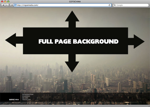
Image above credited to this site.
Awesome, Easy, Progressive CSS3 Way
We can do this purely through CSS thanks to the background-size property now in CSS3. We'll use the html element (better than body as it's always at least the height of the browser window). We set a fixed and centered background on it, then adjust it's size using background-size set to the cover keyword.
html {
  background: url(images/bg.jpg) no-repeat center center fixed;
  -webkit-background-size: cover;
  -moz-background-size: cover;
  -o-background-size: cover;
  background-size: cover;
}
Works in:
- Safari 3+
- Chrome Whatever+
- IE 9+
- Opera 10+ (Opera 9.5 supported background-size but not the keywords)
- Firefox 3.6+ (Firefox 4 supports non-vendor prefixed version)
Update: Thanks to Goltzman in the comments for pointing out an Adobe Developer Connection article which features some code to make IE do cover backgrounds as well:
filter: progid:DXImageTransform.Microsoft.AlphaImageLoader(src='.myBackground.jpg', sizingMethod='scale');
-ms-filter: "progid:DXImageTransform.Microsoft.AlphaImageLoader(src='myBackground.jpg', sizingMethod='scale')";
But careful, reader Pierre Orsander said they tried this and had some problems with links on the page going dead.
Update: Matt Litherland writes in to say that anyone trying to use the above IE filters and having problems with scrollbars or dead links or whatever else (like Pierre above) should try NOT using them on the html or body element. But instead a fixed position div with 100% width and height.
CSS-Only Technique #1
Big thanks, as usual, to Doug Neiner for this alternate version. Here we use an inline <img>element, which will be able to resize in any browser. We set a min-height which keeps it filling the browser window vertically, and set a 100% width which keeps it filling horizontally. We also set a min-width of the width of the image so that the image never gets smaller than it actually is.
The especially clever bit is using a media query to check if the browser window is smaller than the image, and using a combo percentage-left and negative left margin to keep it centered regardless.
Here is the CSS:
img.bg {
  /* Set rules to fill background */
  min-height: 100%;
  min-width: 1024px;

  /* Set up proportionate scaling */
  width: 100%;
  height: auto;

  /* Set up positioning */
  position: fixed;
  top: 0;
  left: 0;
}

@media screen and (max-width: 1024px) { /* Specific to this particular image */
  img.bg {
    left: 50%;
    margin-left: -512px;   /* 50% */
  }
}
Works in:
- Any version of good browsers: Safari / Chrome / Opera / Firefox
- IE 6: Borked - but probably fixable if you use some kind of fixed positioning shim
- IE 7/8: Mostly works, doesn't center at small sizes but fills screen fine
- IE 9: Works
CSS-Only Technique #2
One rather simple way to handle this is to put an inline image on the page, fixed position it to the upper left, and give it a min-width and min-height of 100%, preserving it's aspect ratio.
<img src="images/bg.jpg" id="bg" alt="">#bg {
position: fixed;
top: 0;
left: 0;
/* Preserve aspet ratio */
min-width: 100%;
min-height: 100%;
}However, this doesn't center the image and that's a pretty common desire here... So, we can fix that by wrapping the image in a div. That div we'll make twice as big as the browser window. Then the image will be placed, still preserving it's aspect ratio and covering the visible browser window, and the dead center of that.
<div id="bg">
  <img src="images/bg.jpg" alt="">
</div>
#bg {
position: fixed;
top: -50%;
left: -50%;
width: 200%;
height: 200%;
}
#bg img {
position: absolute;
top: 0;
left: 0;
right: 0;
bottom: 0;
margin: auto;
min-width: 50%;
min-height: 50%;
}Credit to Corey Worrell for the concept on this one.
Works in:
- Safari / Chrome / Firefox (didn't test very far back, but recent versions are fine)
- IE 8+
- Opera (any version) and IE both fail in the same way (wrongly positioned, not sure why)
- Peter VanWylen wrote in to say that if you add the image via JavaScript, the img needs to have width: auto; and height: auto; to work in IE 8, 9, or 10.
jQuery Method
This whole idea becomes a lot easier (from a CSS perspective) if we know if the aspect ratio of the image (inline <img> we intend to use as a background) is larger or smaller than the current aspect ratio of the browser window. If it is lower, than we can set onlythe width to 100% on the image and know it will fill both height and width. If it is higher, we can set only the height to 100% and know that it will fill both the height and width.
We have access to this information through JavaScript. As usual around here, I like to lean on jQuery.
<img src="images/bg.jpg" id="bg" alt="">#bg { position: fixed; top: 0; left: 0; }
.bgwidth { width: 100%; }
.bgheight { height: 100%; }$(window).load(function() {
var theWindow = $(window),
$bg = $("#bg"),
aspectRatio = $bg.width() / $bg.height();
function resizeBg() {
if ( (theWindow.width() / theWindow.height()) < aspectRatio ) {
$bg
.removeClass()
.addClass('bgheight');
} else {
$bg
.removeClass()
.addClass('bgwidth');
}
}
theWindow.resize(resizeBg).trigger("resize");
});This doesn't account for centering, but you could definitely alter this to do that. Credits to Koen Haarbosch for the concept behind this idea.
Works in:
- IE7+ (could probably get in IE6 with a fixed position shim)
- Most any other desktop browser
Update (June 2012): Reader Craig Manley writes in with a technique to load an appropriately sized background image according to screen. As in, don't load some huge 1900px wide background image for an iPhone.
First, you'd make images like 1024.jpg, 1280.jpg, 1366.jpg, etc. Then instead of loading an img, you'd load a shim.
<img id="bg" src="data:image/gif;base64,R0lGODlhAQABAIAAAAAAAP///yH5BAEAAAAALAAAAAABAAEAAAIBRAA7" alt="" style="position: fixed; left: 0; top: 0" />If you don't like the gif shim (personally I think it's OK because it's not "content" it's a background) you could load up one of the real images instead. This code will account for that.
Then you test the screen width and set the src of the image based on it. The code below does it on resize, which you may or may not want. You could just run the code once if you wanted.
(function() {

var win = $(window);

win.resize(function() {

    var win_w = win.width(),
        win_h = win.height(),
        $bg    = $("#bg");

    // Load narrowest background image based on
    // viewport width, but never load anything narrower
    // that what's already loaded if anything.
    var available = [
      1024, 1280, 1366,
      1400, 1680, 1920,
      2560, 3840, 4860
    ];

    var current = $bg.attr('src').match(/([0-9]+)/) ? RegExp.$1 : null;

    if (!current || ((current < win_w) && (current < available[available.length - 1]))) {

      var chosen = available[available.length - 1];

      for (var i=0; i<available.length; i++) {
        if (available[i] >= win_w) {
          chosen = available[i];
          break;
        }
      }

      // Set the new image
      $bg.attr('src', '/img/bg/' + chosen + '.jpg');

      // for testing...
      // console.log('Chosen background: ' + chosen);

    }

    // Determine whether width or height should be 100%
    if ((win_w / win_h) < ($bg.width() / $bg.height())) {
      $bg.css({height: '100%', width: 'auto'});
    } else {
      $bg.css({width: '100%', height: 'auto'});
    }

  }).resize();

})(jQuery);
Note that screen width isn't the only possible good information to have when choosing an image size. See this article.
Enjoy
If you use this, please feel free to leave what technique you used and if you altered it in any way in the comments below. Always cool to see techniques "in the wild."
Just for posterity's sake, there is another example in here called table.php which uses an old technique that used to be a part of this article. It had some cleverness, but wasn't quite as good as either CSS technique now presented above.
转自: http://css-tricks.com/perfect-full-page-background-image/


 5108
5108


 被折叠的 条评论
为什么被折叠?
被折叠的 条评论
为什么被折叠?
 到【灌水乐园】发言


