Android studio引用导包方式
1.在需要用到某个包的Module下的build.gradle文件中dependencies代码块中添加引用(本地没有的包,Android studio会自动帮去下载)
2.点击工具栏setting(设置)右边的Structure按钮,选择需要导包的module,点击右边的加号。减号为移除引用。
以下示例都要导入相应的包
com.android.support:appcompat-v7包
使用方法:
1.引用v7 的appcompat 包
2.使用Toolbar的Activity要继承AppCompatActivity
3.需要更改主题为NoActionbBar的主题
4.在布局文件中引用Toolbar , 需引用v7包中的Toolbar , 默认的Toolbar 仅支持 API >= 21 (android 5.0)的系统
<android.support.v7.widget.Toolbar
   android:id="@+id/my_toolbar"
   android:layout_width="match_parent"
   android:layout_height="?attr/actionBarSize"
   android:background="?attr/colorPrimary"
   android:elevation="4dp"
   android:theme="@style/ThemeOverlay.AppCompat.ActionBar"
   app:popupTheme="@style/ThemeOverlay.AppCompat.Light"/>
5.在代码中调用setSupportActionBar(toobar) 方法将Toolbar绑定到当前界面
示例:下文有
继承自FrameLayout并实现了圆角和阴影效果,常用于ListView或RecyclerView中Item布局的根节点
示例代码:
<android.support.v7.widget.CardView xmlns:android="http://schemas.android.com/apk/res/android"
xmlns:android.support.v7.cardview="http://schemas.android.com/apk/res-auto"
android:id="@+id/item_cardView"
android:layout_width="match_parent"
android:layout_height="wrap_content"
android:clickable="true"
android:elevation="4dp"
android:foreground="?android:attr/selectableItemBackground"
android.support.v7.cardview:cardBackgroundColor="#999"
android.support.v7.cardview:cardCornerRadius="15dp"
android.support.v7.cardview:cardElevation="15dp"
android.support.v7.cardview:contentPadding="0dp">
<TextView
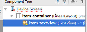
android:id="@+id/item_textView"
android:layout_width="match_parent"
android:layout_height="wrap_content"
android:padding="16dp"
android:text="@string/hello" />
</android.support.v7.widget.CardView>
- 1
- 2
- 3
- 4
- 5
- 6
- 7
- 8
- 9
- 10
- 11
- 12
- 13
- 14
- 15
- 16
- 17
- 18
- 19
- 20
- 1
- 2
- 3
- 4
- 5
- 6
- 7
- 8
- 9
- 10
- 11
- 12
- 13
- 14
- 15
- 16
- 17
- 18
- 19
- 20
添加点击波纹效果:
  android:clickable="true"
  android:foreground="?android:attr/selectableItemBackground"
com.android.support:recyclerview-v7包
recyclerview
高度解耦 , 异常灵活 , 可以用来代替ListView / GridView
相关类介绍:
使用步骤:
1.导包
2.在布局文件中添加RecyclerView
3.在Java代码中实现RecyclerView, 至少要添加两个属性:
recyclerView.setLayoutManager(new LinearLayoutManager(this));//指定布局管理器
recyclerView.setAdapter(adapter); //指定Adapter
4.Adapter的写法
1)创建一个自定义的ViewHolder,在里面初始化Item的每一个控件
2)让自定义的Adapt而继承RecyclerView.Adapter<传入自定义的ViewHolder>
3)实现对应的方法
示例:
1.布局文件
<?xml version="1.0" encoding="utf-8"?>
<RelativeLayout
    xmlns:android="http://schemas.android.com/apk/res/android"
    xmlns:tools="http://schemas.android.com/tools"
    xmlns:app="http://schemas.android.com/apk/res-auto"
    android:layout_width="match_parent"
    android:layout_height="match_parent"
    android:paddingBottom="@dimen/activity_vertical_margin"
    android:paddingLeft="@dimen/activity_horizontal_margin"
    android:paddingRight="@dimen/activity_horizontal_margin"
    android:paddingTop="@dimen/activity_vertical_margin"
    tools:context=".MainActivity">

    <android.support.v7.widget.RecyclerView
        android:id="@+id/rv"
        android:layout_width="match_parent"
        android:layout_height="match_parent"
        android:clickable="true"/>

</RelativeLayout>
- 1
- 2
- 3
- 4
- 5
- 6
- 7
- 8
- 9
- 10
- 11
- 12
- 13
- 14
- 15
- 16
- 17
- 18
- 19
- 20
- 21
- 1
- 2
- 3
- 4
- 5
- 6
- 7
- 8
- 9
- 10
- 11
- 12
- 13
- 14
- 15
- 16
- 17
- 18
- 19
- 20
- 21
2.适配器类
public class RecyclerAdapter extends RecyclerView.Adapter<RecyclerAdapter.ViewHolder> {
    private Context context;
    private ArrayList<String> list;

    public RecyclerAdapter(ArrayList<String> list, Context context) {
        this.list = list;
        this.context = context;
    }

    @Override
    public ViewHolder onCreateViewHolder(ViewGroup parent, int viewType) {
        View view = LayoutInflater.from(parent.getContext()).inflate(R.layout.recycler_item,
                parent, false);
        ViewHolder holder = new ViewHolder(view);
        return holder;
    }

    @Override
    public void onBindViewHolder(ViewHolder holder, int position) {
        String s = list.get(position);
        holder.item_textView.setText(s);
    }

    @Override
    public int getItemCount() {
        return list.size();
    }

    public static class ViewHolder extends RecyclerView.ViewHolder {
        private final TextView item_textView;

        public ViewHolder(View itemView) {
            super(itemView);
            item_textView = (TextView) itemView.findViewById(R.id.item_textView);
        }
    }
}
- 1
- 2
- 3
- 4
- 5
- 6
- 7
- 8
- 9
- 10
- 11
- 12
- 13
- 14
- 15
- 16
- 17
- 18
- 19
- 20
- 21
- 22
- 23
- 24
- 25
- 26
- 27
- 28
- 29
- 30
- 31
- 32
- 33
- 34
- 35
- 36
- 37
- 1
- 2
- 3
- 4
- 5
- 6
- 7
- 8
- 9
- 10
- 11
- 12
- 13
- 14
- 15
- 16
- 17
- 18
- 19
- 20
- 21
- 22
- 23
- 24
- 25
- 26
- 27
- 28
- 29
- 30
- 31
- 32
- 33
- 34
- 35
- 36
- 37
3.适配器用布局视图,recycler_item.xml
4.活动代码
public class MainActivity extends AppCompatActivity {
private RecyclerView recyclerView;
@Override
protected void onCreate(Bundle savedInstanceState) {
super.onCreate(savedInstanceState);
setContentView(R.layout.activity_main);
recyclerView = (RecyclerView) findViewById(R.id.rv);
LinearLayoutManager linearLayoutManager = new LinearLayoutManager(this);
linearLayoutManager.setOrientation(LinearLayoutManager.VERTICAL);
recyclerView.setLayoutManager(linearLayoutManager);
ArrayList<String> list = new ArrayList<>();
for (int i = 0; i < 20; i++) {
list.add("SB---------------->>>>" + i);
}
RecyclerAdapter adapter = new RecyclerAdapter(list, this);
recyclerView.setAdapter(adapter);
}
}
- 1
- 2
- 3
- 4
- 5
- 6
- 7
- 8
- 9
- 10
- 11
- 12
- 13
- 14
- 15
- 16
- 17
- 18
- 19
- 20
- 21
- 22
- 23
- 24
- 25
- 26
- 27
- 28
- 1
- 2
- 3
- 4
- 5
- 6
- 7
- 8
- 9
- 10
- 11
- 12
- 13
- 14
- 15
- 16
- 17
- 18
- 19
- 20
- 21
- 22
- 23
- 24
- 25
- 26
- 27
- 28
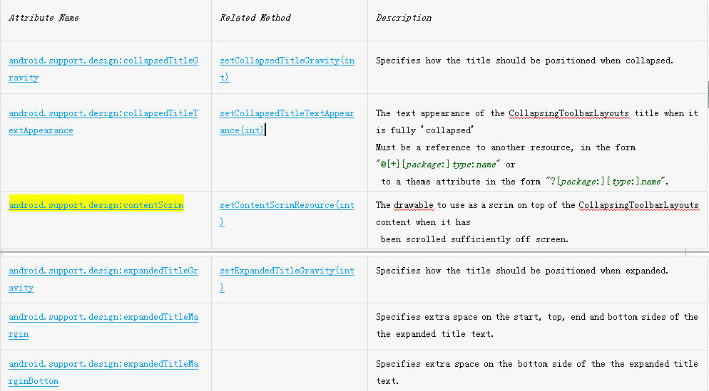
com.android.support:design包
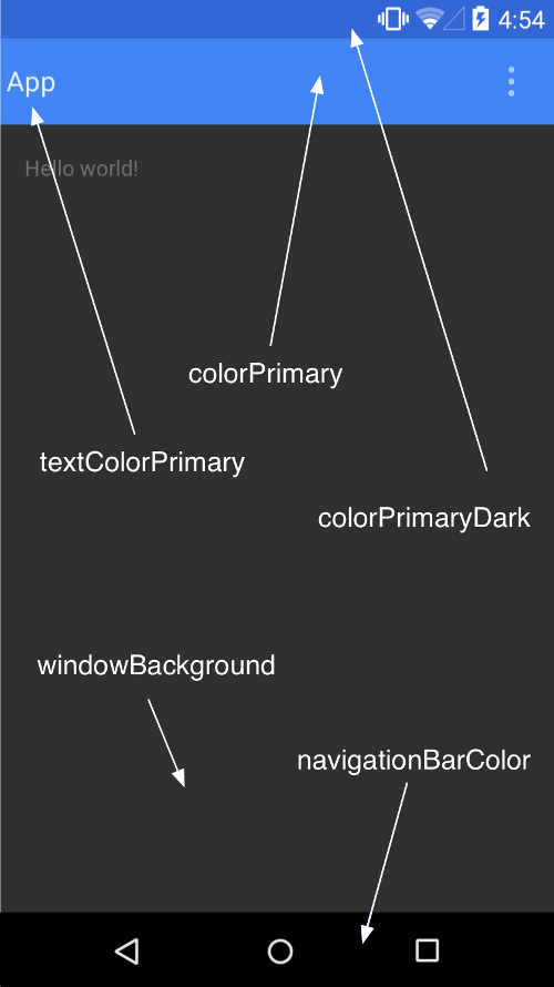
Material Design 自定义主题常用属性值
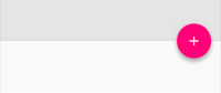
漂浮的Button,该控件父类为ImageView,所以拥有ImageView的所有属性
效果:
常用属性
android.support.design:fabSize=” ” 指定图标的大小 值:normal / mini
android.support.design:elevation=”” 指定阴影的深度 int
app:layout_anchor=” ” 指定显示坐标的锚点
app:layout_anchorGravity=” ” 指定锚点的对齐方式
示例:
布局文件:
<android.support.design.widget.FloatingActionButton
        android:id="@+id/fab"
        android:layout_width="wrap_content"
        android:layout_height="wrap_content"
        android:src="@mipmap/ic_launcher"
        app:elevation = "10dp"
        android:layout_alignParentBottom="true">

</android.support.design.widget.FloatingActionButton>
说明:app:elevation = “10dp”的app包名为
xmlns:app="http://schemas.android.com/apk/res-auto"
java代码部分,将其取出
FloatingActionButton floatingActionButton = (FloatingActionButton) findViewById(R.id.fab)
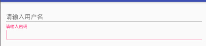
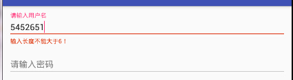
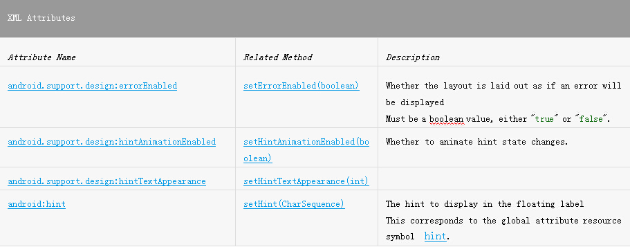
2.TextInputLayout
用于在EditText上显示Floating提示效果的控件。该控件内部必须包括有且只有一个EditText等输入控件。
效果:
常用属性值:
注意:
android:hint需要设置在EditText身上
改变hint的颜色需要更改主题的colorAccent 颜色值
示例:
布局文件
<android.support.design.widget.TextInputLayout
        android:id="@+id/textInputLayout"
        android:layout_width="match_parent"
        android:layout_height="wrap_content">

        <EditText
            android:id="@+id/edit_text"
            android:layout_width="match_parent"
            android:layout_height="wrap_content"
            android:hint="请输入用户名"/>
</android.support.design.widget.TextInputLayout>

<android.support.design.widget.TextInputLayout
        android:id="@+id/textInputLayout2"
        android:layout_width="match_parent"
        android:layout_height="wrap_content"
        android:layout_below="@+id/textInputLayout">

        <EditText
            android:id="@+id/edit_text2"
            android:layout_width="match_parent"
            android:layout_height="wrap_content"
            android:hint="请输入密码"/>
</android.support.design.widget.TextInputLayout>
- 1
- 2
- 3
- 4
- 5
- 6
- 7
- 8
- 9
- 10
- 11
- 12
- 13
- 14
- 15
- 16
- 17
- 18
- 19
- 20
- 21
- 22
- 23
- 24
- 1
- 2
- 3
- 4
- 5
- 6
- 7
- 8
- 9
- 10
- 11
- 12
- 13
- 14
- 15
- 16
- 17
- 18
- 19
- 20
- 21
- 22
- 23
- 24
java代码:
final TextInputLayout textInputLayout = (TextInputLayout) findViewById(R.id.textInputLayout);
TextInputLayout textInputLayout2 = (TextInputLayout) findViewById(R.id.textInputLayout2);
EditText editText = (EditText) findViewById(R.id.edit_text);
EditText editText2 = (EditText) findViewById(R.id.edit_text2);

editText.addTextChangedListener(new TextWatcher() {
            @Override
            public void beforeTextChanged(CharSequence s, int start, int count, int after) {

            }

            @Override
            public void onTextChanged(CharSequence s, int start, int before, int count) {

            }

            @Override
            public void afterTextChanged(Editable s) {
                String string = s.toString();
                if (string.length() > 6) {
                    textInputLayout.setErrorEnabled(true);
                    textInputLayout.setError("输入长度不能大于6!");
                }
            }
});
- 1
- 2
- 3
- 4
- 5
- 6
- 7
- 8
- 9
- 10
- 11
- 12
- 13
- 14
- 15
- 16
- 17
- 18
- 19
- 20
- 21
- 22
- 23
- 24
- 25
- 1
- 2
- 3
- 4
- 5
- 6
- 7
- 8
- 9
- 10
- 11
- 12
- 13
- 14
- 15
- 16
- 17
- 18
- 19
- 20
- 21
- 22
- 23
- 24
- 25
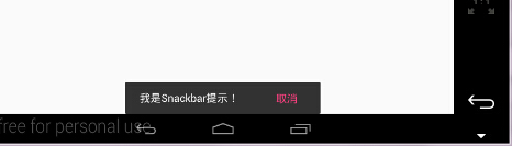
3.Snackbar
介于Toast和AlertDialog之间的轻量级控件,方便的实现消息的提示和动作的反馈
效果:
常用方法和属性
Snackbar.make(View view, CharSequence text, int duration).show()
Snackbar.setAction()
Snackbar.dismiss()
注意事项:
1.构造函数中第一个参数不能是ScrollView,因为SnackBar的实现逻辑是向view中addView,而ScrollView只能有一个childView
2.如果用SnackBar来代替Toast,需要注意的是Toast会浮在所有View之上,包括键盘.而SnakeView是在View之上addView的,所以要注意如果有键盘的时候,一定要先调用Keyboard.hide() , 否则键盘会将SnackBar遮住 .
示例:
final Button button = (Button) findViewById(R.id.button);
button.setOnClickListener(new View.OnClickListener() {
@Override
public void onClick(View v) {
                Snackbar snackbar = Snackbar.make(button, "我是Snackbar提示!",Snackbar.LENGTH_LONG);
                snackbar.setAction("取消", new View.OnClickListener() {
                    @Override
                    public void onClick(View v) {
                        Toast.makeText(SnackbarActivity.this, "你点了Snackbar上的取消", Toast.LENGTH_SHORT).show();
                    }
                });
                snackbar.show();
            }
});
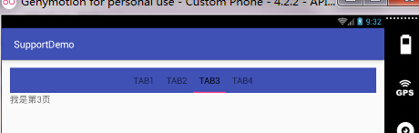
4.TabLayout
封装好了tab页和指示器
效果:
常用方法及属性
addTab(TabLayout.Tab tab, boolean setSelected)
addTab(TabLayout.Tab tab, int position)
addTab(TabLayout.Tab tab, int position, boolean setSelected)
newTab()
setOnTabSelectedListener(TabLayout.OnTabSelectedListener onTabSelectedListener)
setTabTextColors(int normalColor, int selectedColor)
setSelectedTabIndicatorColor(int color)
setSelectedTabIndicatorHeight(int height)
setTabMode(int mode)
注意:
与ViewPager结合Fragment使用,PagerAdapter必须重写getPageTitle()方法
设置适配器:
tabLayout.setupWithViewPager(ViewPager viewPager) //必须在ViewPager.setAdapter() 之后调用
tabLayout.setTabsFromPagerAdapter(PagerAdapter adapter)
示例:
1.布局文件
<android.support.design.widget.TabLayout
        android:id="@+id/tablayout"
        android:layout_width="match_parent"
        android:layout_height="50dp"
        android:background="@color/colorPrimary">

</android.support.design.widget.TabLayout>

<android.support.v4.view.ViewPager
        android:id="@+id/viewPager"
        android:layout_width="match_parent"
        android:layout_height="match_parent"
        android:layout_below="@+id/tablayout">

</android.support.v4.view.ViewPager>
2.ViewPager的适配器
public class ViewPagerAdapter extends FragmentPagerAdapter {
    public ViewPagerAdapter(FragmentManager fm) {
        super(fm);
    }

    @Override
    public Fragment getItem(int position) {
        int p = position + 1;
        return MyFragment.getInstance("我是第" + p + "页");
    }

    @Override
    public int getCount() {
        return 4;
    }

    @Override
    public CharSequence getPageTitle(int position) {
        String title = "null";
        if (position == 0) {
            title = "Tab1";
        } else if (position == 1) {
            title = "Tab2";
        } else if (position == 2) {
            title = "Tab3";
        } else if (position == 3) {
            title = "Tab4";
        }
        return title;
    }
}
- 1
- 2
- 3
- 4
- 5
- 6
- 7
- 8
- 9
- 10
- 11
- 12
- 13
- 14
- 15
- 16
- 17
- 18
- 19
- 20
- 21
- 22
- 23
- 24
- 25
- 26
- 27
- 28
- 29
- 30
- 31
- 1
- 2
- 3
- 4
- 5
- 6
- 7
- 8
- 9
- 10
- 11
- 12
- 13
- 14
- 15
- 16
- 17
- 18
- 19
- 20
- 21
- 22
- 23
- 24
- 25
- 26
- 27
- 28
- 29
- 30
- 31
3.碎片Fragment类
public class MyFragment extends Fragment {
    public static Fragment getInstance(String s) {
        MyFragment fragment = new MyFragment();
        Bundle bundle = new Bundle();
        bundle.putString("content", s);
        fragment.setArguments(bundle);

        return fragment;
    }

    @Nullable
    @Override
    public View onCreateView(LayoutInflater inflater, ViewGroup container, Bundle savedInstanceState) {
        TextView textView = new TextView(inflater.getContext());

        String content = getArguments().getString("content");
        textView.setText(content);

        return textView;
    }
}
- 1
- 2
- 3
- 4
- 5
- 6
- 7
- 8
- 9
- 10
- 11
- 12
- 13
- 14
- 15
- 16
- 17
- 18
- 19
- 20
- 21
- 1
- 2
- 3
- 4
- 5
- 6
- 7
- 8
- 9
- 10
- 11
- 12
- 13
- 14
- 15
- 16
- 17
- 18
- 19
- 20
- 21
4.活动Activity代码
@Override
protected void onCreate(Bundle savedInstanceState) {
super.onCreate(savedInstanceState)
setContentView(R.layout.activity_tab_layout)
TabLayout tabLayout = (TabLayout) findViewById(R.id.tablayout)
tabLayout.addTab(tabLayout.newTab().setText("Tab1"))
tabLayout.addTab(tabLayout.newTab().setText("Tab2"))
tabLayout.addTab(tabLayout.newTab().setText("Tab3"))
tabLayout.addTab(tabLayout.newTab().setText("Tab4"))
ViewPager viewPager = (ViewPager) findViewById(R.id.viewPager)
viewPager.setAdapter(new ViewPagerAdapter(getSupportFragmentManager()))
tabLayout.setupWithViewPager(viewPager)
}
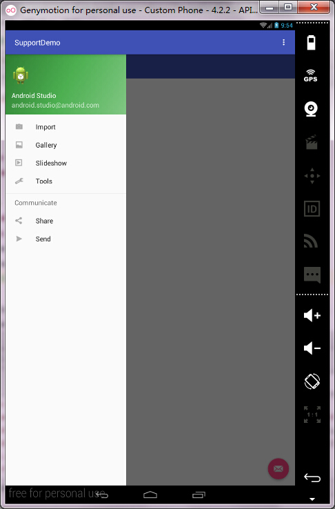
5.NavigationView
类似SlidingMenu
效果:
写法步骤:
1.Android studio中,创建Activity选择模板
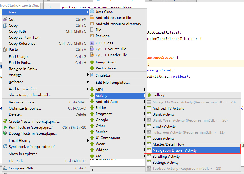
2.手动创建
常用属性和方法
android:layout_gravity="left"
app:headerLayout="@layout/drawer_header"
app:menu="@menu/drawer_menu"

app:itemBackground   //指定menu背景资源
app:itemIconTint     //指定menu Icon的颜色
app:itemTextColor    //指定menu item的字体颜色
说明:app属性为控件持有的属性,需要导入包名xmlns:app="http://schemas.android.com/apk/res-auto"
注意:
1.自动生成的代码中的Toolbar只能支持在API 21(android 5.0)以上
2.点击某一项后自动隐藏:drawerLayout.closeDrawers();
示例:
手动创建
1.主布局文件,根节点标签为android.support.v4.widget.DrawerLayout
<?xml version="1.0" encoding="utf-8"?>
<android.support.v4.widget.DrawerLayout
    android:id="@+id/drawerLayout"
    xmlns:android="http://schemas.android.com/apk/res/android"
    xmlns:app="http://schemas.android.com/apk/res-auto"
    xmlns:tools="http://schemas.android.com/tools"
    android:layout_width="match_parent"
    android:layout_height="match_parent"
    tools:context="com.example.administrator.supportdemo.navigationview.NaviActivity">

    <RelativeLayout
        android:layout_width="match_parent"
        android:layout_height="match_parent">

        <android.support.v7.widget.Toolbar
            android:id="@+id/toolbar1"
            android:layout_width="match_parent"
            android:layout_height="?attr/actionBarSize"
            android:background="@color/colorPrimary"
            />

        <TextView
            android:id="@+id/textView1"
            android:layout_width="wrap_content"
            android:layout_height="wrap_content"
            android:layout_centerInParent="true"
            android:textSize="18sp"/>
    </RelativeLayout>

    <android.support.design.widget.NavigationView
        android:id="@+id/navigationView"
        android:layout_width="match_parent"
        android:layout_height="match_parent"
        android:layout_gravity="left"
        app:headerLayout="@layout/drawer_header"
        app:menu="@menu/drawer_menu"
        />

</android.support.v4.widget.DrawerLayout>
- 1
- 2
- 3
- 4
- 5
- 6
- 7
- 8
- 9
- 10
- 11
- 12
- 13
- 14
- 15
- 16
- 17
- 18
- 19
- 20
- 21
- 22
- 23
- 24
- 25
- 26
- 27
- 28
- 29
- 30
- 31
- 32
- 33
- 34
- 35
- 36
- 37
- 38
- 39
- 40
- 1
- 2
- 3
- 4
- 5
- 6
- 7
- 8
- 9
- 10
- 11
- 12
- 13
- 14
- 15
- 16
- 17
- 18
- 19
- 20
- 21
- 22
- 23
- 24
- 25
- 26
- 27
- 28
- 29
- 30
- 31
- 32
- 33
- 34
- 35
- 36
- 37
- 38
- 39
- 40
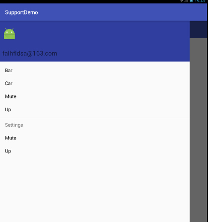
2.头部部分布局文件,drawer_header.xml
<?xml version="1.0" encoding="utf-8"?>
<RelativeLayout xmlns:android="http://schemas.android.com/apk/res/android"
                android:layout_width="match_parent"
                android:layout_height="150dp"
                android:background="@color/colorPrimaryDark"
                android:padding="15dp">

    <TextView
        android:id="@+id/desc"
        android:layout_width="match_parent"
        android:layout_height="wrap_content"
        android:layout_alignParentBottom="true"
        android:text="falhfldsa@163.com"
        android:textSize="18sp"/>

    <ImageView
        android:layout_width="50dp"
        android:layout_height="50dp"
        android:layout_above="@id/desc"
        android:layout_marginBottom="30dp"
        android:src="@mipmap/ic_launcher"/>
</RelativeLayout>
- 1
- 2
- 3
- 4
- 5
- 6
- 7
- 8
- 9
- 10
- 11
- 12
- 13
- 14
- 15
- 16
- 17
- 18
- 19
- 20
- 21
- 22
- 1
- 2
- 3
- 4
- 5
- 6
- 7
- 8
- 9
- 10
- 11
- 12
- 13
- 14
- 15
- 16
- 17
- 18
- 19
- 20
- 21
- 22
3.主体部分,Item项menu资源文件,drawer_menu.xml
<?xml version="1.0" encoding="utf-8"?>
<menu xmlns:android="http://schemas.android.com/apk/res/android">
    <group>

        <item
            android:id="@+id/bar"
            android:title="Bar"/>
        <item
            android:id="@+id/car"
            android:title="Car"/>
        <item
            android:id="@+id/Mute"
            android:title="Mute"/>
        <item
            android:id="@+id/Up"
            android:title="Up"/>

    </group>
    <item android:title="Settings">
        <menu>
            <item
                android:id="@+id/Mute1"
                android:title="Mute"/>
            <item
                android:id="@+id/Up1"
                android:title="Up"/>

        </menu>
    </item>
</menu>
- 1
- 2
- 3
- 4
- 5
- 6
- 7
- 8
- 9
- 10
- 11
- 12
- 13
- 14
- 15
- 16
- 17
- 18
- 19
- 20
- 21
- 22
- 23
- 24
- 25
- 26
- 27
- 28
- 29
- 30
- 1
- 2
- 3
- 4
- 5
- 6
- 7
- 8
- 9
- 10
- 11
- 12
- 13
- 14
- 15
- 16
- 17
- 18
- 19
- 20
- 21
- 22
- 23
- 24
- 25
- 26
- 27
- 28
- 29
- 30
4.活动Activity代码
public class NaviActivity extends AppCompatActivity {
@Override
protected void onCreate(Bundle savedInstanceState) {
super.onCreate(savedInstanceState);
setContentView(R.layout.activity_navi);
Toolbar toolbar = (Toolbar) findViewById(R.id.toolbar1);
final DrawerLayout drawerLayout = (DrawerLayout) findViewById(R.id.drawerLayout);
final NavigationView navigationView = (NavigationView) findViewById(R.id.navigationView);
final TextView textView = (TextView) findViewById(R.id.textView1);
ActionBarDrawerToggle toggle = new ActionBarDrawerToggle(this, drawerLayout, toolbar, R
.string.app_name, R.string.app_name);
drawerLayout.setDrawerListener(toggle);
toggle.syncState();
navigationView.setNavigationItemSelectedListener(new NavigationView
.OnNavigationItemSelectedListener() {
@Override
public boolean onNavigationItemSelected(MenuItem item) {
CharSequence title = item.getTitle();
textView.setText(title);
drawerLayout.closeDrawers();
return true;
}
});
}
}
- 1
- 2
- 3
- 4
- 5
- 6
- 7
- 8
- 9
- 10
- 11
- 12
- 13
- 14
- 15
- 16
- 17
- 18
- 19
- 20
- 21
- 22
- 23
- 24
- 25
- 26
- 27
- 28
- 29
- 30
- 31
- 32
- 33
- 1
- 2
- 3
- 4
- 5
- 6
- 7
- 8
- 9
- 10
- 11
- 12
- 13
- 14
- 15
- 16
- 17
- 18
- 19
- 20
- 21
- 22
- 23
- 24
- 25
- 26
- 27
- 28
- 29
- 30
- 31
- 32
- 33
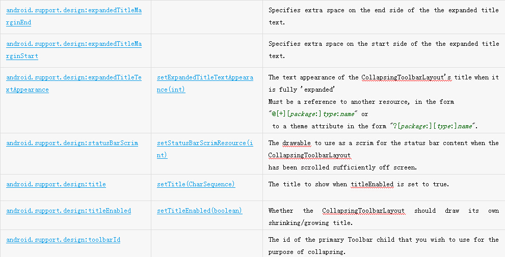
效果图:
以下6、7、8结合使用
6.CoordinatorLayout
更加强大的FrameLayout。
主要用于以下情形:
1.作为一个布局的根布局
2.作为一个为childView之间协调手势效果的协调视图
主要属性:
app:layout_scrollFlags:控制那个childView可滑动
属性值:
1.scroll: 所有想滚动出屏幕的view都需要设置这个flag,没有设置这个flag的view将被固定在屏幕顶部
2.enterAlways: 这个flag让任意向下的滚动都会导致该view变为可见,启用快速“返回模式”
3.enterAlwaysCollapsed: 当你的视图已经设置minHeight属性又使用此标志时,你的视图只能以最小高度进入,只有当滚动视图到达顶部时才扩大到完整高度
4.exitUntilCollapsed: 滚动退出屏幕,最后折叠在顶端
7.AppBarLayout
一个垂直方向的LinearLayout,实现了Matrerial Design效果的App Bar,支持滑动手势操作。
注意事项:
1.必须作为CoordinatorLayout的childView使用,否则很多特效无法实现。
2.同级控件中,必须有一个可滚动的siblingView,不然你用我干嘛呢?
实现滑动的步骤:
1.CoordinatorLayout必须作为整个布局的父布局容器
2.CoordinatorLayout布局下包裹一个可以滑动的布局,比如 RecyclerView,NestedScrollView(ListView,ScrollView不支持)
3.给AppBarLayout设置app:layout_scrollFlags=”scroll|enterAlways” 属性
4.给可滑动的组件,也就是RecyclerView 或者 NestedScrollView 设置如下属性:
app:layout_behavior="@string/appbar_scrolling_view_behavior"
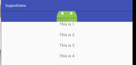
提供一个可折叠的Toolbar容器,对容器中的不同视图设置layout_collapseMode折叠模式,来达到不同的折叠效果
常用属性:
指定childView折叠模式使用
app:layout_collapseMode
值:1.parallax 视差模式 , 需要增加 app:layout_collapseParallaxMultiplier 属性 , 属性值范围为 0.0-1.0 , 必须是float类型
2.pin 固定模式
注意事项:
1.CollapsingToolbarLayout的高度必须是固定值而且要大于Toolbar的高度 , 不能使用wrap_content , 否则不会有折叠效果
2.所有需要折叠的childView必须指定app:layout_collapseMode 属性
3.如果要添加一个自动折叠的FloatingActionBar , 必须指定锚点,锚点需为CollapsingToolbarLayout的父容器
使用parallax模式的时候,app:layout_scrollFlags的属性值不能包含enterAlwaysCollapsed或enterAlways
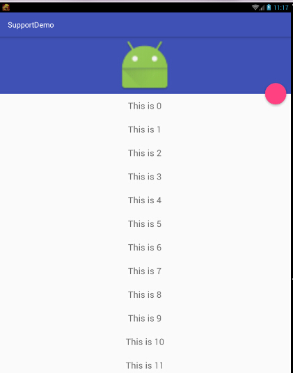
6、7、8示例:
1.布局文件
<?xml version="1.0" encoding="utf-8"?>
<android.support.design.widget.CoordinatorLayout
    xmlns:android="http://schemas.android.com/apk/res/android"
    xmlns:app="http://schemas.android.com/apk/res-auto"
    xmlns:tools="http://schemas.android.com/tools"
    android:layout_width="match_parent"
    android:layout_height="match_parent"
    tools:context="com.example.administrator.supportdemo.coordinate.CoordinateActivity">

    <android.support.design.widget.AppBarLayout
        android:id="@+id/appBarlayout"
        android:layout_width="match_parent"
        android:layout_height="wrap_content"
        >

        <android.support.design.widget.CollapsingToolbarLayout
            android:layout_width="match_parent"
            android:layout_height="150dp"
            app:layout_scrollFlags="scroll|exitUntilCollapsed"
            >

            <ImageView
                android:layout_width="match_parent"
                android:layout_height="match_parent"
                android:src="@mipmap/ic_launcher"
                app:layout_collapseMode="parallax"
                app:layout_collapseParallaxMultiplier="0.5"/>

            <android.support.v7.widget.Toolbar
                android:id="@+id/toolbar"
                android:layout_width="match_parent"
                android:layout_height="?attr/actionBarSize"
                app:layout_collapseMode="pin"
                />
        </android.support.design.widget.CollapsingToolbarLayout>

    </android.support.design.widget.AppBarLayout>

    <android.support.v7.widget.RecyclerView
        android:id="@+id/recyclerView"
        android:layout_width="match_parent"
        android:layout_height="match_parent"
        app:layout_behavior="@string/appbar_scrolling_view_behavior"
        />

    <android.support.design.widget.FloatingActionButton
        android:layout_width="wrap_content"
        android:layout_height="wrap_content"
        app:layout_anchor="@id/appBarlayout"
        app:layout_anchorGravity="bottom|right"
        />
</android.support.design.widget.CoordinatorLayout>
- 1
- 2
- 3
- 4
- 5
- 6
- 7
- 8
- 9
- 10
- 11
- 12
- 13
- 14
- 15
- 16
- 17
- 18
- 19
- 20
- 21
- 22
- 23
- 24
- 25
- 26
- 27
- 28
- 29
- 30
- 31
- 32
- 33
- 34
- 35
- 36
- 37
- 38
- 39
- 40
- 41
- 42
- 43
- 44
- 45
- 46
- 47
- 48
- 49
- 50
- 51
- 52
- 53
- 1
- 2
- 3
- 4
- 5
- 6
- 7
- 8
- 9
- 10
- 11
- 12
- 13
- 14
- 15
- 16
- 17
- 18
- 19
- 20
- 21
- 22
- 23
- 24
- 25
- 26
- 27
- 28
- 29
- 30
- 31
- 32
- 33
- 34
- 35
- 36
- 37
- 38
- 39
- 40
- 41
- 42
- 43
- 44
- 45
- 46
- 47
- 48
- 49
- 50
- 51
- 52
- 53
2.活动java代码
@Override
protected void onCreate(Bundle savedInstanceState) {
super.onCreate(savedInstanceState);
setContentView(R.layout.activity_coordinate);
Toolbar toolbar = (Toolbar) findViewById(R.id.toolbar);
RecyclerView recyclerView = (RecyclerView) findViewById(R.id.recyclerView);
ArrayList<String> list = new ArrayList<>();
for (int i = 0; i < 30; i++) {
list.add("This is " + i);
}
recyclerView.setLayoutManager(new LinearLayoutManager(this));
RecyclerAdapter adapter = new RecyclerAdapter(list, this);
recyclerView.setAdapter(adapter);
}
- 1
- 2
- 3
- 4
- 5
- 6
- 7
- 8
- 9
- 10
- 11
- 12
- 13
- 14
- 15
- 16
- 17
- 18
- 1
- 2
- 3
- 4
- 5
- 6
- 7
- 8
- 9
- 10
- 11
- 12
- 13
- 14
- 15
- 16
- 17
- 18
另附Adapter代码
public class RecyclerAdapter extends RecyclerView.Adapter<RecyclerAdapter.ViewHolder> {
    private Context context;
    private ArrayList<String> list;

    public RecyclerAdapter(ArrayList<String> list, Context context) {
        this.list = list;
        this.context = context;
    }

    @Override
    public ViewHolder onCreateViewHolder(ViewGroup parent, int viewType) {
        View view = LayoutInflater.from(parent.getContext()).inflate(R.layout.recycler_item,
                parent, false);
        ViewHolder holder = new ViewHolder(view);
        return holder;
    }

    @Override
    public void onBindViewHolder(ViewHolder holder, int position) {
        String s = list.get(position);
        holder.item_textView.setText(s);
    }

    @Override
    public int getItemCount() {
        return list.size();
    }

    public static class ViewHolder extends RecyclerView.ViewHolder {
        private final TextView item_textView;

        public ViewHolder(View itemView) {
            super(itemView);
            item_textView = (TextView) itemView.findViewById(R.id.item_textView);
        }
    }
}
- 1
- 2
- 3
- 4
- 5
- 6
- 7
- 8
- 9
- 10
- 11
- 12
- 13
- 14
- 15
- 16
- 17
- 18
- 19
- 20
- 21
- 22
- 23
- 24
- 25
- 26
- 27
- 28
- 29
- 30
- 31
- 32
- 33
- 34
- 35
- 36
- 37
- 1
- 2
- 3
- 4
- 5
- 6
- 7
- 8
- 9
- 10
- 11
- 12
- 13
- 14
- 15
- 16
- 17
- 18
- 19
- 20
- 21
- 22
- 23
- 24
- 25
- 26
- 27
- 28
- 29
- 30
- 31
- 32
- 33
- 34
- 35
- 36
- 37
效果:


 扫一扫
扫一扫
 2752
2752

 被折叠的 条评论
为什么被折叠?
被折叠的 条评论
为什么被折叠?
 到【灌水乐园】发言


