


熟悉Typescript如何在vue项目中使用
觉得写的还不错的请帮我star一下谢谢
github地址
独立封装一个button组件
UIbutton.vue中的代码
<template>
  <div>
    <button
      :class="{'ui-btn-large' : large,
    'ui-btn-small' : small,
    'ui-btn-xlarge': xlarge,
    'ui-btn-xsmall': xsmall,
    'ui-btn-tile': tile,
    'ui-btn-rounded': rounded,
    'ui-btn-circle': circle,
    'ui-btn-disabled': disabled
    }"
      :style="`
       --color-tint: ${TintColor}
    `"
      @click="onClickBtn"
      class="ui-btn"
    >
      <slot>button</slot>
    </button>
  </div>
</template>


<script lang="ts">
import { Component, Vue, Emit, Prop } from "vue-property-decorator";
@Component
export default class UIbutton extends Vue {
  @Prop(Boolean) private xsmall: boolean | undefined;
  @Prop(Boolean) private small: boolean | undefined;
  @Prop(Boolean) private large: boolean | undefined;
  @Prop(Boolean) private xlarge: boolean | undefined;
  @Prop(Boolean) private tile: boolean | undefined;
  @Prop(Boolean) private rounded: boolean | undefined;
  @Prop(Boolean) private circle: boolean | undefined;
  @Prop(Boolean) private disabled: boolean | undefined;
  @Prop(String) private color: string | undefined;
  @Emit("click")
  private emitClickEvent(event: MouseEvent) {}
   // computed
  private get TintColor() {
    if (this.color) {
      return this.color;
    } else {
      return "#2DBCF0";
    }
  }
  private mounted() {
    // console.log(this.large);
  }
  private onClickBtn(event: MouseEvent) {
    if (!this.disabled) {
      this.emitClickEvent(event);
    }
  }
}
</script>


<style lang="stylus" scope>
resize(minWidth, height, paddingLR, fontSize) {
  min-width: minWidth;
  height: height;
  padding: 0 paddingLR;
  font-size: fontSize;

  &.ui-btn-rounded, &.ui-btn-circle {
    border-radius: (@height / 2);
  }

  &.ui-btn-circle {
    min-width: 0;
    padding: 0;
  }
}

.ui-btn {
  resize(64px, 36px, 36px, 0.875rem);
  border-radius: 4px;
  font-weight: 500;
  letter-spacing: 0.09em;
  outline: none;
  border: 0 solid black;
  background-color: var(--color-tint);
  user-select: none;
  cursor: pointer;
  &:hover {
    filter brightness(120%)
  }
  &:active {
    filter brightness(80%)
  }
  &.ui-btn-large {
    resize(80px, 44px, 19px, 0.875rem);
  }

  &.ui-btn-small {
    resize(50px, 28px, 12px, 0.75rem);
  }

  &.ui-btn-xsmall {
    resize(30px, 20px, 9px, 0.625rem);
  }

  &.ui-btn-xlarge {
    resize(120px, 52px, 23px, 1rem);
  }

  &.ui-btn-tile {
    border-radius: 0;
  }

  &.ui-btn-rounded {
    border-radius: (@height / 2);
  }

  &.ui-btn-disabled {
    background-color: #F5F5F5;
    color: #C5C8CE;
    cursor: not-allowed;
  }
}
</style>
在Home.vue中引入封装好的UIbutton组件
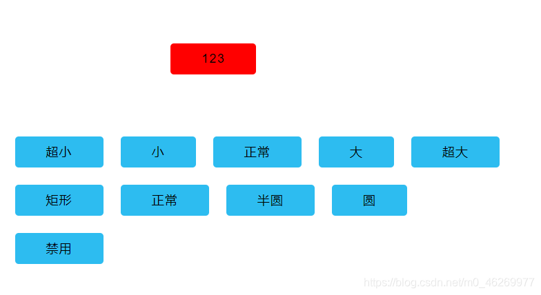
<template>
  <div class="root-home">
    <div class="btn-container">
      <UIbutton
        color="red"
        :tile="tile"
        :rounded="rounded"
        :circle="circle"
        :xsmall="xsmall"
        :small="small"
        :large="large"
        :xlarge="xlarge"
        @click="onClick"
        :disabled="disabled"
      >123</UIbutton>
    </div>
    <div class="btn-group">
      <UIbutton class="btn" @click="resize('xsmall')">超小</UIbutton>
      <UIbutton class="btn" @click="resize('small')">小</UIbutton>
      <UIbutton class="btn" @click="resize('normal')">正常</UIbutton>
      <UIbutton class="btn" @click="resize('large')">大</UIbutton>
      <UIbutton class="btn" @click="resize('xlarge')">超大</UIbutton>
    </div>
    <div class="btn-group">
      <UIbutton class="btn" @click="reRadius('tile')">矩形</UIbutton>
      <UIbutton class="btn" @click="reRadius('normal')">正常</UIbutton>
      <UIbutton class="btn" @click="reRadius('rounded')">半圆</UIbutton>
      <UIbutton class="btn" @click="reRadius('circle')">圆</UIbutton>
    </div>
    <div class="btn-group">
      <UIbutton class="btn" @click="changeDisabled">禁用</UIbutton>
    </div>
  </div>
</template>


<script lang="ts">
import { Component, Vue } from "vue-property-decorator";
import UIbutton from "./components/UIbutton.vue";
@Component({
  components: {
    UIbutton
  }
})
export default class Home extends Vue {
  private xlarge: boolean = false;
  private large: boolean = false;
  private small: boolean = false;
  private xsmall: boolean = false;
  private tile: boolean = false;
  private rounded: boolean = false;
  private circle: boolean = false;
  private disabled: boolean = false;
  private changeDisabled() {
     this.disabled = !this.disabled
  }
  private reRadius(name: string) {
    switch (name) {
      case "tile":
        this.tile = true;
        this.rounded = false;
        this.circle = false;
        break;
      case "rounded":
        this.rounded = true;
        this.tile = false;
        this.circle = false;
        break;
      case "circle":
        this.circle = true;
        this.tile = false;
        this.rounded = false;
        break;
      case "normal":
        this.tile = false;
        this.rounded = false;
        this.circle = false;
        break;
    }
  }
  private resize(name: string) {
    switch (name) {
      case "xsmall":
        this.xsmall = true;
        this.xlarge = false;
        this.large = false;
        this.small = false;
        break;
      case "small":
        this.small = true;
        this.xlarge = false;
        this.xsmall = false;
        this.large = false;
        break;
      case "small":
        this.small = false;
        this.xsmall = false;
        this.xlarge = false;
        this.large = false;
        break;
      case "large":
        this.small = false;
        this.xlarge = false;
        this.xsmall = false;
        this.large = true;
        break;
      case "xlarge":
        this.small = false;
        this.xlarge = true;
        this.xsmall = false;
        this.large = false;
        break;
    }
  }
  private onClick(event: MouseEvent) {
    console.log(event);
  }
}
</script>


<style lang="stylus" scope>
.btn-container {
  width: 480px;
  height: 160px;
  display: flex;
  justify-content: center;
  align-items: center;
}

.btn-group {
  display: flex;
}

.btn {
  margin: 10px;
}
</style>


 5827
5827


 被折叠的 条评论
为什么被折叠?
被折叠的 条评论
为什么被折叠?
 到【灌水乐园】发言


