


目的
数据暴增的年代,数据科学家、分析师在被要求对数据有更深的理解与分析的同时,还需要将结果有效地传递给他人。如何让目标听众更直观地理解?当然是将数据可视化啊,而且最好是动态可视化。
本文将以线型图为例,系统地讲解如何让你的数据图表动起来。
代码
# 处理数据1
import pandas as pd
import numpy as np
%matplotlib inline
%matplotlib notebook
import matplotlib.pyplot as plt

import matplotlib.animation as ani
import matplotlib.pyplot as plt
import numpy as np
import pandas as pd
url = r'time_series_QCC.csv'
df = pd.read_csv(url, delimiter=',', header='infer')
df.rename(index=lambda x: df.at[x, 'Country/Region'], inplace=True)

df
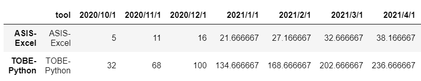
.
# 处理数据2
df1 = df.transpose()
df1 = df1.drop(['tool'])
df1.index = pd.to_datetime(df1.index)

df1
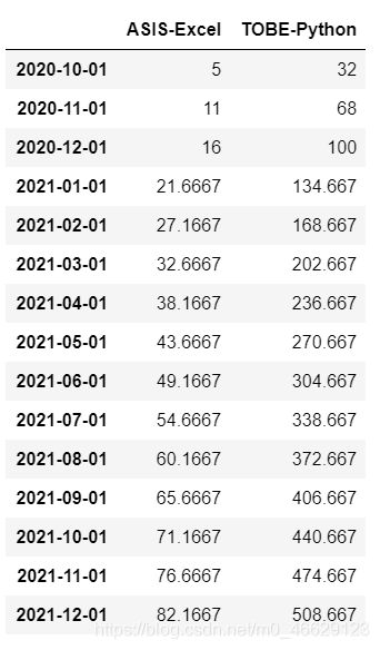
.
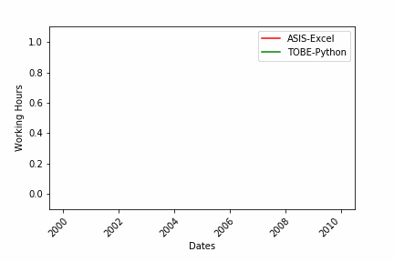
# 画图
import numpy as np
import matplotlib.pyplot as plt
color = ['red', 'green', 'blue', 'orange']
fig = plt.figure()
plt.xticks(rotation=45, ha="right", rotation_mode="anchor") #rotate the x-axis values
plt.subplots_adjust(bottom = 0.2, top = 0.9) #ensuring the dates (on the x-axis) fit in the screen
plt.ylabel('Working Hours')
plt.xlabel('Dates')

def buildmebarchart(i=int):
    plt.legend(df1.columns)
    p = plt.plot(df1[:i].index, df1[:i].values) #note it only returns the dataset, up to the point i
    for i in range(0,2):
        p[i].set_color(color[i]) #set the colour of each curveimport matplotlib.animation as ani

# 动态图
animator = ani.FuncAnimation(fig, buildmebarchart, interval = 200)
#从中我们可以看到 FuncAnimation 的几个输入:
#fig 是用来 「绘制图表」的 figure 对象;
#chartfunc 是一个以数字为输入的函数,其含义为时间序列上的时间;
#interval 这个更好理解,是帧之间的间隔延迟,以毫秒为单位,默认值为 200。
plt.show()

# 保存图片
animator.save(r'Animation.gif',writer='pillow')


 1862
1862


 被折叠的 条评论
为什么被折叠?
被折叠的 条评论
为什么被折叠?
 到【灌水乐园】发言


