


CSS进阶使用
常见的有三种布局:
一、相对布局
二、绝对布局
三、固定布局
一、相对布局:
想要把的布局开启, 那就需要用到position属性。
开启相对布局:
position: relative;
相对布局的特点:
1.是元素在移动位置的时候, 他是相对于自己原来的位置来移动的(移动位置的时候参照点是自己原来的位置)
2.原来的位置继续占有, 后面的盒子仍然保留在原来的位置。
我们上代码, 来看看效果:
<!DOCTYPE html>
<html>
	<head>
		<meta charset="utf-8">
		<title></title>
		<style>
			.box1{
				width: 200px;
				height: 200px;
				background-color: skyblue;
				/* 相对定位 */
				/* position 开启定位 relative 开启相对定位 */
				position: relative;
				top: 100px;
				/* 超出了浏览器屏幕范围, 而不是方块变小了 */
				/* right: 100px; */
				left: 0px;
			}
			.box2{
				width: 200px;
				height: 200px;
				background-color: blue;
			}
		</style>
	</head>
	<body>
		<!-- 1.是元素在移动位置的时候, 他是相对于自己原来的位置来移动的(移动位置的时候参照点是自己原来的位置) -->
		<!-- 2.原来的位置继续占有, 后面的盒子仍然保留在原来的位置。 -->
		<div class="box1"></div>
		<div class="box2"></div>
	</body>
</html>
运行结果:
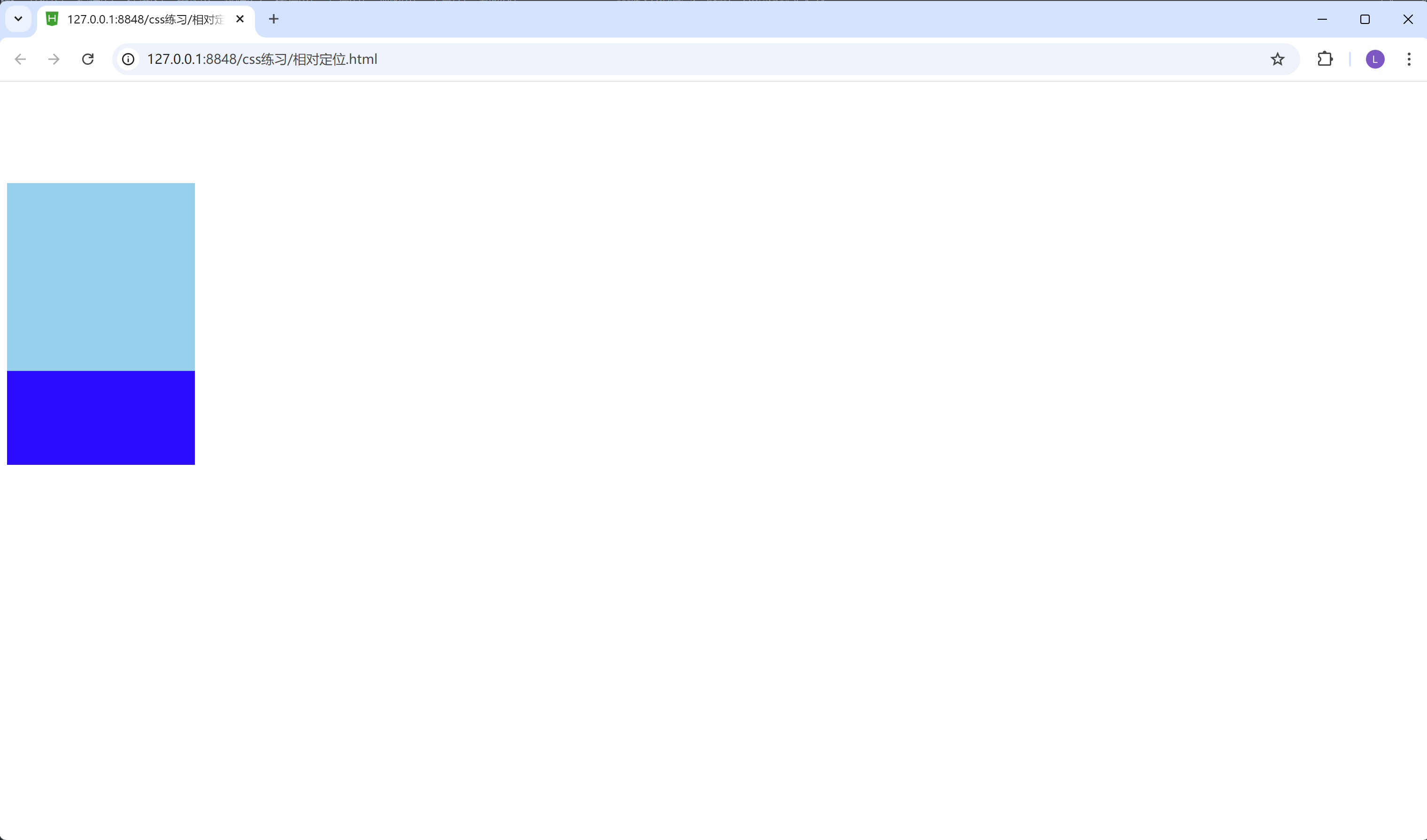
我们可以看到上面淡蓝色的框, 把下面的深蓝色的框, 给覆盖掉了。这个就是遵循相对布局特点的第二条。
相对布局,是相对于自己原来的位置来移动的。参照物是自己, 不是浏览器。(相对布局的第一条特性)所以如果css里面设置right: 100px;的话, 则浅蓝色的方框会超出浏览器的范围, 因为它是按照自己的原来的位置来移动的。
二、 绝对布局:
绝对布局特点:
1.如果没有祖先元素或者祖先元素没有定位, 则以浏览器为准定位
2.当爷爷开启定位的时候, 儿子以爷爷作为参考点
3.当爸爸开启定位的时候, 儿子以爸爸作为参考点
第一种情况:
<!DOCTYPE html>
<html>
	<head>
		<meta charset="utf-8">
		<title></title>
		<style>
			.box1{
				width: 400px;
				height: 400px;
				/* 爸爸现在没有开定位 */
				background-color: green;
			}
			.box2{
				width: 200px;
				height: 200px;
				background-color: red;
				/* 开启绝对定位 */
				/* 爸爸没有开启定位 那儿子就以浏览器为参考点 */
				position: absolute;
				bottom: 100px;
				right: 500px;
			}
		</style>
	</head>
	<body>
		<!-- 如果没有祖先元素或者祖先元素没有定位, 则以浏览器为准定位 -->
		<div class="box1">
			<div class="box2"></div>
		</div>
	</body>
</html>
我们可以看到祖先元素或者祖先元素没有定位, 则儿子元素以浏览器为准定位。
结果如图:
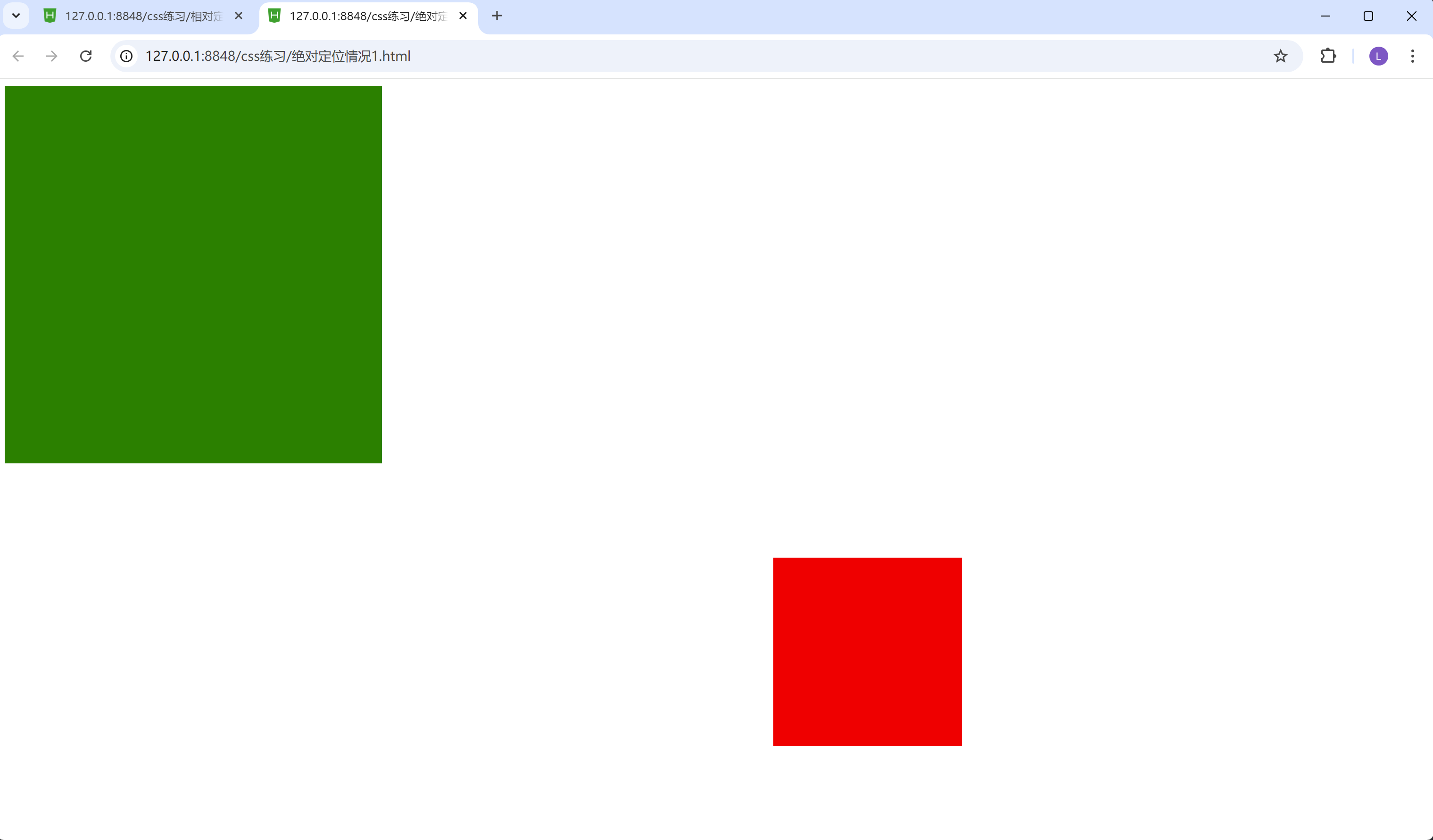
红色方框的位置以浏览器为准定位。
第二种情况:
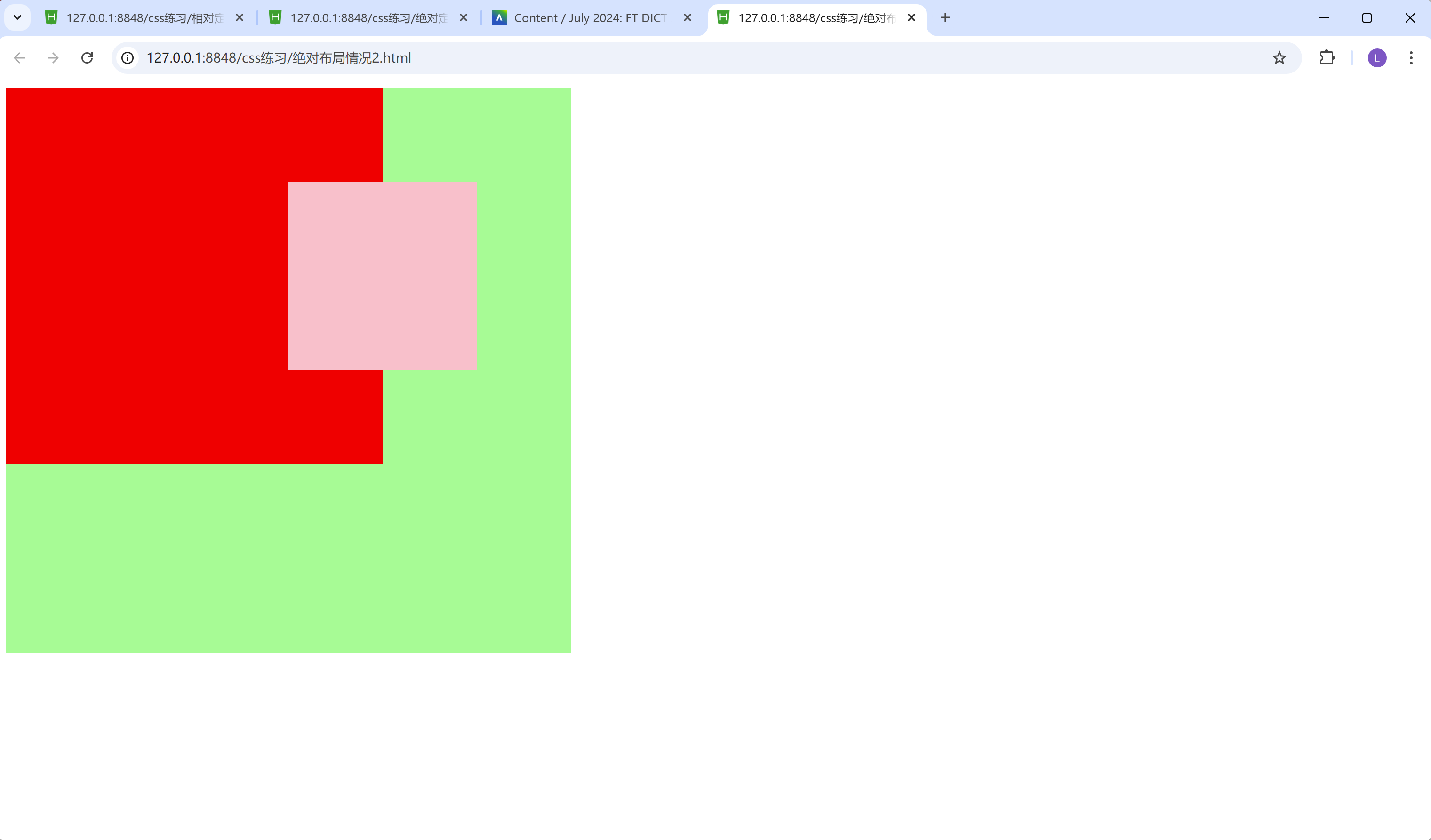
当爷爷开启定位的时候, 儿子以爷爷作为参考点
<!DOCTYPE html>
<html>
	<head>
		<meta charset="utf-8">
		<title></title>
		<style>
			.yeye{
				width: 600px;
				height: 600px;
				background-color: palegreen;
				/* 给爷爷开启相对定位 */
				/* 当爷爷开启定位的时候, 儿子以爷爷作为参考点 */
				position: relative;
			}
			.baba{
				width: 400px;
				height: 400px;
				background-color: red;
			}
			.erzi{
				width: 200px;
				height: 200px;
				background-color: pink;
				/* 给儿子开启绝对定位 */
				position: absolute;
				/* 为儿子加偏移量 */
				top: 100px;
				right: 100px;
			}
		</style>
	</head>
	<body>
		<!-- 如果祖先元素有定位(相对、绝对、固定定位), 则以最近一级的有定位的祖先元素为参考点移动位置 -->
		<div class="yeye">
			<div class="baba">
				<div class="erzi"></div>
			</div>
		</div>
	</body>
</html>
结果:
第三种情况:
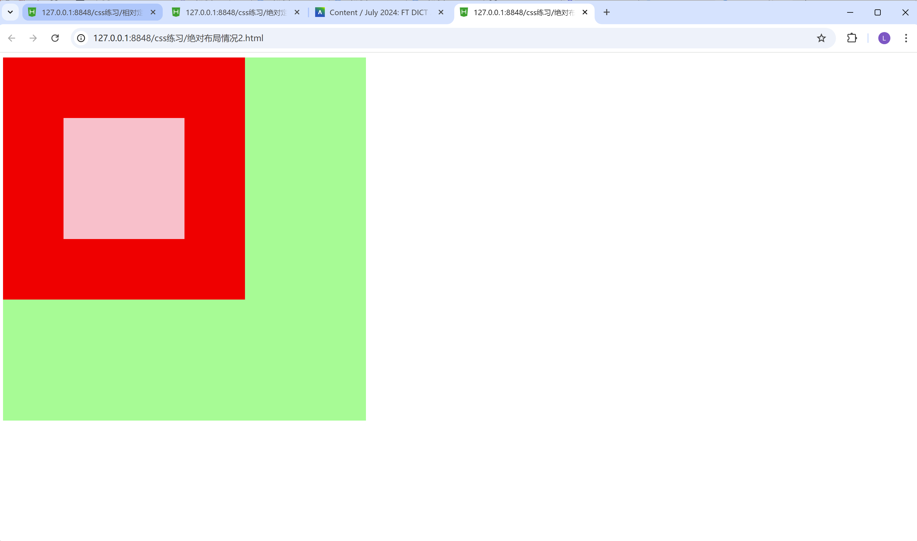
3.当爸爸开启定位的时候, 儿子以爸爸作为参考点
<!DOCTYPE html>
<html>
	<head>
		<meta charset="utf-8">
		<title></title>
		<style>
			.yeye{
				width: 600px;
				height: 600px;
				background-color: palegreen;
				/* 给爷爷开启相对定位 */
				/* 当爷爷开启定位的时候, 儿子以爷爷作为参考点 */
				position: relative;
			}
			.baba{
				width: 400px;
				height: 400px;
				background-color: red;
				/* 为爸爸开启相对定位 */
				/* 当爸爸开启定位的时候, 儿子以爸爸作为参考点 */
				/* 当爷爷和爸爸开启定位的时候, 儿子以爸爸作为参考点(就近原则法) */
				/* 当爷爷没有开启定位并且爸爸开启定位的时候, 儿子以爸爸作为参考点 */
				position: relative;
			}
			.erzi{
				width: 200px;
				height: 200px;
				background-color: pink;
				/* 给儿子开启绝对定位 */
				position: absolute;
				/* 为儿子加偏移量 */
				top: 100px;
				right: 100px;
			}
		</style>
	</head>
	<body>
		<!-- 如果祖先元素有定位(相对、绝对、固定定位), 则以最近一级的有定位的祖先元素为参考点移动位置 -->
		<div class="yeye">
			<div class="baba">
				<div class="erzi"></div>
			</div>
		</div>
	</body>
</html>
我们把爸爸的那个元素, 打开相对定位
结果:
子绝父相
儿子元素是绝对布局, 爸爸元素是相对布局
<!DOCTYPE html>
<html>
	<head>
		<meta charset="utf-8">
		<title></title>
		<style>
			.box1{
				width: 400px;
				height: 400px;
				background-color: red;
				/* 给爸爸开相对定位 */
				position: relative;
			}
			.box2{
				width: 150px;
				height: 150px;
				background-color: yellow;
				/* 给儿子1开绝对定位 */
				position: absolute;
			}
			.box3{
				width: 150px;
				background-color: green;
				/* 原来的为位置不再占有, 后面的盒子会占用位置 */
        /* 我们这里把高度设置为200px, 这样看上去更直观一点, 是被覆盖了。 如果只设置150px的话, 就看不到box3方框了, 其实它是被覆盖了, 而不是消失了。 */
				height: 200px;
			}
			.box11{
				width: 500px;
				height: 500px;
				background-color: purple;
			}
		</style>
	</head>
	<body>
		<div class="box1">
			<div class="box2">我是黄色的盒子</div>
			<div class="box3">我是绿色的盒子</div>
		</div>
		<div class="box11"></div>
	</body>
</html>
结果:
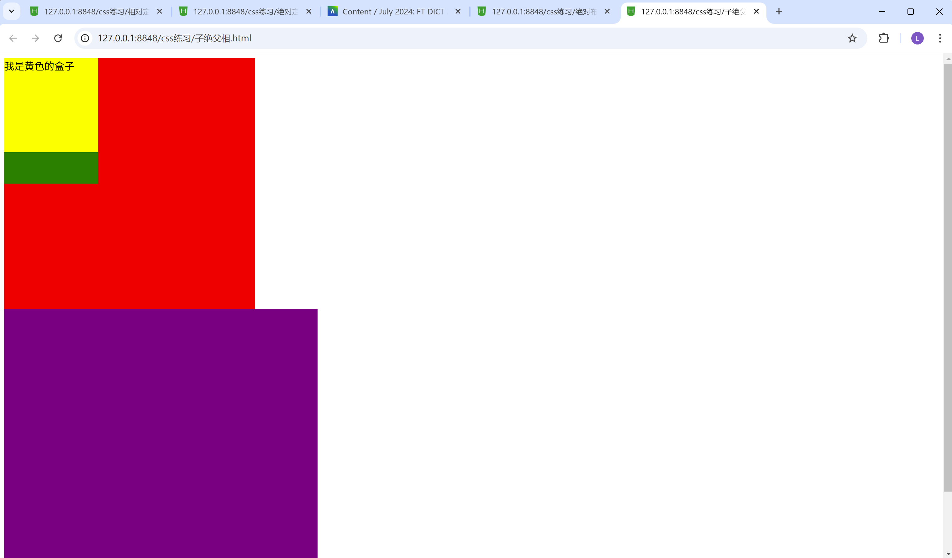
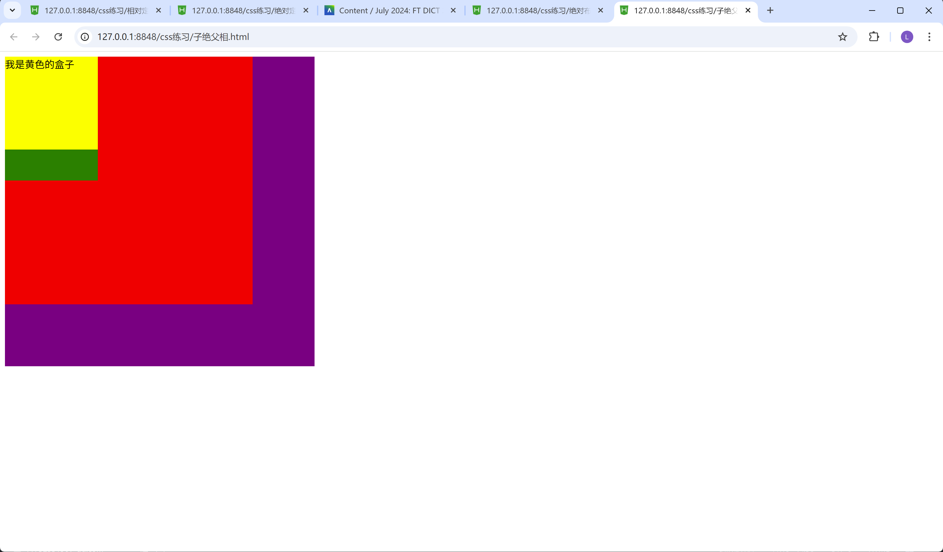
子绝父绝的情况比较少, 但不代表没有。
下面是子绝父绝的情况:
<!DOCTYPE html>
<html>
	<head>
		<meta charset="utf-8">
		<title></title>
		<style>
			.box1{
				width: 400px;
				height: 400px;
				background-color: red;
				/* 给爸爸开绝对定位 */
				position: absolute;
			}
			.box2{
				width: 150px;
				height: 150px;
				background-color: yellow;
				/* 给儿子1开绝对定位 */
				position: absolute;
			}
			.box3{
				width: 150px;
				background-color: green;
				/* 原来的为位置不再占有, 后面的盒子会占用位置 */
				height: 200px;
			}
			.box11{
				width: 500px;
				height: 500px;
				background-color: purple;
			}
		</style>
	</head>
	<body>
		<div class="box1">
			<div class="box2">我是黄色的盒子</div>
			<div class="box3">我是绿色的盒子</div>
		</div>
		<div class="box11"></div>
	</body>
</html>
结果:
固定布局
特点:
1.无论窗口怎么滑动, 元素的位置始终固定
我们举个例子:
<!DOCTYPE html>
<html>
	<head>
		<meta charset="utf-8">
		<title>Document</title>
		<style>
			.box{
				width: 100%;
				height: 100px;
				background-color: red;
				/* 给红色盒子加上固定布局fixed */
				position: fixed;
				/* 固定到 距离下面的距离为0 */
				/* 无论窗口怎么滑动, 红色盒子的位置始终固定 */
				bottom: 0px;
			}
			.box1{
        /* 让box1的盒子足够高, 以至于可以用上下滚动条来滑动, 通过上下滚动条滑动的实验来验证固定布局的特性  */
				height: 3000px;
				background-color: blue;
			}
		</style>
	</head>
	<body>
		<div class="box"></div>
		<div class="box1">我是一个盒子</div>
	</body>
</html>
结果:
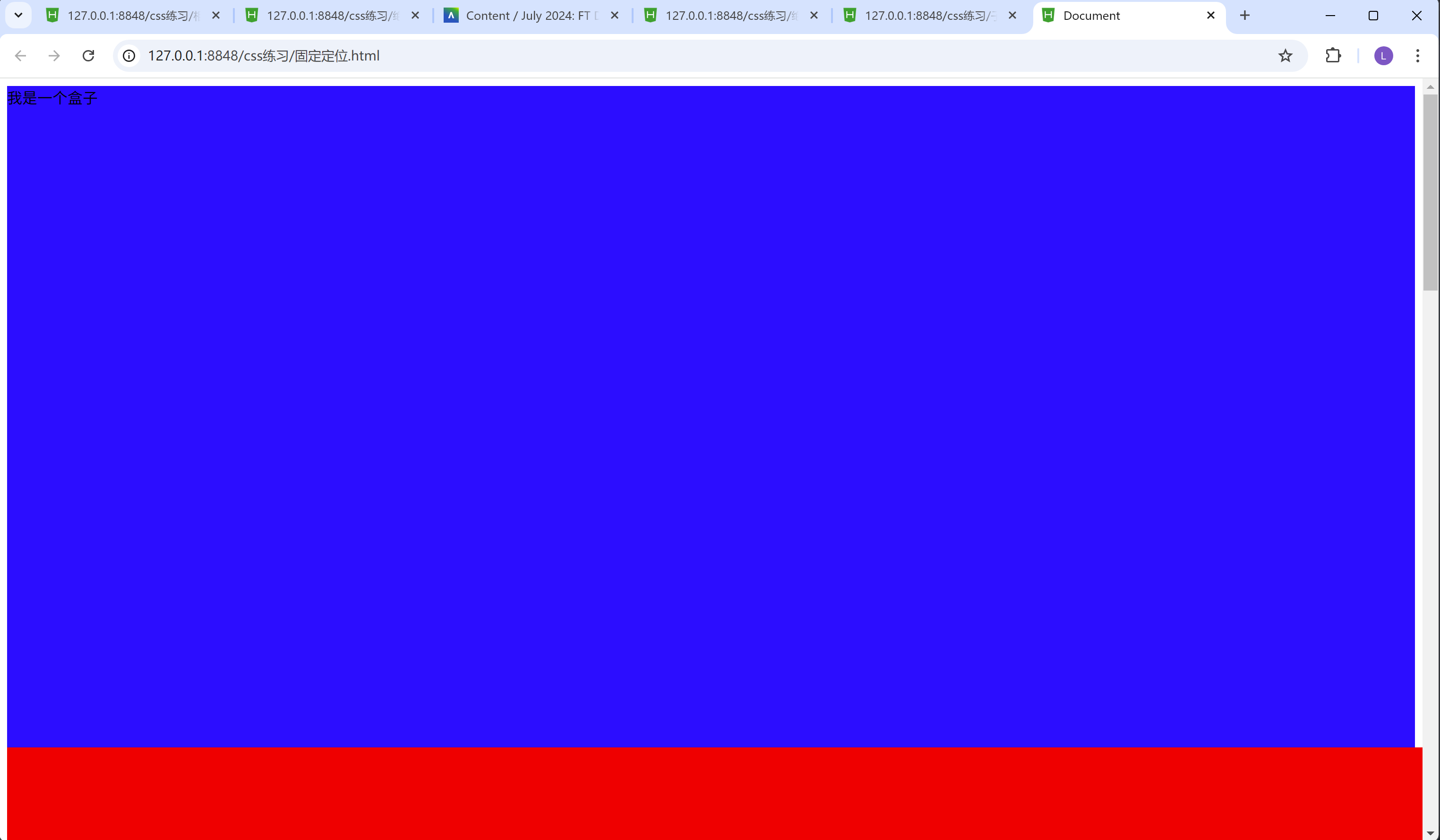
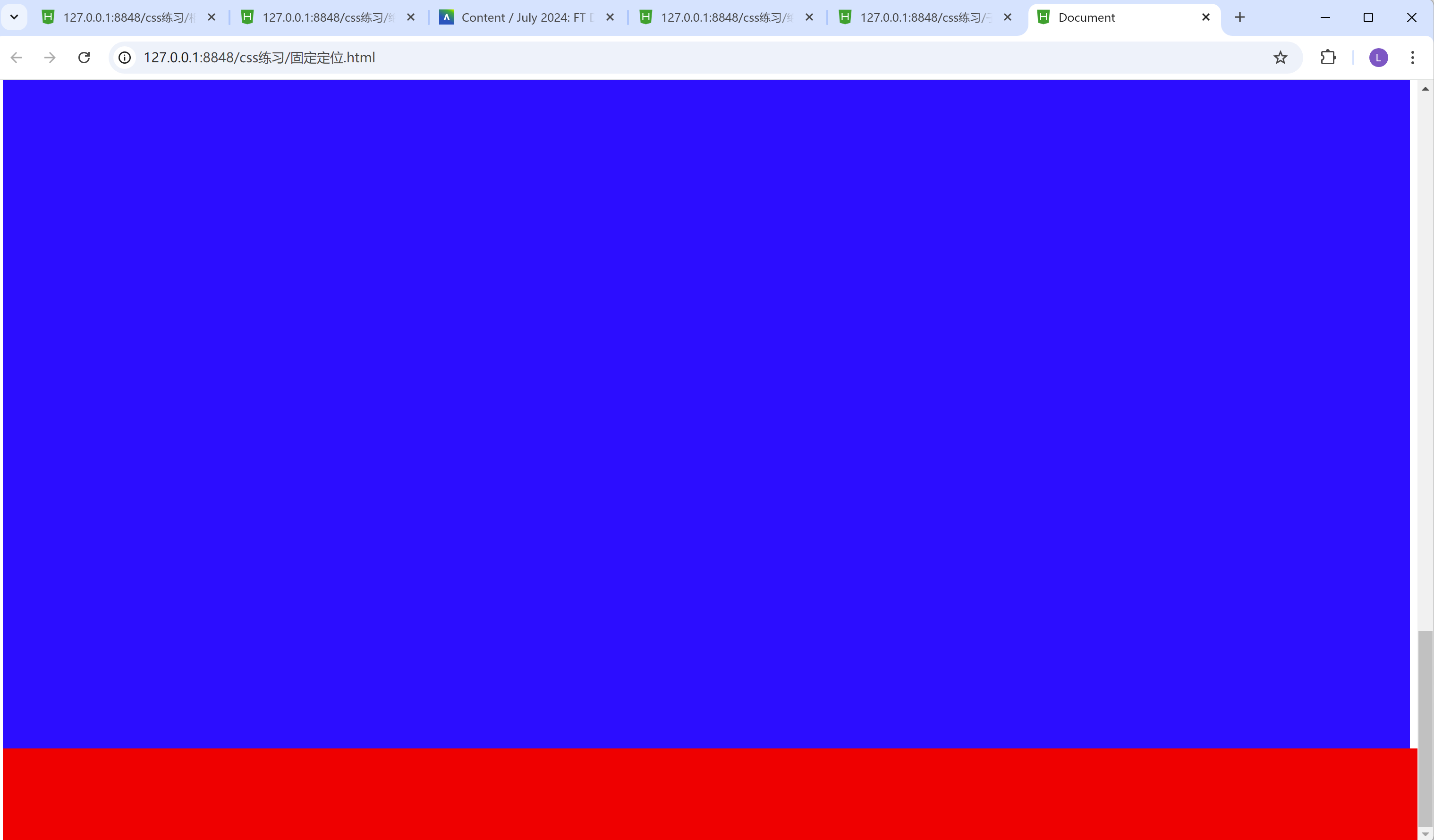
我们可以从两张图片看的出来, 无论滚动条怎么上下滑动, 红色的方框始终在最下方, 这就是固定布局的作用。
flex布局
flex布局, 称之为弹性布局, 我们来学习下flex布局, 到底有哪些属性, 已经它的用法。
首先, 我们在css里面用到弹性布局, 需要用到display: flex;这句话。
display: flex;
我们简单举个列子, 上代码:
<!DOCTYPE html>
<html>
	<head>
		<meta charset="utf-8">
		<title></title>
		<style>
			.box{
				/* 弹性布局 */
				display: flex;
			}
			.inner-box{
				/* width: 200px; */
				height: 200px;
				border: 3px red solid;
				/* 每个盒子占一份空间 */
				flex: 1;
			}
		</style>
	</head>
	<body>
		<div class="box">
			<div class="inner-box"></div>
			<div class="inner-box"></div>
		</div>
	</body>
</html>
结果:
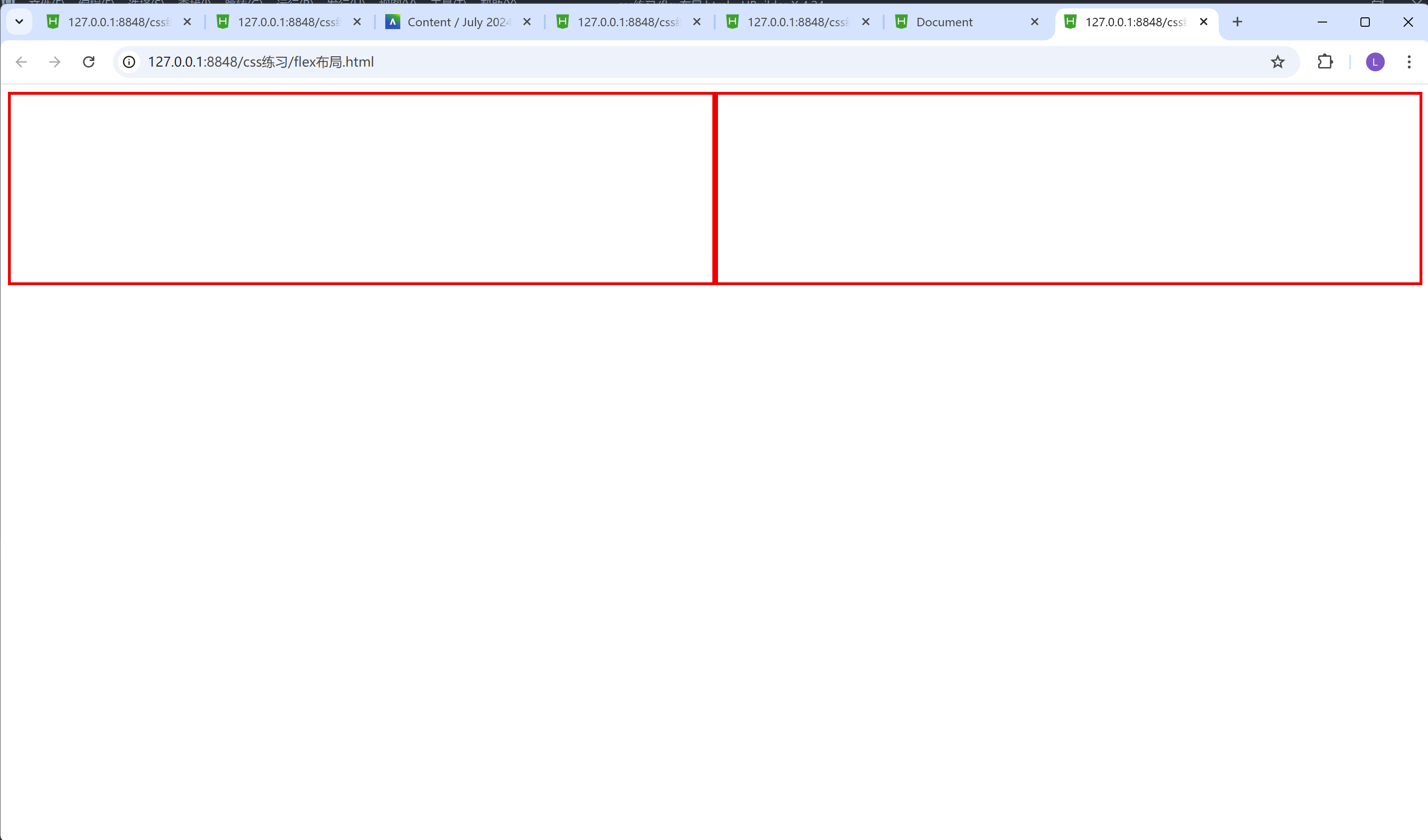
我们可以从结果的图中发现, 有两个方框, 而且占用的宽度都是平均分, 这里面就和弹性布局有关了, 我们首先在box盒子里面设置了弹性布局, 然后再inner-box盒子里面设置了一个flex: 1;这个属性, 这个属性代表着两个inner-box,它们两占领的空间都是一份, 所以一个inner-box就占用了总共大小的二分之一。当然这里我要提醒下, 如果把flex值设置为2的话, 结果也是一样的, 因为第一个inner-box占比2, 第二个inner-box占比也是2, 那这样的话, 它们两占比大小, 还是一样不变的, 相当于都是4份里面占其中2份, 也就是说四分之二同时又等于二分之一。
那我们试着想一下, 如果第一个盒子的flex值设置为2, 第二个盒子的flex值设置为1, 那么呈现出来的效果又会是如何呢?
我们举个例子, 就一目了然了。
<!DOCTYPE html>
<html>
	<head>
		<meta charset="utf-8">
		<title></title>
		<style>
			.box{
				/* 弹性布局 */
				display: flex;
			}
			.inner-box1{
				/* width: 200px; */
				height: 200px;
				border: 3px red solid;
				/* inner-box1盒子占一份空间 */
				flex: 1;
			}
			.inner-box2{
				/* width: 200px; */
				height: 200px;
				border: 3px red solid;
				/* inner-box2盒子占两份空间 */
				flex: 2;
			}
		</style>
	</head>
	<body>
		<div class="box">
			<div class="inner-box1"></div>
			<div class="inner-box2"></div>
		</div>
	</body>
</html>
结果:
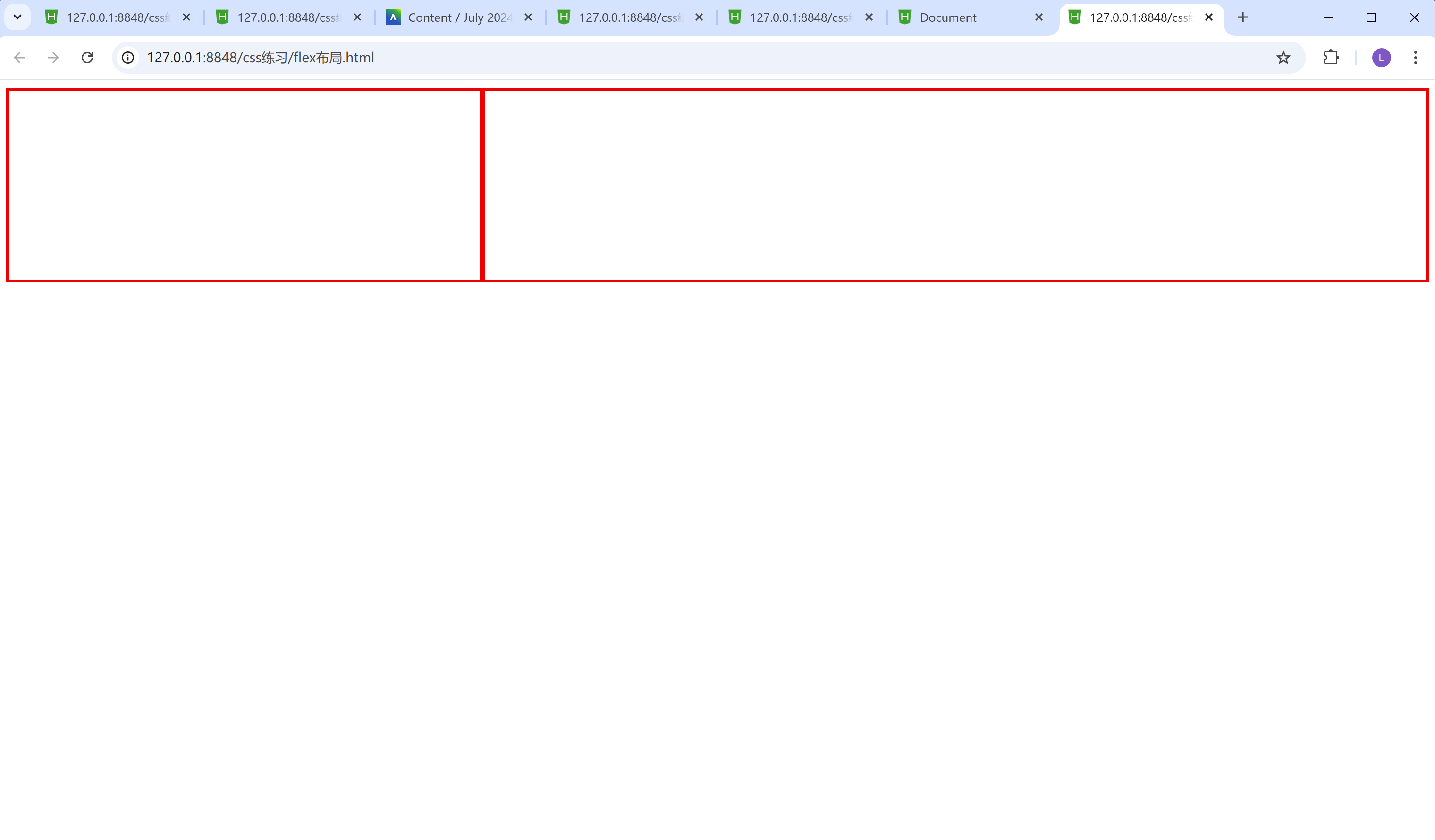
我们不难看到, 第一个盒子宽度短些, 第二个盒子宽度长些。原因也很简单, 因为我们把第一个盒子的flex的值设置成了1, 而第一个盒子的flex的值设置成了2, 那么第一个盒子占比整个盒子的三分之一, 而第二个盒子占比整个盒子的三分之二。
flex布局里面的常见属性配置:
x轴的排列方式用到的属性:
justify-content: 属性值;
以x轴为排列方式, 通常的属性值有:
1.flex-start默认排列方式
2.center居中排列方式
3.flex-end末尾排列方式
4.space-between均匀排列方式, 首个元素放置于起点, 末尾元素放置于终点
5.space-evenly均匀排列方式, 每个元素之间的间隔相等
6.space-around均匀排列方式, 每个元素周围分配相同的空间
这里需要注意下:
运行出来蓝色背景, 背景大小为全屏, height: 100vh;的意思是占比视口高度为100, 相当于占满全屏。
1.flex-start默认排列方式
<!DOCTYPE html>
<html>
	<head>
		<meta charset="utf-8">
		<title></title>
		<style>
			*{
				margin: 0px;
				padding: 0px;
			}
			.box{
				width: 100%;
				/* vh是视口高度 */
				height: 100vh;
				background-color: skyblue;
				display: flex;
				/* x轴的排列方式 */
				/* flex-start默认排列方式 */
				/* center居中排列方式 */
				/* flex-end末尾排列方式 */
				/* space-between均匀排列方式, 首个元素放置于起点, 末尾元素放置于终点 */
				/* space-evenly均匀排列方式, 每个元素之间的间隔相等 */
				/* space-around均匀排列方式, 每个元素周围分配相同的空间 */
				justify-content: flex-start;
			}
			.inner-box{
				width: 50px;
				height: 30px;
				border: 1px red solid;
			}
			/* 鼠标移入效果hover */
			.inner-box:hover{
				color: red;
			}
		</style>
	</head>
	<body>
		<div class="box">
			<div class="inner-box">1</div>
			<div class="inner-box">2</div>
			<div class="inner-box">3</div>
			<div class="inner-box">4</div>
		</div>
	</body>
</html>
结果:

justify-content: flex-start; 通过这行代码,我们可以看到四个inner-box都在最左上方, 当然上下也有个参数叫做align-items属性, 这个一会儿我们会讲到,这里的关键是四个盒子都在最左边。
2.center居中排列方式
<!DOCTYPE html>
<html>
	<head>
		<meta charset="utf-8">
		<title></title>
		<style>
			*{
				margin: 0px;
				padding: 0px;
			}
			.box{
				width: 100%;
				/* vh是视口高度 */
				height: 100vh;
				background-color: skyblue;
				display: flex;
				/* x轴的排列方式 */
				/* center居中排列方式 */
				justify-content: center;
			}
			.inner-box{
				width: 50px;
				height: 30px;
				border: 1px red solid;
			}
			/* 鼠标移入效果hover */
			.inner-box:hover{
				color: red;
			}
		</style>
	</head>
	<body>
		<div class="box">
			<div class="inner-box">1</div>
			<div class="inner-box">2</div>
			<div class="inner-box">3</div>
			<div class="inner-box">4</div>
		</div>
	</body>
</html>
结果:
justify-content: center; 通过这行代码,我们可以看到四个inner-box都在最中间。
3.flex-end末尾排列方式
<!DOCTYPE html>
<html>
	<head>
		<meta charset="utf-8">
		<title></title>
		<style>
			*{
				margin: 0px;
				padding: 0px;
			}
			.box{
				width: 100%;
				/* vh是视口高度 */
				height: 100vh;
				background-color: skyblue;
				display: flex;
				/* x轴的排列方式 */
        /* flex-end末尾排列方式 */
				justify-content: flex-end;
			}
			.inner-box{
				width: 50px;
				height: 30px;
				border: 1px red solid;
			}
			/* 鼠标移入效果hover */
			.inner-box:hover{
				color: red;
			}
		</style>
	</head>
	<body>
		<div class="box">
			<div class="inner-box">1</div>
			<div class="inner-box">2</div>
			<div class="inner-box">3</div>
			<div class="inner-box">4</div>
		</div>
	</body>
</html>
结果:
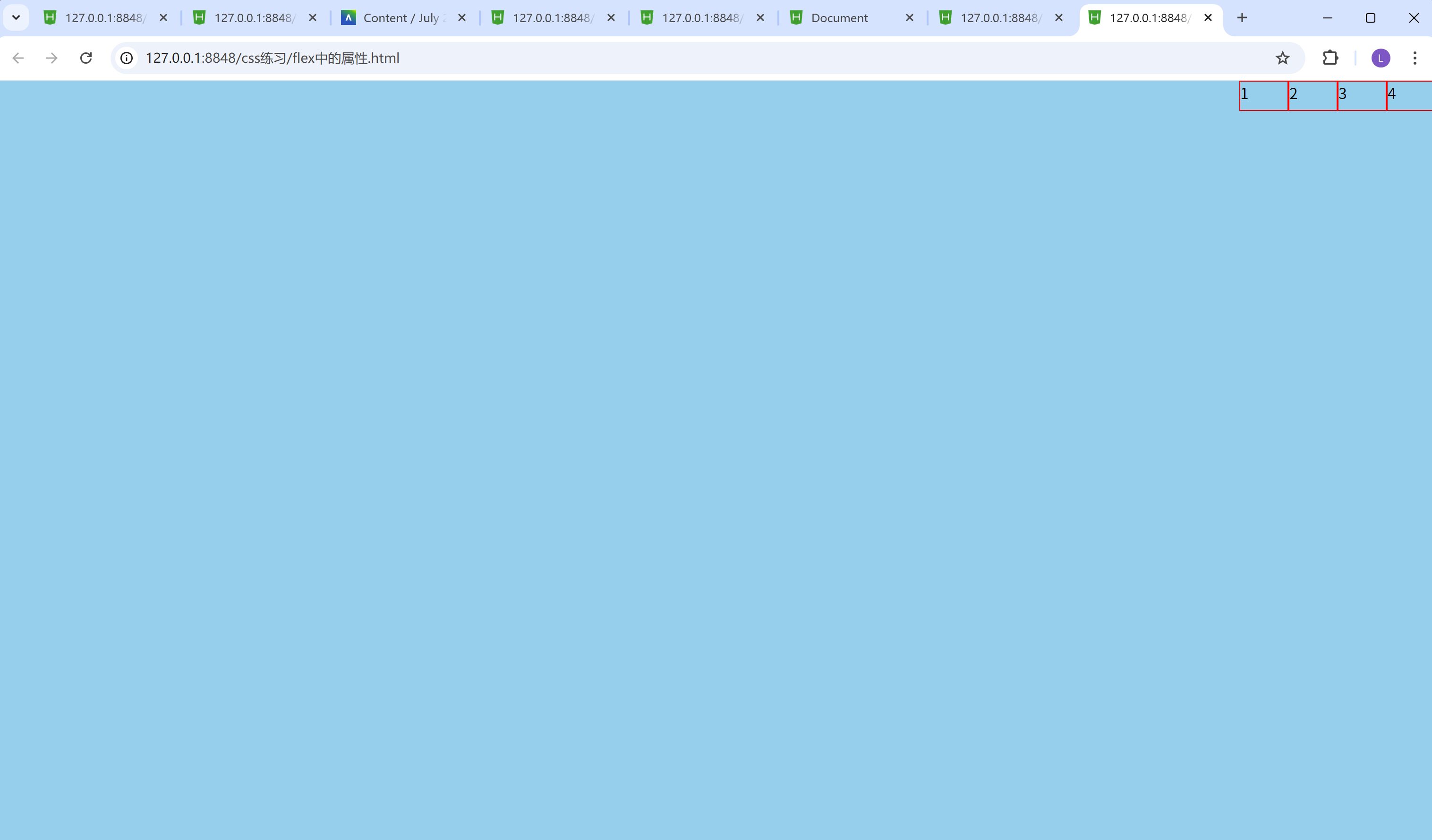
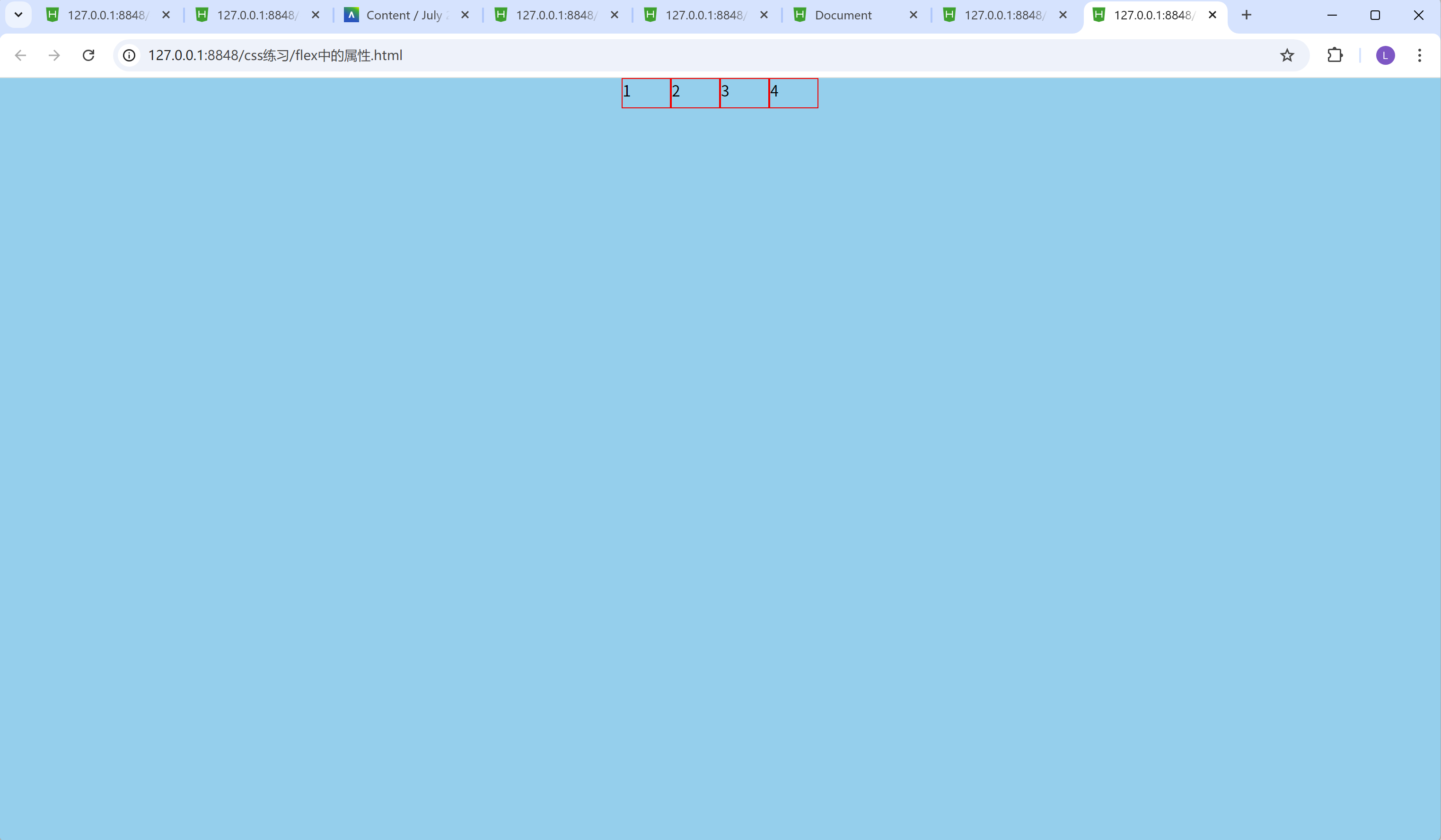
justify-content: flex-end; 通过这行代码,我们可以看到四个inner-box都在最右边。
4.space-between均匀排列方式, 首个元素放置于起点, 末尾元素放
<!DOCTYPE html>
<html>
	<head>
		<meta charset="utf-8">
		<title></title>
		<style>
			*{
				margin: 0px;
				padding: 0px;
			}
			.box{
				width: 100%;
				/* vh是视口高度 */
				height: 100vh;
				background-color: skyblue;
				display: flex;
				/* x轴的排列方式 */
				/* space-between均匀排列方式, 首个元素放置于起点, 末尾元素放置于终点 */
				justify-content: space-between;
			}
			.inner-box{
				width: 50px;
				height: 30px;
				border: 1px red solid;
			}
			/* 鼠标移入效果hover */
			.inner-box:hover{
				color: red;
			}
		</style>
	</head>
	<body>
		<div class="box">
			<div class="inner-box">1</div>
			<div class="inner-box">2</div>
			<div class="inner-box">3</div>
			<div class="inner-box">4</div>
		</div>
	</body>
</html>
结果:
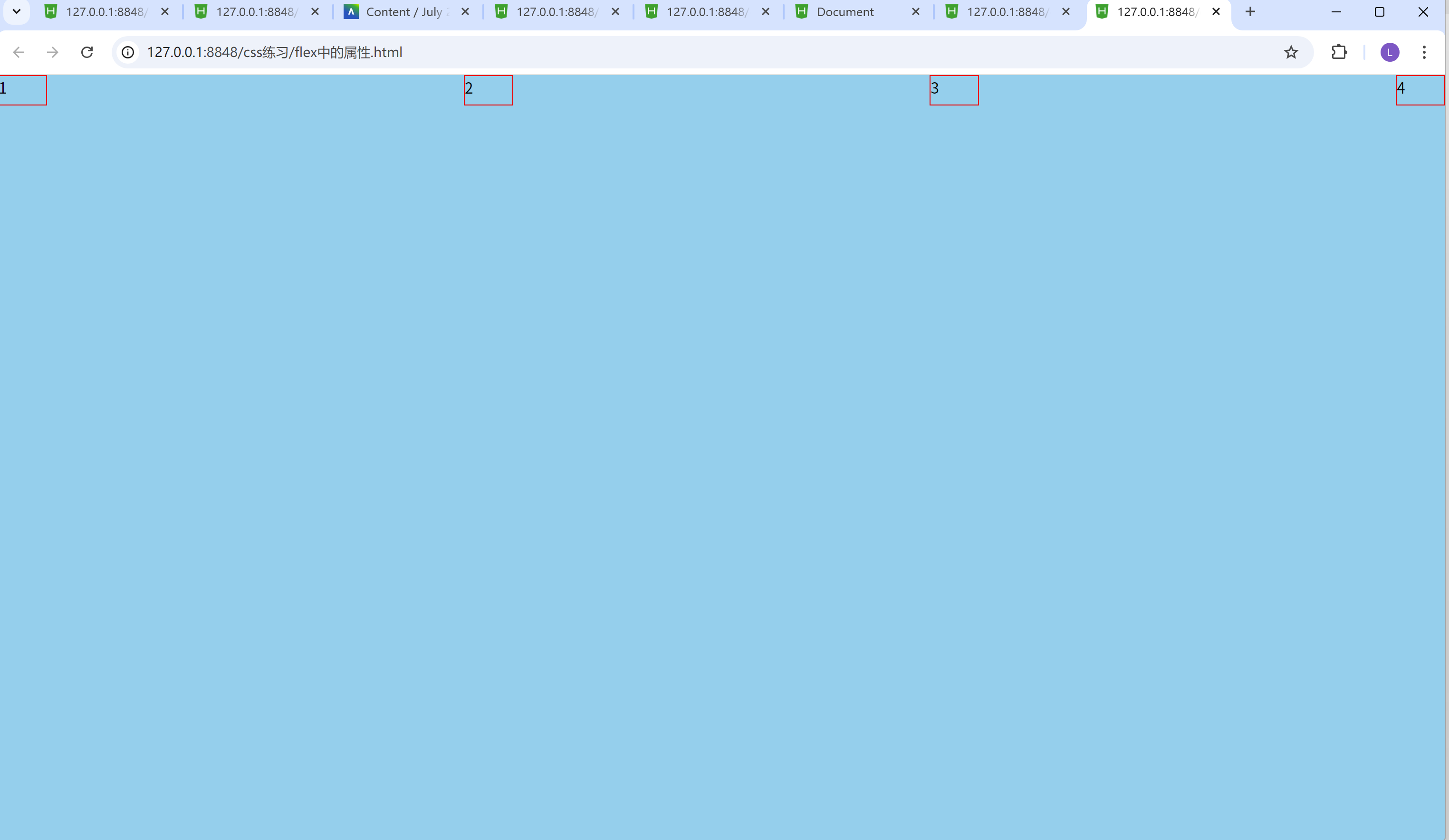
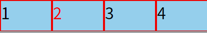
justify-content: space-between; 通过这行代码,我们可以看到四个inner-box的中间间隔的距离一样, 而且第一个inner-box贴在浏览器的最左边, 第四个inner-box贴在浏览器的最右边。
5.space-evenly均匀排列方式, 每个元素之间的间隔相等
<!DOCTYPE html>
<html>
	<head>
		<meta charset="utf-8">
		<title></title>
		<style>
			*{
				margin: 0px;
				padding: 0px;
			}
			.box{
				width: 100%;
				/* vh是视口高度 */
				height: 100vh;
				background-color: skyblue;
				display: flex;
				/* x轴的排列方式 */
				/* space-evenly均匀排列方式, 每个元素之间的间隔相等 */
				justify-content: space-evenly;
			}
			.inner-box{
				width: 50px;
				height: 30px;
				border: 1px red solid;
			}
			/* 鼠标移入效果hover */
			.inner-box:hover{
				color: red;
			}
		</style>
	</head>
	<body>
		<div class="box">
			<div class="inner-box">1</div>
			<div class="inner-box">2</div>
			<div class="inner-box">3</div>
			<div class="inner-box">4</div>
		</div>
	</body>
</html>
结果:
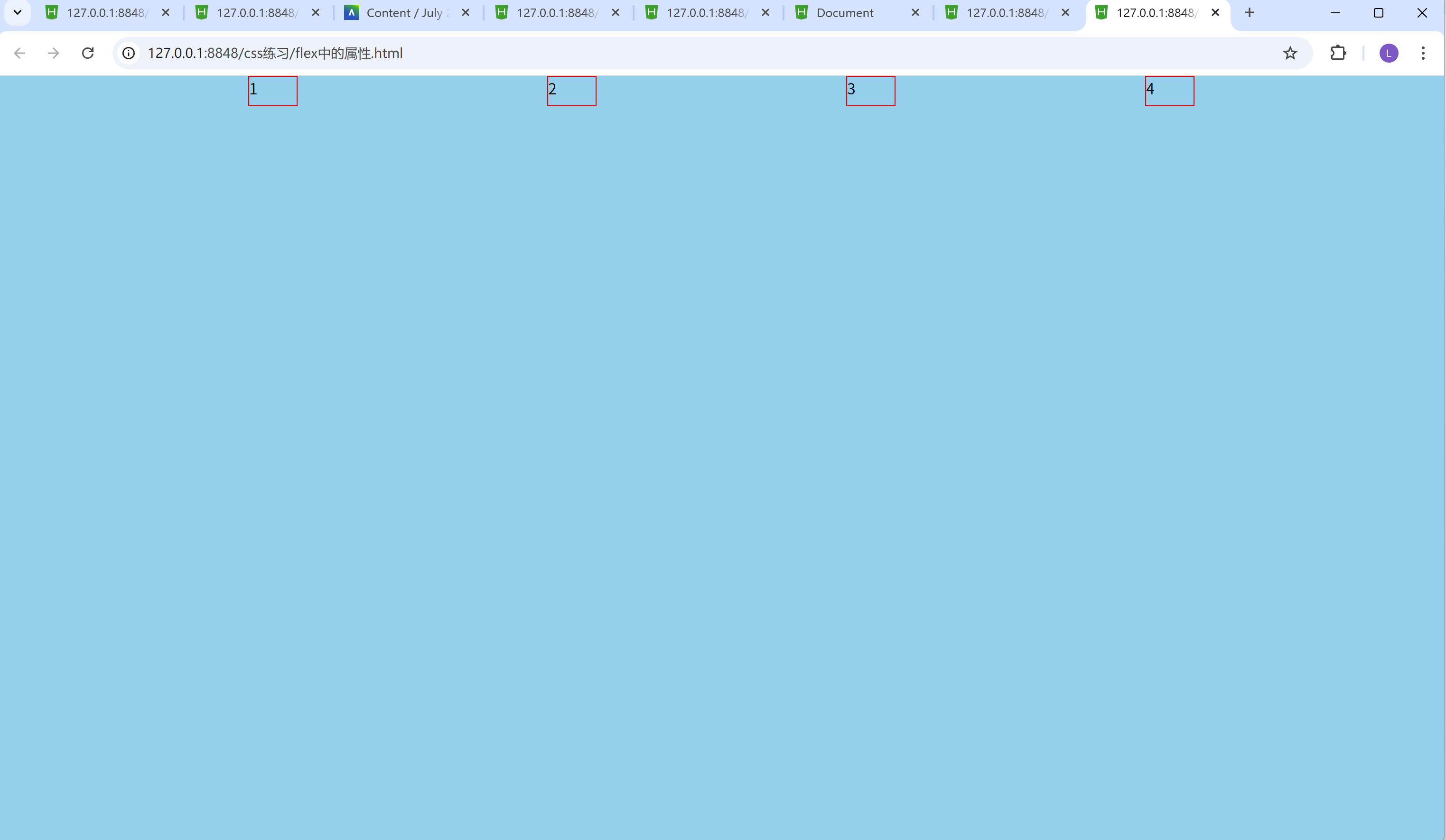
justify-content: space-evenly; 通过这行代码,我们可以看到四个inner-box的中间间隔的距离一样, 而且第一个inner-box贴在浏览器的最左边, 第四个inner-box贴在浏览器的最右边, 但和justify-content: space-between; 的区别是, justify-content: space-evenly; 结果出来第一个和最后一个box-inner没有贴在浏览器旁边, 而是在浏览器中间。
6.space-around均匀排列方式, 每个元素周围分配相同的空间
<!DOCTYPE html>
<html>
	<head>
		<meta charset="utf-8">
		<title></title>
		<style>
			*{
				margin: 0px;
				padding: 0px;
			}
			.box{
				width: 100%;
				/* vh是视口高度 */
				height: 100vh;
				background-color: skyblue;
				display: flex;
				/* x轴的排列方式 */
				/* space-around均匀排列方式, 每个元素周围分配相同的空间 */
				justify-content: space-around;
			}
			.inner-box{
				width: 50px;
				height: 30px;
				border: 1px red solid;
			}
			/* 鼠标移入效果hover */
			.inner-box:hover{
				color: red;
			}
		</style>
	</head>
	<body>
		<div class="box">
			<div class="inner-box">1</div>
			<div class="inner-box">2</div>
			<div class="inner-box">3</div>
			<div class="inner-box">4</div>
		</div>
	</body>
</html>
结果:
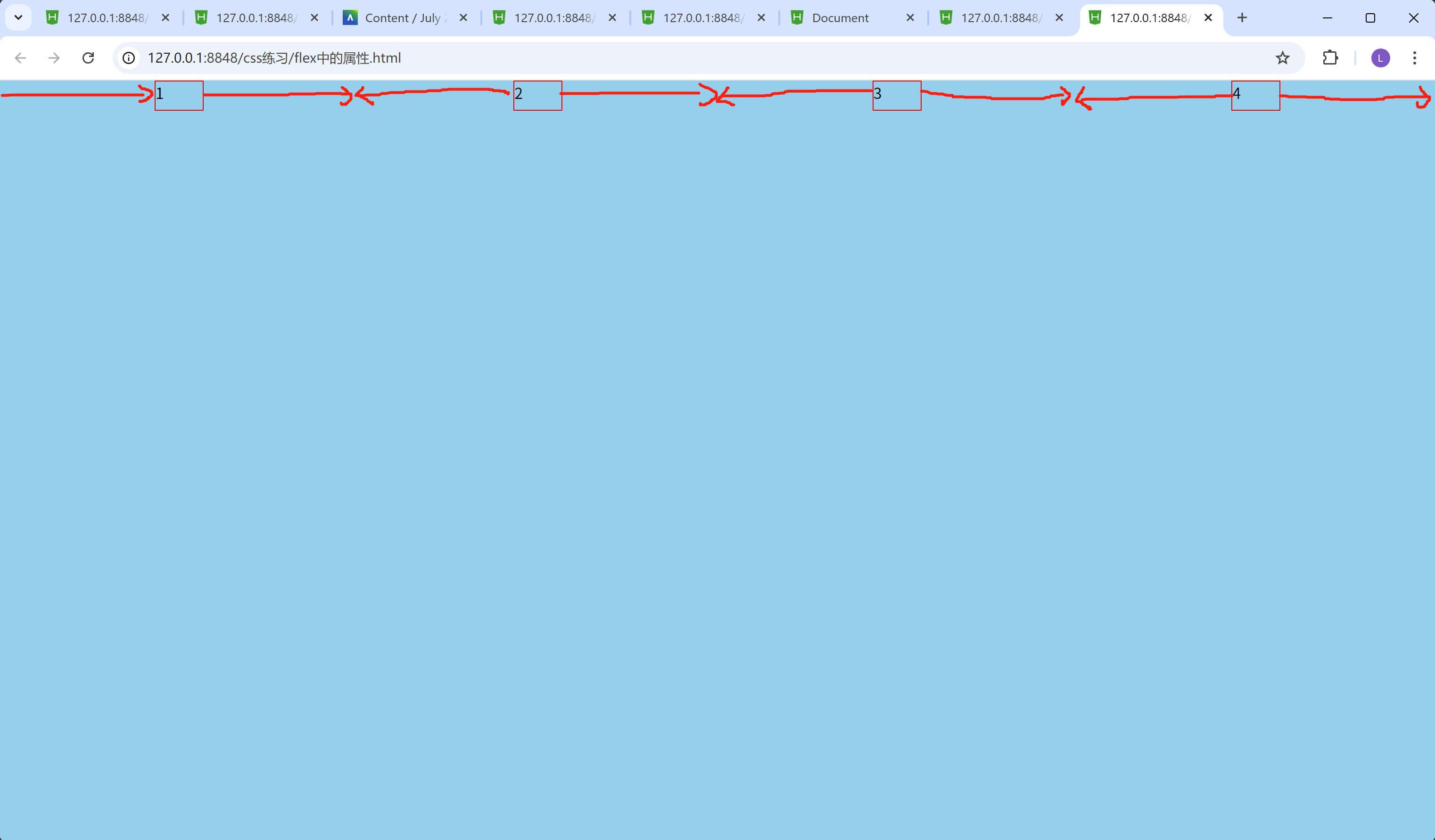
justify-content: space-around; 的效果, 在图中, 已用红色线条展示出来了。均匀排列方式, 每个元素周围分配相同的空间!
y轴的排列方式用到的属性:
align-items: 属性值;
以y轴为排列方式, 通常的属性值有:
1.start(或flex-start)默认排列方式, 元素位于容器的起始位置
2.center中间排列方式, 元素位于容器的中心
3.end(或flex-end)末尾排列方式, 元素位于容器的末尾位置
1.start(或flex-start)默认排列方式, 元素位于容器的起始位置
<!DOCTYPE html>
<html>
	<head>
		<meta charset="utf-8">
		<title></title>
		<style>
			*{
				margin: 0px;
				padding: 0px;
			}
			.box{
				width: 100%;
				/* vh是视口高度 */
				height: 100vh;
				background-color: skyblue;
				display: flex;
				/* x轴的排列方式 */
				/* center居中排列方式 */
				justify-content: center;
				/* y轴的排列方式 */
				/* start(或flex-start)默认排列方式, 元素位于容器的起始位置 */
				align-items: flex-start;
			}
			.inner-box{
				width: 50px;
				height: 30px;
				border: 1px red solid;
			}
			/* 鼠标移入效果hover */
			.inner-box:hover{
				color: red;
			}
		</style>
	</head>
	<body>
		<div class="box">
			<div class="inner-box">1</div>
			<div class="inner-box">2</div>
			<div class="inner-box">3</div>
			<div class="inner-box">4</div>
		</div>
	</body>
</html>
结果:

align-items: flex-start; 这个属性的设置让四个inner-box在浏览器的最上方。
2.center中间排列方式, 元素位于容器的中心
<!DOCTYPE html>
<html>
	<head>
		<meta charset="utf-8">
		<title></title>
		<style>
			*{
				margin: 0px;
				padding: 0px;
			}
			.box{
				width: 100%;
				/* vh是视口高度 */
				height: 100vh;
				background-color: skyblue;
				display: flex;
				/* x轴的排列方式 */
				/* center居中排列方式 */
				justify-content: center;
				/* y轴的排列方式 */
				/* center中间排列方式, 元素位于容器的中心 */

				align-items: center;
			}
			.inner-box{
				width: 50px;
				height: 30px;
				border: 1px red solid;
			}
			/* 鼠标移入效果hover */
			.inner-box:hover{
				color: red;
			}
		</style>
	</head>
	<body>
		<div class="box">
			<div class="inner-box">1</div>
			<div class="inner-box">2</div>
			<div class="inner-box">3</div>
			<div class="inner-box">4</div>
		</div>
	</body>
</html>
结果:
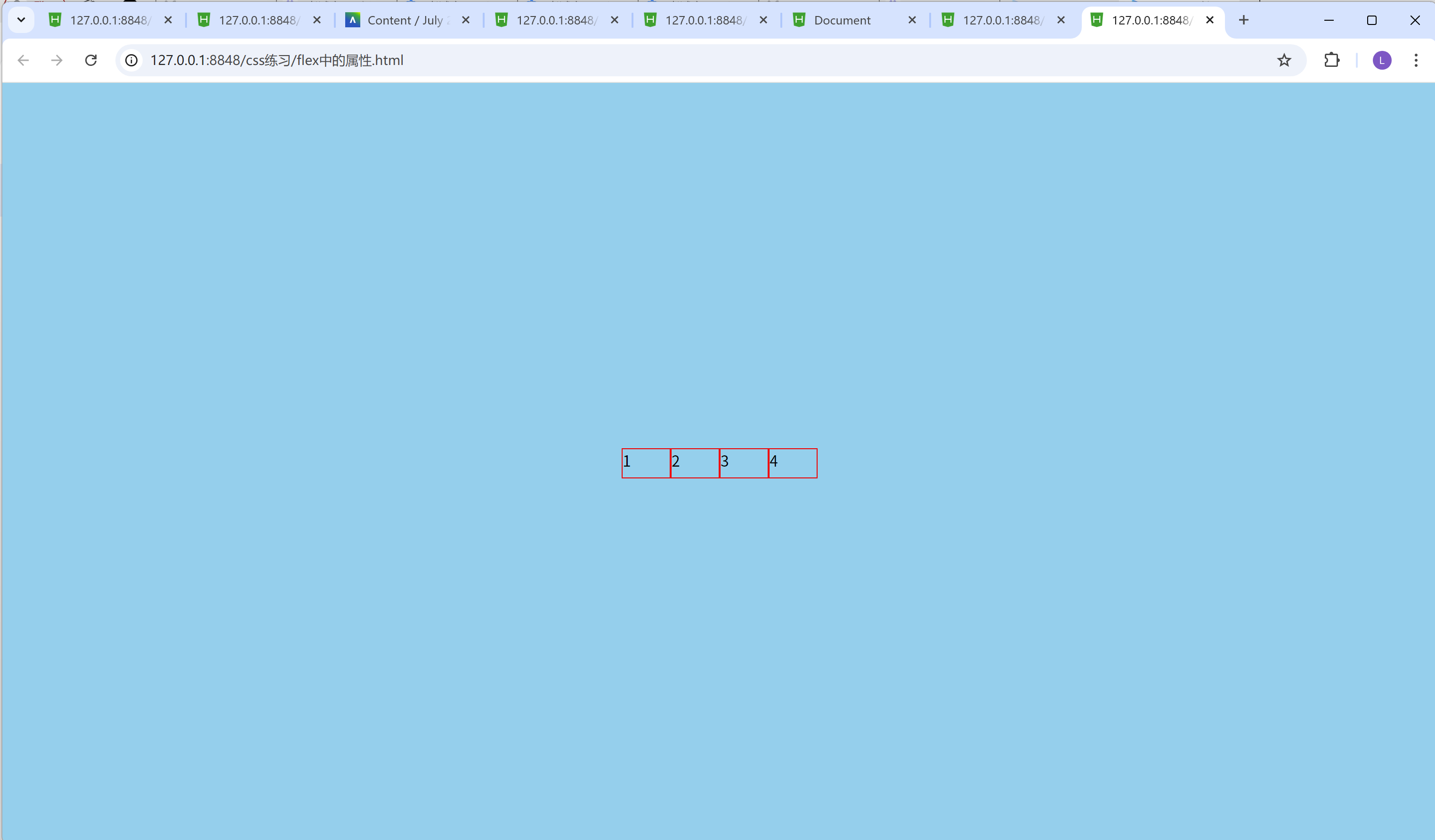
align-items: center;这个属性的设置让四个inner-box在浏览器的正中间。
3.end(或flex-end)末尾排列方式, 元素位于容器的末尾位置
<!DOCTYPE html>
<html>
	<head>
		<meta charset="utf-8">
		<title></title>
		<style>
			*{
				margin: 0px;
				padding: 0px;
			}
			.box{
				width: 100%;
				/* vh是视口高度 */
				height: 100vh;
				background-color: skyblue;
				display: flex;
				/* x轴的排列方式 */
				/* flex-end末尾排列方式 */
				justify-content: center;
				/* y轴的排列方式 */
				/* end(或flex-end)末尾排列方式, 元素位于容器的末尾位置 */
				align-items: flex-end;
			}
			.inner-box{
				width: 50px;
				height: 30px;
				border: 1px red solid;
			}
			/* 鼠标移入效果hover */
			.inner-box:hover{
				color: red;
			}
		</style>
	</head>
	<body>
		<div class="box">
			<div class="inner-box">1</div>
			<div class="inner-box">2</div>
			<div class="inner-box">3</div>
			<div class="inner-box">4</div>
		</div>
	</body>
</html>
结果:
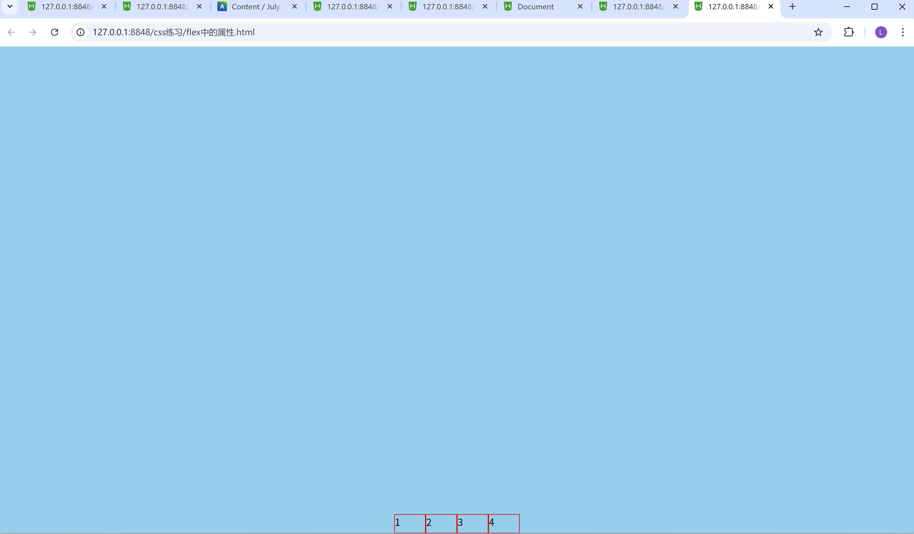
align-items: flex-end; 这个属性的设置让四个inner-box在浏览器的最下方。
display属性的其他用法
常见的有:
1.block(块级元素)
2.inline(行内元素)
1.block(块级元素)
<!DOCTYPE html>
<html>
	<head>
		<meta charset="utf-8">
		<title></title>
		<style>
			div{
				height: 50px;
				background-color: red;
				/* 块级元素(默认), 占一整行空间 */
				display: block;
			}
		</style>
	</head>
	<body>
		<!-- span, 一左一右(行内元素), 都是在一行里面排列的(左右排列), 但不能调整大小 -->
		<span>我是文字</span>
		<span>我是文字</span>
		<!-- div一般默认都是块级元素, 块级元素, 都是占用一整行空间的, 但是可以挑战大小 -->
		<div>我是div</div>
		<div>我是div</div>
	</body>
</html>
结果:
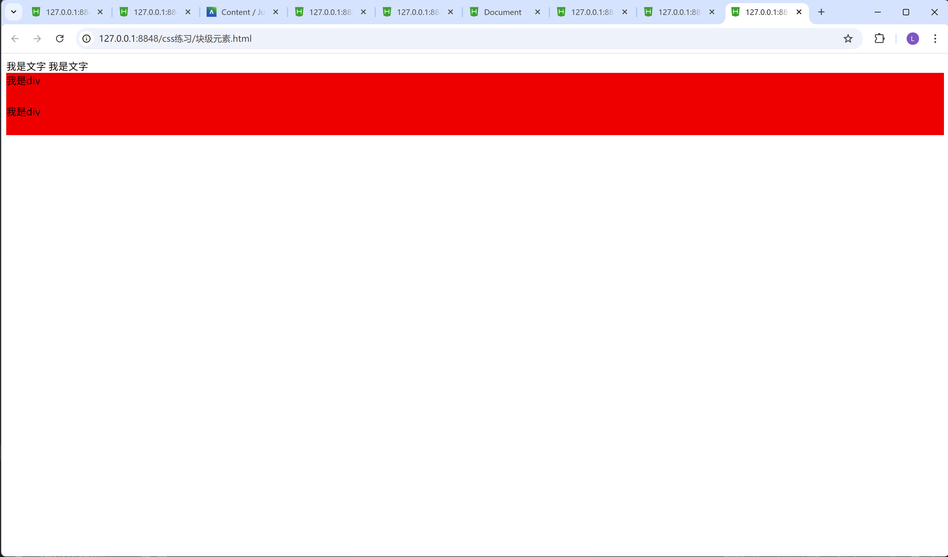
我们可以看到有两个红色的方框, 以上下排列, 因为div的display属性默认值是block, 块级元素, 是占用一整行空间的, 所以第二个div会跟在第一个div下面
2.inline(行内元素)
<!DOCTYPE html>
<html>
	<head>
		<meta charset="utf-8">
		<title></title>
		<style>
			div{
				height: 50px;
				background-color: red;
				/* 行内元素, 左右排列, 都在同一行 */
				display: inline;
			}
		</style>
	</head>
	<body>
		<!-- span, 一左一右(行内元素), 都是在一行里面排列的(左右排列), 但不能调整大小 -->
		<span>我是文字</span>
		<span>我是文字</span>
		<!-- div一般默认都是块级元素, 块级元素, 都是占用一整行空间的, 但是可以挑战大小, 不过我们在这里把div设置成了inline(行内元素) -->
		<div>我是div</div>
		<div>我是div</div>
	</body>
</html>
结果:
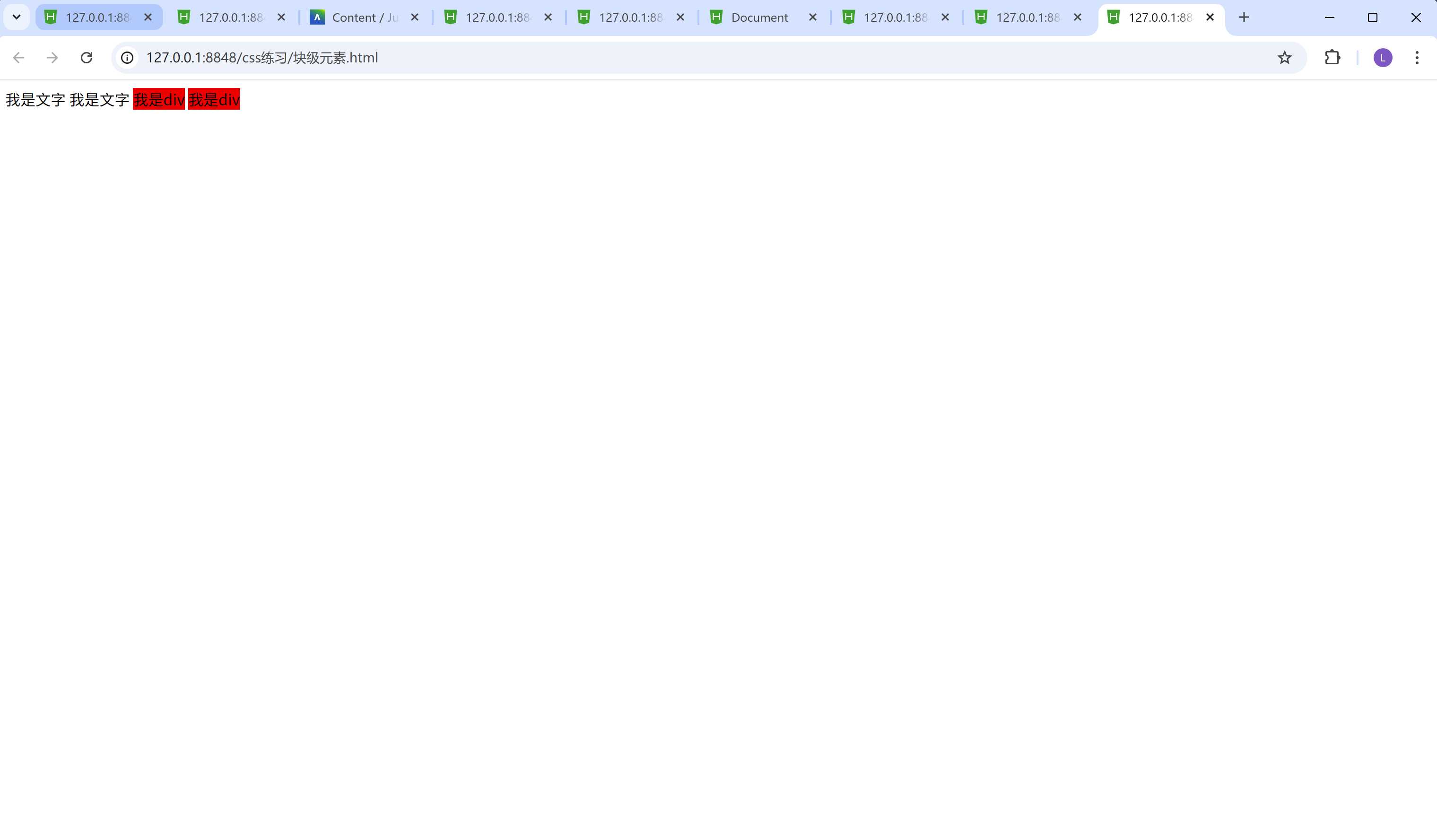
我们可以看到有两个红色的方框, 以左右排列, 因为div的display属性默认值是inline, 行内元素, 所有的元素都在一行空间里面, 所以第二个div会跟在第一个div右边(左右排列)
css中hover的用法
比如:
/* 鼠标移入效果hover */
.inner-box:hover{
	color: red;
}
当我鼠标指在方框上面的时候, 方框里面的文字, 会变色
当我们鼠标离开方框的时候, 方框里面的文字, 又会变为原来的颜色。
实战:
实现以下界面:
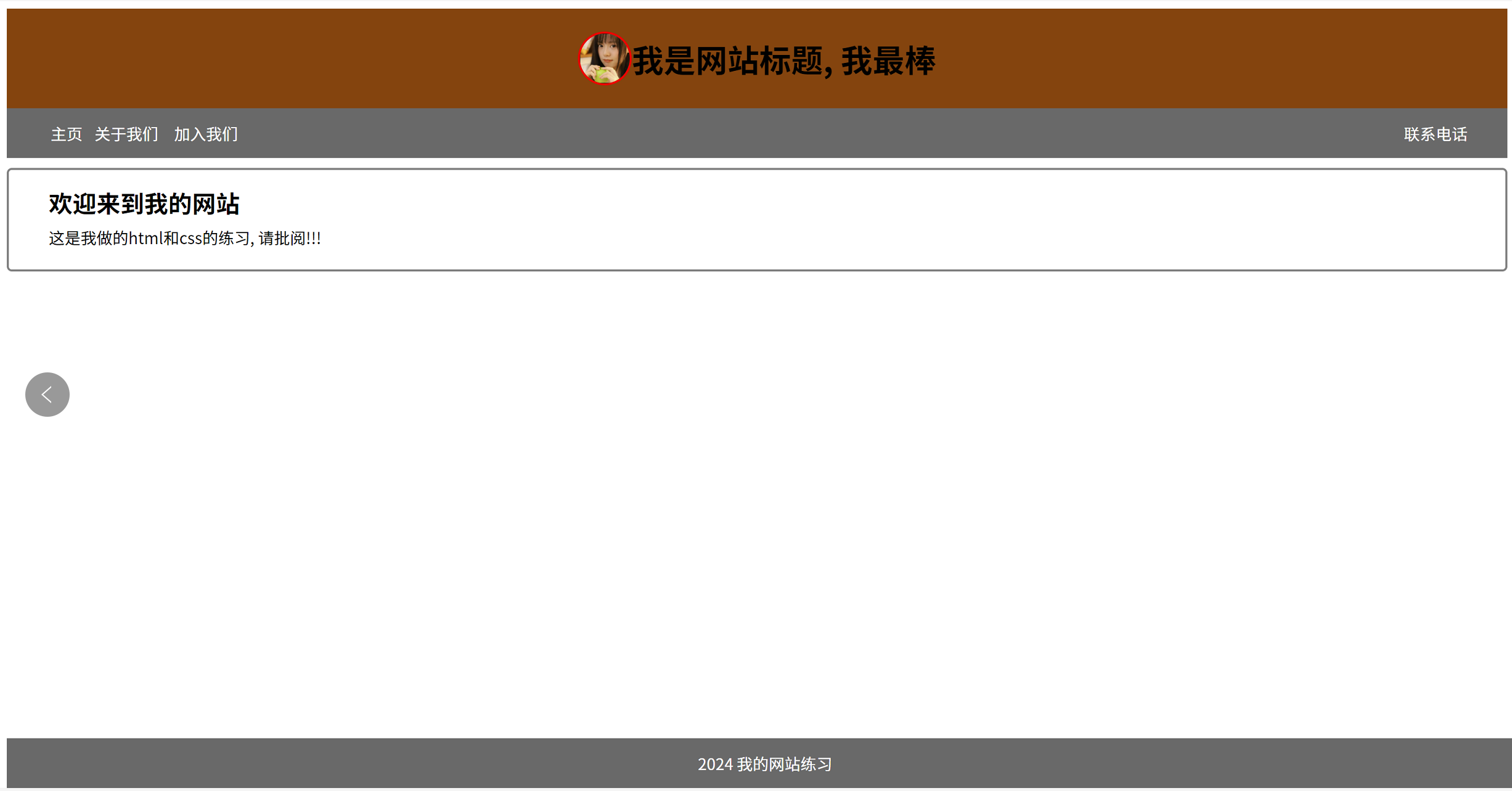
先尝试着自己做下, 只要把网站里面的界面效果做出来就行哦, 不一定要和图片里面的一模一样哦。
答案:
<!DOCTYPE html>
<html>
	<head>
		<meta charset="utf-8">
		<title></title>
		<link rel="stylesheet" href="css/进阶css练习.css" />
	</head>
	<body>
		<div class="header">
			<img src="img/beautiful_girl.png" alt="图片无法加载" class="image"/>
			<h1>我是网站标题, 我最棒</h1>
		</div>
		<div class="navigator">
			<ul>
				<li><a href="https://www.baidu.com">主页</a></li>
				<li><a href="">关于我们</a></li>
				<li><a href="">加入我们</a></li>
			</ul>
			<ul>
				<li><a href="">联系电话</a></li>
			</ul>
		</div>
		<div class="content">
			<h2 class="content-title">欢迎来到我的网站</h2>
			<p class="content-text">这是我做的html和css的练习, 请批阅!!!</p>
		</div>
		<div class="footer">
			<p>2024</p>
			<p>我的网站练习</p>
		</div>
	</body>
</html>
.header{
	height: 100px;
	background-color: saddlebrown;
	text-align: center;
	display: flex;
	justify-content: center;
	align-items: center;
}
.image{
	width: 50px;
	height: 50px;
	display: flex;
	border-radius: 50%;
	border: 2px red solid;
}
.navigator{
	height: 50px;
	background-color: dimgray;
	display: flex;
	align-items: center;
	position: relative;
	line-height: 50px;
}
ul:nth-child(1){
	width: 200px;
	/* 去除文字前面的小圆点 */
	list-style-type: none;
	display: flex;
	justify-content: center;
	text-align: center;
}
ul:nth-child(1) li:nth-child(1){
	flex: 1;
	height: 50px;
}
ul:nth-child(1) li:nth-child(2){
	flex: 2;
	height: 50px;
}
ul:nth-child(1) li:nth-child(3){
	flex: 2;
	height: 50px;
}
.navigator ul:nth-child(2){
	/* 去除文字前面的小圆点 */
	/* position: absolute;
	right: 20px; */
	list-style-type: none;
	/* display: flex; */
	position: absolute;
	right: 40px;
	text-align: center;
}
.navigator ul:nth-child(2) li:nth-child(1){
	height: 50px;
	line-height: 50px;
}
ul:nth-child(1) li:nth-child(1):hover{
	background-color: darkgray;
	color: blue;
}
ul:nth-child(1) li:nth-child(2):hover{
	background-color: darkgray;
	color: blue;
}
ul:nth-child(1) li:nth-child(3):hover{
	background-color: darkgray;
	color: blue;
}
ul:nth-child(2) li:nth-child(1):hover{
	background-color: darkgray;
	color: blue;
}
a{
	text-decoration: none;
	color: white;
}
.content{
	border: 2px gray solid;
	border-radius: 5px;
	height: 100px;
	position: relative;
	top: 10px;
}
.content-title{
	position: relative;
	left: 40px;
	bottom: 5px;
}
.content-text{
	position: absolute;
	left: 40px;
	bottom: 5px;
}
.footer{
	position: fixed;
	width: 100%;
	bottom: 0px;
	height: 50px;
	background-color: dimgray;
	color: white;
	text-align: center;
}
.footer p{
	display: inline;
	line-height: 50px;
}
这里面的css,我们用到了外部样式。
运用了link标签将css文件引入进来。
请问, 你答对了吗? 如果把这个实战题靠自己独立做出来的话, 那就给自己一个掌声哦!!!
以上就是css进阶的所有内容了, 如果有哪里不懂的地方,可以把问题打在评论区, 欢迎大家在评论区交流!!!
如果我有写错的地方, 望大家指正, 也可以联系我, 让我们一起努力, 继续不断的进步.
学习是个漫长的过程, 需要我们不断的去学习并掌握消化知识点, 有不懂或概念模糊不理解的情况下,一定要赶紧的解决问题, 否则问题只会越来越多, 漏洞也就越老越大.
人生路漫漫, 白鹭常相伴!!!


 扫一扫
扫一扫
 87
87

 被折叠的 条评论
为什么被折叠?
被折叠的 条评论
为什么被折叠?
 到【灌水乐园】发言


