


background-attachment
当页面内容超过显示区域时,使用 local 使背景图片同页面内容一同滚动。
background-attachment: [, ]*
= scroll | fixed | local
background-position
background-position: [, ]*
= [left|center|right|top|bottom||]|[left|center|right|top|bottom||] [left|center|right|top|bottom||] | [center |[left|right][|]?]&&[center |[left|right][|]?]
/* 默认位置为 */
background-position: 0 0;
/* percentage 是容器与图片的百分比重合之处*/
background-position: 20% 50%;
/* 等同效果 */
background-position: 50% 50%;
background-position: center center;
background-position: 0 0;
background-position: left top;
background-position: 100% 100%;
background-position: right bottom;
/* 四个值时方向只为参照物 */
background-position: right 10px top 20px;
Sprite 的使用
background-image: url(sprite.png)
background-repeat: no-repeat;
background-positon: 0 -100px
使用位置为负值将图片偏移使需要的图片位置上移并显示正确的图案。
linear-gradient()
[[<angle> | to <side-or-corner],]? <color-step>[, <color-stop>]+
<side-or-corner> = [left | right] || [top | bottom]
<color-stop> = <color> [<percentage> | <length>]?

background-image: linear-gradient(red, blue);
background-image: linear-gradient(to top, red, blue);
background-image: linear-gradient(to right bottom, red, blue);
background-image: linear-gradient(0deg, red, blue);
background-image: linear-gradient(45deg, red, blue);
background-image: linear-gradient(red, green, blue);
background-image: linear-gradient(red, green 20%, blue);
radial-gradient
radial-gradient(   [ circle || <length> ] [ at <position> ]? , | [ ellipse || [<length> | <percentage> ]{2}] [ at <position> ]? , | [ [ circle | ellipse ] || <extent-keyword> ] [ at <position> ]? , | at <position> , <color-stop> [ , <color-stop> ]+ )

<extent-keyword> = closest-corner | closest-side | farthest-corner | farthest-side
<color-stop> = <color> [ <percentage> | <length> ]?

background-image: radial-gradient(cloest-side, red, blue);
background-image: radial-gradient(circle, red, blue);
background-image: radial-gradient(circle 100px, red, blue);
background-image: radial-gradient(red, blue);
background-image: radial-gradient(100px 50px, red, blue);
background-image: radial-gradient(100px 50px at 0 0, red, blue);
background-image: radial-gradient(red, green 20%, blue);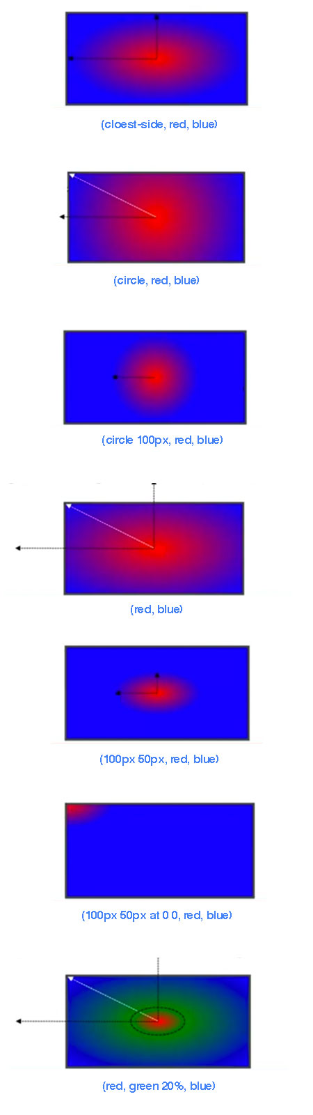
repeat-*-gradient
background-image: repeating-linear-gradient(red, blue 20px, red 40px);
background-image: repeating-radial-gradient(red, blue 20px, red 40px);
决定背景 (0,0) 坐标与 100% 坐标的区域。默认值为 padding-box。
<box>[, <box>]*
<box> = border-box | padding-box | content-box

background-image: url(red.png);
background-repeat: no-repeat;

background-origin: padding-box;
background-origin: border-box;
background-origin: content-box;


 903
903


 被折叠的 条评论
为什么被折叠?
被折叠的 条评论
为什么被折叠?
 到【灌水乐园】发言


