


CSS能够制作各种形状。正方形和矩形很容易,因为它们是自然形状。添加宽度和高度,就可以获得所需的确切尺寸矩形。添加border-radius,就可以将这些矩形变成圆形和椭圆形。
我们还可以利用CSS中的::before和::after元素,添加到原始元素的形状,再通过巧妙地定位或者其它操作,就可以在CSS中使用单个HTML元素制作许多形状。
正方形

#square {
  width: 100px;
  height: 100px;
  background: red;
}
矩形

#rectangle {
  width: 200px;
  height: 100px;
  background: red;
}
圆形
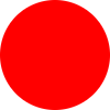
#circle {
  width: 100px;
  height: 100px;
  background: red;
  border-radius: 50%
}
椭圆
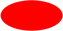
#oval {
  width: 200px;
  height: 100px;
  background: red;
  border-radius: 100px / 50px;
}
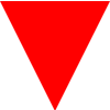
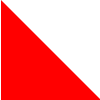
正三角(上、下、左、右)
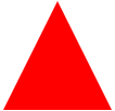
/** 向上 **/
#triangle-up {
width: 0;
height: 0;
border-left: 50px solid transparent;
border-right: 50px solid transparent;
border-bottom: 100px solid red;
}
/** 向下 **/
#triangle-down {
width: 0;
height: 0;
border-left: 50px solid transparent;
border-right: 50px solid transparent;
border-top: 100px solid red;
}
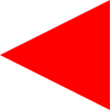
/** 向左 **/
#triangle-left {
width: 0;
height: 0;
border-top: 50px solid transparent;
border-right: 100px solid red;
border-bottom: 50px solid transparent;
}
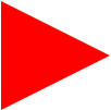
/** 向右 **/
#triangle-right {
width: 0;
height: 0;
border-top: 50px solid transparent;
border-left: 100px solid red;
border-bottom: 50px solid transparent;
}
直角三角形(左上、右上、左下、右下)
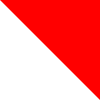
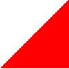
/** 左上 **/
#triangle-topleft {
width: 0;
height: 0;
border-top: 100px solid red;
border-right: 100px solid transparent;
}
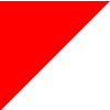
/** 右上 **/
#triangle-topright {
width: 0;
height: 0;
border-top: 100px solid red;
border-left: 100px solid transparent;
}
/** 左下 **/
#triangle-bottomleft {
width: 0;
height: 0;
border-bottom: 100px solid red;
border-right: 100px solid transparent;
}
/** 右下 **/
#triangle-bottomright {
width: 0;
height: 0;
border-bottom: 100px solid red;
border-left: 100px solid transparent;
}
梯形

#trapezoid {
  border-bottom: 100px solid red;
  border-left: 25px solid transparent;
  border-right: 25px solid transparent;
  height: 0;
  width: 100px;
}
平行四边形
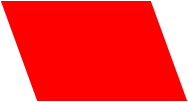
#parallelogram {
  width: 150px;
  height: 100px;
  transform: skew(20deg);
  background: red;
}
五边形

#pentagon {
  position: relative;
  width: 54px;
  box-sizing: content-box;
  border-width: 50px 18px 0;
  border-style: solid;
  border-color: red transparent;
}
#pentagon:before {
  content: "";
  position: absolute;
  height: 0;
  width: 0;
  top: -85px;
  left: -18px;
  border-width: 0 45px 35px;
  border-style: solid;
  border-color: transparent transparent red;
}
六边形
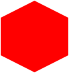
#hexagon {
  width: 100px;
  height: 55px;
  background: red;
  position: relative;
}
#hexagon:before {
  content: "";
  position: absolute;
  top: -25px;
  left: 0;
  width: 0;
  height: 0;
  border-left: 50px solid transparent;
  border-right: 50px solid transparent;
  border-bottom: 25px solid red;
}
#hexagon:after {
  content: "";
  position: absolute;
  bottom: -25px;
  left: 0;
  width: 0;
  height: 0;
  border-left: 50px solid transparent;
  border-right: 50px solid transparent;
  border-top: 25px solid red;
}
五角星

#star-five {
  margin: 50px 0;
  position: relative;
  display: block;
  color: red;
  width: 0px;
  height: 0px;
  border-right: 100px solid transparent;
  border-bottom: 70px solid red;
  border-left: 100px solid transparent;
  transform: rotate(35deg);
}
#star-five:before {
  border-bottom: 80px solid red;
  border-left: 30px solid transparent;
  border-right: 30px solid transparent;
  position: absolute;
  height: 0;
  width: 0;
  top: -45px;
  left: -65px;
  display: block;
  content: '';
  transform: rotate(-35deg);
}
#star-five:after {
  position: absolute;
  display: block;
  color: red;
  top: 3px;
  left: -105px;
  width: 0px;
  height: 0px;
  border-right: 100px solid transparent;
  border-bottom: 70px solid red;
  border-left: 100px solid transparent;
  transform: rotate(-70deg);
  content: '';
}
六角星
#star-six {
  width: 0;
  height: 0;
  border-left: 50px solid transparent;
  border-right: 50px solid transparent;
  border-bottom: 100px solid red;
  position: relative;
}
#star-six:after {
  width: 0;
  height: 0;
  border-left: 50px solid transparent;
  border-right: 50px solid transparent;
  border-top: 100px solid red;
  position: absolute;
  content: "";
  top: 30px;
  left: -50px;
}
爱心

#heart {
  position: relative;
  width: 100px;
  height: 90px;
}
#heart:before,
#heart:after {
  position: absolute;
  content: "";
  left: 50px;
  top: 0;
  width: 50px;
  height: 80px;
  background: red;
  border-radius: 50px 50px 0 0;
  transform: rotate(-45deg);
  transform-origin: 0 100%;
}
#heart:after {
  left: 0;
  transform: rotate(45deg);
  transform-origin: 100% 100%;
}
太极/阴阳
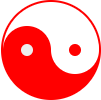
#yin-yang {
  width: 96px;
  box-sizing: content-box;
  height: 48px;
  background: #eee;
  border-color: red;
  border-style: solid;
  border-width: 2px 2px 50px 2px;
  border-radius: 100%;
  position: relative;
}
#yin-yang:before {
  content: "";
  position: absolute;
  top: 50%;
  left: 0;
  background: #eee;
  border: 18px solid red;
  border-radius: 100%;
  width: 12px;
  height: 12px;
  box-sizing: content-box;
}
#yin-yang:after {
  content: "";
  position: absolute;
  top: 50%;
  left: 50%;
  background: red;
  border: 18px solid #eee;
  border-radius: 100%;
  width: 12px;
  height: 12px;
  box-sizing: content-box;
}
参考以及更多css形状:https://css-tricks.com/the-shapes-of-css/


 516
516


 被折叠的 条评论
为什么被折叠?
被折叠的 条评论
为什么被折叠?
 到【灌水乐园】发言


