


 本文介绍使用Matplotlib进行复杂布局的方法,包括不同子图的排列方式及如何使用科学计数法显示坐标轴。通过实例展示了subplot与GridSpec布局技巧,并提供了科学计数法的两种实现方案。
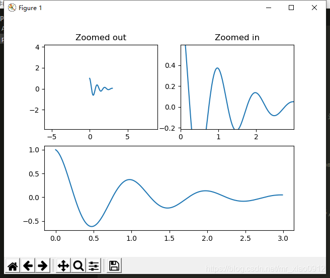
布局方法一:
import numpy as np
import matplotlib.pyplot as plt

def f(t):
    return np.exp(-t) * np.cos(2*np.pi*t)

t1 = np.arange(0.0, 3.0, 0.01)

ax1 = plt.subplot(212)      #两行一列第二行
ax1.margins(0.05)           # Default margin is 0.05, value 0 means fit
ax1.plot(t1, f(t1))


ax2 = plt.subplot(221)      #两行两列第一个    按顺序排1,2,3,4
ax2.margins(2, 2)           # Values >0.0 zoom out
ax2.plot(t1, f(t1))
ax2.set_title('Zoomed out')

ax3 = plt.subplot(222)      #两行两列第一个
ax3.margins(x=0, y=-0.25)   # Values in (-0.5, 0.0) zooms in to center
ax3.plot(t1, f(t1))
ax3.set_title('Zoomed in')

plt.show()
效果图:
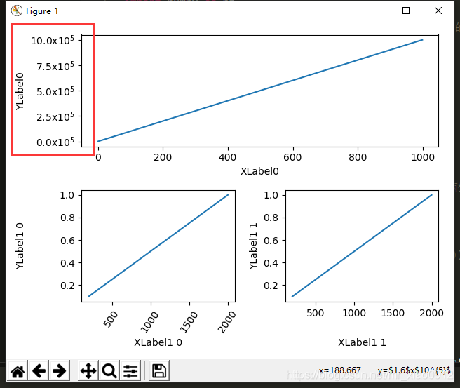
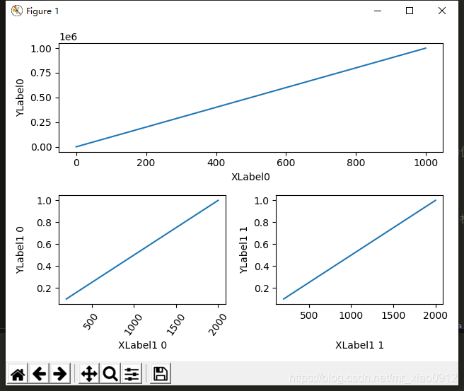
布局方法二:(含坐标轴科学计数)
import matplotlib.pyplot as plt
import numpy as np
import matplotlib.gridspec as gridspec
from matplotlib.ticker import FuncFormatter   ### 今天的主角设置y标签

fig = plt.figure(tight_layout=True)
gs = gridspec.GridSpec(2, 2)

ax = fig.add_subplot(gs[0, :])
ax.plot(np.arange(0, 1e6, 1000))

# 科学计数法显示坐标轴

# 方法一:
# def formatnum(x, pos):
#     return '$%.1f$x$10^{5}$' % (x/100000)   #注意修改两处的值,一个为x的除数,一个为对应的指数
# formatter = FuncFormatter(formatnum)
# ax.yaxis.set_major_formatter(formatter)

# 方法二:
ax.yaxis.get_major_formatter().set_powerlimits((0,1)) # 将坐标轴的base number设置为一位。


ax.set_ylabel('YLabel0')
ax.set_xlabel('XLabel0')

for i in range(2):
    ax = fig.add_subplot(gs[1, i])
    ax.plot(np.arange(1., 0., -0.1) * 2000., np.arange(1., 0., -0.1))
    ax.set_ylabel('YLabel1 %d' % i)
    ax.set_xlabel('XLabel1 %d' % i)
    if i == 0:
        for tick in ax.get_xticklabels():
            tick.set_rotation(55)
fig.align_labels()  # same as fig.align_xlabels(); fig.align_ylabels()

plt.show()
效果图:


 2809
2809

 被折叠的 条评论
为什么被折叠?
被折叠的 条评论
为什么被折叠?
 到【灌水乐园】发言


