


目录
SectionOutlet和SectionContent组件
.NET 8引入了用于控制子组件中的内容的sections。让我们探讨Blazor中的sections,以及如何使用布局实现它们。
在.NET 8中,ASP.NET Core引入了sections,这是一项新功能,允许从子组件控制内容。Sections既可以在布局中使用,也可以在嵌套的父子组件中使用。
虽然sections对 Blazor来说是全新的,但如果使用过其他ASP.NET技术,这个概念可能看起来很熟悉。Sections类似于Web窗体中的ContentPlaceHolder或MVC ASP.NET RenderSection。在这篇文章中, 我们将探讨Blazor中的sections,了解如何使用布局和最佳做法实现部分。
SectionOutlet和SectionContent组件
使Blazor中的sections成为可能的是对应的对象SectionOutlet和SectionContent。
使Blazor中的sections成为可能的是对应的对象SectionOutlet和SectionContent。SectionOutlet和SectionContent位于ASP.NET Core的Sections命名空间中。带上SectionOutlet和SectionContent添加到作用域中,将以下using语句添加到应用程序的_Imports.razor文件中。
@using Microsoft.AspNetCore.Components.SectionsSectionOutlet是一个组件,它使用匹配的SectionName或SectionId参数呈现由SectionContent组件提供的内容。两个或多个SectionOutlet组件不能具有相同的组件SectionName或SectionId。
SectionContent是一个组件,它以RenderFragment的形式向具有匹配SectionName或SectionId的SectionOutlet组件提供内容。
如果多个SectionContent组件具有相同的SectionName或SectionId,则匹配的SectionOutlet组件将呈现上次呈现的SectionContent的内容。
SectionName与SectionId
使用SectionOutlet创建sections,并由sections的SectionName或SectionId参数来标识。SectionName参数是一个字符串,用于从SectionContent组件面向SectionOutlet组件。虽然传递给SectionName的参数可以使用任何类型的大小写,但通常使用kebab大小写(例如,top-section),这是HTML元素ID的大小写选择。
让我们看一下典型的Blazor应用程序模板,看看可以在何处实现此功能。在Microsoft的Blazor模板中,有一个类为top-rowtop-row。默认情况下,显示指向“关于”页面的链接,如图1所示。
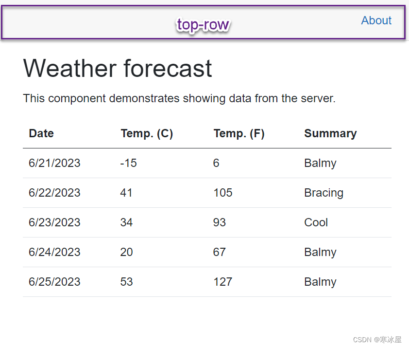
图 1: 突出显示顶行元素以强调的Blazor应用程序。
将内容添加到顶行的唯一方法是直接编辑源代码。但是,将部分添加到顶行会使其容易被应用程序中的任何子组件自定义。
若要添加部分,我们将修改MainLayout.razor的源代码。目前,一个div元素定义布局中的顶行,而内部的锚标记则链接到“关于”页面。
<div class="top-row px-4">
    <a href="https://learn.microsoft.com/aspnet/core/" target="_blank">About</a>
</div>我们可以通过在“关于”链接之前添加SectionOutlet来允许内容出现在现有锚点之前。SectionOutlet将被命名为pre-top-row,以帮助确定内容在呈现时的显示位置,在本例中,在顶行中的第一个元素之前。
<div class="top-row px-4">
    <SectionOutlet SectionName="before-top-row"/>
    <a href="https://learn.microsoft.com/aspnet/core/" target="_blank">About</a>
</div>
添加SectionOutlet后,任何使用MainLayout的子组件都可以在before-top-row中显示内容。现在可以在“关于”链接之前插入内容,以演示每个页面的专用帮助链接。
在ShowData.razor中,我们将添加一个SectionContent组件,并将SectionName分配给before-top-row。在SectionContent中,添加了一个用于ShowData帮助的链接。
<SectionContent SectionName="before-top-row">
    <a href="/showdata-help" target="_blank">ShowData Help</a>
</SectionContent>启动应用程序时,将显示主页,并且仅显示“关于”链接。由于此页面没有SectionContent组件,因此不会呈现其他内容。当我们导航到ShowData页面时,ShowData帮助链接是rendered,如图2所示。导航回主页将刷新内容,并且不会显示其他链接。
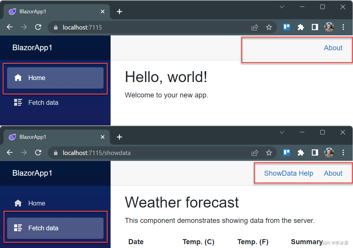
图2:在两个帧中显示的Blazor应用程序。第一帧显示带有“关于”链接菜单项的主页。第二帧显示“ShowData”页面,其中包含“ShowData 帮助”和“关于”链接。
这种方法的困难之一是可发现性。如果不直接查看MainLayout的源代码,就无法了解ContentSection。此外,没有文档、Intellisense或其他曲面处理方法section信息,供处理代码的开发人员使用。为了获得更好的开发人员体验(DX),我们可以使用ContentId参数而不是ContentName。
ContentId参数接受对象而不是字符串。由于ContentId使用对象,因此该名称由强类型化并由编译器识别。若要使用ContentId参数,请在代码中声明静态SectionOutlet对象。 然后,将SectionOutlet对象分配给SectionOutlet组件的、ContentId参数。
在下面的示例中,使用SectionId参数而不是SectionName。声明了名为BeforeTopRow的静态SectionOutlet。SectionOutlet引用名为BeforeTopRow的静态字段。对象的名称遵循C#命名约定并使用XML文档注释。
<div class="top-row px-4">
    <SectionOutlet SectionId="BeforeTopRow" />
    <a href="https://learn.microsoft.com/aspnet/core/" target="_blank">About</a>
</div>

@code{

    /// <summary>
    /// A section of the layout displayed at the top of the main layout.
    /// </summary>
    public static SectionOutlet BeforeTopRow = new();
}若要使用SectionOutlet,需要创建一个SectionContent组件,并将SectionId设置为静态对象。呈现的结果与使用SectionName的结果相同,但是,在键入时,我们获得了图3-1所示的额外好处将显示布局的类名SectionId(图3-2),并附上描述其用法的文档(图3-3)。
<SectionContent SectionId="MainLayout.BeforeTopRow">
    <a href="/showdata-help" target="_blank">ShowData Help</a>
</SectionContent>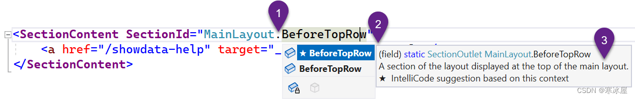
图3:[1]正在键入的SectionId属性的代码。[2]显示MainLayout sections的Intellisense菜单。[3]BeforeTopRow的描述,由XML注释提供。
创建默认内容
如果多个SectionContent组件具有相同的SectionName或SectionId,则匹配的SectionOutlet组件将呈现上次呈现的 SectionContent的内容。
可以利用此功能来提供默认部分内容。在前面的示例的基础上,我们将直接在同一个SectionId的SectionOutlet下添加一个SectionContent组件。然后,将现有的“关于”链接移动到SectionContent中。 现在,将显示“关于”链接,直到另一个SectionContent替换它。
<div class="top-row px-4">
    <SectionOutlet SectionId="TopRow" />
    <SectionContent SectionId="TopRow">
        <a href="https://learn.microsoft.com/aspnet/core/" target="_blank">About</a>
    </SectionContent>
</div>

@code {

    /// <summary>
    /// A section of the layout displayed at the top of the main layout.
    /// </summary>
    public static SectionOutlet TopRow = new();
}Sections有助于在布局中创建模板区域。它们可以使用字符串值进行松散类型化,也可以使用对象进行强类型化。Sections可用于预置、附加或替换内容,具体取决于SectionOutlets的排列方式。Sections也不局限于这些用例,当与嵌套的LayoutComponents结合使用时,可以看到它们的全部潜力。
将Sections与布局结合使用
Blazor中的sections在与布局一起使用时真正显示出其潜力,因为它们可以为任何应用程序提供一组丰富的视图模板。许多现代应用程序需要针对不同类型的视图或数据的多个布局架构。
考虑当今Web应用程序中常见的基本两列(图4)和三列(图5)布局。使用sections和布局,可以轻松实现管理两列或三列布局模板。让我们看看如何使用HTML、CSS和SectionOutlet实现这一点。
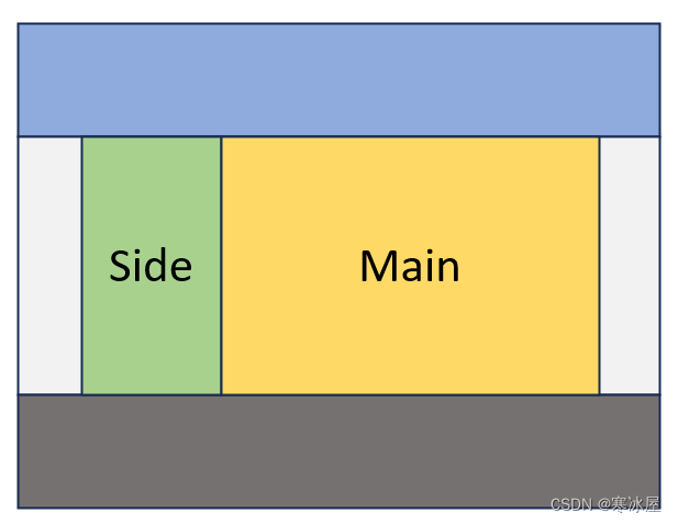
图 4:带有侧栏和主sections的两列布局。
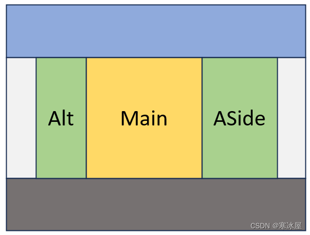
图 5:三列布局,包括alt、main和aside部分。
如图6所示,MainLayout用作两列和三列布局的基础。MainLayout还包含Header、Body和Footer 部分。在MainLayout的body中,嵌套TwoColumn或ThreeColumn布局。TwoColumn布局具有用于导航的侧列,而Main部分用于应用程序的主要内容。ThreeColumn布局包括一个附加列,用于 aside,或切线相关的信息。
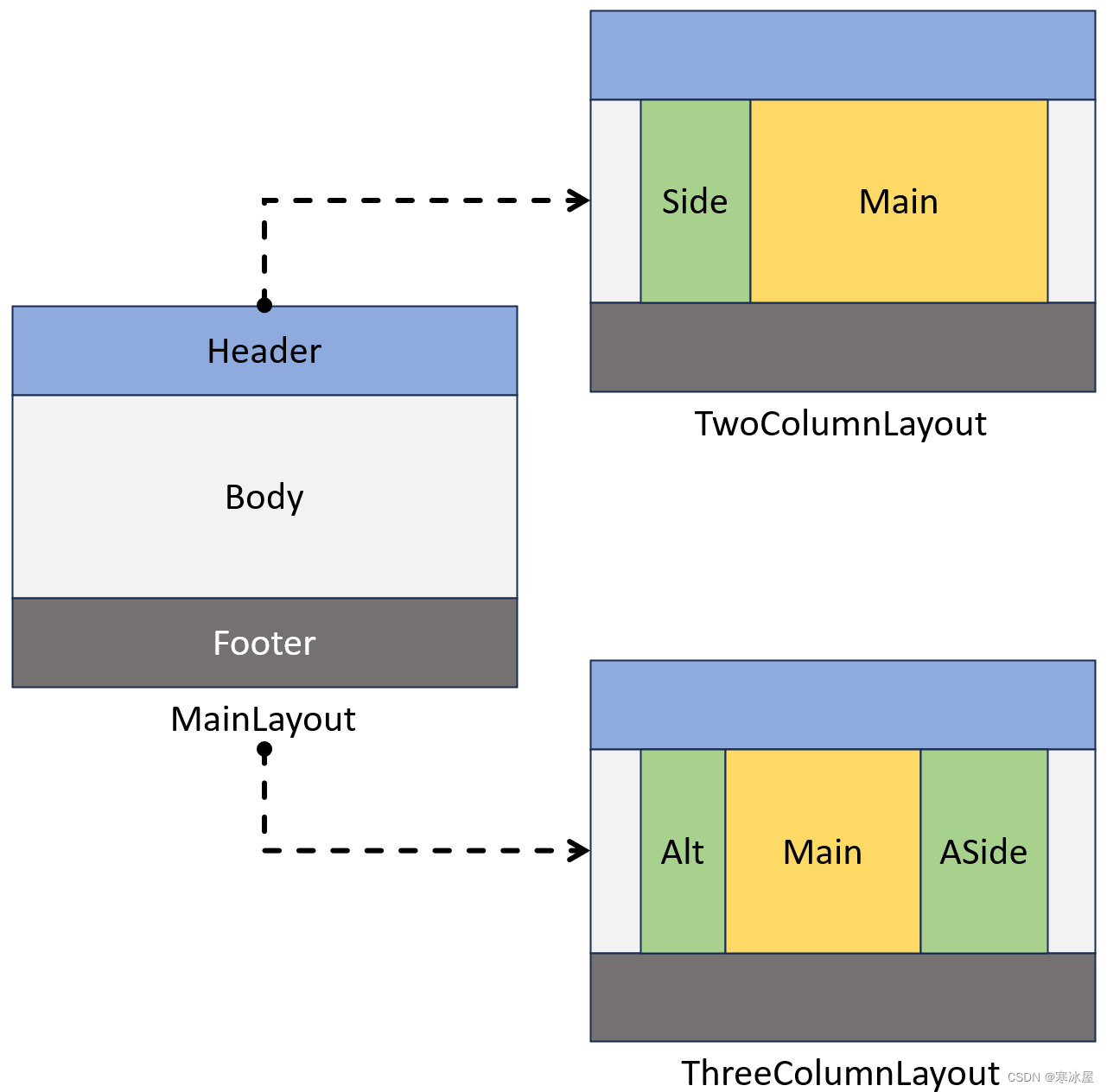
图 6:显示MainLayout、TwoColumn布局和ThreeColumn布局的图。MainLayout用作两个布局的基础。
Blazor中布局的嵌套行为增加了额外的好处,因为三个布局中的每一个都包含页眉和页脚部分。这些部分只需在MainLayout中定义一次,并由其他布局继承。
若要开始开发三个布局模板,我们将从MainLayout开始。从干净的MainLayout.razor文件开始,我们将添加必要的HTML元素来创建页眉、页脚和body设计。
<div class="wrapper">
    <div class="grid-container">
        <header>
            <div class="container">
                <!-- Header -->
                <h1>Untitled</h1>
            </div>
        </header>
        <div class="container">
            <!-- Body -->
        </div>
        <footer>
            <div class="container">
                <p>Copyright ... All Rights Reserved.</p>
                <!-- Footer -->
            </div>
        </footer>
    </div>
</div>
接下来,我们将编写CSS代码,用于以所需的方向和颜色显示页面上的元素。
.wrapper {
    /* push footer to the bottom of the page */
    height: 100%;
}
.container {
    /* maintian whitespace around content*/
    width: 80%;
    max-width: 1100px;
    margin: 0 auto;
}
.grid-container {
    display: grid;
    grid-template-rows: auto 1fr auto;
    row-gap:2rem;
    /* push footer to the bottom of the page */
    min-height: 100%;
    background: whitesmoke;
}

header {
    background: #34ace0;
    padding: 1rem;
}

footer {
    background: #227093;
    padding: 1rem;
    color:white;
}
若要将这些元素转换为Blazor布局,我们需要实现LayoutComponentBase类。然后,我们将为Header、Body和Footer SectionOutlets添加代码。Body SectionOutlet将是可选的,但在布局时添加了一个不错的DX被消耗。
我们将使用一个名为Sections的静态类来帮助确定哪些sections可用于此布局。我们还将确保使用XML文档注释来传达每个sections的意图。
@inherits LayoutComponentBase
...
@code {
/// <summary>
/// Sections for the MainLayout
/// </summary>
internal static class Sections
{
/// <summary>
/// The root <header></header> element of the application
/// </summary>
internal static SectionOutlet? Header = new();
/// <summary>
/// The root content container of the document.
/// This element has no semantic meanding. When using this section be sure to specify a main element for accessibility.
/// Default, uses the Body of the layout component.
/// </summary>
internal static SectionOutlet? Body = new();
/// <summary>
/// The root <footer></footer> of the application
/// </summary>
internal static SectionOutlet? Footer = new();
}
}定义SectionOutlet字段后,我们现在可以添加SectionOutlet组件。每个SectionOutlet组件都将使用与Sections类中的字段相对应的SectionId属性。
<div class="wrapper">
    <div class="grid-container">
        <header>
            <div class="container">
                <!-- Header -->
                <SectionOutlet SectionId="Sections.Header" />
                <SectionContent SectionId="Sections.Header">
                    <h1>Untitled</h1>
                </SectionContent>
            </div>
        </header>
        <div class="container">
            <!-- Body -->
            <SectionOutlet SectionId="Sections.Body" />
            @Body
        </div>
        <footer>
            <div class="container">
                <p>Copyright ... All Rights Reserved.</p>
                <!-- Footer -->
                <SectionOutlet SectionId="Sections.Footer" />
            </div>
        </footer>
    </div>
</div>
完成MainLayout后,我们将创建一个名为TwoColumn布局的子布局。此布局将放置在MainLayout的Body中,并呈现两列。我们将首先创建HTML,它由一个包装元素组成,该元素将定义网格的属性。然后添加两个内部元素,每列一个。
<div class="grid">
    <nav>
        <!-- Nav -->
    </nav>
    <main>
        <!-- Main/Body -->
    </main>
</div>
接下来,我们将通过CSS定义网格属性。在这种情况下,网格将有两列,比例为2:5,即2fr x 5fr。
div.grid {
    display:grid;
    grid-template-columns: 2fr 5fr;
    column-gap: 2rem;
}
TwoColumn组件使用MainLayout作为其布局,从而创建嵌套效果。
若要使用MainLayout,我们将添加@layout指令并指定要使用的布局。接下来,使用静态类和静态字段在代码中定义SectionOutlets。这两个列按照它们的语义命名,Nav表示导航列,Main表示文档的主要内容。我们还将确保使用注释来传达每个部分的HTML语义含义。
@inherits LayoutComponentBase
@layout MainLayout
...
@code {
/// <summary>
/// Sections for the TwoColumn layout.
/// Uses MainLayout.
/// </summary>
internal static class Sections
{
/// <summary>
/// An <nav></main> element representing the layout's navigation column.
/// This nav element should contain navigation for this layout.
/// </summary>
internal static SectionOutlet? Nav = new();
/// <summary>
/// A <main></main> element representing the layout's second column.
/// Default, uses the Body of the layout component.
/// </summary>
internal static SectionOutlet? Main = new();
}
}为了完成TwoColumn布局,将SectionOutlet组件与Sections类中的字段对应的SectionId属性一起添加。
<div class="grid">
    <nav>
        <!-- Nav -->
        <SectionOutlet SectionId="Sections.Nav" />
    </nav>
    <main>
        <!-- Main/Body -->
        <SectionOutlet SectionId="Sections.Main" />
        @Body
    </main>
</div>
我们对ThreeColumn布局重复此过程。它还继承自LayoutComponentBase并嵌套在MainLayout中,使用类似的HTML和CSS,并为每列包含SectionOutlets。完成的代码如下所示。
@inherits LayoutComponentBase
@layout MainLayout
<div class="grid">
<section>
<SectionOutlet SectionId="Sections.Alt" />
</section>
<main class="demo-outline--main">
<SectionOutlet SectionId="Sections.Main" />
@Body
</main>
<aside>
<SectionOutlet SectionId="Sections.Aside" />
</aside>
</div>
@code {
/// <summary>
/// Sections for the ThreeColumn layout.
/// Uses MainLayout.
/// </summary>
internal static class Sections
{
/// <summary>
/// A <section></section> element representing the layout's first column.
/// </summary>
internal static SectionOutlet? Alt = new();
/// <summary>
/// A <main></main> element representing the layout's middle column.
/// Default, uses the Body of the layout component.
/// </summary>
internal static SectionOutlet? Main = new();
/// <summary>
/// An <aside></aside> element representing the layout's second column.
/// </summary>
internal static SectionOutlet? Aside = new();
}
}完成这三个布局后,我们可以开始在我们的应用程序中使用它们。
若要使用布局,我们将向具有所需布局的视图添加@layout指令。在此示例中,我们将使用TwoColumn布局。声明布局后,我们将为每个可用的section添加一个SectionContent组件,包括MainLayout的页眉和页脚。
唯一未使用section的是MainLayout的Body部分,因为此部分被TwoColumn布局占用。每个SectionContent都使用SectionId来确定它所代表的sections展示。
@layout TwoColumn
@page "/"

<PageTitle>Index</PageTitle>
<SectionContent SectionId="MainLayout.Sections.Header">
</SectionContent>

<SectionContent SectionId="TwoColumn.Sections.Main">
</SectionContent>

<SectionContent SectionId="TwoColumn.Sections.Nav">
</SectionContent>

<SectionContent SectionId="MainLayout.Sections.Footer">
</SectionContent>
定义SectionContent组件后,我们可以用要在视图中显示的内容填充它们。
<SectionContent SectionId="MainLayout.Sections.Header">
    <h1>Index</h1>
</SectionContent>

<SectionContent SectionId="TwoColumn.Sections.Main">
    <h1>Hello, world!</h1>

    Welcome to your new app.
</SectionContent>

<SectionContent SectionId="TwoColumn.Sections.Nav">
    <h2>Navigation</h2>
    <NavMenu/>
</SectionContent>

<SectionContent SectionId="MainLayout.Sections.Footer">
    Footer for index.razor
</SectionContent>内容到位后,我们可以启动应用程序并查看完全渲染的输出。在图7中,为清楚起见,显示了该应用程序的列。导航列显示为绿色,主列在黄色中显示。
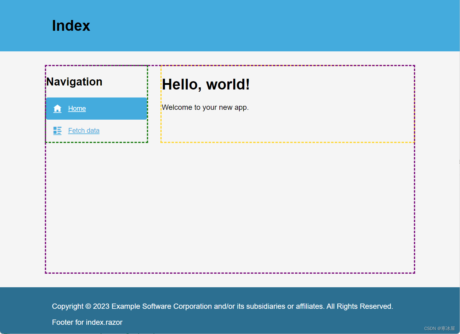
图7: 在浏览器中呈现的“索引”页,包含两列。导航列以绿色标出,主列以黄色标出。
使用ThreeColumn布局对ShowData视图重复该过程。在图8中,我们可以看到浏览器显示的三列。主列用黄色勾勒,两侧列用绿色勾勒。
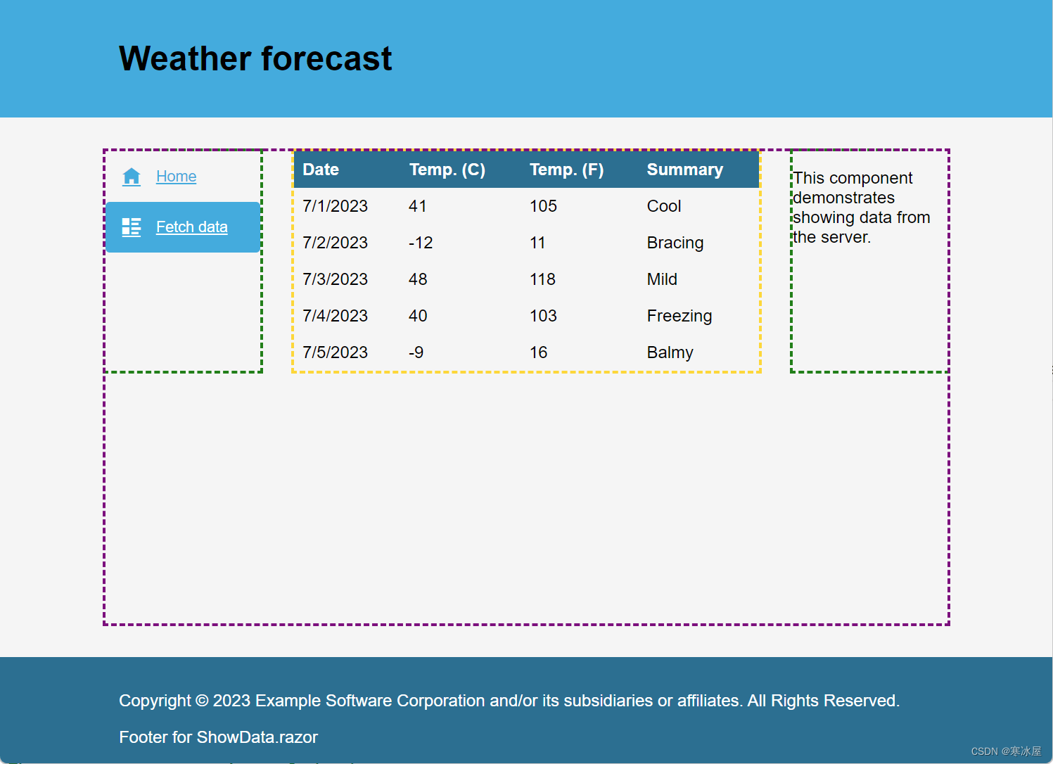
图8:在浏览器中呈现的ShowData页面,包含三列。主列用黄色勾勒,侧列用绿色勾勒。
Sections摘要
通过示例,我们看到了在.NET 8中使用ASP.NET Core的Blazor引入的新部分功能。Sections使子组件能够通过SectionOutlet控制组件指定区域中的呈现内容。可以定义Sections按字符串名称或使用强类型对象。强类型SectionId可用于支持Intellisense、文档和可发现性,以实现更好的DX。
我们看到,部分可以与布局组件相结合,为应用程序创建一个强大的模板系统。使用HTML、CSS和SectionOutlet,创建了TwoColumn和ThreeColumn布局。由于Blazor中的嵌套功能, TwoColumn和ThreeColumn利用MainLayout,同时仍提供对MainLayout部分的访问。
到目前为止,我们已经使用HTML和CSS为我们的布局创建行和列。如果你不是HTML和CSS专家,仍然可以在使用Progress Telerik UI for Blazor的部分时制作美观的布局。
适用于Blazor和Sections的Telerik UI
在前面的示例中,我们使用CSS网格来定义布局的行和列。另一种选择是将Telerik UI用于Blazor的TelerikGridLayout。
TelerikGridLayout是一种基于组件的方法,用于定义网格布局,使用最少的CSS或没有CSS。使用TelerikGridLayout, 网格是在Razor标记中定义的。让我们使用TelerikGridLayout重新创建MainLayout、TwoColumn和ThreeColumn布局。
我们将首先创建一个新的MainLayout并继承自LayoutComponentBase。接下来,添加TelerikRootComponent。TelerikRootComponent是一个包装整个应用程序并提供状态和功能的组件到Telerik UI组件。
@inherits LayoutComponentBase

<TelerikRootComponent>
</TelerikRootComponent>
在TelerikRootComponent中,添加了一个TelerikGridLayout。TelerikGridLayout提供了一种在网格布局系统中组织UI元素的简单方法,包括行和列。该组件基于CSS网格布局,但包括熟悉的Blazor组件。该组件可以设置网格属性,包括行和列间距、水平和垂直对齐选项、行高、列宽等。
<TelerikRootComponent>
    <TelerikGridLayout RowSpacing="2rem">
    </TelerikGridLayout>
</TelerikRootComponent>
在网格布局中,定义了行和列。GridLayoutRows是GridLayoutRow组件的集合,用于设置网格中每一行的属性。对于列,使用GridLayoutColumns和GridLayoutColumn组件。
对于MainLayout,我们将创建页眉、body和页脚行的定义。为每一行添加一个GridLayoutRow,并将height属性设置为所需值。
<TelerikGridLayout RowSpacing="2rem">
    <GridLayoutRows>
        <GridLayoutRow Height="auto" />
        <GridLayoutRow Height="1fr" />
        <GridLayoutRow Height="auto" />
    </GridLayoutRows>
</TelerikGridLayout>
定义网格属性后,将添加网格项。GridLayoutItems和GridLayoutItem表示网格中每行或每列的内容。为页眉、body和页脚行添加LayoutItem,并使用HTML设置其内容元素。
<TelerikGridLayout>
...
    <GridLayoutItems>
        <GridLayoutItem>
            <header>
                <div class="container">
                    <!-- Header -->
                </div>
            </header>
        </GridLayoutItem>
        <GridLayoutItem>
            <div class="container">
                <!-- Body -->
            </div>
        </GridLayoutItem>
        <GridLayoutItem>
            <footer>
                <div class="container">
                    <p>Copyright ... All Rights Reserved.</p>
                    <!-- Footer -->
                </div>
            </footer>
        </GridLayoutItem>
    </GridLayoutItems>
</TelerikGridLayout>
网格标记完成后,我们可以使用SectionOutlet添加sections。
虽然网格是在没有CSS的情况下定义的,但为了美观,添加了一些CSS类。
<TelerikRootComponent>
<TelerikGridLayout RowSpacing="2rem" Class="grid-container">
<GridLayoutRows>...</GridLayoutRows>
<GridLayoutItems>
<GridLayoutItem>
<header>
<div class="container">
<!-- Header -->
<SectionOutlet SectionId="Sections.Header" />
<SectionContent SectionId="Sections.Header">
<h1>Untitled</h1>
</SectionContent>
</div>
</header>
</GridLayoutItem>
<GridLayoutItem>
<div class="container">
<SectionOutlet SectionId="Sections.Body" />
@Body
</div>
</GridLayoutItem>
<GridLayoutItem>
<footer>
<div class="container">
<p>Copyright ... All Rights Reserved.</p>
<SectionOutlet SectionId="Sections.Footer" />
</div>
</footer>
</GridLayoutItem>
</GridLayoutItems>
</TelerikGridLayout>
</TelerikRootComponent>
@code {
/// <summary>
/// Sections for the MainLayout
/// </summary>
internal static class Sections
{
/// <summary>
/// The root <header></header> element of the application
/// </summary>
internal static SectionOutlet? Header = new();
/// <summary>
/// The root content container of the document.
/// This element has no semantic meanding. When using this section be sure to specify a main element for accessibility.
/// Default, uses the Body of the layout component.
/// </summary>
internal static SectionOutlet? Body = new();
/// <summary>
/// The root <footer></footer> of the application
/// </summary>
internal static SectionOutlet? Footer = new();
}
}完成MainLayout后,我们可以创建TwoColumn。TwoColumn布局将使用MainLayout,创建层次结构。添加TelerikGridLayout组件,并使用GridLayoutColumn组件定义列。通过使用分数单位2fr和5fr设置Width属性,以2:5的比例创建两个列。按照网格定义,将添加一个GridLayoutItems组件,其中包含每列的HTML内容。最后,我们使用SectionOutlet完成这些部分。
@inherits LayoutComponentBase
@layout MainLayout
<TelerikGridLayout ColumnSpacing="2rem" >
<GridLayoutColumns>
<GridLayoutColumn Width="2fr" />
<GridLayoutColumn Width="5fr" />
</GridLayoutColumns>
<GridLayoutItems>
<GridLayoutItem>
<nav>
<SectionOutlet SectionId="Sections.Nav" />
</nav>
</GridLayoutItem>
<GridLayoutItem>
<article>
<SectionOutlet SectionId="Sections.Body" />
@Body
</article>
</GridLayoutItem>
</GridLayoutItems>
</TelerikGridLayout>
@code {
/// <summary>
/// Sections for the TwoColumnLayout.
/// Uses MainLayout.
/// </summary>
internal static class Sections
{
/// <summary>
/// An element representing the layout's navigation column.
/// This nav element should contain navigation for this layout.
/// </summary>
internal static SectionOutlet? Nav = new();
/// <summary>
/// A <main></main> element representing the layout's second column.
/// Default, uses the Body of the layout component.
/// </summary>
internal static SectionOutlet? Main = new();
}
}对ThreeColumn布局重复相同的过程。此组件的代码如下所示。
<TelerikGridLayout ColumnSpacing="2rem" >
<GridLayoutColumns>
<GridLayoutColumn Width="2fr" />
<GridLayoutColumn Width="3fr" />
<GridLayoutColumn Width="1fr" />
</GridLayoutColumns>
<GridLayoutItems>
<GridLayoutItem>
<section>
<SectionOutlet SectionId="Sections.Alt" />
</section>
</GridLayoutItem>
<GridLayoutItem>
<article>
<SectionOutlet SectionId="Sections.Body" />
@Body
</article>
</GridLayoutItem>
<GridLayoutItem>
<aside>
<SectionOutlet SectionId="Sections.Aside" />
</aside>
</GridLayoutItem>
</GridLayoutItems>
</TelerikGridLayout>
@code {
/// <summary>
/// Sections for the ThreeColumnLayout.
/// Uses MainLayout.
/// </summary>
internal static class Sections
{
/// <summary>
/// A <section></section> element representing the layout's first column.
/// </summary>
internal static SectionOutlet? Alt = new();
/// <summary>
/// A <main></main> element representing the layout's middle column.
/// Default, uses the Body of the layout component.
/// </summary>
internal static SectionOutlet? Main = new();
/// <summary>
/// An <aside></aside> element representing the layout's second column.
/// </summary>
internal static SectionOutlet? Aside = new();
}
}无论是使用纯CSS还是将组件方法与Telerik UI for Blazor一起使用,最终用途都是完全相同的。通过向视图添加@layout指令来使用布局。声明布局后,SectionContent每个可用section都使用组件。
在图9中,TwoColumn布局用于创建用户配置文件界面。第一列显示用于导航的TelerikPanelBar组件。第二列显示用户配置文件的表单字段。
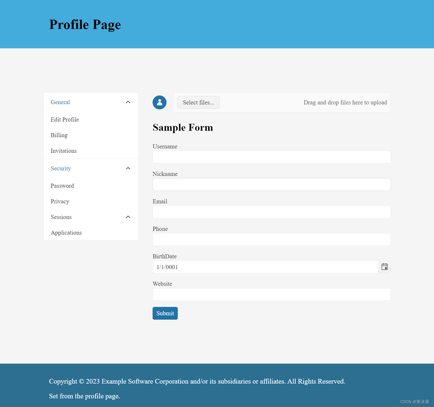
图9:使用两列布局的用户配置文件界面。
在图10中,ThreeColumn布局用于创建社交媒体源。第一列使用TelerikTreeView列出热门话题。第二列显示使用TelerikStackLayout和TelerikCard组件的社交媒体帖子。最后一列显示一个用于共享的接口,其中包含一个TelerikQRCode组件。
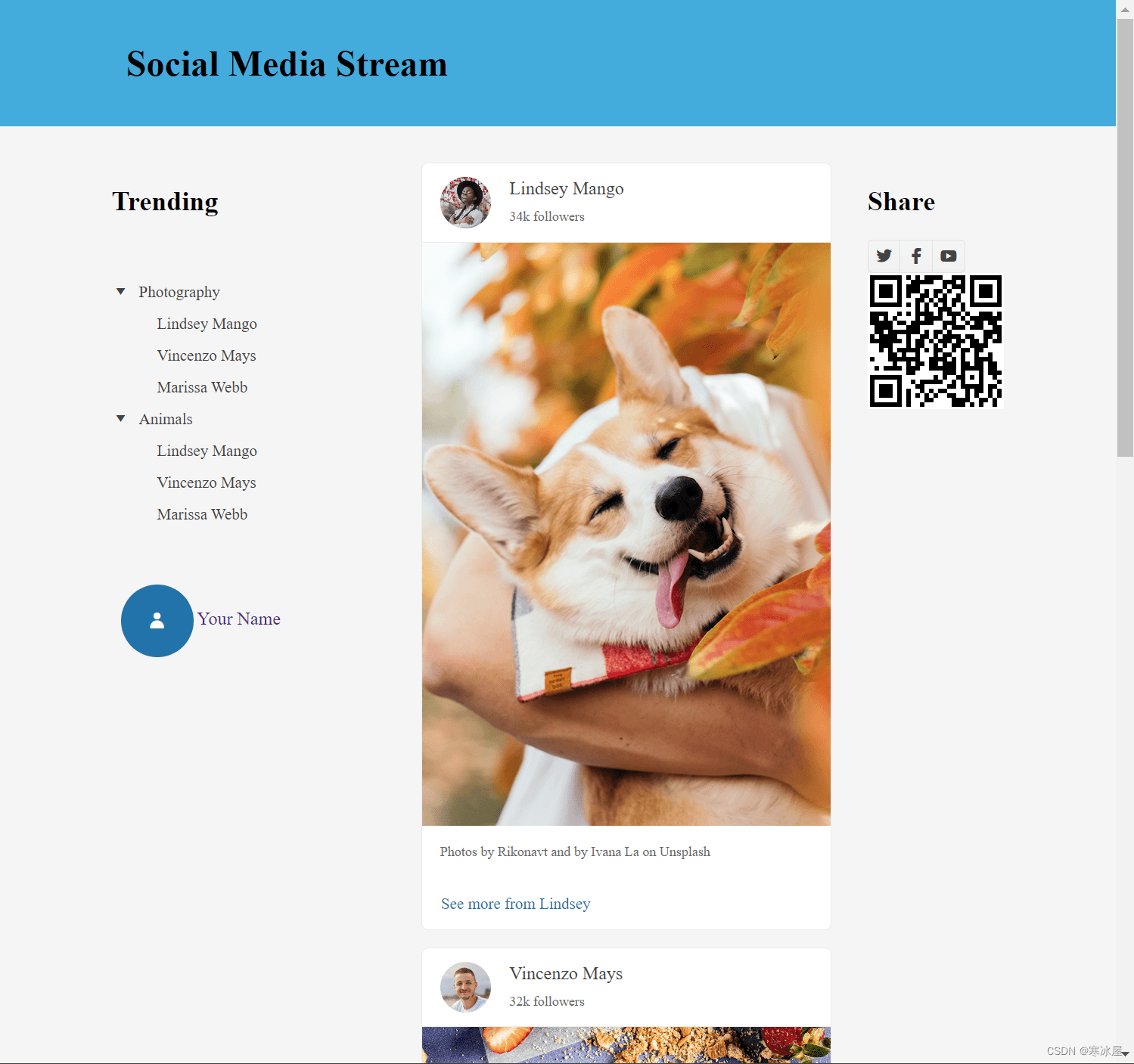
图10:使用三列布局的社交媒体提要界面。
结论
TelerikGridLayout组件是Blazor sections的良好伴侣。该组件允许在Razor的上下文中创建布局,而不是切换到CSS文件。TelerikGridLayout只是Telerik UI for Blazor库。想要开始利用TelerikGridLayout或任何其他110+现成组件,如数据网格或调度程序?立即开始免费试用适用于Blazor的Telerik UI。
源代码
本文的源代码可在GitHub上找到。在开始之前,请阅读先决条件。
https://www.telerik.com/blogs/aspnet-8-blazor-sections-fully-explained


 扫一扫
扫一扫


 被折叠的 条评论
为什么被折叠?
被折叠的 条评论
为什么被折叠?
 到【灌水乐园】发言


