


(1)bootstrap是twitter公司开发基于HTML\CSS\javascript 的前端框架
(2)为实现web应用程序快速开发提供的一套前端工具包
(3)响应式布局
(4)移动设备优先
大标题和小标题
<!DOCTYPE html>
<html lang="en">
<head>
    <meta charset="UTF-8">
    <title>Title</title>
    <script src="http://libs.baidu.com/jquery/1.9.1/jquery.js"></script>
    <link rel="stylesheet" href="bootstrap-3.3.7-dist/css/bootstrap.min.css">
    <script src="bootstrap-3.3.7-dist/js/bootstrap.min.js"></script>
</head>
<body>
<h1>1<small>小标题</small></h1>
<h2>2</h2>
<h3>3</h3>
<h4>4</h4>
<h5>5</h5>
<h6>6</h6>
<span class="h1">标题</span>
<span class="h2">标题</span>
<span class="h3">标题</span>
<span class="h4">标题</span>
<span class="h5">标题</span>
<span class="h6">标题</span>

</body>
</html>
文本
<!DOCTYPE html>
<html lang="en">
<head>
    <meta charset="UTF-8">
    <title>Title</title>
    <script src="http://libs.baidu.com/jquery/1.9.1/jquery.js"></script>
    <link rel="stylesheet" href="bootstrap-3.3.7-dist/css/bootstrap.min.css">
    <script src="bootstrap-3.3.7-dist/js/bootstrap.min.js"></script>
</head>
<body>
<p><del>xxxxxxxxxxxxxxxxxx</del>xxxxxxsdfadadasfasf<mark>打发法师是</mark>的ad阿萨德阿萨德阿萨德奥数打死奥数
    打打死打傻撒地上          <ins>是速度奥数</ins> <!--ins 插入文本-->
    是哒啊啊但是啊啊啊啊啊啊啊啊啊啊啊啊啊啊啊啊啊啊啊啊啊啊啊啊啊啊
</p>

<p>xxxxxxxxxxxxxxxxxxxxxxxxsdfadadasfasf打发法师是的ad阿萨德阿萨德阿萨德奥数打死奥数
    打打死打傻撒地上          是速度奥数
    是哒啊啊但是啊啊啊啊啊啊啊啊啊啊啊啊啊啊啊啊啊啊啊啊啊啊啊啊啊啊
</p>
<p class="text-left">
    lalala
</p>
<p class="text-center">
    lalala
</p>
<p class="text-right">
    lalala
</p>

<p class="text-lowercase">
    HELLO!
</p>
<p class="text-uppercase">
    hello!
</p>
<p class="text-capitalize">
    hello!
</p>
</body>
</html>
表格
<!DOCTYPE html>
<html lang="en">
<head>
    <meta charset="UTF-8">
    <title>Title</title>
    <script src="http://libs.baidu.com/jquery/1.9.1/jquery.js"></script>
    <link rel="stylesheet" href="bootstrap-3.3.7-dist/css/bootstrap.min.css">
    <script src="bootstrap-3.3.7-dist/js/bootstrap.min.js"></script>
</head>
<body>
<table class="table table-striped table-bordered table-hover"><!--table-striped 条纹 table-bordered填充完-->
    <thead>
    <tr>
        <th>标题1</th>
        <th>标题1</th>
        <th>标题1</th>
        <th>标题1</th>
    </tr>
    </thead>
    <tbody>
    <tr class="danger"><!--这一行表格变成红色-->
        <td>内容1</td>
        <td>内容1</td>
        <td>内容1</td>
        <td>内容1</td>
    </tr>
    <tr class="warning"><!--黄色-->
        <td>内容1</td>
        <td>内容1</td>
        <td>内容1</td>
        <td>内容1</td>
    </tr>
    <tr class="info"><!--蓝色-->
        <td>内容1</td>
        <td>内容1</td>
        <td>内容1</td>
        <td>内容1</td>
    </tr>
    <tr class="info"><!--蓝色-->
        <td>内容1</td>
        <td>内容1</td>
        <td>内容1</td>
        <td>内容1</td>
    </tr>
    <tr class="info"><!--蓝色-->
        <td>内容1</td>
        <td>内容1</td>
        <td>内容1</td>
        <td>内容1</td>
    </tr>
    <tr class="success"><!--绿色-->
        <td>内容1</td>
        <td>内容1</td>
        <td>内容1</td>
        <td>内容1</td>
    </tr>
    <tr class="active"><!--白色-->
        <td>内容1</td>
        <td>内容1</td>
        <td>内容1</td>
        <td>内容1</td>
    </tr>
    </tbody>
</table>
</body>
</html>
表单
<!DOCTYPE html>
<html lang="en">
<head>
    <meta charset="UTF-8">
    <title>Title</title>
    <script src="http://libs.baidu.com/jquery/1.9.1/jquery.js"></script>
    <link rel="stylesheet" href="bootstrap-3.3.7-dist/css/bootstrap.min.css">
    <script src="bootstrap-3.3.7-dist/js/bootstrap.min.js"></script>
</head>
<body>
<form class="form-inline "><!--排版变为水平-->
    <div class="form-group has-success"><!--变成一个组件  控制样式直接控制这个组件就好-->
        <label class="control-label" for="">这是一个输入框:</label><!--sr-only让提示信息消失 只显示框  has-success与control-lable配合-->
        <input type="text" class="form-control input-lg" placeholder="这是输入框"><!--变成了圆角框 获得焦点边框变色-->
    </div><!--input-lg  大框 input-sm小框-->
    <div class="form-group has-error"><!--变成一个组件  控制样式直接控制这个组件就好-->
        <label class="control-label" for="">这是一个输入框:</label>
        <select   name="" id="">
            <option value="">背景</option>
            <option value="">背景</option>
            <option value="">背景</option>
            <option value="">背景</option>

        </select>
    </div>
    <div class="form-group has-warning"><!--变成一个组件  控制样式直接控制这个组件就好-->
        <label class="form-control" for="">这是一个输入框:</label>
        <textarea name="" id="hah" cols="30" rows="10">

        </textarea>
    </div>
</form>
</body>
</html>
按钮
<!DOCTYPE html>
<html lang="en">
<head>
    <meta charset="UTF-8">
    <title>Title</title>
    <script src="http://libs.baidu.com/jquery/1.9.1/jquery.js"></script>
    <link rel="stylesheet" href="bootstrap-3.3.7-dist/css/bootstrap.min.css">
    <script src="bootstrap-3.3.7-dist/js/bootstrap.min.js"></script>
</head>
<body>
<button class="btn btn-default btn-sm">这是按钮</button>
<button class="btn btn-success btn-lg">这是按钮</button>
<button class="btn btn-info btn-block">这是按钮</button><!--btn-block--变成一个很长的按钮 手机端-->
<button class="btn btn-error">这是按钮</button>
<button class="btn btn-danger">这是按钮</button>
<button class="btn btn-warning">这是按钮</button>
<button class="btn btn-link">这是按钮</button><!--按钮改成连接-->
<a class="btn btn-danger">这是a标签写的按钮</a>
</body>
</html>
图片【

bootstrap 渐进
viewport
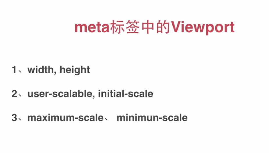
解决在iPhone里细线变粗的问题(阿里解决方案)
<meta name="viewport" content="width=device-width,initial-scale=1, maximum-scale=1,minimum-scale-1,user-scalable=no"
栅格布局
<!DOCTYPE html>
<html lang="en">
<head>
    <meta charset="UTF-8">
    <meta name="viewport" content="width=device-width,initial-scale=1, maximum-scale=1,minimum-scale-1,user-scalable=no"
    <title>Title</title>
    <script src="http://libs.baidu.com/jquery/1.9.1/jquery.js"></script>
    <link rel="stylesheet" href="bootstrap-3.3.7-dist/css/bootstrap.min.css">
    <script src="bootstrap-3.3.7-dist/js/bootstrap.min.js"></script>
    <style>
        *{
            padding: 0;
            margin: 0;
        }
        .test{
            width: 300px;
            height: 200px;
            background-color: red;
        }
        @media screen and (max-width: 900px) and (min-width: 500px){/*屏幕发生改变会显示下面的样式*/
            .test{
                width: 100%;
                height: 100px;
                background-color: blue;
            }
        }
        /*@media screen and(max-width:*px) and (min-width:*px){

        }*/
    </style>
</head>
<body>
<div class="test"></div>
</body>
</html>
<div class="test col-lg-3 col-md-4 col-sm-6 col-xs-12 col-lg-offset-3"></div><!--屏幕十二分 大屏 中评 小屏幕 全屏-->
字体
html默认字体为16px,所以16*62.5%=10px;
所以10px=1rem
px 相对显示屏分辨率的长度单位
em 相对于当前文本内的字体尺寸 继承父元素
rem与em类似,继承根元素(html)的大小,并且大小稳定
bootstrap提供的图标
<style>
    .glyphicon-pencil{
        color: green;
        font-size: 100px;
    }
</style>
<span class="glyphicon glyphicon-pencil"></span>
图标链接
http://v3.bootcss.com/components/
例子
<button class="btn btn-default">
    <span class="glyphicon glyphicon-star"></span>
    这是一个按钮
</button>
bootstrap组件
下拉菜单
<!DOCTYPE html>
<html lang="en">
<head>
    <meta charset="UTF-8">
    <meta name="viewport" content="width=device-width,initial-scale=1, maximum-scale=1,minimum-scale-1,user-scalable=no"
    <title>Title</title>
    <script src="http://libs.baidu.com/jquery/1.9.1/jquery.js"></script>
    <link rel="stylesheet" href="bootstrap-3.3.7-dist/css/bootstrap.min.css">
    <script src="bootstrap-3.3.7-dist/js/bootstrap.min.js"></script>
    <style>
        .glyphicon-pencil{
            color: green;
            font-size: 100px;
        }
    </style>
</head>
<body>
    <div class="dropdown">
        <button class="btn btn-default dropdown-toggle " data-toggle="dropdown">这是按钮data-toggle绑定
        <span class="caret"></span><!--角标下三角-->
        </button>
        <ul class="dropdown-menu">
            <li><a href="http://www.baidu.com">baidu</a> </li>
            <li><a href="http://www.baidu.com">baidu</a> </li>
            <li><a href="http://www.baidu.com">baidu</a> </li>

        </ul>
    </div>
</body>
</html>
控件组
<!DOCTYPE html>
<html lang="en">
<head>
    <meta charset="UTF-8">
    <meta name="viewport" content="width=device-width,initial-scale=1, maximum-scale=1,minimum-scale-1,user-scalable=no">
    <title>Title</title>
    <script src="http://libs.baidu.com/jquery/1.9.1/jquery.js"></script>
    <link rel="stylesheet" href="bootstrap-3.3.7-dist/css/bootstrap.min.css">
    <script src="bootstrap-3.3.7-dist/js/bootstrap.min.js"></script>
    <style>
        .glyphicon-pencil{
            color: green;
            font-size: 100px;
        }
    </style>
</head>
<body>
    <div class="input-group">
        <span class="input-group-addon">$</span>
        <input type="text" class="form-control">
    </div>
</body>
</html>
导航
<!DOCTYPE html>
<html lang="en">
<head>
    <meta charset="UTF-8">
    <meta name="viewport" content="width=device-width,initial-scale=1, maximum-scale=1,minimum-scale-1,user-scalable=no">
    <title>Title</title>
    <script src="http://libs.baidu.com/jquery/1.9.1/jquery.js"></script>
    <link rel="stylesheet" href="bootstrap-3.3.7-dist/css/bootstrap.min.css">
    <script src="bootstrap-3.3.7-dist/js/bootstrap.min.js"></script>
    <style>
        .glyphicon-pencil{
            color: green;
            font-size: 100px;
        }
    </style>
</head>
<body>

        <ul class="nav nav-tabs">
            <li class="active"><a href="http://www.baidu.com">22323</a> </li>
            <li><a href="http://www.baidu.com">22323</a> </li>
            <li><a href="http://www.baidu.com">22323</a> </li>
        </ul>
        <ul class="nav nav-pills">
            <li class="active"><a href="http://www.baidu.com">22323</a> </li>
            <li><a href="http://www.baidu.com">22323</a> </li>
            <li><a href="http://www.baidu.com">22323</a> </li>
        </ul>
        <ul class="nav nav-pills nav-stacked"><!--垂直-->
            <li class="active"><a href="http://www.baidu.com">22323</a> </li>
            <li><a href="http://www.baidu.com">22323</a> </li>
            <li><a href="http://www.baidu.com">22323</a> </li>
        </ul>
</body>
</html>
分页
<!DOCTYPE html>
<html lang="en">
<head>
    <meta charset="UTF-8">
    <meta name="viewport" content="width=device-width,initial-scale=1, maximum-scale=1,minimum-scale-1,user-scalable=no">
    <title>Title</title>
    <script src="http://libs.baidu.com/jquery/1.9.1/jquery.js"></script>
    <link rel="stylesheet" href="bootstrap-3.3.7-dist/css/bootstrap.min.css">
    <script src="bootstrap-3.3.7-dist/js/bootstrap.min.js"></script>

</head>
<body>
    <nav>
        <ul class="pager">
            <li class="previous"><!--previous最左-->
                <a href="http://www.baidu.com">向左 </a>
            </li>
            <li class="next"><!--最右-->
                <a href="http://www.baidu.com">向右 </a>
            </li>
        </ul>
        <ul class="pagination pagination-lg">
            <li class="active"><a href="http://www.baidu.com">1</a> </li>
            <li><a href="http://www.baidu.com">2</a> </li>
            <li><a href="http://www.baidu.com">3</a> </li>
            <li><a href="http://www.baidu.com">4</a> </li>
            <li><a href="http://www.baidu.com">5</a> </li>
            <li><a href="http://www.baidu.com">6</a> </li>

        </ul>
    </nav>

</body>
</html>
进度条
<!DOCTYPE html>
<html lang="en">
<head>
    <meta charset="UTF-8">
    <meta name="viewport" content="width=device-width,initial-scale=1, maximum-scale=1,minimum-scale-1,user-scalable=no">
    <title>Title</title>
    <script src="http://libs.baidu.com/jquery/1.9.1/jquery.js"></script>
    <link rel="stylesheet" href="bootstrap-3.3.7-dist/css/bootstrap.min.css">
    <script src="bootstrap-3.3.7-dist/js/bootstrap.min.js"></script>

</head>
<body>
  <div class="progress">
      <div class="progress-bar progress-bar-success progress-bar-striped" style="width: 60%">
        60%
      </div>
  </div>
</body>
</html>
列表.
<!DOCTYPE html>
<html lang="en">
<head>
    <meta charset="UTF-8">
    <meta name="viewport" content="width=device-width,initial-scale=1, maximum-scale=1,minimum-scale-1,user-scalable=no">
    <title>Title</title>
    <script src="http://libs.baidu.com/jquery/1.9.1/jquery.js"></script>
    <link rel="stylesheet" href="bootstrap-3.3.7-dist/css/bootstrap.min.css">
    <script src="bootstrap-3.3.7-dist/js/bootstrap.min.js"></script>

</head>
<body>
    <ul class="list-group">
        <li class="list-group-item active">
            这是一个列表
            <span class="badge">14</span>
        </li>
        <li class="list-group-item disabled">
            这是一个列表
            <span class="badge">14</span>
        </li>
        <li class="list-group-item">
            这是一个列表
            <span class="badge">14</span>
        </li>
        <li class="list-group-item">
            这是一个列表
            <span class="badge">14</span>
        </li>
    </ul>
</body>
</html>
面板
<!DOCTYPE html>
<html lang="en">
<head>
    <meta charset="UTF-8">
    <meta name="viewport" content="width=device-width,initial-scale=1, maximum-scale=1,minimum-scale-1,user-scalable=no">
    <title>Title</title>
    <script src="http://libs.baidu.com/jquery/1.9.1/jquery.js"></script>
    <link rel="stylesheet" href="bootstrap-3.3.7-dist/css/bootstrap.min.css">
    <script src="bootstrap-3.3.7-dist/js/bootstrap.min.js"></script>

</head>
<body>
    <div class="panel panel-default">
        <div class="panel-heading panel-primary"><!--primary改颜色?-->
            弹出层!
        </div>
        <div class="panel-body">
            这是面板具体内容
        </div>
        <div class="panel-footer">
            脚注
        </div>
    </div>
</body>
</html>
为了兼容ie9以下的ie版本使用
<!-- 以下两个插件用于在IE8以及以下版本浏览器支持HTML5元素和媒体查询,如果不需要用可以移除 -->
<!--[if lt IE 9]>
<script src="https://oss.maxcdn.com/libs/html5shiv/3.7.0/html5shiv.js"></script>
<script src="https://oss.maxcdn.com/libs/respond.js/1.4.2/respond.min.js"></script>
<![endif]-->
标题
在Bootstrap中为了让非标题元素和标题使用相同的样式,还特意定义了.h1~.h6六个类名。
下面两组的效果几乎一模一样
<!--Bootstrap中的标题-->
<h1>Bootstrap标题一</h1>
<h2>Bootstrap标题二</h2>
<h3>Bootstrap标题三</h3>
<h4>Bootstrap标题四</h4>
<h5>Bootstrap标题五</h5>
<h6>Bootstrap标题六</h6>
<!--Bootstrap中让非标题元素和标题使用相同的样式-->
<div class="h1">Bootstrap标题一</div>
<div class="h2">Bootstrap标题二</div>
<div class="h3">Bootstrap标题三</div>
<div class="h4">Bootstrap标题四</div>
<div class="h5">Bootstrap标题五</div>
<div class="h6">Bootstrap标题六</div>
副标题
<!--Bootstrap中使用了<small>标签来制作副标题-->
<h1>Bootstrap标题一<small>我是副标题</small></h1>
<h2>Bootstrap标题二<small>我是副标题</small></h2>
<h3>Bootstrap标题三<small>我是副标题</small></h3>
<h4>Bootstrap标题四<small>我是副标题</small></h4>
<h5>Bootstrap标题五<small>我是副标题</small></h5>
<h6>Bootstrap标题六<small>我是副标题</small></h6>
强调和粗体
<p>我的一个普通的段落,我不需要强调显示。</p>
<strong>这部分内容需要特别的强调,我和别人长得不一样。</strong> <!--粗体-->
<p class="lead">这部分内容需要特别的强调,我和别人长得不一样。</p><!--强调-->
<em>和<i>斜体 其中em还表强调 而i只是斜体
通过颜色强调的类型
- .text-muted:提示,使用浅灰色(#999)
- .text-primary:主要,使用蓝色(#428bca)
- .text-success:成功,使用浅绿色(#3c763d)
- .text-info:通知信息,使用浅蓝色(#31708f)
- .text-warning:警告,使用黄色(#8a6d3b)
- .text-danger:危险,使用褐色(#a94442)
<div class="text-muted">.text-muted 效果</div>
<div class="text-primary">.text-primary效果</div>
<div class="text-success">.text-success效果</div>
<div class="text-info">.text-info效果</div>
<div class="text-warning">.text-warning效果</div>
<div class="text-danger">.text-danger效果</div>
<!--下面是任务部分-->
<p class="text-danger">我是一段危险信息,请用Bootstrap框架中的危险风格显示</p>
文本对齐
☑ .text-left:左对齐
☑ .text-center:居中对齐
☑ .text-right:右对齐
☑ .text-justify:两端对齐
去点列表
例如要实现下列要求
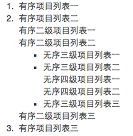
代码如下
重点是.list-unstyled这个类名
<ol>
<li>有序项目列表一</li>
<li>有序项目列表二
<ol class="list-unstyled">
<li>有序二级项目列表一</li>
<li>有序二级项目列表二
<ul>
<li>无序三级项目列表一</li>
<li>无序三级项目列表二
<ul class="list-unstyled">
<li>无序四级项目列表一</li>
<li>无序四级项目列表二</li>
</ul>
</li>
<li>无序三级项目列表三</li>
</ul>
<li>有序三级项目列表三</li>
</li>
</ol>
</li>
<li>有序项目列表三</li>
</ol>
内联列表
实现

代码如下 重点是.list-inline
<li>
城市:
<ul class="list-inline">
<li>北京</li>
<li>上海</li>
<li>南京</li>
<li>厦门</li>
</ul>
</li>
</ul>
在bs4里面,除了ul要使用list-inline之外,li全部还要用list-inline-item这个类来实现水平
定义列表
对于定义列表使用,其实很简单,与我们以前的使用定义列表的方法是相同的:
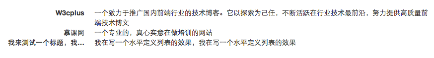
<dl>
    <dt>W3cplus</dt>
    <dd>一个致力于推广国内前端行业的技术博客</dd>
    <dt>慕课网</dt>
    <dd>一个真心在做教育的网站</dd>
</dl>
其用法如下: dl-horizontal
<dl class="dl-horizontal">
    <dt>W3cplus</dt>
    <dd>一个致力于推广国内前端行业的技术博客。它以探索为己任,不断活跃在行业技术最前沿,努力提供高质量前端技术博文</dd>
    <dt>慕课网</dt>
    <dd>一个专业的,真心实意在做培训的网站</dd>
    <dt>我来测试一个标题,我来测试一个标题</dt>
    <dd>我在写一个水平定义列表的效果,我在写一个水平定义列表的效果</dd>
</dl>
宽屏下的效果(屏幕大于768px):
当你缩小你的浏览器屏幕时,水平定义列表将回复到原始的状态。

代码
在使用代码时,用户可以根据具体的需求来使用不同的类型:
1、<code>:一般是针对于单个单词或单个句子的代码
2、<pre>:一般是针对于多行代码(也就是成块的代码)
3、<kbd>:一般是表示用户要通过键盘输入的内容
code风格:
<div>Bootstrap的代码风格有三种: <code><code></code> <code><pre></code> <code><kbd></code> </div>
pre风格:
<div> <pre> <ul> <li>...</li> <li>...</li> <li>...</li> </ul> </pre> </div>
kbd风格:
<div>请输入<kbd>ctrl+c</kbd>来复制代码,然后使用<kbd>ctrl+v</kbd>来粘贴代码</div>
类名“.pre-scrollable”,就可以控制代码块区域最大高度为340px,一旦超出这个高度,就会在Y轴出现滚动条。
<pre class="pre-scrollable">
<ol>
    <li>....</li>
    <li>....</li>
    <li>....</li>
    <li>....</li>
    <li>....</li>
    <li>....</li>
    <li>....</li>
    <li>....</li>
    <li>....</li>
    <li>....</li>
    <li>....</li>
    <li>....</li>
    <li>....</li>
    <li>....</li>
</ol>
</pre>
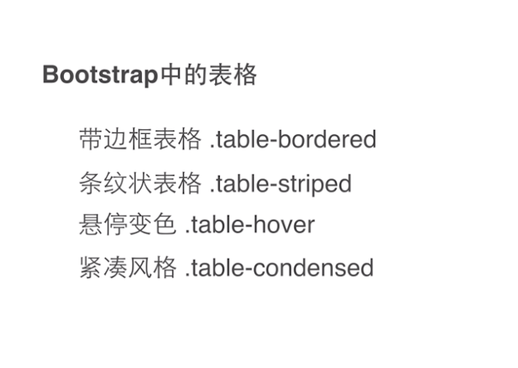
表格
☑ .table:基础表格
☑ .table-striped:斑马线表格
☑ .table-bordered:带边框的表格
☑ .table-hover:鼠标悬停高亮的表格
☑ .table-condensed:紧凑型表格
☑ .table-responsive:响应式表格
使用了bootstrap4.0的同学要注意了,在新版本中这些类前面要加table-前缀才有效,如table-info
Bootstrap还为表格的行元素<tr>提供了五种不同的类名,每种类名控制了行的不同背景颜色,具体说明如下表所示:
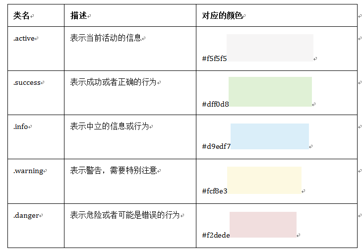
<table class="table table-bordered">
    <thead>
    <tr class="active">
        <th>biaoti</th>
    </tr></thead>
    <tbody>
   <tr class="success">
       <td>成功</td>
   </tr>
    <tr class="warning">
        <td>警告</td>
    </tr>
    <tr class="info">
        <td>信息</td>
    </tr>
    <tr class="danger">
        <td>危险</td>
    </tr>
    </tbody>
</table>
水平表单
Bootstrap框架默认的表单是垂直显示风格,但很多时候我们需要的水平表单风格(标签居左,表单控件居右)见下图。
.form-horizontal
<!DOCTYPE html>
<html lang="en">
<head>
    <meta charset="utf-8">
    <script src="http://libs.baidu.com/jquery/1.9.1/jquery.js"></script>
    <link rel="stylesheet" href="bootstrap-3.3.7-dist/css/bootstrap.min.css">
    <script src="bootstrap-3.3.7-dist/js/bootstrap.min.js"></script>
    <title>h</title>
    <style type="text/css">
        body {
        padding: 50px 100px;
    }
    </style>

</head>
<body>
<form class="form-horizontal">
    <div class="form-group" >
        <label for="email" class="control-label col-sm-2">邮箱:</label>
        <div class="col-sm-10">
            <input type="email" id="email" class="form-control" placeholder="请输入邮箱">
        </div>
    </div>
    <div class="form-group">
        <label for="password" class="control-label col-sm-2">密码:</label>
        <div class="col-sm-10">
            <input type="password" id="password" class="form-control" placeholder="请输入密码">
        </div>
    </div>
    <div class="form-group">
        <div class="col-sm-offset-2 col-sm-10">
            <div class="checkbox">
            <label>
                <input type="checkbox">记住密码
            </label>
            </div>
        </div>
    </div>
    <div class="form-group">
        <div class="col-sm-offset-2 col-sm-10">
            <button class="btn btn-default" type="submit">进入</button>
        </div>
    </div>
</form>
</body>
</html>
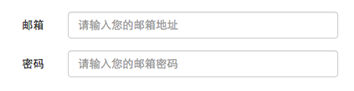
内联表单
.form-inline
<form class="form-inline" >
<div class="form-group">
  <label for="exampleInputEmail2">邮箱</label>
  <input type="email" class="form-control" id="exampleInputEmail2" placeholder="请输入你的邮箱地址">
</div>
<div class="form-group">
  <label for="exampleInputPassword2">密码</label>
  <input type="password" class="form-control" id="exampleInputPassword2" placeholder="请输入你的邮箱密码">
</div>
<div class="checkbox">
<label>
   <input type="checkbox">记住密码
</label>
</div>
<button type="submit" class="btn btn-default">进入邮箱</button>
</form>
为了让控件在各种表单风格中样式不出错,需要添加类名“form-control”,如:
<form role="form">
<div class="form-group">
<input type="email" class="form-control" placeholder="Enter email">
</div>
</form>
下拉框 multiple会显示所有供选项
<form role="form">
<div class="form-group">
  <select class="form-control">
    <option>1</option>
    <option>2</option>
    <option>3</option>
    <option>4</option>
    <option>5</option>
  </select>
  </div>
  <div class="form-group">
  <select multiple class="form-control">
    <option>1</option>
    <option>2</option>
    <option>3</option>
    <option>4</option>
    <option>5</option>
  </select>
</div>
</form>
文本域
文本域和原始使用方法一样,设置rows可定义其高度,设置cols可以设置其宽度。但如果textarea元素中添加了类名“form-control”类名,则无需设置cols属性。因为Bootstrap框架中的“form-control”样式的表单控件宽度为100%或auto。
<form role="form">
  <div class="form-group">
    <textarea class="form-control" rows="3"></textarea>
  </div>
</form>
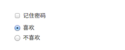
checkbox和radio
<form role="form">
<div class="checkbox">
<label>
<input type="checkbox" value="">
记住密码
</label>
</div>
<div class="radio">
<label>
<input type="radio" name="optionsRadios" id="optionsRadios1" value="love" checked>
喜欢
</label>
</div>
<div class="radio">
<label>
<input type="radio" name="optionsRadios" id="optionsRadios2" value="hate">
不喜欢
</label>
</div>
</form>
运行效果如下或查看右侧结果窗口(案例1):
如果需要水平排列
<form role="form">
  <div class="form-group">
    <label class="checkbox-inline">
      <input type="checkbox"  value="option1">游戏
    </label>
    <label class="checkbox-inline">
      <input type="checkbox"  value="option2">摄影
    </label>
    <label class="checkbox-inline">
    <input type="checkbox"  value="option3">旅游
    </label>
  </div>
  <div class="form-group">
    <label class="radio-inline">
      <input type="radio"  value="option1" name="sex">男性
    </label>
    <label class="radio-inline">
      <input type="radio"  value="option2" name="sex">女性
    </label>
    <label class="radio-inline">
      <input type="radio"  value="option3" name="sex">中性
    </label>
  </div>
</form>
运行效果如下或查看右侧结果窗口:
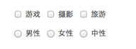
以前学radio的时候经常会弄混"name"、"value"和选择框文本三个东西。这里说明一下:1.radio是按组来区分选择框的,“name”其实是组名,只有选择框的“name”相同才表明同组,这样才可以实现单选,试想一下,如果不同组那你选你的我选我的就都可以勾选了也就不是单项选择框了;2.“value”代表的是这个选择框的值,是提交服务器用的,因为服务器要识别选择框的值,所以“value”的值必须不同这样才能区分不同选择框;3.选择框文本直接在<input>标签后写上就行。总结一句就是"name"必须相同,"value"必须不同,文本在标签之后。
表单控件大小
1、input-sm:让控件比正常大小更小
2、input-lg:让控件比正常大小更大
这两个类适用于表单中的input,textarea和select控件,具体使用如下:
<input class="form-control input-lg" type="text" placeholder="添加.input-lg,控件变大">
<input class="form-control" type="text" placeholder="正常大小">
<input class="form-control input-sm" type="text" placeholder="添加.input-sm,控件变小">
.col-xs- 超小屏幕 手机 (<768px)
.col-sm- 小屏幕 平板 (≥768px)
.col-md- 中等屏幕 桌面显示器 (≥992px)
.col-lg- 大屏幕 大桌面显示器 (≥1200px)
.form-control 控件自带focus焦点伪类的效果
表单控件禁用状态
    <h3>实例1</h3>
    <form role="form" class="form-horizontal">
        <div class="form-group">
            <div class="col-xs-6">
                <input class="form-control input-lg" type="text" placeholder="不是焦点下的状态">
            </div>
            <div class="col-xs-6">
                <input class="form-control input-lg" type="text" placeholder="表单禁用" disabled>
            </div>
        </div>
    </form>
<br>
<br>
    <h3>实例2</h3>
    <form role="form">
        <fieldset disabled>

            <div class="form-group">
                <label for="disableTextInupt">禁用的输入框</label>
                <input type="text" id="disableTextInupt" class="form-control" placeholder="禁止输入">
            </div>
            <div class="form-group">
                <label for="disableselect">禁用下拉框</label>
                <select id="disableselect" class="form-control">
                    <option>不可选</option>
                </select>
            </div>
            <div class="checkbox">
                <label>
                    <input type="checkbox">无法选择
                </label>
            </div>
            <button type="submit" class="btn btn-primary">不能提交</button>
        </fieldset>
    </form>
<br>
<br>

    <h3>实例3</h3>
    <form role="form">
        <fieldset disabled>
            <legend>
                <input type="text" class="form-control" placeholder="第一个legend无法禁用" >
            </legend>
            <legend>
                    <label>
                    <input type="checkbox">第二个被禁用
                    </label>
            </legend>
        </fieldset>
    </form>
</body>
表单控件验证状态
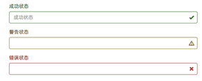
<form role="form">
    <div class="form-group has-success has-feedback">
        <label class="control-label" for="inputsuccess">成功</label>
        <input type="text" id="inputsuccess" class="form-control" placeholder="成功状态">
        <span class="glyphicon glyphicon-ok form-control-feedback"></span>
    </div>
    <div class="form-group has-warning has-feedback">
        <label class="control-label" for="inputwarning">警告</label>
        <input type="text" id="inputwarning" class="form-control" placeholder="警告状态">
        <span class="glyphicon glyphicon-warning-sign form-control-feedback"></span>
    </div>
    <div class="form-group has-error has-feedback">
        <label class="control-label" for="inputerror">错误</label>
        <input type="text" class="form-control" id="inputerror" placeholder="错误状态">
        <span class="glyphicon glyphicon-remove form-control-feedback"></span>
    </div>
</form>
注意:1.label要加入control-label类,以保持一致的样式
2.包裹form组件的div要加入has-success/waring/error和has-feedback
3.最后必须加入一个<span class="glyphicon glyphicon-remove form-control-feedback"></span>以显示反馈信息
结果:
按钮
基本按钮
<button class="btn" type="button">我是一个基本按钮</button>
虽然不用加type="button"也能实现相应的显示效果,不过请始终为按钮<button>规定type属性。
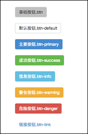
不同风格的button
<button class="btn" type="button">基础按钮.btn</button>
<button class="btn btn-default" type="button">默认按钮.btn-default</button>
<button class="btn btn-primary" type="button">主要按钮.btn-primary</button>
<button class="btn btn-success" type="button">成功按钮.btn-success</button>
<button class="btn btn-info" type="button">信息按钮.btn-info</button>
<button class="btn btn-warning" type="button">警告按钮.btn-warning</button>
<button class="btn btn-danger" type="button">危险按钮.btn-danger</button>
<button class="btn btn-link" type="button">链接按钮.btn-link</button>
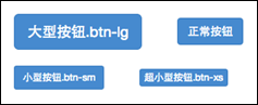
按钮大小
<button class="btn btn-primary btn-lg" type="button">大型按钮.btn-lg</button>
<button class="btn btn-primary" type="button">正常按钮</button>
<button class="btn btn-primary btn-sm" type="button">小型按钮.btn-sm</button>
<button class="btn btn-primary btn-xs" type="button">超小型按钮 .btn-xs</button>
块状按钮 加上.btn-block 就行了
按钮禁用
<button class="btn btn-primary" type="reset" disabled>重置</button>
无论是用disabled类还是disabled属性的方法,链接行为都被禁止了
图像
图像在网页制作中也是常要用到的元素,在Bootstrap框架中对于图像的样式风格提供以下几种风格:
1、img-responsive:响应式图片,主要针对于响应式设计
2、img-rounded:圆角图片
3、img-circle:圆形图片
4、img-thumbnail:缩略图片
使用方法:
使用方法非常简单,只需要在<img>标签上添加对应的类名,如下代码:
<img  alt="140x140" src="http://placehold.it/140x140">
<img  class="img-rounded" alt="140x140" src="http://placehold.it/140x140">
<img  class="img-circle" alt="140x140" src="http://placehold.it/140x140">
<img  class="img-thumbnail" alt="140x140" src="http://placehold.it/140x140">
<img  class="img-responsive" alt="140x140" src="http://placehold.it/140x140">
alt在图片显示不出来的时候显示
<!DOCTYPE html>
<html lang="en">
<head>
    <meta charset="utf-8">
    <script src="http://libs.baidu.com/jquery/1.9.1/jquery.js"></script>
    <link rel="stylesheet" href="bootstrap-3.3.7-dist/css/bootstrap.min.css">
    <script src="bootstrap-3.3.7-dist/js/bootstrap.min.js"></script>
    <title>h</title>
    <style type="text/css">
        body {
        padding: 50px 100px;
    }
    </style>

</head>
<body>
<form class="form-horizontal">
    <div class="form-group">
        <label for="email" class="control-label col-sm-2">邮箱:</label>
        <div class="col-sm-10">
            <input type="email" id="email" class="form-control" placeholder="请输入邮箱" disabled>
        </div>
    </div>
    <div class="form-group">
        <label for="password" class="control-label col-sm-2">密码:</label>
        <div class="col-sm-10">
            <input type="password" id="password" class="form-control input-lg" placeholder="请输入密码">
        </div>
    </div>
    <div class="form-group">
            <div class="checkbox">
                <label class="checkbox-inline"><!--要在label上-->
                    <input type="checkbox" >记住密码
                </label>
            </div>
            <div class="checkbox">
                <label class="checkbox-inline">
                    <input type="checkbox" >偏不记住
                </label>
            </div>
    </div>
    <div class="form-group">
        <div class="col-sm-offset-2 col-sm-10">
            <button class="btn btn-default" type="submit">进入邮箱</button>
        </div>
    </div>
    <div class="form-group">
        <div class="col-sm-offset-2 col-sm-10">
            <label>
            <select class="form-control">
                <option value="1">1</option>
                <option value="1">1</option>
                <option value="1">1</option>
                <option value="1">1</option>
            </select>
        </label>
        </div>
    </div>
    <div class="form-group">
        <div class="col-sm-offset-2 col-sm-10">
            <label>
                <textarea class="form-control" cols="3" rows="3"></textarea>
            </label>
        </div>
    </div>
    <div class="form-group">
        <div class="radio">
            <label for="option1" class="radio-inline">
                <input type="radio" name="optionradio" id="option1" value="love" checked>喜欢
            </label>
        </div>
        <div class="radio">
            <label class="radio-inline">
                <input type="radio" id="option2" name="optionradio" value="haste">讨厌
            </label>
        </div>
    </div>
</form>
<form role="form">
<div class="form-group">
    <label class="checkbox-inline">
        <input type="checkbox"  value="option1">游戏
    </label>
    <label class="checkbox-inline">
        <input type="checkbox"  value="option2">摄影
    </label>
    <label class="checkbox-inline">
        <input type="checkbox"  value="option3">旅游
    </label>
</div>
<div class="form-group">
    <label class="radio-inline">
        <input type="radio"  value="option1" name="sex">男性
    </label>
    <label class="radio-inline">
        <input type="radio"  value="option2" name="sex">女性
    </label>
    <label class="radio-inline">
        <input type="radio"  value="option3" name="sex">中性
    </label>
</div>

</form>
<form class="form-horizontal">
    <div class="form-group has-success has-feedback">
        <label for="inputsuccess">成功</label>
        <input type="text" id="inputsuccess" class="form-control" placeholder="成功状态">
        <span class="glyphicon glyphicon-ok-sign form-control-feedback"></span>
    </div>
    <div class="form-group has-warning has-feedback">
        <label for="inputwarning">警告</label>
        <input type="text" id="inputwarning" class="form-control" placeholder="警告状态">
        <span class="glyphicon glyphicon-warning-sign form-control-feedback"></span>
    </div>
    <div class="form-group has-error has-feedback">
        <label for="inputerror">错误</label>
        <input type="text" id="inputerror" class="form-control" placeholder="错误状态">
        <span class="glyphicon glyphicon-remove-sign form-control-feedback"></span>
    </div>
</form>

<form>
    <div class="form-group">
        <button type="button" class="btn btn-default">普通按钮</button>
        <button type="button" class="btn btn-info btn-lg">按钮</button>
        <button type="button" class="btn btn-danger btn-sm">按钮</button>
        <button type="button" class="btn btn-success btn-block">按钮</button>
        <button type="button" class="btn btn-primary">按钮</button>
        <button type="button" class="btn btn-link" disabled>按钮</button>
    </div>
</form>

<img src="http://ww4.sinaimg.cn/large/c4d8b1e7gw1ezgwmpihchj20by04g3zf.jpg" alt="图片">
<img src="http://ww4.sinaimg.cn/large/c4d8b1e7gw1ezgwmpihchj20by04g3zf.jpg" alt="" class="img-circle">
<img src="http://ww4.sinaimg.cn/large/c4d8b1e7gw1ezgwmpihchj20by04g3zf.jpg" alt="" class="img-rounded">
<img src="http://ww4.sinaimg.cn/large/c4d8b1e7gw1ezgwmpihchj20by04g3zf.jpg" alt="" class="img-responsive">
<img src="http://ww4.sinaimg.cn/large/c4d8b1e7gw1ezgwmpihchj20by04g3zf.jpg" alt="" class="img-thumbnail">
</body>
</html>


 扫一扫
扫一扫
 1174
1174

 被折叠的 条评论
为什么被折叠?
被折叠的 条评论
为什么被折叠?
 到【灌水乐园】发言


