


这节课程向你展示了通过如下方式支持不同的屏幕大小:
确保你的布局能适当地调整大小来适应屏幕
根据屏幕的配置提供适当的UI布局
确保正确的布局被应用到正确的屏幕
提供正确缩放的位图
使用"wrap_content"和“match_parent"
——————————————————————————————————————————————————————————————
为了确保你的布局是灵活的,并且适应不同的屏幕大小,你应该使用”wrap_content"和“match_parent"设置一些视图组件的宽度和高度。如果你使用"wrap_content",这个视图的宽度或者高度设置为符合视图内部内容需要的最小尺寸。然而”match_parent"(在API8之前又名"fill_parent")使组件扩展来匹配他的父视图的尺寸。
通过使用“wrap_content"和"match_parent"尺寸值替代固定值尺寸,你的视图要么仅仅使用视图必要的空间,或者扩展来填充可用的空间。例如:
<LinearLayout xmlns:android="http://schemas.android.com/apk/res/android"
    android:orientation="vertical"
    android:layout_width="match_parent"
    android:layout_height="match_parent">
    <LinearLayout android:layout_width="match_parent"
                  android:id="@+id/linearLayout1"
                  android:gravity="center"
                  android:layout_height="50dp">
        <ImageView android:id="@+id/imageView1"
                   android:layout_height="wrap_content"
                   android:layout_width="wrap_content"
                   android:src="@drawable/logo"
                   android:paddingRight="30dp"
                   android:layout_gravity="left"
                   android:layout_weight="0" />
        <View android:layout_height="wrap_content"
              android:id="@+id/view1"
              android:layout_width="wrap_content"
              android:layout_weight="1" />
        <Button android:id="@+id/categorybutton"
                android:background="@drawable/button_bg"
                android:layout_height="match_parent"
                android:layout_weight="0"
                android:layout_width="120dp"
                style="@style/CategoryButtonStyle"/>
    </LinearLayout>

    <fragment android:id="@+id/headlines"
              android:layout_height="fill_parent"
              android:name="com.example.android.newsreader.HeadlinesFragment"
              android:layout_width="match_parent" />
</LinearLayout>
注意,实例使用”wrap_content"和“match_parent"指定组件的尺寸,而不是指定特定的大小。这允许布局正确的适配不同的屏幕大小和方向。
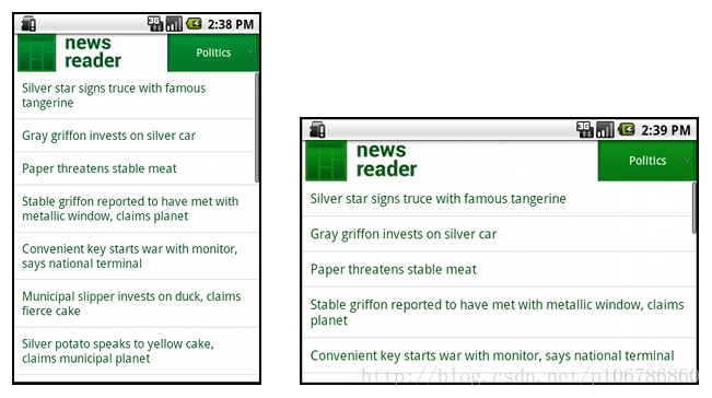
例如,这是这个布局在竖屏和横屏模式下的养子。注意组件的大小自动适配宽度和高度。
使用RelativeLayout
——————————————————————————————————————————————————————————————
你可以使用嵌入LinearLayout实例和"wrap_content"和”match_parent"尺寸结合,构建相当复杂的布局。然而,LinearLayout不允许是精确的控制孩子视图的位置关系;在LinearLayout中的视图简单一行一行排列。如果你需要子视图有变化的朝向而不是一条直线,一个更好的解决办法是经常使用RelativeLayout,它允许你指定你的布局组件之间的空间关系。例如,你能对齐一个子视图在屏幕的左边,并且另一个视图在屏幕的右边。
例如:
<?xml version="1.0" encoding="utf-8"?>
<RelativeLayout xmlns:android="http://schemas.android.com/apk/res/android"
    android:layout_width="match_parent"
    android:layout_height="match_parent">
    <TextView
        android:id="@+id/label"
        android:layout_width="match_parent"
        android:layout_height="wrap_content"
        android:text="Type here:"/>
    <EditText
        android:id="@+id/entry"
        android:layout_width="match_parent"
        android:layout_height="wrap_content"
        android:layout_below="@id/label"/>
    <Button
        android:id="@+id/ok"
        android:layout_width="wrap_content"
        android:layout_height="wrap_content"
        android:layout_below="@id/entry"
        android:layout_alignParentRight="true"
        android:layout_marginLeft="10dp"
        android:text="OK" />
    <Button
        android:layout_width="wrap_content"
        android:layout_height="wrap_content"
        android:layout_toLeftOf="@id/ok"
        android:layout_alignTop="@id/ok"
        android:text="Cancel" />
</RelativeLayout>
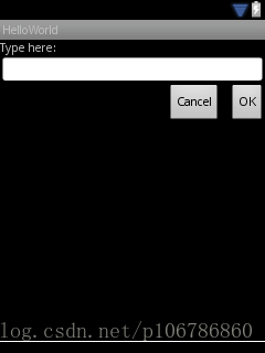
图例展示了这个布局如何在一个QVGA屏幕中显示。
图例展示了在一个较大的屏幕中如何展现。
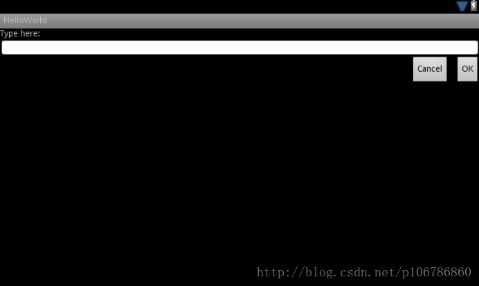
主要到尽管组件的大小被改变了,它们空间位置关系通过RelativeLayout.LayoutParams被指定保存。
使用大小限定符
——————————————————————————————————————————————————————————————
你能从一个灵活布局或者像前一个章节相对布局获得的仅仅由这些了。然而这些布局通过拉伸组件内部和外部空间,来适配不同的屏幕,它们可能不能为每个屏幕尺寸提供最好的用户体验。因此,你的应用程序不仅要实现灵活布局,但还应该提供几个不同的布局来匹配不同的屏幕配置。你也可以通过使用配置限定符,它允许在运行时基于当前设备的配置自动选择合适的资源(例如对不同的屏幕尺寸不同的布局设计)。
例如,一些应用程序针对大屏幕(这个应用在一个窗格中显示列表项目,和在另一个窗格中显示内容)实现了“两个窗格”模式。平板和电视屏幕对于同时填充两个窗格已经足够大,但是手机屏幕必须分开显示它们。所以,为了实现这些布局,你必须下面的文件:
res/layout/main.xml,单窗格(默认)布局:
<LinearLayout xmlns:android="http://schemas.android.com/apk/res/android"
    android:orientation="vertical"
    android:layout_width="match_parent"
    android:layout_height="match_parent">

    <fragment android:id="@+id/headlines"
              android:layout_height="fill_parent"
              android:name="com.example.android.newsreader.HeadlinesFragment"
              android:layout_width="match_parent" />
</LinearLayout> res/layout-large/main.xml,双窗格布局:
<LinearLayout xmlns:android="http://schemas.android.com/apk/res/android"
    android:layout_width="fill_parent"
    android:layout_height="fill_parent"
    android:orientation="horizontal">
    <fragment android:id="@+id/headlines"
              android:layout_height="fill_parent"
              android:name="com.example.android.newsreader.HeadlinesFragment"
              android:layout_width="400dp"
              android:layout_marginRight="10dp"/>
    <fragment android:id="@+id/article"
              android:layout_height="fill_parent"
              android:name="com.example.android.newsreader.ArticleFragment"
              android:layout_width="fill_parent" />
</LinearLayout> 注意在第二个布局目录名称中的large限定符。这个布局将会在被分类为大屏幕的设备中使用(例如,7寸或者以上的平板)。另一个布局(没有限定符)将被在更小的设备中使用。
使用最小宽度限定符
——————————————————————————————————————————————————————————————
开发者的一个困难是在3.2之前的“大”屏幕设备,它通常包含戴尔的Streak,原来的Galaxy Tab,和7寸平板。然而,一些应用程序可能想针对这样分类(例如5寸和7寸设备)的不同设备显示不同布局,即使它们都被认为是“大”屏幕。这就是为什么Android在Android3.2中包含“最小宽度”限定符。
最小宽度限定符允许你把一个使用dp描述的,有明确最小宽度的屏幕作为目标。例如,典型的7寸平板有最少600dp宽度,所以如果你想你的UI在这些屏幕(但是在更小的屏幕仅仅有一个单独的列表)中有两个窗格,你可以使用和前面章节为单和双窗格布局相同的布局文件,但是使用sw600dp替代large尺寸限定符,来说明双窗格布局是用于最小宽度为600dp的屏幕。
res/layout/main.xml,单窗格(默认)布局:
<LinearLayout xmlns:android="http://schemas.android.com/apk/res/android"
    android:orientation="vertical"
    android:layout_width="match_parent"
    android:layout_height="match_parent">

    <fragment android:id="@+id/headlines"
              android:layout_height="fill_parent"
              android:name="com.example.android.newsreader.HeadlinesFragment"
              android:layout_width="match_parent" />
</LinearLayout>
res/layout-sw600dp/main.xml,双窗格布局:
<LinearLayout xmlns:android="http://schemas.android.com/apk/res/android"
    android:layout_width="fill_parent"
    android:layout_height="fill_parent"
    android:orientation="horizontal">
    <fragment android:id="@+id/headlines"
              android:layout_height="fill_parent"
              android:name="com.example.android.newsreader.HeadlinesFragment"
              android:layout_width="400dp"
              android:layout_marginRight="10dp"/>
    <fragment android:id="@+id/article"
              android:layout_height="fill_parent"
              android:name="com.example.android.newsreader.ArticleFragment"
              android:layout_width="fill_parent" />
</LinearLayout>
这意味着最小宽度大于或者等于600dp的设备将会选择layout-sw600dp/main.xml(双窗格)布局,然而更小的屏幕将会选择layout/main.xml(单窗格)布局。
然而,在Android3.2之前的设备上这不能正常工作,因为它们不认识sw600dp作为大小限定符,所以你还是要使用larger限定符。因此,你应该有一个被命名为res/layout-large/main.xml的文件
使用布局别名
——————————————————————————————————————————————————————————————
最小宽度限定符仅仅在Android3.2和更高的版本中可用。因此,你仍然应该使用抽象大小容器(small,normal,large和xlarge)来兼容更早的版本。例如,如果你设计你的UI,以便在手机上显示单窗格界面,但是在7寸平板,电视和其它的大屏幕上显示多窗格,你必须提供这些文件:
res/layout/main.xml:单窗格布局
res/layout-large/main.xml:多窗格布局
res/layout-sw600dp/main.xml:多窗格布局
最后两个文件时相同的,因为它们中的一个将匹配Android3.2的设备,另一个对于更早的Android版本的平板和电视更好。
为了避免平板和电视同样文件的重复(和造成让人头疼的维护),你可以使用别名文件。例如,你可以定义下面布局:
res/layout/main.xml,单面板布局
res/layout/main_twopanes.xml,双面板布局
并且添加两个文件:
res/values-large/layout.xml:
<resources>
    <item name="main" type="layout">@layout/main_twopanes</item>
</resources>
res/values-sw600dp/layout.xml:
<resources>
    <item name="main" type="layout">@layout/main_twopanes</item>
</resources>
后面两个文件具有相同的内容,但是它们实际上不会定义布局。它们只不过是设置main.xml为main_twopanes的一个别名。因为这些文件有large和sw600dp选择符,它们被应用到平板和电视上,不顾Android版本(3.2之前的平板和电视匹配large,3.2之后将会匹配sw600dp)。
使用方向限定符
——————————————————————————————————————————————————————————————
一些布局在横屏和竖屏方向都能显示的很好,但是它们的大部分都可以调整的更好。在新闻阅读器示例应用中,这里是在每个屏幕大小和方向布局的表现:
小屏幕,竖屏:单窗格,图标
小屏幕,横屏:单窗格,图标
7寸平板,竖屏:单窗格,Action bar
7寸平板,横屏:双窗格,宽,Action bar
10寸平板,竖屏:双窗格,窄,Action bar
10寸平板,横屏:双窗格,宽,Action bar
电视,横屏:双窗格,宽,Action bar
那么这些布局都被定义在/res/layout/目录下的XML文件中。然把每一个布局分配给各种配置的屏幕,这个应用采用布局别名来匹配每个配置。
res/layout/onepane.xml:
<LinearLayout xmlns:android="http://schemas.android.com/apk/res/android"
    android:orientation="vertical"
    android:layout_width="match_parent"
    android:layout_height="match_parent">

    <fragment android:id="@+id/headlines"
              android:layout_height="fill_parent"
              android:name="com.example.android.newsreader.HeadlinesFragment"
              android:layout_width="match_parent" />
</LinearLayout>
res/layout/onepane_with_bar.xml:
<LinearLayout xmlns:android="http://schemas.android.com/apk/res/android"
    android:orientation="vertical"
    android:layout_width="match_parent"
    android:layout_height="match_parent">
    <LinearLayout android:layout_width="match_parent"
                  android:id="@+id/linearLayout1"
                  android:gravity="center"
                  android:layout_height="50dp">
        <ImageView android:id="@+id/imageView1"
                   android:layout_height="wrap_content"
                   android:layout_width="wrap_content"
                   android:src="@drawable/logo"
                   android:paddingRight="30dp"
                   android:layout_gravity="left"
                   android:layout_weight="0" />
        <View android:layout_height="wrap_content"
              android:id="@+id/view1"
              android:layout_width="wrap_content"
              android:layout_weight="1" />
        <Button android:id="@+id/categorybutton"
                android:background="@drawable/button_bg"
                android:layout_height="match_parent"
                android:layout_weight="0"
                android:layout_width="120dp"
                style="@style/CategoryButtonStyle"/>
    </LinearLayout>

    <fragment android:id="@+id/headlines"
              android:layout_height="fill_parent"
              android:name="com.example.android.newsreader.HeadlinesFragment"
              android:layout_width="match_parent" />
</LinearLayout>
res/layout/twopanes.xml:
<LinearLayout xmlns:android="http://schemas.android.com/apk/res/android"
    android:layout_width="fill_parent"
    android:layout_height="fill_parent"
    android:orientation="horizontal">
    <fragment android:id="@+id/headlines"
              android:layout_height="fill_parent"
              android:name="com.example.android.newsreader.HeadlinesFragment"
              android:layout_width="400dp"
              android:layout_marginRight="10dp"/>
    <fragment android:id="@+id/article"
              android:layout_height="fill_parent"
              android:name="com.example.android.newsreader.ArticleFragment"
              android:layout_width="fill_parent" />
</LinearLayout>
res/layout/twopanes_narrow.xml:
<LinearLayout xmlns:android="http://schemas.android.com/apk/res/android"
    android:layout_width="fill_parent"
    android:layout_height="fill_parent"
    android:orientation="horizontal">
    <fragment android:id="@+id/headlines"
              android:layout_height="fill_parent"
              android:name="com.example.android.newsreader.HeadlinesFragment"
              android:layout_width="200dp"
              android:layout_marginRight="10dp"/>
    <fragment android:id="@+id/article"
              android:layout_height="fill_parent"
              android:name="com.example.android.newsreader.ArticleFragment"
              android:layout_width="fill_parent" />
</LinearLayout> 现在所有可能的布局都被定义了,使用限定符仅仅是正确的布局和每个配置的简单映射。你现在能使用别名技术实现它:
res/values/layouts.xml:
<resources>
    <item name="main_layout" type="layout">@layout/onepane_with_bar</item>
    <bool name="has_two_panes">false</bool>
</resources>
res/values-sw600dp-land/layouts.xml:
<resources>
    <item name="main_layout" type="layout">@layout/onepane</item>
    <bool name="has_two_panes">false</bool>
</resources>
res/values-large-land/layouts.xml:
<resources>
    <item name="main_layout" type="layout">@layout/twopanes</item>
    <bool name="has_two_panes">true</bool>
</resources>
res/values-large-port/layouts.xml:
<resources>
    <item name="main_layout" type="layout">@layout/twopanes_narrow</item>
    <bool name="has_two_panes">true</bool>
</resources>
使用可拉伸的位图
——————————————————————————————————————————————————————————————
适配不同屏幕尺寸通常意味着你的图片资源也必须能够适应不同的尺寸。例如,一个按钮背景必须适应它应用的任何按钮形状。
如果你在会改变大小的组件上使用简单的图片,你将会很快发现效果有点不太尽如人意,因为在运行时将会拉伸或者收缩你的图片。解决方案是使用可拉伸的位图,它专门格式的图片,指定了哪些区域能拉伸和哪些区域不能。
因此,当设计奖将被使用在变化大小的组件上的位图时,通常使用可拉伸图片。将位图转换为可拉伸图片,你从一个普通图片开始(图4.4倍放大清晰显示)。
图4.button.png
然后使用SDK的draw9path工具打开它(被放在tools/目录下),通过沿着左和上边界绘制像素点来标记可拉伸的区域。你也可以通过沿着右和下边界绘制像素标记容纳内容的区域,结果如图5.
图5.button.9.png
注意沿着边界的黑色像素。在上和左边界的说明图片的这个区域可以被伸缩,和右和下边界的说明内容将被放置。
同样,注意.9.png扩展名。你必须使用这个扩展名,因为这是Android框架相对普通的PNG图片,发现它是一个可伸缩图片的标志。
当你在一个组件使用它作为背景的时候(通过设置android:background="@drawable/button"),框架伸缩图片来正确的适应按钮的尺寸,如在图6中的各种大小。
图6.一个使用button.9.png可拉伸图片按钮的各种尺寸。


 55
55


 被折叠的 条评论
为什么被折叠?
被折叠的 条评论
为什么被折叠?
 到【灌水乐园】发言


