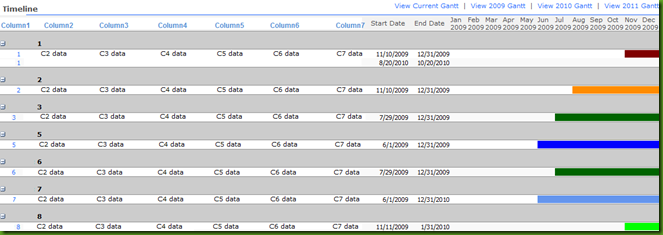
User requirements for this Gantt chart made it even more challenging; have the bars be color coded by project name, have grouping, sorting and filtering by all fields, have as many fields as needed to the left of the Gantt.
Now before you say “oh there are third party products that create Gantts” …yes there are, I evaluated them and none of them met all my user requirements.

To save time, I will assume you already know how to take a List View and convert it to a Data View and that you know how to use SharePoint Designer. If you don’t know these things, just comment to this post and I will email you.
Now once you do this you will realize there are other ways to accomplish this but using the same techniques.
- Create your list. I created mine from the Project Tasks built in list so that I have that functionality.
- Add your columns
- Create your Gantt columns.
- Color – Calculated Field – Single Line of Text
- ="<SPAN style='width:100%;background-color:"&IF([Status]="","Black",IF([Status]="Not Started","Blue",IF([Status]="In Progress","Chartreuse",IF([Status]="Completed","Green",IF([Status]="Deferred","Darkorange",IF([Status]="Waiting on someone else","Gold",IF([Status]="","Aqua","")))))))&";'> </SPAN>"
- This field could also reference a Project Name field or any other choice field.
- Jan – Calculated Field – Single Line of Text
- ="<DIV style='background-color:"&Color&"; width:100%;'> </DIV>"
- Feb – Calculated Field – Single Line of Text
- ="<DIV style='background-color:"&Color&"; width:100%;'> </DIV>"
- Mar – Calculated Field – Single Line of Text
- ="<DIV style='background-color:"&Color&"; width:100%;'> </DIV>"
- Apr – Calculated Field – Single Line of Text
- ="<DIV style='background-color:"&Color&"; width:100%;'> </DIV>"
- May – Calculated Field – Single Line of Text
- ="<DIV style='background-color:"&Color&"; width:100%;'> </DIV>"
- Jun – Calculated Field – Single Line of Text
- ="<DIV style='background-color:"&Color&"; width:100%;'> </DIV>"
- Jul – Calculated Field – Single Line of Text
- ="<DIV style='background-color:"&Color&"; width:100%;'> </DIV>"
- Aug – Calculated Field – Single Line of Text
- ="<DIV style='background-color:"&Color&"; width:100%;'> </DIV>"
- Sep – Calculated Field – Single Line of Text
- ="<DIV style='background-color:"&Color&"; width:100%;'> </DIV>"
- Oct – Calculated Field – Single Line of Text
- ="<DIV style='background-color:"&Color&"; width:100%;'> </DIV>"
- Nov – Calculated Field – Single Line of Text
- ="<DIV style='background-color:"&Color&"; width:100%;'> </DIV>"
- Dec – Calculated Field – Single Line of Text
- ="<DIV style='background-color:"&Color&"; width:100%;'> </DIV>"
- Optional fields – you can use these fields to automatically change the Year or Month Headers – however, I suggest for your first Gantt you just manually type in the headers.
- StartMonth - Calculated Field – Number
- =IF([Start Date]="",0,MONTH([Start Date]))
- CompleteMonth - Calculated Field – Number
- =IF([Complete Date]="",0,MONTH([Complete Date]))
- StartYear - Calculated Field – Number
- =IF([Start Date]="",0,YEAR([Start Date]))
- EndYear - Calculated Field – Number
- =IF([Complete Date]="",0,YEAR([Complete Date]))
- StartMonth - Calculated Field – Number
- Color – Calculated Field – Single Line of Text
- Organize your columns in your view how you want them to appear, make sure you have the Jan-Dec month fields there.
- Then add a Content Editor Web Part to the end of the page. This web part must remain under the list view.
- Edit the CEWP in the Source Code button to add JavaScript that will render the HTML as HTML rather than text. I use to create my own but recently I started using the one supplied by “PathToSharePoint” site because Christopher’s is better.
<script type="text/javascript">
function TextToHTML(NodeSet, HTMLregexp) {
var CellContent = "";
var i=0;
while (i < NodeSet.length){
try {
CellContent = NodeSet[i].innerText || NodeSet[i].textContent;
if (HTMLregexp.test(CellContent)) {NodeSet[i].innerHTML = CellContent;}
}
catch(err){}
i=i+1;
}
}// Calendar views
var regexpA = new RegExp("\\s*<([a-zA-Z]*)(.|\\s)*/\\1?>\\s*");
TextToHTML(document.getElementsByTagName("a"),regexpA);// List views
var regexpTD = new RegExp("^\\s*<([a-zA-Z]*)(.|\\s)*/\\1?>\\s*$");
TextToHTML(document.getElementsByTagName("TD"),regexpTD);// Grouped list views
ExpGroupRenderData = (function (old) {
return function (htmlToRender, groupName, isLoaded) {
var result = old(htmlToRender, groupName, isLoaded);
var regexpTD = new RegExp("^\\s*<([a-zA-Z]*)(.|\\s)*/\\1?>\\s*$");
TextToHTML(document.getElementsByTagName("TD"),regexpTD);
};
})(ExpGroupRenderData);// Preview pane views
if (typeof(showpreview1)=="function") {
showpreview1 = (function (old) {
return function (o) {
var result = old(o);
var regexpTD = new RegExp("^\\s*<([a-zA-Z]*)(.|\\s)*/\\1?>\\s*$");
TextToHTML(document.getElementsByTagName("TD"),regexpTD);
};
})(showpreview1);
}</script>
- In SharePoint Designer convert the List View to a Data View.
- Now you will notice that your month fields are displaying the HTML. Don’t worry about that as the JavaScript won’t render it as HTML in this data view mode, but it will in the resulting page.
- Here I prefer to change each cell to a fixed width, especially the month fields.
- Now click on the Jan column, and click on its chevron button, and change the “Format as:” to Rich Text. You should notice the text change to <DIV style=….</DIV> . Sometimes it doesn’t change for some reason. In those case I have to change the Format as: to Label, then save it, then change it back to Rich Text.
- Then repeat step 9 for each month field.
- Then save it.
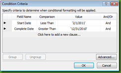
- Then you will create a Conditional Formatting statement for each month field.
- Then repeat step 12 for each month field.
- Save your changes to your page.
- View page in browser.
- To remove the spaces in between the colored bars you need to click on the Jan-Dec columns in Split mode so that you can see their code, then in their code change all “padding=” or “spacing=” to equal 0. You will also have to set the entire table and each column to are set widths, otherwise as the monitor resolutions change they can space out again.
Now your Gantt should look like the one above. This is just the beginning. Now you can do the same thing for week views, quarter views, or yearly views, using the same basic concepts of creating calculated fields and showing them with conditional formatting in SPD.
I know I usually would explain things step by step, but I promised to get this posted for someone quickly tonight that needed it. Let me know if you need more instructions.
Also note that since we are using background colors you could not use the right click Print function. If you need to print this Gantt you should change your formula from using a background color to displayinga repeating graphic instead. That is what I did in my second version of it, which then also gave it more of the traditional 3 dimensional graph look.
In my next article I will explain how to add scroll bars to this. The scroll bars I did strictly through code. So I might work on a generic STP to upload here.


 被折叠的 条评论
为什么被折叠?


