使用 CSS 实现打字效果
<h1>Pure CSS Typing animation.</h1>
<style lang="scss">
h1 {
  font-family: monospace;
  width: 26ch;
  white-space: nowrap;
  overflow: hidden;
  animation: typing 3s steps(26, end);
}

@keyframes typing {
  from {
    width: 0px;
  }
  to {
    width: 26ch;
  }
}
</style>
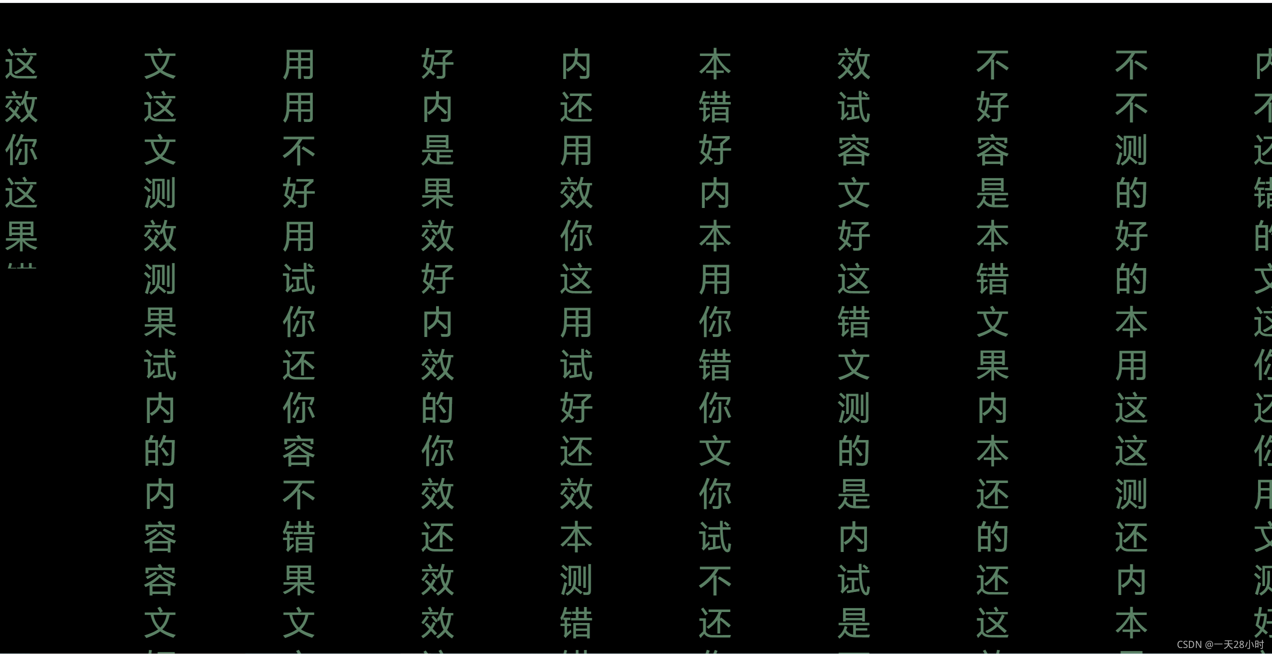
满屏动画 依次出现
<!--
* @Author: zhang gen yuan
* @Date: 2021-07-14 14:50:52
* @Descripttion:
-->
<template>
<div class="box">
<p></p>
<p></p>
<p></p>
<p></p>
<p></p>
<p></p>
<p></p>
<p></p>
<p></p>
<p></p>
</div>
</template>
<script>
export default {};
</script>
<style lang="scss">
.box {
width: 100vw;
display: flex;
justify-content: space-between;
}
@import url("https://fonts.googleapis.com/css2?family=Inconsolata:wght@200&display=swap");
$str: "你好这是测试用的文本内容,效果还不错";
$length: str-length($str);
$n: 50;
$animationTime: 1;
$perColumnNums: 25;
@function randomChar() {
$r: random($length);
@return str-slice($str, $r, $r);
}
@function randomChars($number) {
$value: "";
@if $number > 0 {
@for $i from 1 through $number {
$value: $value + randomChar();
}
}
@return $value;
}
body,
html {
width: 100%;
height: 100%;
background: #000;
display: flex;
overflow: hidden;
}
.g-container {
width: 100vw;
display: flex;
justify-content: space-between;
flex-wrap: nowrap;
flex-direction: row;
font-family: "Inconsolata", monospace, sans-serif;
}
p {
position: relative;
width: 5vh;
height: 100vh;
text-align: center;
font-size: 5vh;
word-break: break-all;
white-space: pre-wrap;
&::before,
&::after {
position: absolute;
top: 0;
left: 0;
right: 0;
height: 100%;
overflow: hidden;
}
}
$n: 10;
$animationTime: 3;
$perColumnNums: 20;
@for $i from 0 through $n {
$content: randomChars($perColumnNums);
$contentNext: randomChars($perColumnNums);
$delay: random($n);
$randomAnimationTine: #{$animationTime + random(20) / 10 - 1}s;
p:nth-child(#{$i})::before {
content: $content;
color: rgba(179, 255, 199,.5);
animation: typing-#{$i}
$randomAnimationTine
steps(20, end)
#{$delay *
0.1s *
-1}
infinite;
}
@keyframes typing-#{$i} {
0% {
height: 0;
}
25% {
height: 100%;
}
100% {
height: 100%;
content: $contentNext;
}
}
}
@keyframes mask {
0% {
background-position: 0 220%;
}
30% {
background-position: 0 0%;
}
100% {
background-position: 0 0%;
}
}
</style>


 4524
4524


 被折叠的 条评论
为什么被折叠?
被折叠的 条评论
为什么被折叠?
 到【灌水乐园】发言


