


绪
今年的Google IO给我们android开发着带来了三样很屌很屌的library:
- ASD(Android Support Design)
- APL(Android Percent Layout)
- DBL(Data Binding Library)
这三个库都是很屌很屌的库,第一个可以让我们在低版本的Android上使用Material Design,第二个是为了更好的适配,提供了基于百分比的Layout;至于第三个,能让Activity更好负责MVC中C的职责,让我们开发者更少的去findViewById。
ok,首先我们来看看第一个库,可能也是最主要的库-ASD。
ASD简介
前面说了,ASD给我们提供了Material Design提供了向下的兼容,当然我们也需要学习几个控件的使用,最后用一个实例的形式综合一个需要学习的这几个控件。
如何使用ASD?很简单,在AS中添加以下一句话就ok啦。
compile ‘com.android.support:design:22.2.0’
当然,我们在我们学习一些控件的时候还需要AppCompat Library。所以:
compile ‘com.android.support:appcompat-v7:22.2.0’
Snackbar
Snackbar我认为他是一个介于Dialog和Toast之前的玩意,可以在作为一种用户选择提醒时使用。Snackbar的使用很简单,接下来我们以代码和效果的形式快速预览一下这玩意的使用。
    public void click(View view) {
        Snackbar.make(view, "真要点我?", Snackbar.LENGTH_LONG)
                .setAction("真的!", new View.OnClickListener() {
                    @Override
                    public void onClick(View v) {
                        Toast.makeText(MainActivity.this, "你真点我了!",
                                Toast.LENGTH_SHORT).show();
                    }
                }).show();
    }
来看看效果。
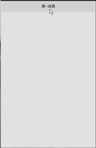
好吧,这玩意真的很简单,对照着上面的代码这下面的效果,肯定秒懂的。
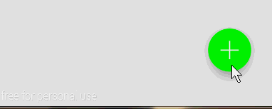
FloatingActionButton
在看看看另一个小控件,也许在项目中我们需要一个圆形的Button, 你可能会想到用自定义Shape的方式去做,但那样文本的显示不好居中,这时估计就想到用自定义控件去解决了。好吧,现在ASD给我们提供了FloatingActionButton可以轻松的创建圆形Button,而且更牛x的是FloatingActionButton具有更绚丽的效果。
FloatingActionButton的使用也很简单,他直接继承ImageView,所以ImageView的所有属性都可以用在FloatingActionButton上。来,看看我们的demo:
<android.support.design.widget.FloatingActionButton
        xmlns:app="http://schemas.android.com/apk/res-auto"
        android:onClick="click"
        android:layout_width="wrap_content"
        android:layout_height="wrap_content"
        android:layout_alignParentRight="true"
        android:layout_alignParentBottom="true"
        android:layout_margin="0dp"
        android:src="@drawable/add"
        app:backgroundTint="#FF00FF00"
        app:rippleColor="#FF0000FF"
        app:borderWidth="0dp"
        app:fabSize="normal"
        app:elevation="10dp"
        app:pressedTranslationZ="20dp"/>
简单解释一下命名空间为app的配置项。
1. app:backgroundTint是指定默认的背景颜色
2. app:rippleColor是指定点击时的背景颜色
3. app:borderWidth border的宽度
4. app:fabSize是指FloatingActionButton的大小,可选normal|mini
5. app:elevation 可以看出该空间有一个海拔的高度
6. app:pressedTranslationZ 哈,按下去时的z轴的便宜
来看看FloatingActionButton的效果:
恩,不错,但是有一个明显的缺陷就是FloatingActionButton和Snackbar的配合不太好,这对于Material Design简直就是耻辱!
想要解决这个问题,我们需要引入另一个控件。
CoordinatorLayout
CoordinatorLayout这个控件的作用是让它的子view更好的去协作,在接下来的时间里,我们基本都会用到这个控件,这里我们只是简单的用CoordinatorLayout来包裹一下FloatingActionButton来达到和Snackbar更好协作的效果。修改我们的布局:
<android.support.design.widget.CoordinatorLayout
        android:layout_width="match_parent"
        android:layout_height="wrap_content"
        android:layout_alignParentBottom="true"
        android:layout_alignParentRight="true">
        <android.support.design.widget.FloatingActionButton
            xmlns:app="http://schemas.android.com/apk/res-auto"
            android:layout_width="wrap_content"
            android:layout_height="wrap_content"
            android:layout_margin="0dp"
            android:onClick="click"
            android:layout_gravity="right"
            android:src="@drawable/add"
            app:backgroundTint="#FF00FF00"
            app:borderWidth="0dp"
            app:elevation="20dp"
            app:fabSize="normal"
            app:pressedTranslationZ="10dp"
            app:rippleColor="#FF0000FF" />
    </android.support.design.widget.CoordinatorLayout>
此时的效果:
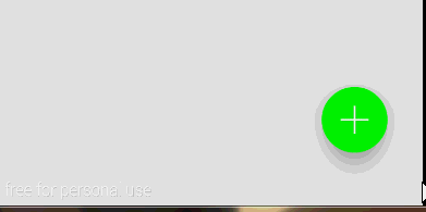
可以看到,当Snackbar显示的时候,Button自动往上移动了,而当Snackbar消失以后,Button又回到了原来的位置。
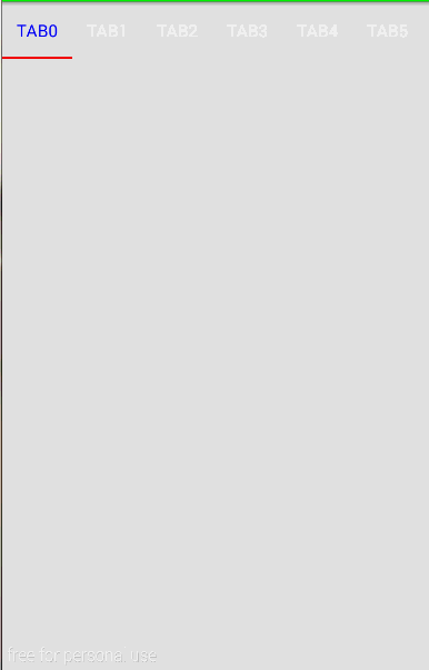
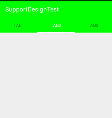
TabLayout
TabLayout也是一个好东西,有了它我们再也不需要使用麻烦人的PagerTabStrip了,也不需要使用自定义view的形式来达到效果。首先来看看简单用法。
<android.support.design.widget.TabLayout
        android:id="@+id/tl"
        android:layout_width="match_parent"
        android:layout_height="wrap_content"
        app:tabIndicatorColor="#FFFF0000"
        app:tabSelectedTextColor="#FF0000FF"
        app:tabTextColor="#FFFFFFFF"
        app:tabMode="scrollable"
        app:tabGravity="fill"/>
还是只解释app命名空间的。
1. app:tabIndicatorColor tab的指示符颜色
2. app:tabSelectedTextColor 选择tab的文本颜色
3. app:tabTextColor 普通tab字体颜色
4. app:tabMode 模式,可选fixed和scrollable fixed是指固定个数,scrollable是可以横行滚动的(逼格高)
5. app:tabGravity 对齐方式,可选fill和center
在来看看activity的代码:
final TabLayout tabLayout = (TabLayout) findViewById(R.id.tl);
        for(int i=0;i<20;i++) tabLayout.addTab(tabLayout.newTab().setText("TAB" + i));
        tabLayout.setOnTabSelectedListener(new TabLayout.OnTabSelectedListener() {
            @Override
            public void onTabSelected(TabLayout.Tab tab) {
                Toast.makeText(MainActivity.this, tab.getText(), Toast.LENGTH_SHORT).show();
            }

            @Override
            public void onTabUnselected(TabLayout.Tab tab) {

            }

            @Override
            public void onTabReselected(TabLayout.Tab tab) {

            }
        });
首先,获取该控件,然后一个for循环添加20个tab,使用:
tabLayout.addTab(tabLayout.newTab().setText(“TAB”));
添加新的tab。然后通过setOnTabSelectedListener来设置tab的item点击事件。so easy。 来看看效果。
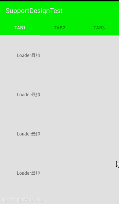
AppBarLayout
AppBarLayout这个控件也是让子view共同协作的,它和CoordinatorLayout的区别在于:
AppBarLayout是在效果上的协作,用AppBarLayout包裹的子view会以一个整体的形式作为AppBar。
CoordinatorLayout是在行为上的一种协作,尤其是在滚动的协作上,可以说非常完美(额, 也不是那么完美)
首先来看一下我们要做的效果吧。
从效果图上看,Toolbar和TabLayout成为了一体。
再来看看我们的代码
<android.support.design.widget.CoordinatorLayout
    xmlns:android="http://schemas.android.com/apk/res/android"
    xmlns:tools="http://schemas.android.com/tools"
    android:layout_width="match_parent"
    android:layout_height="match_parent"
    android:fitsSystemWindows="true"
    tools:context=".MainActivity">

    <android.support.design.widget.AppBarLayout
        android:layout_width="match_parent"
        android:layout_height="wrap_content">

        <android.support.v7.widget.Toolbar
            android:id="@+id/tb"
            android:layout_width="match_parent"
            android:layout_height="?attr/actionBarSize"/>

        <android.support.design.widget.TabLayout
            android:id="@+id/tl"
            android:layout_width="match_parent"
            android:layout_height="wrap_content"/>

    </android.support.design.widget.AppBarLayout>

</android.support.design.widget.CoordinatorLayout>
仅仅是用AppBarLayout包裹了一下Toolbar和TabLayout。细心的朋友可能看到了我们的TabLayout的背景也变了颜色,这里是因为我们在theme中设置了:
<item name="colorPrimary">#FF00FF00</item>那上面那个白色背景的呢? 好难看!难道没有设置吗?其实我也设置了,但是没有体现到TabLayout上,从这里也验证了我们上面所说的:
AppBarLayout是在效果上的一种协作
既然我们验证了该假设,那么顺便来验证一下
CoordinatorLayout是在行为上的一种协作
的假设吧。 修改代码:
<android.support.design.widget.CoordinatorLayout
    xmlns:android="http://schemas.android.com/apk/res/android"
    xmlns:app="http://schemas.android.com/apk/res-auto"
    xmlns:tools="http://schemas.android.com/tools"
    android:layout_width="match_parent"
    android:layout_height="match_parent"
    android:fitsSystemWindows="true"
    tools:context=".MainActivity">

    <android.support.design.widget.AppBarLayout
        android:layout_width="match_parent"
        android:layout_height="wrap_content">

        <android.support.v7.widget.Toolbar
            android:id="@+id/tb"
            android:layout_width="match_parent"
            android:layout_height="?attr/actionBarSize"
            app:layout_scrollFlags="scroll|enterAlways"/>

        <android.support.design.widget.TabLayout
            android:id="@+id/tl"
            android:layout_width="match_parent"
            android:layout_height="wrap_content"/>

    </android.support.design.widget.AppBarLayout>

    <android.support.v4.widget.NestedScrollView
        android:layout_width="match_parent"
        android:layout_height="wrap_content"
        app:layout_behavior="@string/appbar_scrolling_view_behavior">
        <LinearLayout
            android:layout_width="match_parent"
            android:layout_height="wrap_content"
            android:orientation="vertical">
            <TextView
                android:layout_width="match_parent"
                android:layout_height="wrap_content"
                android:padding="50dp"
                android:text="Loader最帅"/>
            <TextView
                android:layout_width="match_parent"
                android:layout_height="wrap_content"
                android:padding="50dp"
                android:text="Loader最帅"/>
            <TextView
                android:layout_width="match_parent"
                android:layout_height="wrap_content"
                android:padding="50dp"
                android:text="Loader最帅"/>
            <TextView
                android:layout_width="match_parent"
                android:layout_height="wrap_content"
                android:padding="50dp"
                android:text="Loader最帅"/>
            <TextView
                android:layout_width="match_parent"
                android:layout_height="wrap_content"
                android:padding="50dp"
                android:text="Loader最帅"/>
            <TextView
                android:layout_width="match_parent"
                android:layout_height="wrap_content"
                android:padding="50dp"
                android:text="Loader最帅"/>
            <TextView
                android:layout_width="match_parent"
                android:layout_height="wrap_content"
                android:padding="50dp"
                android:text="Loader最帅"/>
            <TextView
                android:layout_width="match_parent"
                android:layout_height="wrap_content"
                android:padding="50dp"
                android:text="Loader最帅"/>
            <TextView
                android:layout_width="match_parent"
                android:layout_height="wrap_content"
                android:padding="50dp"
                android:text="Loader最帅"/>
            <TextView
                android:layout_width="match_parent"
                android:layout_height="wrap_content"
                android:padding="50dp"
                android:text="Loader最帅"/>
            <TextView
                android:layout_width="match_parent"
                android:layout_height="wrap_content"
                android:padding="50dp"
                android:text="Loader最帅"/>
            <TextView
                android:layout_width="match_parent"
                android:layout_height="wrap_content"
                android:padding="50dp"
                android:text="Loader最帅"/>
            <TextView
                android:layout_width="match_parent"
                android:layout_height="wrap_content"
                android:padding="50dp"
                android:text="Loader最帅"/>
            <TextView
                android:layout_width="match_parent"
                android:layout_height="wrap_content"
                android:padding="50dp"
                android:text="Loader最帅"/>
        </LinearLayout>
    </android.support.v4.widget.NestedScrollView>

</android.support.design.widget.CoordinatorLayout>
对比上面的代码,首先我们添加了app的命名空间,为什么要添加这个?因为我们下面要用到!(靠!什么回答)
而且,我们给Toolbar增加了一条配置:
app:layout_scrollFlags="scroll|enterAlways"表示这个控件是可以滚出屏幕的,而且是随时可以再显示
layout_scrollFlags的其他取值有:
1. scroll 谁要滚出屏幕,谁就设置这个值
2. enterAlways 其他向上滑动时,可以立即显示出来
3. exitUntilCollapsed 将关闭滚动直到它被折叠起来(有 minHeight) 并且一直保持这样
4. enterAlwaysCollapsed 定义了 View 是如何回到屏幕的,当你的 view 已经声明了一个最小高度(minHeight) 并且你使用了这个标志,你的 View 只有在回到这个最小的高度的时候才会展开,只有当 view 已经到达顶部之后它才会重新展开全部高度。
(以上解释,参考了其他文章[目测也是翻译的官方文档])
在CoordinatorLayout中我们还引入了另外一个新的控件:
NestedScrollView,这个view其实是ScrollView的增强版,增强在哪呢?他支持属性:
app:layout_behavior="@string/appbar_scrolling_view_behavior"这条语句的作用是标识他要一起来写作完成scroll的效果。换句话说,上面的滚出屏幕的效果要配合一个可以滚动的View,并且得设置了该属性后才可以。(至少你得告诉人家,谁要滚出去,滑动谁时才滚出去吧)
好吧,来看看此时的效果:
看到了吧,我们在滑动下面的时候,Toolbar自觉的滚出了屏幕,而且在往上滑动的时候,Toolbar立马出现了,这就是enterAlways的功劳。
CollapsingToolbarLayout
最后,我们来看一个逼格同样高的控件:CollapsingToolbarLayout。
该控件的的子view必须要有Toolbar,他的作用就是提供一个可折叠的标题栏。通常情况下,该控件会和上面我们说的一些控件搭配使用,达到一种固定的效果。
CollapsingToolbarLayout本身的使用很简单,只是他的子view需要设置很多属性来达到这种效果,下面,我们就提供一个demo实例,来学习一下CollapsingToolbarLayout的使用,顺便复习一下上面所学到的一些控件。我们来实现一个这样的UI:
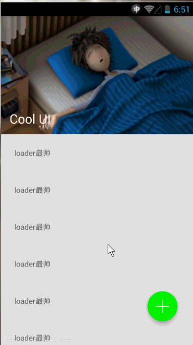
首先来分析一下,最直观的,可以看到有一个行为上的协作, 那肯定需要CoordinatorLayout这个控件,而且还会有一个效果上的协作,那肯定是AppBarLayout啦,当然,细心的朋友可能还会看出来,那个图片和Toolbar会有一种视差的效果,而且整个banner部分是一种折叠的效果,这就需要CollapsingToolbarLayout这个控件了。
来说一下CoolapsingToolbarLayout,这个控件必须要有一个Toolbar的子view,而且它将作为AppBarLayout的唯一直接子view使用,它提供了一个可以折叠的AppBar,并且还提供一种视差的效果。下面就让我们从例子中感受CoolapsingToolbarLayout的使用。
<RelativeLayout xmlns:android="http://schemas.android.com/apk/res/android"
    xmlns:app="http://schemas.android.com/apk/res-auto"
    xmlns:tools="http://schemas.android.com/tools"
    android:layout_width="match_parent"
    android:layout_height="match_parent"
    tools:context=".MainActivity">

    <android.support.design.widget.CoordinatorLayout
        android:layout_width="match_parent"
        android:layout_height="wrap_content"
        android:fitsSystemWindows="true">

        <android.support.design.widget.AppBarLayout
            android:layout_width="match_parent"
            android:layout_height="wrap_content">
            <android.support.design.widget.CollapsingToolbarLayout
                android:id="@+id/ctl"
                android:layout_width="match_parent"
                android:layout_height="wrap_content"
                app:contentScrim="?attr/colorPrimary"
                app:layout_scrollFlags="scroll|exitUntilCollapsed">

                <ImageView
                    android:layout_width="match_parent"
                    android:layout_height="wrap_content"
                    android:src="@drawable/banner"
                    android:scaleType="fitXY"
                    app:layout_collapseMode="parallax"/>

                <android.support.v7.widget.Toolbar
                    android:id="@+id/tb"
                    android:layout_width="match_parent"
                    android:layout_height="?attr/actionBarSize"
                    app:layout_collapseMode="pin"/>

            </android.support.design.widget.CollapsingToolbarLayout>
        </android.support.design.widget.AppBarLayout>
        <android.support.v7.widget.RecyclerView
            android:id="@+id/rv"
            android:layout_width="match_parent"
            android:layout_height="wrap_content"
            app:layout_behavior="@string/appbar_scrolling_view_behavior"/>
    </android.support.design.widget.CoordinatorLayout>

    <android.support.design.widget.CoordinatorLayout
        android:layout_width="match_parent"
        android:layout_height="wrap_content"
        android:layout_alignParentRight="true"
        android:layout_alignParentBottom="true">
        <android.support.design.widget.FloatingActionButton
            android:onClick="add"
            android:layout_width="wrap_content"
            android:layout_height="wrap_content"
            android:layout_gravity="right"
            android:layout_margin="0dp"
            android:src="@drawable/add"
            app:backgroundTint="#FF00FF00"
            app:rippleColor="#FF0000FF"
            app:borderWidth="0dp"
            app:fabSize="normal"
            app:elevation="10dp"
            app:pressedTranslationZ="20dp"/>
    </android.support.design.widget.CoordinatorLayout>
</RelativeLayout>
分析一下这个布局,最外层一个RelativeLayout他包含了两个CoordinatorLayout , 第二个CoordinatorLayout比较简单就是包括了一个FloatingActionButton,这样的用法可以参考博客上面讲的。
我们的重点是放在第一个CoordinatorLayout上。它有两个直接子view,和我们说的一样,一个提供滚出效果,一个提供滚动的效果。接下来一个AppBarLayout将ImageView和Toolbar作为了AppBar。可是它不是直接包含了这两个小控件,而是通过CollapsingToolbarLayout,而且表示滚动标识的app:layout_scrollFlags="scroll|exitUntilCollapsed"也是赋值给了CollapsingToolbarLayout,在这里思考一下,这样整个CoolapsingToolbarLayout将会作为一个整体滚出界面。可是看效果并不是啊, Toolbar明明还在那,那么接下来,我们来观察一下这个ImageView和Toolbar有什么神奇之处:
<ImageView
       android:layout_width="match_parent"
       android:layout_height="wrap_content"
       android:src="@drawable/banner"
       android:scaleType="fitXY"
       app:layout_collapseMode="parallax"/>
<android.support.v7.widget.Toolbar
       android:id="@+id/tb"
       android:layout_width="match_parent"
       android:layout_height="?attr/actionBarSize"
app:layout_collapseMode="pin"/>ImageView有一条属性app:layout_collapseMode="parallax"表示这个ImageView以视差的形式折叠(效果上看着貌似就是有点小偏移)。
Toolbar的app:layout_collapseMode="pin"表示Toolbar在折叠的过程中会停靠顶部(pin的意思是钉住)。
最后我们使用了一个RecyclerView,并且给这个控件设置app:layout_behavior="@string/appbar_scrolling_view_behavior",至于RecyclerView如果你不会用,请自行网补。
继续…, 继续观察上面的效果,在滑动的过程中有一个蛋疼的颜色–绿色,它是一个从无到有的过程,是一个渐变的效果,它是怎么控制的呢?
来看看CollapsingToolbarLayout它有一条属性是:app:contentScrim="?attr/colorPrimary",设置这条属性,在滑动的过程中,会自动变化到该颜色。
最后,要注意一下,现在我们不能给Toolbar设置标题了,而是给CollapsingToolbarLayout设置标题,可以看到标题在滚动的过程中会有一个大小的变化。
现在这个效果的逼格已经很高了,但是我们还不满足,那个绿色太TMD的难看了, 哎?能不能跟随那个图片的颜色?这样看起来逼格是不是更高!! 哈哈,完全可以!这需要我们再引用另一个库Palette,关于Palette的使用,可以看我之前的博客:《Android5.0之Palette简单实用》。
我们在activity中这么使用:
final CollapsingToolbarLayout ctl = (CollapsingToolbarLayout) findViewById(R.id.ctl);
        ctl.setTitle("Cool UI");
...
Bitmap bmp = BitmapFactory.decodeResource(getResources(), R.drawable.banner);
        Palette.generateAsync(bmp, new Palette.PaletteAsyncListener() {
            @Override
            public void onGenerated(Palette palette) {
                Palette.Swatch swatch = palette.getDarkMutedSwatch();
                ctl.setContentScrimColor(swatch.getRgb());
            }
        });
来看看此时的效果:
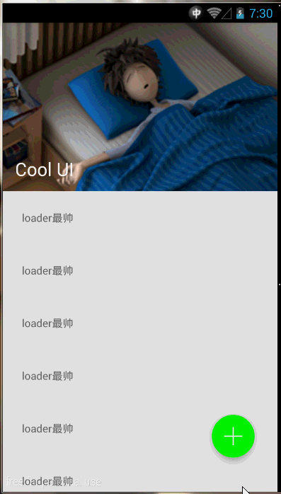
CollapsingToolbarLayout的ContentScrim是我们从那个Bitmap上取的。好了,就这么多吧,累尿了,休息去了。
源码下载: demo下载


 3664
3664


 被折叠的 条评论
为什么被折叠?
被折叠的 条评论
为什么被折叠?
 到【灌水乐园】发言


