


前言
絮叨两句,感觉Component这个库有点傲娇,我碰到一个情景,使用Button,设置了background属性,当使用样式是AppCompat时,正常显示背景。但是当我换成MaterialComponents之后,我发现有一些Button背景正常,有一些背景不正常了。我又没用MaterialButton。。。普通写的selector都能给我失效哦。肯定是这个库搞得鬼,然后我看到了backgroundTint这个属性,总之很无语。然后找了篇文章,写了这篇笔记。
主题属性
总而言之在这些里面选就好了,类比Appcompat的,如果您又想迁移,又不想一次获得所有新属性,请使用Theme.MaterialComponents.*.Bridge变体
- Theme.MaterialComponents
- Theme.MaterialComponents.NoActionBar
- Theme.MaterialComponents.Light
- Theme.MaterialComponents.Light.DarkActionBar
- Theme.MaterialComponents.Light.NoActionBar
statusBarColor和navigationBarColor属性用了设置状态栏和导航栏颜色。
colorBackground属性用来设置背景色。
备注:属性大家都知道的,format指定为reference的时候,需要输入索引,比如@color/white,但是format指定为color时,可以直接设置16进制的int作为颜色,不要搞错了。
颜色
颜色属性主要包括primary、secondary、error、surface和background颜色,以及它们各自的次要变体和“on”颜色。其中一些已从 AppCompat 主题中重用(例如colorPrimary,colorError和android:colorBackground):
- colorPrimary:应用的主要品牌颜色,最常用于主题
- colorPrimaryVariant:您的主要品牌颜色的较浅/较深变体,在主题中很少使用
- colorOnPrimary:用于显示在原色之上的元素的颜色(例如,文本和图标,通常为白色或半- 透明黑色,具体取决于可访问性)
- colorSecondary:您的应用的辅助品牌颜色,主要用作某些需要突出的小部件的重点
- colorSecondaryVariant:您的辅助品牌颜色的较浅/较深变体,在主题中很少使用
- colorOnSecondary:用于显示在辅助颜色之上的元素的颜色
- colorError:用于错误的颜色(通常是红色阴影)
- colorOnError:用于显示在错误颜色之上的元素的颜色
- colorSurface:用于表面的颜色(即材料“片材”)
- colorOnSurface:用于显示在表面颜色之上的元素的颜色
- colorBackground:所有其他屏幕内容背后的颜色
- colorOnBackground:用于显示在背景颜色之上的元素的颜色
排版
类型属性在文本字体、粗细、大小、大小写和字母间距方面遵循材料类型系统。属性引用实现(并以其命名)各种类型比例的样式:TextAppearance.MaterialComponents.*
- textAppearanceHeadline1:轻,96sp
- textAppearanceHeadline2:轻,60sp
- textAppearanceHeadline3:常规,48sp
- textAppearanceHeadline4:常规,34sp
- textAppearanceHeadline5:常规,24sp
- textAppearanceHeadline6:中,20sp
- textAppearanceSubtitle1:常规,16sp
- textAppearanceSubtitle2:中,14sp
- textAppearanceBody1:常规,16sp
- textAppearanceBody2:常规,14sp
- textAppearanceCaption:常规,12sp
- textAppearanceButton:常规,14sp,全部大写
- textAppearanceOverline:常规,12sp,全部大写
字体
Android 8.0(API 级别 26)引入了“XML 中的字体”这项新功能,可让您将字体用作资源。您可以在 res/font/ 文件夹中添加 font 文件,将字体捆绑为资源。使用资源也很容易,通过@font/myfont 或 R.font.myfont。
您可以在style属性中,通过fontFamily属性来设置字体。
<item name="android:fontFamily" >@font/myfont</item>
在程序中设置字体
val typeface = resources.getFont(R.font.myfont)
textView.typeface = typeface
形状
材料组件角可以是圆角(默认)的一部分,也可以是剪切的,可以继承形状主题属性然后修改cornerFamily和cornerSize。
形状属性是指应用程序中每个表面和小部件的一般形式。
形状主题属性参考ShapeAppearance.MaterialComponents.*样式:
- shapeAppearanceSmallComponent: 用于小元件,如按钮和芯片
- shapeAppearanceMediumComponent: 用于卡片等中型组件
- shapeAppearanceLargeComponent:对于大型组件,例如底部板
示例
< style name="AppShapeAppearance.MediumComponent" parent="ShapeAppearance.MaterialComponents.MediumComponent" >
    < item name="cornerFamily" >cut</ item >
    < item name="cornerSize" >8dp</ item >
</ style >
然后这个cardView圆角变方了
小部件
虽然全局主题涵盖了我们的大部分需求,但是有时候是需要单独定义小部件的。
Buttons
- Widget.MaterialComponents.Button :默认情况,凸起
- Widget.MaterialComponents.Button.UnelevatedButton :非凸起
- Widget.MaterialComponents.Button.OutlinedButton :有轮廓(外边框)
- Widget.MaterialComponents.Button.TextButton :文本
部分属性:
- backgroundTint:应用于按钮背景的色调颜色。文本按钮和colorPrimary所有其他变体的默认启用颜色是透明的。
- iconTint:应用于可选按钮图标的色调。默认启用颜色colorPrimary用于文本按钮和colorOnPrimary所有其他变体。
- rippleColor:按钮触摸波纹的颜色。默认颜色colorOnPrimary用于凸起/未凸起按钮和colorPrimary轮廓/文本按钮。
- strokeColor:按钮背景周围的描边颜色。默认颜色colorOnSurface用于带轮廓的按钮,并为所有其他变体透明。
- strokeWidth:按钮背景周围的描边宽度。轮廓按钮的默认值为 1dp,所有其他变体的默认值为 0dp。
- shapeAppearance:按钮背景的形状外观。默认值为shapeAppearanceSmallComponent
来个示例
< style name="AppTheme" parent="Theme.MaterialComponents.Light" >
    ...
    < item name="materialButtonStyle" >@style/AppButton</ item >
</ style >
< style name="AppButton" parent="Widget.MaterialComponents.Button" >
    < item name="backgroundTint" >?attr/colorSecondary</ item >
</ style >
效果如图

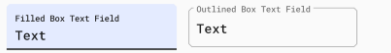
Text Fields
这里讲的是TextInputLayout和TextInputEditText,样式有2种变体,可选样式目前有8种
- Widget.MaterialComponents.TextInputLayout.*
- Widget.MaterialComponents.TextInputEditText.*.
变体具有样式后缀,包括填充框(默认,.FilledBox)和轮廓框(.OutlinedBox)。所有文本字段变体都使用标准文本外观作为输入和textAppearanceCaption“帮助”文本(标签、错误、计数器等)的主题属性。
部分属性:
- boxBackgroundMode:框背景的模式,可以是filled,outline或none。
- boxBackgroundColor:文本字段背景的颜色。默认启用的颜色colorOnSurface用于填充的框文本字段和透明的框文本字段。
- boxStrokeColor:文本字段背景周围的笔触颜色。轮廓框文本字段的默认颜色是(在默认状态下)colorOnSurface,填充的框文本字段将被忽略。
- hintTextColor/ errorTextColor/ counterTextColor:各种不同的“帮手”文本子组件颜色。
- shapeAppearance:文本字段背景的形状外观。默认值为shapeAppearanceSmallComponent。
来个示例
< style name="AppTheme" parent="Theme.MaterialComponents.Light" >
    ...
    < item name="textInputStyle" >@style/AppTextField</ item >
</ style >
< style name="AppTextField" parent="Widget.MaterialComponents.TextInputLayout.FilledBox">
     < item name="boxBackgroundColor" >@color/text_field_background</ item >
< /style >
效果如图
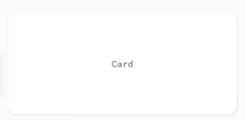
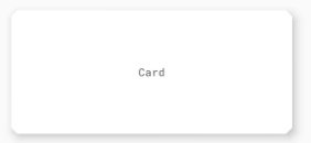
Cards
主体样式为 Widget.MaterialComponents.CardView
主要属性:
- cardBackgroundColor:卡片背景的颜色。默认颜色是colorSurface。
- cardElevation: 卡的高度。默认值为 1dp。
- shapeAppearance:卡片背景的形状外观。默认值为shapeAppearanceMediumComponent。
来个示例
< style name="AppTheme" parent="Theme.MaterialComponents.Light" >
    ...
    < item name="materialCardViewStyle" >@style/AppCard</ item >
</ style >
< style name="AppCard" parent="Widget.MaterialComponents.CardView" >
    < item name="cardElevation" >8dp</ item >
</ style >
效果如图
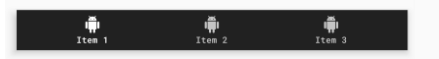
Bottom Navigation
- Widget.MaterialComponents.BottomNavigationView :默认样式
- **Widget.MaterialComponents.BottomNavigationView.PrimarySurface ** :深色主题支持样式
- Widget.MaterialComponents.BottomNavigationView.Colored :彩色款式
部分属性
- backgroundTint:底部导航背景的颜色。默认颜色colorSurface用于表面底部导航和colorPrimary彩色底部导航。
- itemTextColor/ itemIconTint:底部导航项图标和标签的颜色。表面底部导航和彩色底部导航的默认颜色为colorOnSurface/ colorPrimary(已选择)colorOnPrimary。
- itemHorizontalTranslationEnabled: 设置在选择底部导航项时是否应出现翻译动画的标志。默认值为假。
来个示例
< style name="AppTheme" parent="Theme.MaterialComponents.Light" >
    ...
    < item name="bottomNavigationStyle" >@style/AppBottomNavigation</ item >
</ style >
< style name="AppBottomNavigation" parent="Widget.MaterialComponents.BottomNavigation.Colored" />
效果如图
后话
原文:Setting up a Material Components theme for Android
关于更多属性查看项目:material-components-android
关于模板示例项目:material-components-android-examples


 扫一扫
扫一扫


 1455
1455

 被折叠的 条评论
为什么被折叠?
被折叠的 条评论
为什么被折叠?
 到【灌水乐园】发言


