【WPF】设置ListBox容器子控件的布局

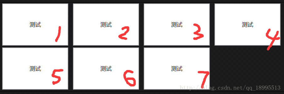
需求:像下图那样显示把一组内容装入ListBox中显示。要求用WrapPanel横向布局,顺序如图中的数字。

这里写图片描述

问题:ListBox默认的布局是从上往下单列的,所以需要设置布局。

<ListBox x:Name="HousePlansLB">
    <ListBox.Template>
        <ControlTemplate TargetType="ListBox">
            <WrapPanel Width="600" Orientation="Horizontal" IsItemsHost="True"/>
        </ControlTemplate>
    </ListBox.Template>

    <TextBox Text="测试" Width="140" Height="90" HorizontalContentAlignment="Center" VerticalContentAlignment="Center"/>
    <TextBox Text="测试" Width="140" Height="90" HorizontalContentAlignment="Center" VerticalContentAlignment="Center"/>
    <TextBox Text="测试" Width="140" Height="90" HorizontalContentAlignment="Center" VerticalContentAlignment="Center"/>
    <TextBox Text="测试" Width="140" Height="90" HorizontalContentAlignment="Center" VerticalContentAlignment="Center"/>
    <TextBox Text="测试" Width="140" Height="90" HorizontalContentAlignment="Center" VerticalContentAlignment="Center"/>
    <TextBox Text="测试" Width="140" Height="90" HorizontalContentAlignment="Center" VerticalContentAlignment="Center"/>
    <TextBox Text="测试" Width="140" Height="90" HorizontalContentAlignment="Center" VerticalContentAlignment="Center"/>
</ListBox>

实际使用中,还要给ListBox设置它的ItemsSource绑定到ViewModel中的某个列表,不会是向上面那样直接手打一串的TextBox的。

重要的参考:

http://www.cnblogs.com/qishichang/archive/2010/09/30/1839040.html

  • 1
    点赞
  • 1
    收藏
    觉得还不错? 一键收藏
  • 0
    评论
1. 在XAML中,可以使用ScrollBarStyle属性来设置ListBox的滚动条样式。 2. 可以使用Style属性为ListBox的滚动条定义一个样式。例如,以下是一个简单的样式,它将滚动条的背景颜色设置为灰色: ```xaml <ListBox ScrollViewer.VerticalScrollBarStyle="{StaticResource ScrollBarStyle}"> <ListBox.Resources> <Style TargetType="ScrollBar" x:Key="ScrollBarStyle"> <Setter Property="Background" Value="Gray"/> </Style> </ListBox.Resources> </ListBox> ``` 3. 可以使用VisualStateManager类来定义滚动条的不同状态,例如:正常、拖动、禁用等等。以下是一个示例,其中定义了三种状态: ```xaml <ListBox ScrollViewer.VerticalScrollBarStyle="{StaticResource ScrollBarStyle}"> <ListBox.Resources> <Style TargetType="ScrollBar" x:Key="ScrollBarStyle"> <Setter Property="Background" Value="Gray"/> <Setter Property="Template"> <Setter.Value> <ControlTemplate TargetType="ScrollBar"> <Grid> <VisualStateManager.VisualStateGroups> <VisualStateGroup x:Name="CommonStates"> <VisualState x:Name="Normal"/> <VisualState x:Name="Disabled"> <Storyboard> <DoubleAnimation Storyboard.TargetName="PART_Thumb" Storyboard.TargetProperty="Opacity" To="0.5" Duration="0"/> </Storyboard> </VisualState> <VisualState x:Name="MouseOver"> <Storyboard> <DoubleAnimation Storyboard.TargetName="PART_Thumb" Storyboard.TargetProperty="Opacity" To="1" Duration="0"/> </Storyboard> </VisualState> </VisualStateGroup> </VisualStateManager.VisualStateGroups> <Grid.RowDefinitions> <RowDefinition Height="*"/> <RowDefinition Height="Auto"/> </Grid.RowDefinitions> <Border Grid.Row="0" Background="{TemplateBinding Background}" CornerRadius="2"/> <RepeatButton Grid.Row="0" Style="{StaticResource ScrollBarButtonStyle}" Command="{TemplateBinding Track.DecreaseCommand}" IsEnabled="{TemplateBinding Track.DecreaseButton.IsEnabled}"/> <Track Grid.Row="0" Name="PART_Track"> <Track.DecreaseRepeatButton> <RepeatButton Style="{StaticResource ScrollBarButtonStyle}" Command="{TemplateBinding Track.DecreaseCommand}" IsEnabled="{TemplateBinding Track.DecreaseButton.IsEnabled}"/> </Track.DecreaseRepeatButton> <Track.Thumb> <Thumb x:Name="PART_Thumb" Style="{StaticResource ScrollBarThumbStyle}"/> </Track.Thumb> <Track.IncreaseRepeatButton> <RepeatButton Style="{StaticResource ScrollBarButtonStyle}" Command="{TemplateBinding Track.IncreaseCommand}" IsEnabled="{TemplateBinding Track.IncreaseButton.IsEnabled}"/> </Track.IncreaseRepeatButton> </Track> <RepeatButton Grid.Row="1" Style="{StaticResource ScrollBarButtonStyle}" Command="{TemplateBinding Track.IncreaseCommand}" IsEnabled="{TemplateBinding Track.IncreaseButton.IsEnabled}"/> </Grid> </ControlTemplate> </Setter.Value> </Setter> </Style> <Style TargetType="Thumb" x:Key="ScrollBarThumbStyle"> <Setter Property="Background" Value="#FF8E8F8F"/> <Setter Property="BorderThickness" Value="1"/> <Setter Property="BorderBrush" Value="#FFCED2D8"/> <Setter Property="Width" Value="8"/> <Setter Property="Height" Value="20"/> <Setter Property="IsTabStop" Value="False"/> <Setter Property="Template"> <Setter.Value> <ControlTemplate TargetType="Thumb"> <Border Background="{TemplateBinding Background}" BorderBrush="{TemplateBinding BorderBrush}" BorderThickness="{TemplateBinding BorderThickness}"/> </ControlTemplate> </Setter.Value> </Setter> </Style> <Style TargetType="RepeatButton" x:Key="ScrollBarButtonStyle"> <Setter Property="Background" Value="Transparent"/> <Setter Property="BorderThickness" Value="1"/> <Setter Property="BorderBrush" Value="#FFCED2D8"/> <Setter Property="Width" Value="10"/> <Setter Property="Height" Value="10"/> <Setter Property="IsTabStop" Value="False"/> <Setter Property="Template"> <Setter.Value> <ControlTemplate TargetType="RepeatButton"> <Border Background="{TemplateBinding Background}" BorderBrush="{TemplateBinding BorderBrush}" BorderThickness="{TemplateBinding BorderThickness}"/> </ControlTemplate> </Setter.Value> </Setter> </Style> </ListBox.Resources> </ListBox> ``` 4. 可以使用ScrollViewer类来设置ListBox的滚动行为。例如,以下是一个示例,它启用了水平滚动条和垂直滚动条: ```xaml <ListBox ScrollViewer.HorizontalScrollBarVisibility="Auto" ScrollViewer.VerticalScrollBarVisibility="Auto"> </ListBox> ``` 5. 可以使用ScrollBar类的各种属性和事件来自定义ListBox的滚动条。例如,以下是一个示例,它定义了一个自定义滚动条,该滚动条使用Thumb.DragStarted事件和Thumb.DragDelta事件来更新ListBox的滚动位置: ```xaml <ListBox> <ListBox.Resources> <Style TargetType="ScrollBar"> <Setter Property="Background" Value="Gray"/> <Setter Property="Width" Value="10"/> <Setter Property="Template"> <Setter.Value> <ControlTemplate TargetType="ScrollBar"> <Grid> <Grid.RowDefinitions> <RowDefinition Height="*"/> <RowDefinition Height="Auto"/> </Grid.RowDefinitions> <Border Grid.Row="0" Background="{TemplateBinding Background}" CornerRadius="2"/> <Thumb x:Name="PART_Thumb" Background="#FF8E8F8F" BorderThickness="1" BorderBrush="#FFCED2D8" Width="8" Height="20" IsTabStop="False" DragStarted="PART_Thumb_DragStarted" DragDelta="PART_Thumb_DragDelta"/> </Grid> </ControlTemplate> </Setter.Value> </Setter> </Style> </ListBox.Resources> </ListBox> ``` ```csharp private void PART_Thumb_DragStarted(object sender, DragStartedEventArgs e) { var thumb = sender as Thumb; var scrollBar = thumb.TemplatedParent as ScrollBar; if (scrollBar != null) { scrollBar.CaptureMouse(); } } private void PART_Thumb_DragDelta(object sender, DragDeltaEventArgs e) { var thumb = sender as Thumb; var scrollBar = thumb.TemplatedParent as ScrollBar; if (scrollBar != null) { double newValue = scrollBar.Value - e.VerticalChange; if (newValue < scrollBar.Minimum) { newValue = scrollBar.Minimum; } else if (newValue > scrollBar.Maximum) { newValue = scrollBar.Maximum; } scrollBar.Value = newValue; } } ``` 以上是一些设置WPF ListBox滚动条的方法。可以根据需要进行自定义和修改,以满足具体的需求。

“相关推荐”对你有帮助么?

  • 非常没帮助
  • 没帮助
  • 一般
  • 有帮助
  • 非常有帮助
提交
评论
添加红包

请填写红包祝福语或标题

红包个数最小为10个

红包金额最低5元

当前余额3.43前往充值 >
需支付:10.00
成就一亿技术人!
领取后你会自动成为博主和红包主的粉丝 规则
hope_wisdom
发出的红包
实付
使用余额支付
点击重新获取
扫码支付
钱包余额 0

抵扣说明:

1.余额是钱包充值的虚拟货币,按照1:1的比例进行支付金额的抵扣。
2.余额无法直接购买下载,可以购买VIP、付费专栏及课程。

余额充值